Create and Customize Seaborn Radial (Circular) Bar plot
In this tutorial, you’ll learn how to create and customize Seaborn radial bar plot.
We’ll explore various customization methods, such as adjusting colors, adding labels, formatting the radial axis, and even making your plot interactive for an enhanced user experience.
Create Radial Bar Plot
To transform a linear bar plot into a radial (circular) bar plot, you can use Seaborn and matplotlib in Python.
First, let’s start by importing the necessary libraries and preparing some sample data. We’ll use Seaborn for plotting and Pandas for data manipulation.
import matplotlib.pyplot as plt
import seaborn as sns
import pandas as pd
import numpy as np
data = pd.DataFrame({
    'Category': ['Category A', 'Category B', 'Category C', 'Category D'],
    'Values': [23, 45, 56, 78]
})
This code sets up your environment and creates a sample DataFrame with two columns: ‘Category’ and ‘Values’.
Next, let’s convert this linear data into a radial format. This requires calculating the angles and positions for each bar in the circular plot.
# Number of variables
N = len(data)
# Angle for each category
theta = np.linspace(0.0, 2 * np.pi, N, endpoint=False)
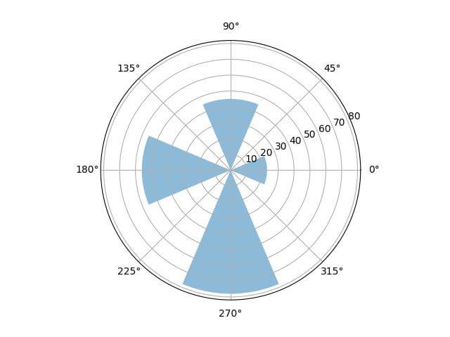
fig, ax = plt.subplots(subplot_kw={'projection': 'polar'})
bars = ax.bar(theta, data['Values'], align='center', alpha=0.5)
plt.show()
Output:
Customize Plot Appearance
Seaborn and matplotlib offer customization options such as color, transparency (alpha channel), linewidth, edgecolor, and the width of bars.
First, define the color and other style attributes:
# Define color, alpha, linewidth, and edgecolor
colors = sns.color_palette('hsv', N)  # Using seaborn's color palette
alpha = 0.7
linewidth = 1
edgecolor = 'black'
bar_width = (2 * np.pi) / (N * 1.5)
Here, sns.color_palette('hsv', N) generates a list of colors from the HSV color space.
The alpha sets the transparency level, and linewidth and edgecolor define the border of the bars.
Next, let’s apply these customizations to our bar plot:
fig, ax = plt.subplots(subplot_kw={'projection': 'polar'})
bars = ax.bar(theta, data['Values'], width=bar_width, color=colors,
              alpha=alpha, linewidth=linewidth, edgecolor=edgecolor)
plt.show()
Output:
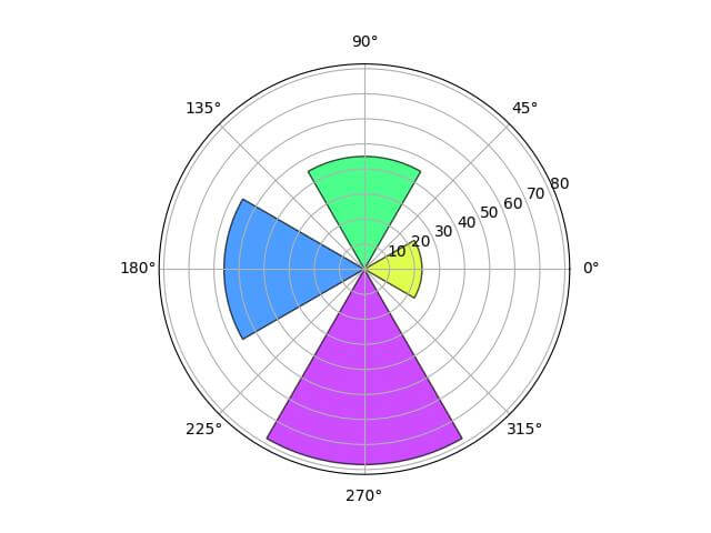
In this code, the bar() function now includes parameters for color, alpha, linewidth, edgecolor, and bar width.
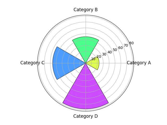
Add Labels
Here’s how you can set and customize them:
ax.set_xticks(theta)
ax.set_xticklabels(data['Category'])
plt.xticks(rotation=45, size=12)
Output:
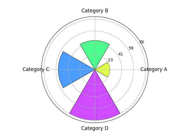
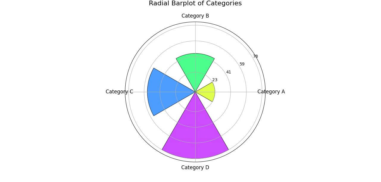
Customize Radial Axis Labels
Customizing the radial (or circular) axis labels helps in conveying the scale of values. Here’s how to do it:
ax.set_yticklabels([])  # Hides the default radial labels
ax.set_rlabel_position(30)  # Sets the position of new radial labels

# Custom radial labels
custom_labels = np.linspace(data['Values'].min(), data['Values'].max(), num=4)
ax.set_yticks(custom_labels)
ax.set_yticklabels([f'{int(label)}' for label in custom_labels], size=10)
Output:
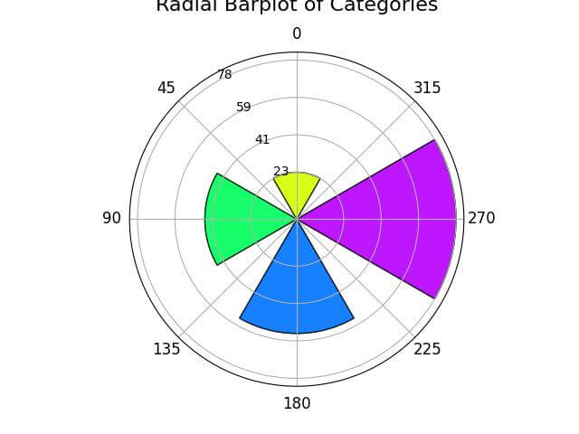
Add Central Title
You can add a title using title method:
plt.title('Radial Barplot of Categories', size=16, y=1.1)
Output:
Format the Radial Axis
The start and stop points of the radial axis can be adjusted to align the plot according to your preferences:
# Setting the start and stop point of the radial axis
ax.set_theta_zero_location('N')  # Sets the start point (0 degrees) to the top (North)
ax.set_theta_direction(-1)  # Sets the direction of the plot to clockwise
Output:
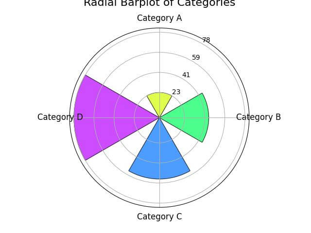
Here, set_theta_zero_location('N') sets the 0-degree point to the top of the circle (North). The set_theta_direction(-1) changes the direction to clockwise.
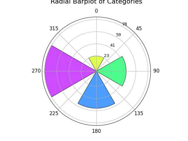
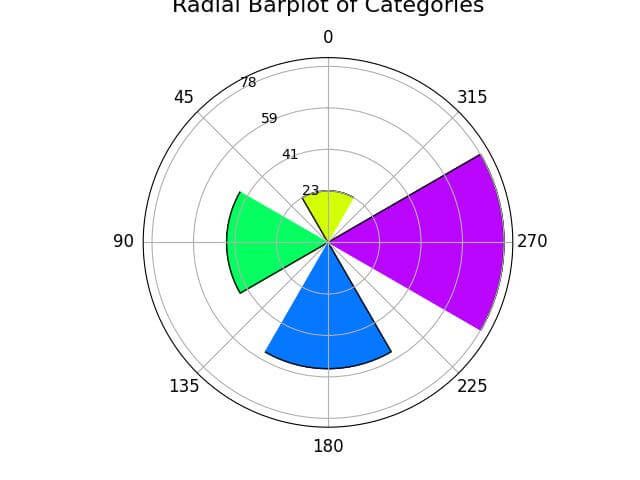
Change to Degrees
To display the radial axis units in degrees, which are more intuitive, you can modify the tick labels:
# Changing radial axis to degrees
ax.set_xticks(np.pi/180. * np.linspace(0,  360, num=8, endpoint=False))
ax.set_xticklabels(range(0, 360, 45))
Output:
Set Clockwise/Counterclockwise Direction
You can further customize the direction of the radial plot:
# Setting plot direction to counterclockwise
ax.set_theta_direction(1)  # Changing to counterclockwise direction
Output:
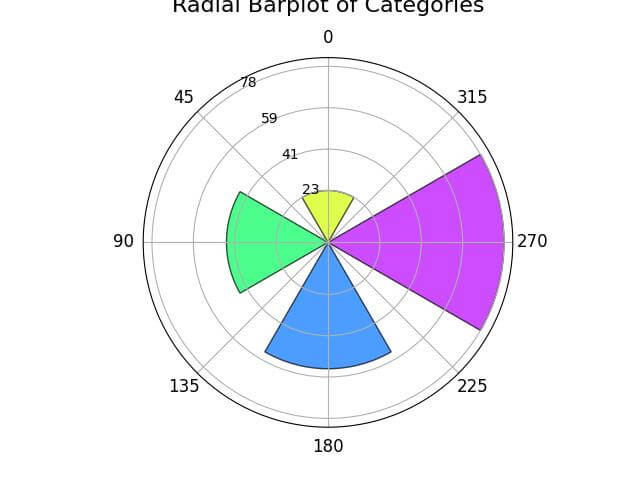
By setting the theta_direction to 1, the plot will be drawn in a counterclockwise direction.
Capsize to Control Bar Caps, Inner Ring Size
The capsize parameter adds or adjusts caps at the end of each bar, providing a more polished look:
# Adding capsize to bars
capsize = 0.1
bars = ax.bar(theta, data['Values'], width=bar_width, color=colors,
              alpha=alpha, linewidth=linewidth, edgecolor=edgecolor,
              capsize=capsize)
Output:
In this example, capsize is set to 0.1, adding small caps to the end of each bar.
Order the Bars
Ordering the bars can help in highlighting patterns or trends:
data_sorted = data.sort_values('Values')
theta_sorted = np.linspace(0.0, 2 * np.pi, N, endpoint=False)
bars = ax.bar(theta_sorted, data_sorted['Values'], width=bar_width, color=colors,
              alpha=alpha, linewidth=linewidth, edgecolor=edgecolor,
              capsize=capsize)
Output:
Here, the data is first sorted by ‘Values’, and then the bars are plotted accordingly.
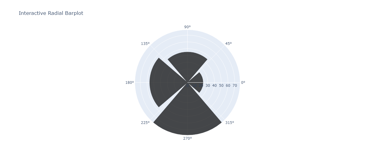
Make Radial Bar Plots Interactive
Plotly is a powerful library for creating interactive plots. First, let’s import Plotly and prepare our data:
import plotly.graph_objects as go
data['Theta'] = np.linspace(0, 360, N, endpoint=False)
Here, we import Plotly’s graph objects and add a ‘Theta’ column to our data for the angular coordinates.
Now let’s create the interactive plot:
fig = go.Figure()
fig.add_trace(go.Barpolar(
    r=data['Values'],
    theta=data['Theta'],
    marker_color=colors,
    marker_line_color=edgecolor,
    marker_line_width=linewidth,
    opacity=alpha
))
fig.update_layout(
    title='Interactive Radial Barplot',
    polar=dict(
        radialaxis=dict(
            visible=True,
            range=[0, data['Values'].max()]
        )
    ),
    showlegend=False
)
fig.show()
In this code, go.Barpolar creates a polar bar trace, which is then added to our Plotly figure.
The update_layout method is used to customize the plot, including setting the title and adjusting the radial axis.
Output
Mokhtar is the founder of LikeGeeks.com. He is a seasoned technologist and accomplished author, with expertise in Linux system administration and Python development. Since 2010, Mokhtar has built an impressive career, transitioning from system administration to Python development in 2015. His work spans large corporations to freelance clients around the globe. Alongside his technical work, Mokhtar has authored some insightful books in his field. Known for his innovative solutions, meticulous attention to detail, and high-quality work, Mokhtar continually seeks new challenges within the dynamic field of technology.