Seaborn Bar Plot: Visualizing Positive and Negative Values
In this tutorial, you’ll learn how to plot positive and negative values using Seaborn in Python.
We’ll cover various types of Seaborn bar plots such as horizontal bar plots, stacked bar plots, and side-by-side bar plots.
Plotting Positive and Negative Values
First, let’s import the necessary libraries and prepare our sample data:
import pandas as pd
import seaborn as sns
import matplotlib.pyplot as plt
data = {
    'Month': ['Jan', 'Feb', 'Mar', 'Apr', 'May', 'Jun'],
    'Net_Change': [150, -120, 180, -100, 200, -160]
}
df = pd.DataFrame(data)
print(df)
Output:
  Month  Net_Change
0   Jan         150
1   Feb        -120
2   Mar         180
3   Apr        -100
4   May         200
5   Jun        -160
Here, you have created a DataFrame with months and corresponding net changes, which include both positive and negative values.
Next, let’s plot this data using Seaborn’s barplot function:
sns.set_theme(style="whitegrid")
plt.figure(figsize=(8, 4))
bar_plot = sns.barplot(x='Month', y='Net_Change', data=df, palette='vlag')
plt.title('Monthly Net Change')
plt.xlabel('Month')
plt.ylabel('Net Change')
plt.show()
Output:
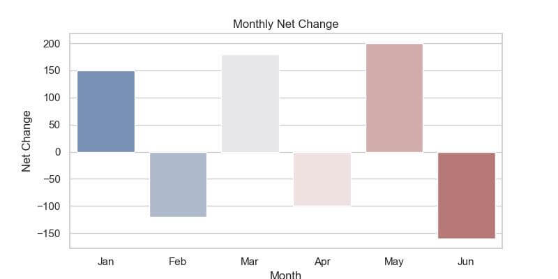
Months with positive net change are displayed in one color, while those with negative net change are shown in another.
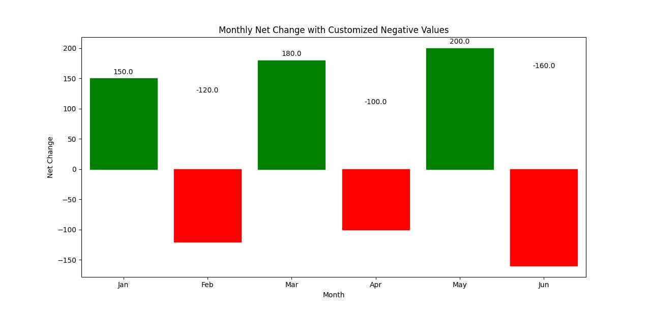
Customizing Negative Values: Coloring and Labeling
Let’s start by customizing the colors for negative and positive values differently and then add labels to our bars:
plt.figure(figsize=(8, 4))
bar_plot = sns.barplot(x='Month', y='Net_Change', data=df)
for p in bar_plot.patches:
    bar_plot.annotate(format(p.get_height(), '.1f'),
                      (p.get_x() + p.get_width() / 2., abs(p.get_height())),
                      ha = 'center', va = 'center',
                      xytext = (0, 9),
                      textcoords = 'offset points')
    if p.get_height() < 0:
        p.set_color('red')
    else:
        p.set_color('green')
plt.title('Monthly Net Change with Customized Negative Values')
plt.xlabel('Month')
plt.ylabel('Net Change')
plt.show()
Output:
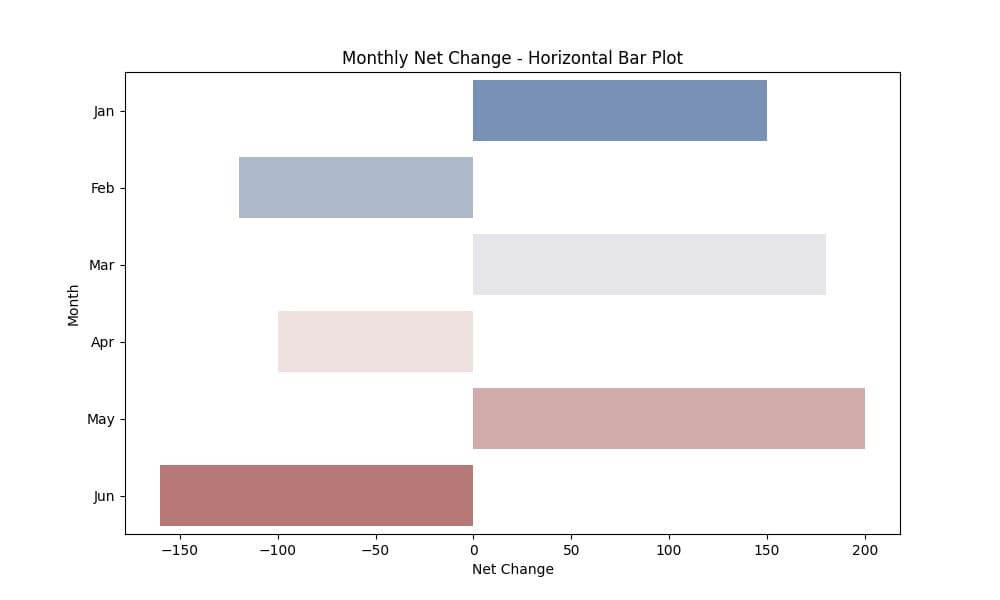
Horizontal Bar Plot
Let’s create a horizontal bar plot using the same dataset:
plt.figure(figsize=(10, 6))
horizontal_bar_plot = sns.barplot(x='Net_Change', y='Month', data=df, palette="vlag")
plt.title('Monthly Net Change - Horizontal Bar Plot')
plt.xlabel('Net Change')
plt.ylabel('Month')
plt.show()
Output:
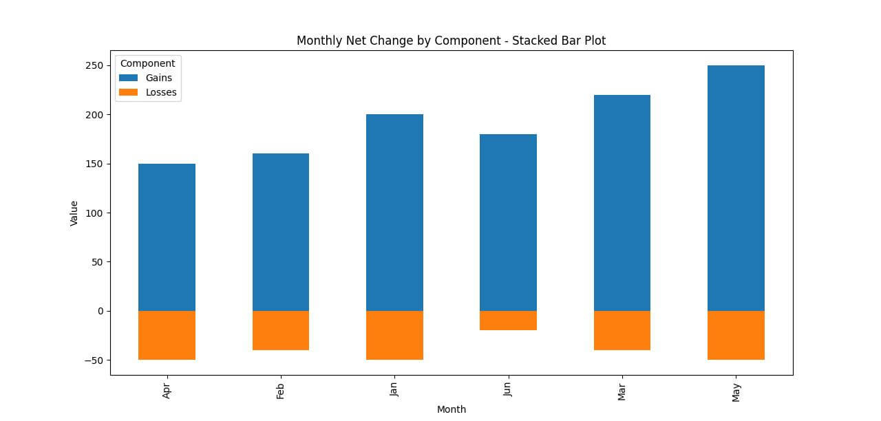
Stacked Bar Plot
Let’s assume we have additional data representing different components of the net change.
We’ll modify our dataset and then create a stacked bar plot:
# Extended Sample Data
data = {
    'Month': ['Jan', 'Jan', 'Feb', 'Feb', 'Mar', 'Mar', 'Apr', 'Apr', 'May', 'May', 'Jun', 'Jun'],
    'Component': ['Gains', 'Losses', 'Gains', 'Losses', 'Gains', 'Losses', 'Gains', 'Losses', 'Gains', 'Losses', 'Gains', 'Losses'],
    'Value': [200, -50, 160, -40, 220, -40, 150, -50, 250, -50, 180, -20]
}
df_extended = pd.DataFrame(data)
pivot_df = df_extended.pivot(index='Month', columns='Component', values='Value').fillna(0)
pivot_df.plot(kind='bar', stacked=True, figsize=(10, 6))
plt.title('Monthly Net Change by Component - Stacked Bar Plot')
plt.xlabel('Month')
plt.ylabel('Value')
plt.show()
Output:
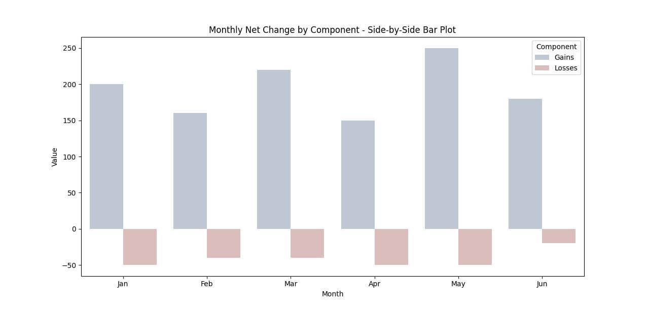
Side-by-Side Bar Plot
Creating a side-by-side bar plot is useful for visualizing positive and negative values in a way that highlights contrasts and comparisons between categories.
Let’s use our extended dataset to create a side-by-side bar plot:
plt.figure(figsize=(10, 6))
sns.barplot(x='Month', y='Value', hue='Component', data=df_extended, palette='vlag')
plt.title('Monthly Net Change by Component - Side-by-Side Bar Plot')
plt.xlabel('Month')
plt.ylabel('Value')
plt.legend(title='Component')
plt.show()
Output:
Mokhtar is the founder of LikeGeeks.com. He is a seasoned technologist and accomplished author, with expertise in Linux system administration and Python development. Since 2010, Mokhtar has built an impressive career, transitioning from system administration to Python development in 2015. His work spans large corporations to freelance clients around the globe. Alongside his technical work, Mokhtar has authored some insightful books in his field. Known for his innovative solutions, meticulous attention to detail, and high-quality work, Mokhtar continually seeks new challenges within the dynamic field of technology.