Seaborn barplot tutorial (Visualize your data in bars)
Data visualization has become an essential phase to communicate with the analyzed data. Through data visualization, data scientists & business analysts can easily extract insight from a massive collection of data.
Seaborn is one such statistical graphical plotting and visualization library in Python that allows data analysts and data science professionals to render visualization.
In this article, we will discuss how to create & handle bar plots through the powerful seaborn library.
- 1 What is a barplot?
- 2 Seaborn barplot from DataFrame
- 3 Create a barplot from a list
- 4 Show values
- 5 Change the color of the barplot
- 6 Conditional colors
- 7 Horizontal barplot
- 8 Put a legend
- 9 Remove the legend
- 10 Add labels
- 11 Change the bar width
- 12 Set the figure size
- 13 Set font size
- 14 Space between bars
- 15 Rotate Axis tick-level vertically
- 16 Plot multiple/grouped barplot
- 17 Sort Seaborn barplot
- 18 Create Seaborn barplot From a Dictionary
- 19 Barplot with Counts
- 20 Create a Bar Plot From a Pivot Table
What is a barplot?
A bar plot or bar chart is one of the most prominent visualization plots for describing statistical and data-driven action in graphical format.
Statisticians and engineers use it to show the relationship between a numeric and a categorical variable.
All the entities of the categorical variable get represented in the form of a bar. The bar size represents the numeric value.
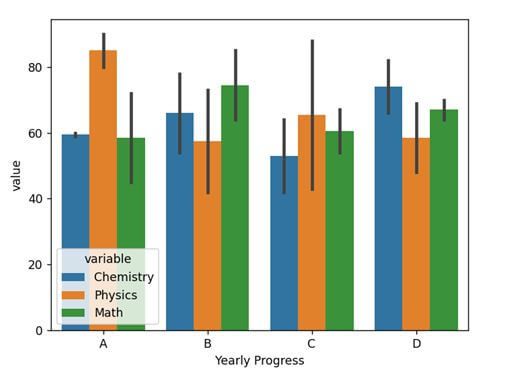
Seaborn barplot from DataFrame
We can use the DataFrame of Pandas for visualizing the data in seaborn. For this, we have to import three modules: the Pandas, Matplotlib, and the seaborn. Here is a code snippet showing how to use it.
import pandas as pd
import matplotlib.pyplot as plt
import seaborn as sns
#creating dataframe
df = pd.DataFrame({
    'Name':list("QWERTYUI"),
    'Student IDs': list(range(12001,12009)),
    'Yearly Progress':list('ABCDABCD'),
    'Chemistry': [59,54,42,66,60,78,64,82],
    'Physics': [90,42,88,48,80,73,43,69],
    'Math': [45,85,54,64,72,64,67,70]
})
df_detailed = pd.melt(df, id_vars=['Name', 'Student IDs', 'Yearly Progress'], value_vars=['Chemistry', 'Physics', 'Math'])
ax = sns.barplot(x = "Yearly Progress", y = "value", hue = "variable", data = df_detailed)
plt.show()
Output
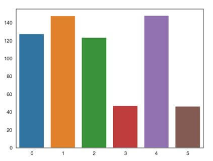
Create a barplot from a list
Instead of using a Pandas DataFrame, we can also use a simple list full of data to generate a barplot using seaborn. Here is a code snippet to show how to use it.
import numpy as np
import matplotlib.pyplot as plt
import seaborn as sns
raw_data1 = [[127.66773437098896, 47.585408826566024, 90.426437828641106, 414.955787935926836],
           [147.700582993718115, 37.59796443553682, 245.38896827262796, 312.80916093973529],
           [123.66563311651776, 177.476571906259835, 145.21460968763448, 54.78683755963528],
           [47.248523637295705, 67.42573841363118, 145.52890109500238, 211.10243082784969],
           [148.14532745960979, 87.46958795222966, 67.4804195003332, 68.97715435208194],
           [46.61620129160194, 224.316775886868584, 138.053032014046366, 41.527497508033704]]
def plot_sns(raw_data):
  data = np.array(raw_data)
  x = np.arange(len(raw_data))
  sns.axes_style('white')
  sns.set_style('white')
  ax = sns.barplot(x, data[:,0])
  plt.show()

plot_sns(raw_data1)
Output
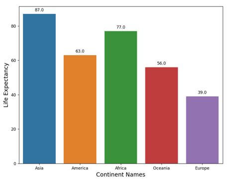
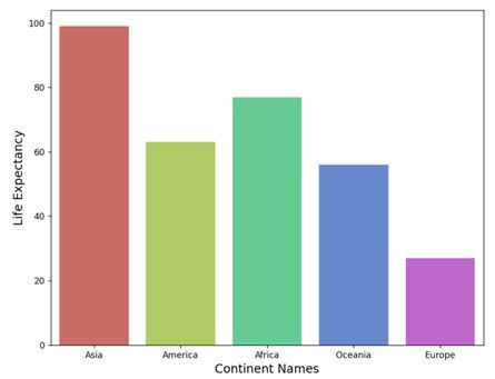
Show values
Showing individual values on or within the bars is another significant way of using the barplot using seaborn.
We can use the annotate() with some attributes to set up the position where the labeling will occur. Here is a code snippet to show how to implement it as a whole through DataFrame.
import pandas as pd
import seaborn as sns
import matplotlib.pyplot as plt
continent_data = ["Asia", "America", "Africa", "Oceania", "Europe"]
lifeExpectancy = [87, 63, 77, 56, 39]

dataf = pd.DataFrame({"continent_data":continent_data, "lifeExpectancy":lifeExpectancy})
plt.figure(figsize = (9, 7))
splot = sns.barplot(x = "continent_data", y = "lifeExpectancy", data=dataf)
for g in splot.patches:
    splot.annotate(format(g.get_height(), '.1f'),
                   (g.get_x() + g.get_width() / 2., g.get_height()),
                   ha = 'center', va = 'center',
                   xytext = (0, 9),
                   textcoords = 'offset points')
plt.xlabel("Continent Names", size = 14)
plt.ylabel("Life Expectancy", size = 14)
plt.show()
Output
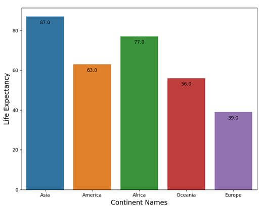
We can also provide the value within the bars in the barplot. To do this we have to simply set the xytext attribute to (0, -12), which means the y value of the attribute will go downward because of the negative value set for it. In this case, the code will be:
import pandas as pd
import seaborn as sns
import matplotlib.pyplot as plt
continent_data = ["Asia", "America", "Africa", "Oceania", "Europe"]
lifeExpectancy = [87, 63, 77, 56, 39]

dataf = pd.DataFrame({"continent_data":continent_data, "lifeExpectancy":lifeExpectancy})
plt.figure(figsize = (9, 7))
splot = sns.barplot(x = "continent_data", y = "lifeExpectancy", data=dataf)
for g in splot.patches:
    splot.annotate(format(g.get_height(), '.1f'),
                   (g.get_x() + g.get_width() / 2., g.get_height()),
                   ha = 'center', va = 'center',
                   xytext = (0, -13),
                   textcoords = 'offset points')
plt.xlabel("Continent Names", size = 14)
plt.ylabel("Life Expectancy", size = 14)
plt.show()
Output
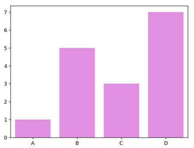
Change the color of the barplot
There are various ways to change the color of the default boxplot. We can alter all of them to new color using the color attribute of the barplot().
We can also set palette values manually through a list or use the default palette color set already created using seaborn. Here is a code snippet to show how to change all the bars to a single color.
import matplotlib.pyplot as plt
import seaborn as sns
x = ['A', 'B', 'C', 'D']
y = [1, 5, 3, 7]
sns.barplot(x, y, color = 'violet')
plt.show()
Output
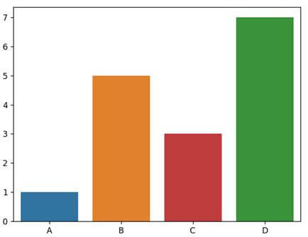
Again we can manually set colors for each bar using the palette parameter of the barplot(). We have to pass the color names within the list as palette values.
import matplotlib.pyplot as plt
import seaborn as sns
x = ['A', 'B', 'C', 'D']
y = [1, 5, 3, 7]
sns.barplot(x, y, color = 'blue', palette = ['tab:blue', 'tab:orange', 'tab:red', 'tab:green'])
plt.show()
Output
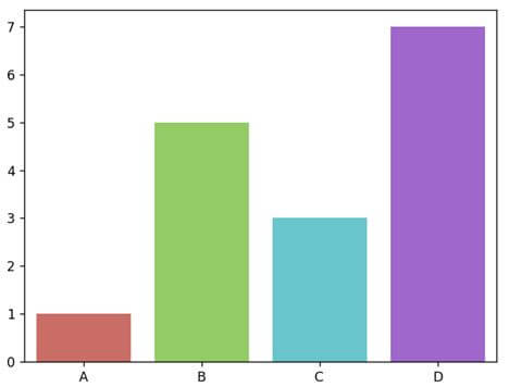
Apart from manually providing the color values, we can also use predefined color palettes defined in the Seaborn color palettes. Here is how to use it.
import matplotlib.pyplot as plt
import seaborn as sns
x = ['A', 'B', 'C', 'D']
y = [1, 5, 3, 7]
sns.barplot(x, y, color = 'blue', palette = 'hls')
plt.show()
Output
Conditional colors
We can also set specific conditions on the barplot values or against the data to set different colors or color palettes for them.
Here is a code snippet to show how to set different colors through color palettes based on conditions.
import pandas as pd
import seaborn as sns
import matplotlib.pyplot as plt
continent_data = ["Asia", "America", "Africa", "Oceania", "Europe"]
lifeExpectancy = [99, 63, 77, 56, 27]
custom_palette = {}
dataf = pd.DataFrame({"continent_data":continent_data, "lifeExpectancy":lifeExpectancy})
plt.figure(figsize = (9, 7))
for q in lifeExpectancy:
    if q < 30 and q > 50:
        custom_palette[q] = 'Paired'
    elif q < 50 and q > 60:
        custom_palette[q] = 'PRGn'
    elif q < 60 and q > 70:
        custom_palette[q] = 'husl'
    else:
        custom_palette[q] = 'hls'
sns.barplot(x = "continent_data", y = "lifeExpectancy", data=dataf, palette=custom_palette[q])
plt.xlabel("Continent Names", size = 14)
plt.ylabel("Life Expectancy", size = 14)
plt.show()
Output
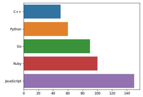
Horizontal barplot
We can use the barplot() to generate a horizontal bar graph. It will also have the same features and visualization power; the only difference is instead of putting the bars vertically (we have encountered so far), they will lay horizontally.
import seaborn as sns
import matplotlib.pyplot as plt
labels = ['C++', 'Python', 'Go', 'Ruby', 'JavaScript']
price = [50, 60, 90, 100, 150]
sns.barplot(x = price, y = labels)
plt.show()
Output
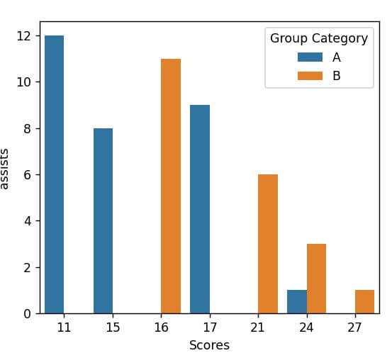
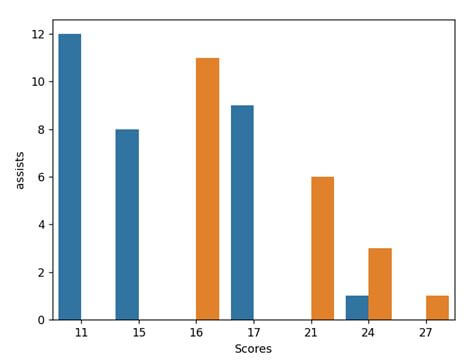
Put a legend
A legend in data visualization is a small box that exists in any one corner of the graph. It contains multiple color lines associated with text that represent certain types of elements of the plot.
When multiple data reside in a graph, the indication in the legend represents which component represents which data.
Seaborn will take the string (keys) from the DataFrame as legend labels. Here is a code snippet to show how seaborn generates one.
import pandas as pd
import seaborn as sns
import matplotlib.pyplot as plt
df = pd.DataFrame({'Scores': [24, 15, 17, 11, 16, 21, 24, 27],
                   'assists': [1, 8, 9, 12, 11, 6, 3, 1],
                   'Group': ['A', 'A', 'A', 'A', 'B', 'B', 'B', 'B']})

sns.barplot(data = df, x = 'Scores', y = 'assists', hue = 'Group')
plt.legend(title = 'Group Category')
plt.show()
Output
We can also change the position of the Legend but not using seaborn. For such manipulation, we need to use the Matplotlib.pyplot’s legend() method loc parameter. We can also specify other location values to the loc:
- upper right
- upper left
- lower left
- lower right
- right
- center left
- center right
- lower center
- upper center
- center
import pandas as pd
import seaborn as sns
import matplotlib.pyplot as plt
df = pd.DataFrame({'Scores': [24, 15, 17, 11, 16, 21, 24, 27],
                   'assists': [1, 8, 9, 12, 11, 6, 3, 1],
                   'Group': ['A', 'A', 'A', 'A', 'B', 'B', 'B', 'B']})

sns.barplot(data = df, x = 'Scores', y = 'assists', hue = 'Group')
plt.legend(loc = 'center right', title = 'Group Category')
plt.show()
Output
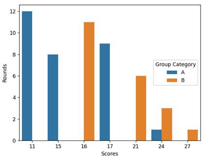
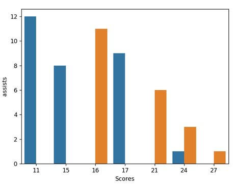
Remove the legend
There are two different ways to remove a legend from visualization in seaborn. These are:
Method 1: Using matplotlib.pyplot.legend(): We can use the matplotlib.pyplot.legend() function to add a customized legend to the seaborn plots.
We can use the legend() from matplotlib.pyplot because it is easy to manipulate Seaborm operations and visualizations because seaborn runs on top of the matplotlib module.
To remove the legend, we have to add an empty legend to the plot & remove its frame. It will help hide the legend from the final figure.
import pandas as pd
import seaborn as sns
import matplotlib.pyplot as plt
df = pd.DataFrame({'Scores': [24, 15, 17, 11, 16, 21, 24, 27],
                   'assists': [1, 8, 9, 12, 11, 6, 3, 1],
                   'Group': ['A', 'A', 'A', 'A', 'B', 'B', 'B', 'B']})

sns.barplot(data = df, x = 'Scores', y = 'assists', hue = 'Group')
plt.legend([],[], frameon=False)
plt.show()
Output
Method 2: Using remove(): We can also use the legend_.remove() to remove the legend from the plot.
import pandas as pd
import seaborn as sns
import matplotlib.pyplot as plt
df = pd.DataFrame({'Scores': [24, 15, 17, 11, 16, 21, 24, 27],
                   'assists': [1, 8, 9, 12, 11, 6, 3, 1],
                   'Group': ['A', 'A', 'A', 'A', 'B', 'B', 'B', 'B']})

gk = sns.barplot(data = df, x = 'Scores', y = 'assists', hue = 'Group')
gk.legend_.remove()
plt.show()
Output
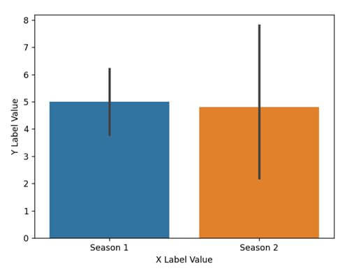
Add labels
We often need to label the x-axis and y-axis for better indication or give meaning to the plot. To set the labels in a plot there are two different methods. These are:
Method 1: Using the set() method: The first way is to use the set() method and pass the strings as labels to the xlabel and ylabel parameters. Here is a code snippet showing how can we perform that.
import pandas as pd
import matplotlib.pyplot as plt
import seaborn as sns
datf = pd.DataFrame({"Season 1": [7, 4, 5, 6, 3],
                 "Season 2" : [1, 2, 8, 4, 9]})
p = sns.barplot(data = datf)
p.set(xlabel="X Label Value", ylabel = "Y Label Value")
plt.show()
Output
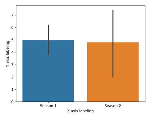
Method 2: Using matplotlib’s xlabel() and ylabel(): Since seaborn runs on top of Matplotlib, we can use the Matplotlib methods to set the labels for the x and y axes. Here is a code snippet showing how can we perform that.
import pandas as pd
import matplotlib.pyplot as plt
import seaborn as sns
datf = pd.DataFrame({"Season 1": [7, 4, 5, 6, 3],
                 "Season 2" : [1, 2, 8, 4, 9]})
p = sns.barplot(data = datf)
plt.xlabel('X axis labeling')
plt.ylabel('Y axis labeling')
plt.show()
Output
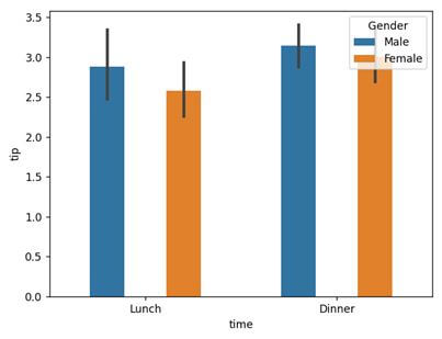
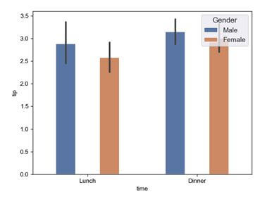
Change the bar width
By default, the barplot in seaborn does not provide an explicit parameter to change the width of the bar. But we can write and add a separate function to do so.
import pylab as plt
import seaborn as sns
tips = sns.load_dataset("tips")
fig, axi = plt.subplots()
sns.barplot(data = tips, ax = axi, x = "time", y = "tip", hue = "sex")
def width_changer(axi, new_value):
    for patch in axi.patches :
        cur_width = patch.get_width()
        diff = cur_width - new_val
        patch.set_width(new_val)
        patch.set_x(patch.get_x() + diff * .5)
plt.legend(loc = 'upper right', title = 'Gender')
width_changer(axi, .18)
plt.show()
Output
Set the figure size
There are different ways to set the figure size of the plot in a seaborn. Some well-known methods are:
Method 1: seaborn.set():
This method helps in controlling the composition and configurations of the seaborn plot. We can set the rc parameter and pass the figure size attribute to set the figure size of the seaborn plot.
Here is a code snippet showing how to use it.
import pylab as plt
import seaborn as sns
tips = sns.load_dataset("tips")
fig, axi = plt.subplots()
sns.set(rc = {'figure.figsize':(12.0,8.5)})
sns.barplot(data = tips, ax = axi, x = "time", y = "tip", hue = "sex")
def width_changer(axi, new_val):
    for patch in axi.patches :
        cur_width = patch.get_width()
        diff = cur_width - new_val
        patch.set_width(new_val)
        patch.set_x(patch.get_x() + diff * .5)
plt.legend(loc = 'upper right', title = 'Gender')
width_changer(axi, .18)
plt.show()
Output
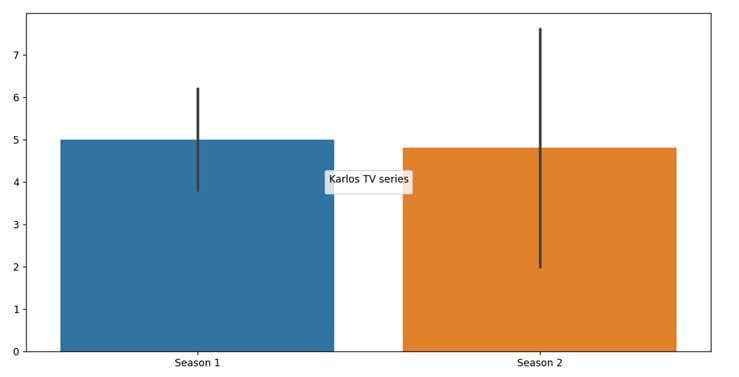
Method 2: matplotlib.pyplot.figure(): We can also use the matplotlib.pyplot.figure() and use the figsize parameter to pass two values as Tuple. The code snippet will look something like this.
import pandas as pd
import matplotlib.pyplot as plt
import seaborn as sns
from matplotlib import rcParams

datf = pd.DataFrame({"Season 1": [7, 4, 5, 6, 3],
                 "Season 2" : [1, 2, 8, 4, 9]})
plt.figure(figsize = (14, 7))
p = sns.barplot(data = datf)
plt.legend(loc = 'center', title = 'Karlos TV series')
plt.show()
Output
Method 3: Using rcParams: We can also use the rcParams, which is a part of the Matplotlib library to control the style and size of the plot. It works similar to the seaborn.set(). Here is a code snippet showing how to use it.
import pandas as pd
import matplotlib.pyplot as plt
import seaborn as sns
from matplotlib import rcParams

datf = pd.DataFrame({"Season 1": [7, 4, 5, 6, 3],
                 "Season 2" : [1, 2, 8, 4, 9]})
rcParams['figure.figsize'] = 14, 7
p = sns.barplot(data = datf)
plt.legend(loc = 'center', title = 'Karlos TV series')
plt.show()
Output
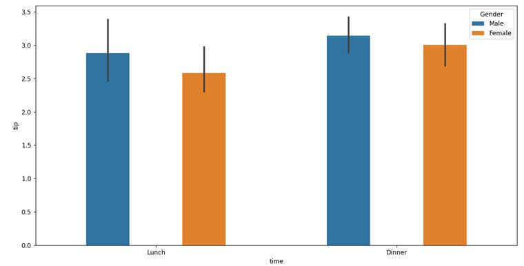
Method 4: matplotlib.pyplot.gcf(): This function helps in getting the instance of the current figure. Along with the gcf() instance, we can use the set_size_inches() method to modify the final size of the seaborn plot. The code snippet will look something like this.
import pylab as plt
import seaborn as sns
tips = sns.load_dataset("tips")
fig, axi = plt.subplots()
sns.barplot(data = tips, ax = axi, x = "time", y = "tip", hue = "sex")
def width_changer(axi, new_val):
    for patch in axi.patches :
        cur_width = patch.get_width()
        diff = cur_width - new_val
        patch.set_width(new_val)
        patch.set_x(patch.get_x() + diff * .5)
plt.gcf().set_size_inches(14, 7)
plt.legend(loc = 'upper right', title = 'Gender')
width_changer(axi, .18)
plt.show()
Output
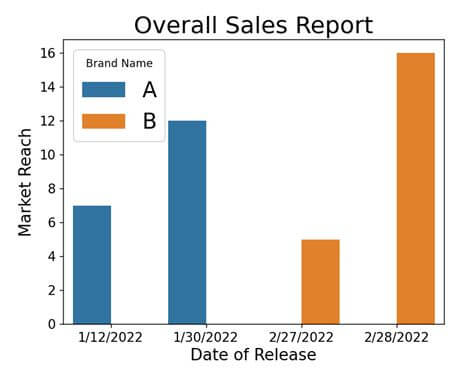
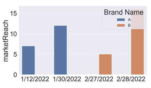
Set font size
Font size plays a significant role while creating the visualization through seaborn. There are two different ways of setting font size for the visualization. These are:
Method 1: Using the fontsize parameter: We can use this parameter with multiple matplotlib methods like xlabel(), ylabel(), title(), etc. Here is a code snippet to show how to leverage them.
import pandas as pd
import matplotlib.pyplot as plt
import seaborn as sns
datf = pd.DataFrame({'dor': ['1/12/2022', '1/30/2022', '2/27/2022', '2/28/2022'],
                   'marketReach': [7, 12, 5, 16],
                   'Brand': ['A', 'A', 'B', 'B']})

sns.barplot(x = 'dor', y = 'marketReach', hue = 'Brand', data = datf)
plt.legend(title = 'Brand Name', fontsize=20)
plt.xlabel('Date of Release', fontsize = 15);
plt.ylabel('Market Reach', fontsize = 15);
plt.title('Overall Sales Report', fontsize = 22)
plt.tick_params(axis='both', which='major', labelsize=12)
plt.show()
Output
Method 2: Using the set() method: Another way to set the font size for all the fonts associated with the plot is using the set() method of the Seaborn. Here’s how to use it.
import pandas as pd
import matplotlib.pyplot as plt
import seaborn as sns

datf = pd.DataFrame({'dor': ['1/12/2022', '1/30/2022', '2/27/2022', '2/28/2022'],
                   'marketReach': [7, 12, 5, 16],
                   'Brand': ['A', 'A', 'B', 'B']})
sns.set(font_scale = 3)
sns.barplot(x = 'dor', y = 'marketReach', hue = 'Brand', data = datf)
plt.legend(title = 'Brand Name', fontsize=20)
plt.show()
Output
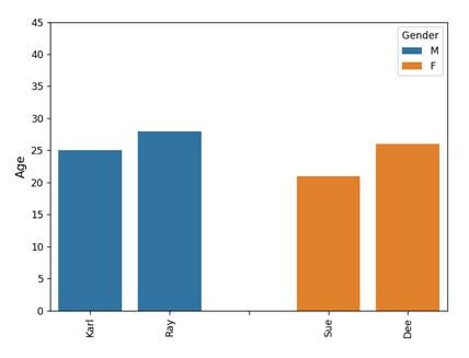
Space between bars
We can create space between bars through two different approaches.
Method 1: By adding a blank bar between consecutive bars:
import matplotlib.pyplot as plt
import seaborn as sns
import pandas as pd
datf = pd.DataFrame({'Name': ['Karl', 'Ray', 'Sue', 'Dee'],
 'SalInLac': [25, 28, 21, 26], 'Gender': ['M', 'M', 'F', 'F']})
datf = pd.concat([datf[datf.Gender == 'M'],
pd.DataFrame({'Name': [''], 'SalInLac': [0], 'Gender': ['M']}), datf[datf.Gender == 'F']])
age_plot = sns.barplot(data = datf, x = "Name", y = "SalInLac", hue="Gender", dodge=False)
plt.setp(age_plot.get_xticklabels(), rotation=90)
plt.ylim(0, 45)
age_plot.tick_params(labelsize = 6)
age_plot.tick_params(length = 4, axis='x')
age_plot.set_ylabel("Age", fontsize=12)
age_plot.set_xlabel("", fontsize=1.5)
plt.tight_layout()
plt.show()
Output
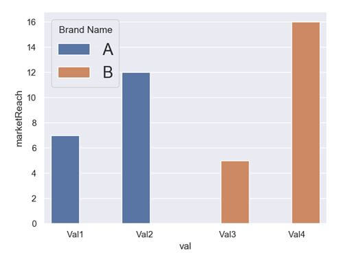
Method 2: By creating spaces in the label names:
import pandas as pd
import matplotlib.pyplot as plt
import seaborn as sns

datf = pd.DataFrame({'val': ['    Val1    ', '   Val2   ', '     Val3    ', '    Val4   '],
                   'marketReach': [7, 12, 5, 16],
                   'Brand': ['A', 'A', 'B', 'B']})
sns.set(font_scale = 1)
sns.barplot(x = 'val', y = 'marketReach', hue = 'Brand', data = datf)
plt.legend(title = 'Brand Name', fontsize=20)
plt.show()
Output
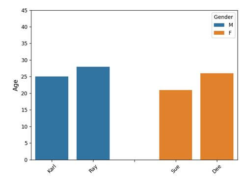
Rotate Axis tick-level vertically
There are two different ways of rotating the axis by tweaking the tick labels.
Method 1: Using xticks() method: The rotation parameter available within the matplotlib.pyplot.xticks() function can help in achieving this. Here is the code snippet on how to use it.
import matplotlib.pyplot as plt
import seaborn as sns
import pandas as pd
datf = pd.DataFrame({'Name': ['Karl', 'Ray', 'Sue', 'Dee'], 'SalInLac': [25, 28, 21, 26], 'Gender': ['M', 'M', 'F', 'F']})
datf = pd.concat([datf[datf.Gender == 'M'], pd.DataFrame({'Name': [''], 'SalInLac': [0], 'Gender': ['M']}), datf[datf.Gender == 'F']])
age_plot = sns.barplot(data = datf, x = "Name", y = "SalInLac", hue="Gender", dodge=False)
plt.setp(age_plot.get_xticklabels(), rotation=90)
plt.ylim(0, 45)
age_plot.tick_params(labelsize = 10)
age_plot.tick_params(length = 4, axis='x')
age_plot.set_ylabel("Age", fontsize=12)
age_plot.set_xlabel("", fontsize=1.5)
plt.tight_layout()
plt.xticks(rotation = 45)
plt.show()
Output
Method 2: using setp() method: The set parameter setp() method also enables us to rotate the x-axis tick-levels. Here is the code snippet on how to use it.
import matplotlib.pyplot as plt
import seaborn as sns
import pandas as pd
datf = pd.DataFrame({'Name': ['Karl', 'Ray', 'Sue', 'Dee'], 'SalInLac': [25, 28, 21, 26], 'Gender': ['M', 'M', 'F', 'F']})
datf = pd.concat([datf[datf.Gender == 'M'], pd.DataFrame({'Name': [''], 'SalInLac': [0], 'Gender': ['M']}), datf[datf.Gender == 'F']])
age_plot = sns.barplot(data = datf, x = "Name", y = "SalInLac", hue="Gender", dodge=False)
plt.setp(age_plot.get_xticklabels(), rotation=90)
plt.ylim(0, 45)
age_plot.tick_params(labelsize = 10)
age_plot.tick_params(length = 4, axis='x')
age_plot.set_ylabel("Age", fontsize=12)
age_plot.set_xlabel("", fontsize=1.5)
plt.tight_layout()
locs, labels = plt.xticks()
plt.setp(labels, rotation = 45)
plt.show()
Output
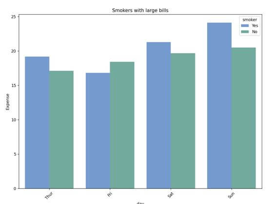
Plot multiple/grouped barplot
We can group multiple bar plots in Seaborn and display them under one plot. Here is a code snippet showing how to use it.
import seaborn as sns
import matplotlib.pyplot as plt
tips = sns.load_dataset("tips")
colors = ["#69d", "#69b3a2"]
sns.set_palette(sns.color_palette(colors))
plt.figure(figsize = (9, 8))

# multiple barplot grouped together
ax = sns.barplot(
    x = "day",
    y = "total_bill",
    hue = "smoker",
    data = tips,
    ci=None
    )
ax.set_title("Smokers with large bills")
ax.set_ylabel("Expense")
plt.show()
Output
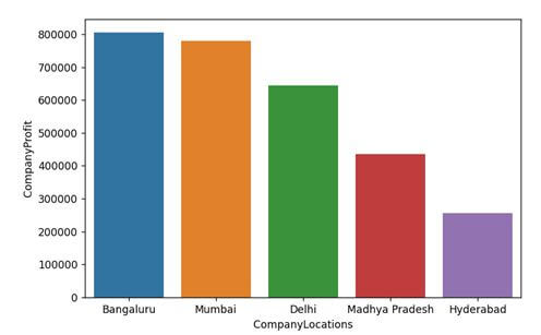
Sort Seaborn barplot
We can sort bars in a Seaborn bar plot using the sort_values() method and pass the object based on which the sorting should take place.
Also, we have to set the ascending parameter as True or False to determine whether to display the sorted bar plot in ascending or descending order.
Here is a code snippet showing how to use it within the seaborn.barplot().
import pandas as pd
import matplotlib.pyplot as plt
import seaborn as sns
CompanyLocations = ["Delhi", "Mumbai", "Madhya Pradesh",
         "Hyderabad", "Bangaluru"]
CompanyProfit = [644339, 780163, 435245, 256079, 805463]
datf = pd.DataFrame({"CompanyLocations": CompanyLocations,
                   "CompanyProfit": CompanyProfit})
# make barplot and sort bars
sns.barplot(x='CompanyLocations',
            y="CompanyProfit", data = datf,
            order = datf.sort_values('CompanyProfit',ascending = False).CompanyLocations)
plt.show()
Output
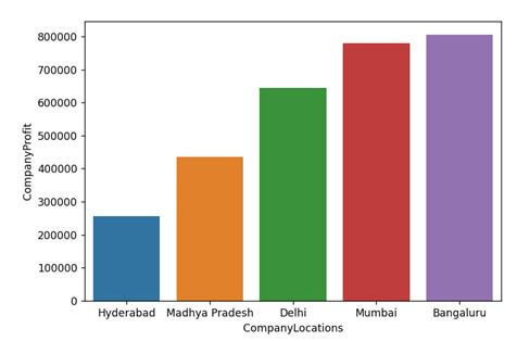
If we want to show it in ascending order, we have to simply set the ascending = True
sns.barplot(x='CompanyLocations',
            y="CompanyProfit", data = datf,
            order = datf.sort_values('CompanyProfit',ascending = True).CompanyLocations)
Output
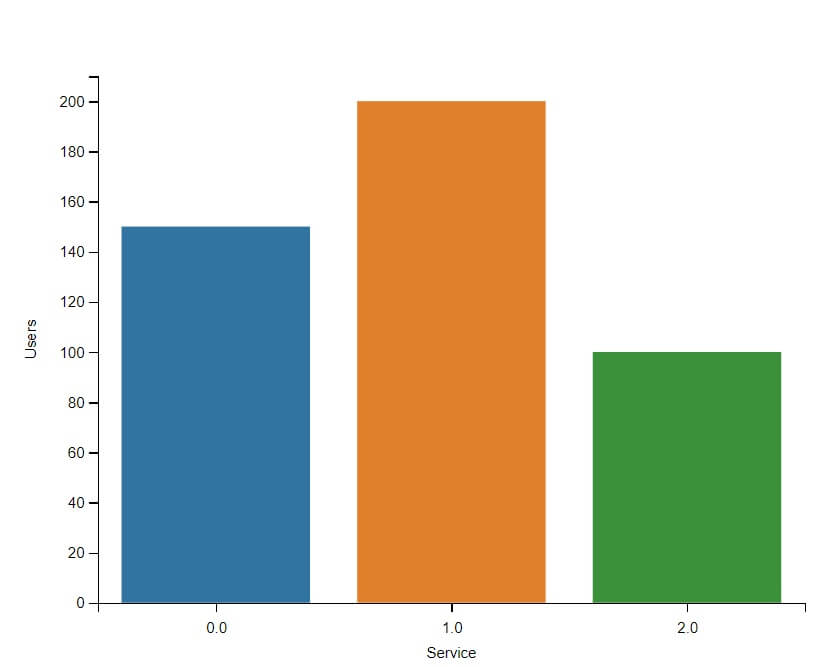
Create Seaborn barplot From a Dictionary
First, you need to convert the dictionary into a Pandas DataFrame.
Let’s consider an example with a sample dictionary containing data.
The keys will represent categories (like types of services), and the values will represent some metric (like the number of users).
import seaborn as sns
import pandas as pd
import matplotlib.pyplot as plt
data = {'Service A': 150, 'Service B': 200, 'Service C': 100}
df = pd.DataFrame(list(data.items()), columns=['Service', 'Users'])
sns.barplot(x='Service', y='Users', data=df)
plt.show()
Output
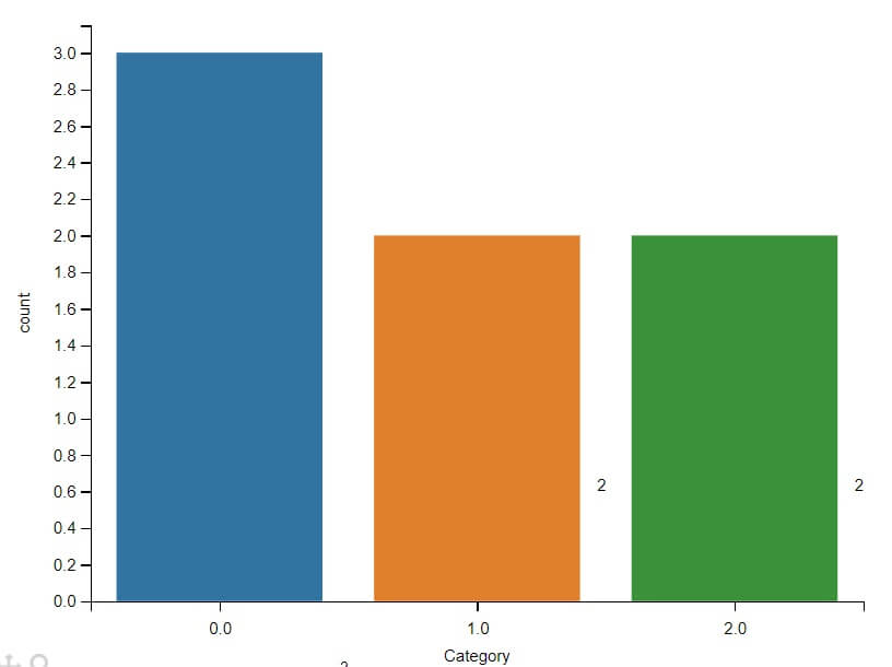
Barplot with Counts
If you have a DataFrame with categorical data, Seaborn can automatically calculate the count of each category and plot it.
import seaborn as sns
import pandas as pd
import matplotlib.pyplot as plt
data = {'Category': ['Service A', 'Service B', 'Service A', 'Service C', 'Service B', 'Service C', 'Service A']}
df = pd.DataFrame(data)
ax = sns.countplot(x='Category', data=df)
for p in ax.patches:
    ax.annotate(f'{int(p.get_height())}', (p.get_x() + p.get_width() / 2., p.get_height()),
                ha='center', va='center', fontsize=10, color='black', xytext=(0, 5),
                textcoords='offset points')
plt.show()
Output
Create a Bar Plot From a Pivot Table
import seaborn as sns
import pandas as pd
import numpy as np
import matplotlib.pyplot as plt
np.random.seed(0)
data = {
    "Customer ID": np.random.randint(1000, 1100, 100),
    "Plan Type": np.random.choice(["Basic", "Premium", "Standard"], 100),
    "Data Usage (GB)": np.random.uniform(1, 10, 100)
}
df = pd.DataFrame(data)
pivot_table = df.pivot_table(index="Plan Type", values="Data Usage (GB)", aggfunc=np.mean)
sns.barplot(x=pivot_table.index, y=pivot_table["Data Usage (GB)"])
plt.title("Average Data Usage per Plan Type")
plt.ylabel("Average Data Usage (GB)")
plt.xlabel("Plan Type")
plt.show()
Output
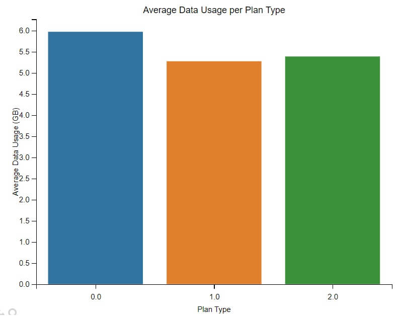
- First, we generate sample data representing different customers, their chosen plan types, and their respective data usage in GB.
- We then create a DataFrame from this sample data.
- A pivot table is created using this DataFrame, calculating the average data usage for each plan type.
- Finally, we use Seaborn’s
barplotfunction to visualize this data, with the plan types on the x-axis and their corresponding average data usage on the y-axis.
Gaurav is a Full-stack (Sr.) Tech Content Engineer (6.5 years exp.) & has a sumptuous passion for curating articles, blogs, e-books, tutorials, infographics, and other web content. Apart from that, he is into security research and found bugs for many govt. & private firms across the globe. He has authored two books and contributed to more than 500+ articles and blogs. He is a Computer Science trainer and loves to spend time with efficient programming, data science, Information privacy, and SEO. Apart from writing, he loves to play foosball, read novels, and dance.