Seaborn Error Bars: Python Plotting Perfected
In this tutorial, we’ll talk about data visualization using Seaborn in Python, with a focus on error bars.
Error bars allow us to visually represent the variability or uncertainty in our data.
We’ll cover customizing error bars, creating grouped error bars, and handling asymmetric error bars.
Plotting Error Bars with Seaborn
First, let’s import the necessary libraries:
import seaborn as sns
import matplotlib.pyplot as plt
import pandas as pd
import numpy as np
Error Bars in Barplot
For categorical data, sns.barplot can be used to include error bars.
data = pd.DataFrame({
    'Month': ['Jan', 'Feb', 'Mar', 'Apr', 'May', 'Jun'],
    'Subscriptions': [200, 220, 250, 270, 260, 280],
    'Category': ['Basic', 'Basic', 'Premium', 'Premium', 'Basic', 'Premium'],
    'Error': [10, 12, 15, 14, 13, 11]  # Error values for each month
})
plt.errorbar(data['Month'], data['Subscriptions'], yerr=data['Error'])
sns.barplot(x='Month', y='Subscriptions', hue='Category', data=data)
plt.title('Monthly Telecom Subscriptions by Category with Error Bars')
plt.show()
Output:
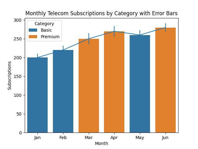
Each bar includes an error bar indicating the variability in subscriptions for each month.
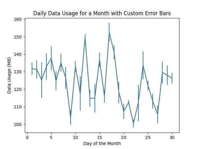
Error Bars in line plot
Next, we’ll explore how to use sns.lineplot for continuous data.
time_data = pd.DataFrame({
    'Day': np.arange(1, 31),
    'Data_Usage': np.random.normal(120, 15, 30),  # Simulating daily data usage
    'Error': np.random.normal(5, 2, 30)  # Error values for each day
})
plt.errorbar(time_data['Day'], time_data['Data_Usage'], yerr=time_data['Error'])
sns.lineplot(x='Day', y='Data_Usage', data=time_data)
plt.title('Daily Data Usage for a Month with Custom Error Bars')
plt.xlabel('Day of the Month')
plt.ylabel('Data Usage (MB)')
plt.show()
Output:
Adjusting Width, Color, and Style
Enhancing your data visualizations in Python with Seaborn allows for customization of error bars.
Customizing Error Bars in sns.barplot
You can use ecolor and elinewidth parameters to customize the width and color of the error bars.
data = pd.DataFrame({
    'Month': ['Jan', 'Feb', 'Mar', 'Apr', 'May', 'Jun'],
    'Subscriptions': [200, 220, 250, 270, 260, 280],
    'Category': ['Basic', 'Basic', 'Premium', 'Premium', 'Basic', 'Premium'],
    'Error': [10, 12, 15, 14, 13, 11]  # Error values for each month
})
plt.errorbar(data['Month'], data['Subscriptions'], yerr=data['Error'], fmt='o',
             ecolor='red', elinewidth=2)
sns.barplot(x='Month', y='Subscriptions', hue='Category', data=data)
plt.title('Monthly Telecom Subscriptions by Category with Custom Error Bars')
plt.show()
Output:

These error bars are wider (linewidth=2).
Customizing Error Bars in sns.lineplot
Next, let’s customize error bars in a sns.lineplot for continuous data.
time_data = pd.DataFrame({
    'Day': np.arange(1, 31),
    'Data_Usage': np.random.normal(120, 15, 30),  # Simulating daily data usage
    'Error': np.random.normal(5, 2, 30)  # Error values for each day
})
plt.errorbar(time_data['Day'], time_data['Data_Usage'], yerr=time_data['Error'], fmt='o',
             ecolor='green', elinewidth=1.5)
sns.lineplot(x='Day', y='Data_Usage', data=time_data)
plt.title('Daily Data Usage for a Month with Custom Error Bars')
plt.xlabel('Day of the Month')
plt.ylabel('Data Usage (MB)')
plt.show()
Output:
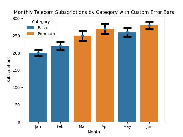
Customizing Caps and Thickness
Customizing Error Bar Caps and Thickness in sns.barplot
You can use capsize and capthick parameters to adjust the capsize.
data = pd.DataFrame({
    'Month': ['Jan', 'Feb', 'Mar', 'Apr', 'May', 'Jun'],
    'Subscriptions': [200, 220, 250, 270, 260, 280],
    'Category': ['Basic', 'Basic', 'Premium', 'Premium', 'Basic', 'Premium'],
    'Error': [10, 12, 15, 14, 13, 11]  # Error values for each month
})
sns.barplot(x='Month', y='Subscriptions', hue='Category', data=data, capsize=0.2)
plt.errorbar(data['Month'], data['Subscriptions'], yerr=data['Error'], fmt='o',
             ecolor='black', elinewidth=3, capsize=10, capthick=5)
plt.title('Monthly Telecom Subscriptions by Category with Custom Error Bars')
plt.show()
Output:
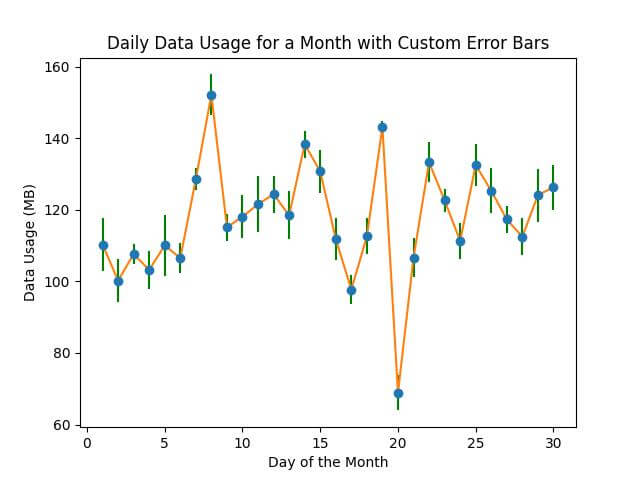
Customizing Error Bar Caps and Thickness in sns.lineplot
Now, we’ll adjust the error bar caps and thickness in a sns.lineplot.
time_data = pd.DataFrame({
    'Day': np.arange(1, 31),
    'Data_Usage': np.random.normal(120, 15, 30),  # Simulating daily data usage
    'Error': np.random.normal(5, 2, 30)  # Error values for each day
})
plt.errorbar(time_data['Day'], time_data['Data_Usage'], yerr=time_data['Error'], fmt='o',
             ecolor='blue', elinewidth=2, capsize=5, capthick=8)
sns.lineplot(x='Day', y='Data_Usage', data=time_data)
plt.title('Daily Data Usage for a Month with Custom Error Bars')
plt.xlabel('Day of the Month')
plt.ylabel('Data Usage (MB)')
plt.show()
Output:
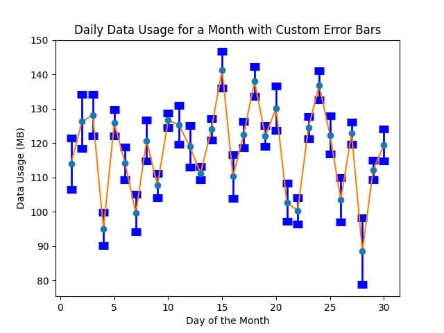
The bars feature blue caps (capsize=5, capthick=2) and a thicker line (linewidth=2).
Plotting Grouped Error Bars
Grouped error bar charts are valuable for comparing data across different categories or groups.
This type of chart is useful for comparing multiple categories or groups side by side.
data = pd.DataFrame({
    'Subject': ['Math', 'Science', 'English', 'History'] * 2,
    'Score': [75, 88, 82, 90, 85, 92, 89, 88],
    'School': ['School A'] * 4 + ['School B'] * 4,
    'Error': [5, 4, 6, 5, 4, 3, 5, 6]  # Error values for each score
})
sns.barplot(x='Subject', y='Score', hue='School', data=data, capsize=0.1)
for i, subject in enumerate(data['Subject'].unique()):
    # Extract subset for each subject
    subset = data[data['Subject'] == subject]

    # Plotting error bars for each group
    plt.errorbar(x=np.array([i-0.2, i+0.2]), y=subset['Score'],
                 yerr=subset['Error'], fmt='none', ecolor='black', capsize=5)
plt.title('Grouped Error Bar Chart: Scores by Subject and School')
plt.show()
Output:
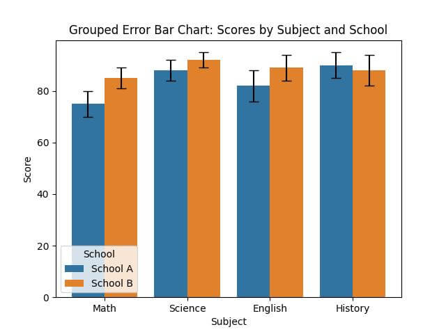
Error bars for each group provide a visual representation of the variability or precision in scores for each subject across the two schools.
Asymmetric Error Bars
Asymmetric error bars are used when the error or uncertainty in data is not uniform in both directions.
To reflect asymmetric uncertainties, we’ll create a plot where error values above and below the data points are different.
data = pd.DataFrame({
    'Student': ['Alice', 'Bob', 'Charlie', 'David'],
    'Score': [85, 90, 95, 88],
    'Error_Up': [5, 4, 3, 6],
    'Error_Down': [3, 2, 4, 2]
})
# We need to specify errors in both directions separately
errors = np.array([data['Error_Down'], data['Error_Up']])
sns.barplot(x='Student', y='Score', data=data, capsize=0.1)
plt.errorbar(data['Student'], data['Score'], yerr=errors, fmt='none',
             ecolor='red', elinewidth=2, capsize=5)
plt.title('Asymmetric Error Bars')
plt.show()
Output:
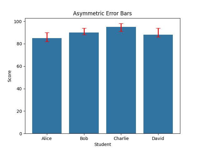
The error bars are longer in one direction (either up or down) compared to the other, accurately reflecting the different uncertainties associated with each score.
Mokhtar is the founder of LikeGeeks.com. He is a seasoned technologist and accomplished author, with expertise in Linux system administration and Python development. Since 2010, Mokhtar has built an impressive career, transitioning from system administration to Python development in 2015. His work spans large corporations to freelance clients around the globe. Alongside his technical work, Mokhtar has authored some insightful books in his field. Known for his innovative solutions, meticulous attention to detail, and high-quality work, Mokhtar continually seeks new challenges within the dynamic field of technology.