Seaborn Bar Plot Tick Label Customization in Python
In this tutorial, you’ll learn how to customize tick labels in Seaborn bar plot.
We’ll cover basic label adjustments, formatting date-time labels, and more.
Differentiating between Axes and Figures
Axes
In Seaborn, an Axes refers to an individual plot or graph. This is the element where the actual data visualization takes place. You can think of it as the canvas on which your data is painted.
Figures
On the other hand, a Figure in Seaborn acts like a container for one or more Axes. It’s the overall window or page on which everything is drawn. You can have multiple Axes (plots) in a single Figure.
You want to create a bar plot showing a specific metric across different categories.
First, we import the necessary libraries and prepare sample data:
import seaborn as sns
import matplotlib.pyplot as plt
import pandas as pd
data = {
    'Category': ['Plan A', 'Plan B', 'Plan C', 'Plan D'],
    'Metric': [200, 150, 300, 250]
}
df = pd.DataFrame(data)
Now, let’s create a bar plot:
sns.barplot(x='Category', y='Metric', data=df)
plt.show()
Output:

This bar plot is an Axes object. It’s contained within a Figure, which is created by Seaborn/matplotlib.
Accessing and Modifying X-axis and Y-axis Tick Labels
Accessing Tick Labels
The first step in customization is accessing the tick labels. In Seaborn, this is done through the Axes object.
Continuing from the previous example:
ax = sns.barplot(x='Category', y='Metric', data=df)
x_labels = ax.get_xticklabels()
y_labels = ax.get_yticklabels()
print("X-axis labels:", x_labels)
print("Y-axis labels:", y_labels)
Output:
X-axis labels: [Text(0, 0, 'Plan A'), Text(1, 0, 'Plan B'), Text(2, 0, 'Plan C'), Text(3, 0, 'Plan D')]
Y-axis labels: [Text(0, 0.0, '0'), Text(0, 50.0, '50'), Text(0, 100.0, '100'), Text(0, 150.0, '150'), Text(0, 200.0, '200'), Text(0, 250.0, '250'), Text(0, 300.0, '300'), Text(0, 350.0, '350')]
The get_xticklabels() and get_yticklabels() methods retrieve the current labels as Text objects.
Formatting Tick Labels
Enhancing the visual appeal and clarity of your Seaborn bar plots involves more than just changing the text of the tick labels.
You can also format these labels by adjusting their font size, rotation, and color.
This level of customization is vital for creating plots that are not only informative but also engaging.
Adjust Font Size
You can set the font size using fontsize property:
ax.set_xticklabels(ax.get_xticks(), fontsize=11)
ax.set_yticklabels(ax.get_yticks(), fontsize=14)
plt.show()
Output:

Rotate Labels
You can rotate the labels using the rotation property:
ax.set_xticklabels(new_x_labels, rotation=30)
plt.show()
Output:

Change Label Color
You can change the label color using the color property:
ax.set_xticklabels(ax.get_xticks(), color="blue")
ax.set_yticklabels(ax.get_yticks(), color="green")
plt.show()
Output:

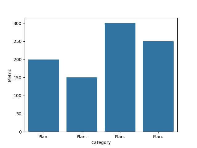
Using Custom Functions to Format Labels
Let’s create a function to format our x-axis labels. In this example, we’ll use a function that abbreviates longer words in our dataset’s category names.
def abbreviate_label(label):
    if len(label.get_text()) > 4:
        return label.get_text()[:4] + '.'
    else:
        return label.get_text()
ax.set_xticklabels([abbreviate_label(label) for label in ax.get_xticklabels()])
plt.show()
Output:
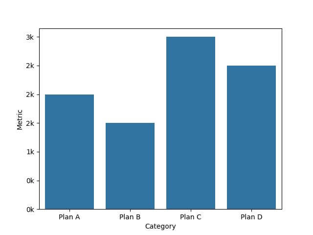
You can also use lambda functions to format y-axis tick labels based on the value.
import seaborn as sns
import matplotlib.pyplot as plt
import pandas as pd
data = {
    'Category': ['Plan A', 'Plan B', 'Plan C', 'Plan D'],
    'Metric': [2000, 1500, 3000, 2500]
}
df = pd.DataFrame(data)
ax = sns.barplot(x='Category', y='Metric', data=df)
ax.set_yticklabels(['{:.0f}k'.format(y/1000) for y in ax.get_yticks()])
plt.show()
Output:
Conditional Formatting Based on Data Values
We can make the label red if the value is above a certain threshold, indicating higher importance:
def format_ytick_label(label, threshold=200):
    value = int(label.get_text())
    color = 'red' if value > threshold else 'black'
    return {'color': color, 'weight': 'bold' if color == 'red' else 'normal'}
formatted_labels = [format_ytick_label(label) for label in ax.get_yticklabels()]
for i, label in enumerate(ax.get_yticklabels()):
    label.set_color(formatted_labels[i]['color'])
    label.set_weight(formatted_labels[i]['weight'])
plt.show()
Output:

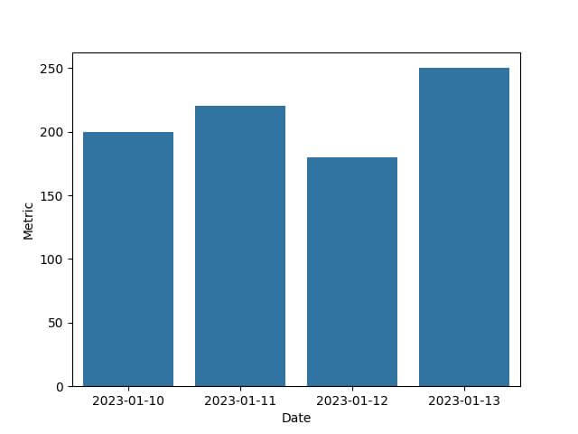
Format Date-Time Values on Axes
Let’s begin by importing the necessary libraries and creating sample date-time data.
import seaborn as sns
import matplotlib.pyplot as plt
import pandas as pd
import datetime
data = {
    'Date': [datetime.datetime(2023, 1, 10), datetime.datetime(2023, 1, 11),
             datetime.datetime(2023, 1, 12), datetime.datetime(2023, 1, 13)],
    'Metric': [200, 220, 180, 250]
}
df = pd.DataFrame(data)
When plotting, Seaborn will automatically handle the date-time formatting, but it might not be in the most readable format.
sns.barplot(x='Date', y='Metric', data=df)
plt.show()
Output:
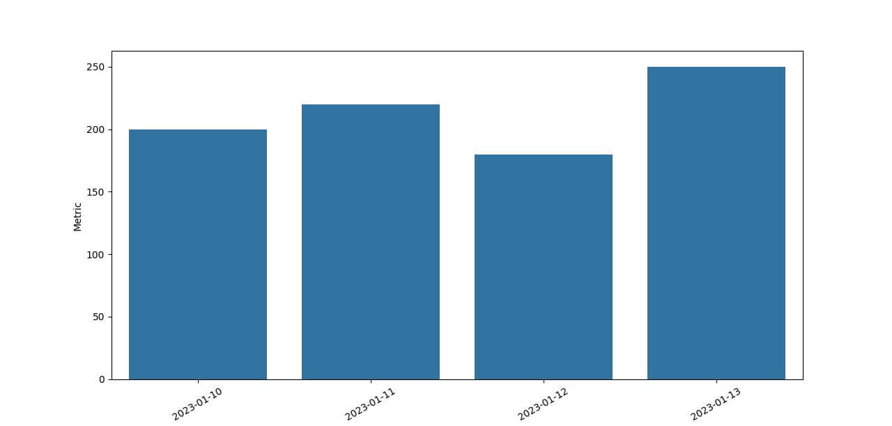
To format these date-time labels, we can use strftime from datetime module:
import datetime
df['Date'] = pd.to_datetime(df['Date'])  # Convert Date column to datetime data type
df['Date'] = df['Date'].dt.strftime('%Y-%m-%d')
sns.barplot(x='Date', y='Metric', data=df)
plt.xticks(rotation=30)
plt.show()
Output:
Mokhtar is the founder of LikeGeeks.com. He is a seasoned technologist and accomplished author, with expertise in Linux system administration and Python development. Since 2010, Mokhtar has built an impressive career, transitioning from system administration to Python development in 2015. His work spans large corporations to freelance clients around the globe. Alongside his technical work, Mokhtar has authored some insightful books in his field. Known for his innovative solutions, meticulous attention to detail, and high-quality work, Mokhtar continually seeks new challenges within the dynamic field of technology.