Seaborn Estimators: Visualize Data Aggregation
Seaborn estimators offer a method for statistical data aggregation, allowing for calculating mean, median, and standard deviation directly within visualizations.
In this tutorial, we will explore the various types of estimators available in Seaborn, such as mean, median, sum, and more, including how to create custom estimators.
Then, we will implement these estimators in different Seaborn plots such as line plots and bar plots.
Next, we will discuss grouping data for more refined estimations and conclude with methods to visualize aggregated data.
Types of Estimators in Seaborn
Built-in Estimators
Mean Estimator
import seaborn as sns
import pandas as pd
import matplotlib.pyplot as plt
import numpy as np
data = {
'Month': ['Jan', 'Jan', 'Feb', 'Feb', 'Mar', 'Mar'],
'Calls': [200, 150, 180, 210, 190, 200],
'Duration': [60, 55, 65, 70, 60, 75]
}
df = pd.DataFrame(data)
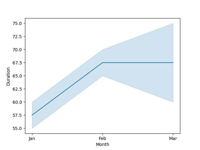
# Mean Estimator
sns.lineplot(x='Month', y='Duration', data=df, estimator='mean')
plt.show()
Output:
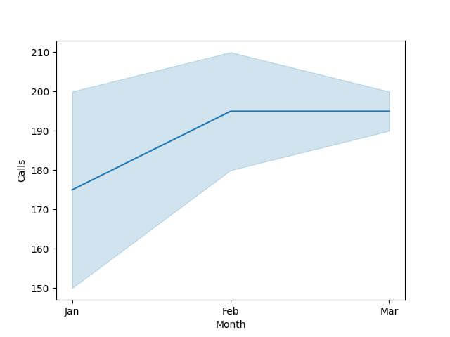
Median Estimator
sns.lineplot(x='Month', y='Calls', data=df, estimator='median')
plt.show()
Output:
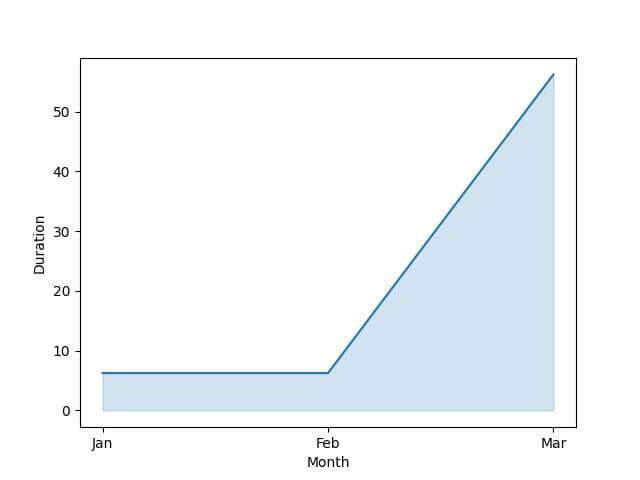
Sum Estimator
sns.lineplot(x='Month', y='Duration', data=df, estimator=np.sum)
plt.show()
Output:

Standard Deviation Estimator
sns.lineplot(x='Month', y='Calls', data=df, estimator=np.std)
plt.show()
Output:

Variance Estimator
sns.lineplot(x='Month', y='Duration', data=df, estimator=np.var)
plt.show()
Output:
Custom Estimators
If built-in estimators don’t meet specific analytical needs, Seaborn allows you to create custom estimators.
def custom_range_estimator(arr):
    return np.max(arr) - np.min(arr)

sns.lineplot(x='Month', y='Calls', data=df, estimator=custom_range_estimator)
plt.show()
Output:
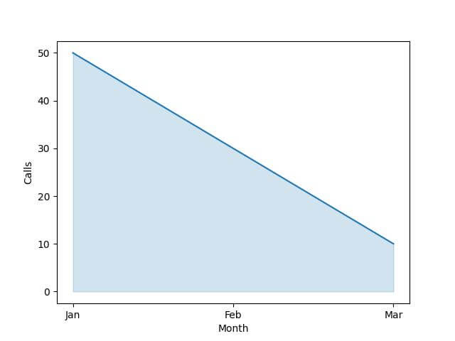
This custom estimator calculates the range of calls.
Implement Estimators in Seaborn Plots
Implementing estimators in your visualizations provides deeper insights into your dataset.
Estimators in Line Plots
Line plots are ideal for observing trends over time. Here’s how to implement various estimators in a line plot:
import seaborn as sns
import pandas as pd
import numpy as np
import matplotlib.pyplot as plt
data = {
    'Month': ['Jan', 'Jan', 'Feb', 'Feb', 'Mar', 'Mar'],
    'Calls': [200, 150, 180, 210, 190, 200],
    'Duration': [60, 55, 65, 70, 60, 75]
}
df = pd.DataFrame(data)
sns.lineplot(x='Month', y='Calls', data=df, estimator='mean')
plt.show()
Output:

This plot helps track the average call volume trends over the months.
Estimators in Bar Plots
Bar plots are effective for comparing quantities across different categories. Here’s how to use estimators in bar plots:
sns.barplot(x='Month', y='Duration', data=df, estimator=np.sum)
plt.show()
Output:
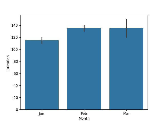
This visualization shows the total duration of calls in each month.
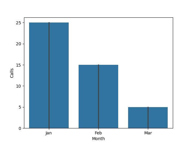
def custom_median_absolute_deviation(arr):
    return np.median(np.abs(arr - np.median(arr)))

sns.barplot(x='Month', y='Calls', data=df, estimator=custom_median_absolute_deviation)
plt.show()
Output:
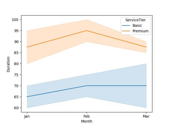
Grouping Data for Estimation
Grouping data allows you to perform comparative analyses across different subsets of your data.
First, consider grouping data by a single variable. For instance, you can compare the average call duration across different months.
import seaborn as sns
import pandas as pd
import matplotlib.pyplot as plt
data = {
    'Month': ['Jan', 'Jan', 'Feb', 'Feb', 'Mar', 'Mar', 'Jan', 'Jan', 'Feb', 'Feb', 'Mar', 'Mar'],
    'ServiceTier': ['Basic', 'Premium', 'Basic', 'Premium', 'Basic', 'Premium', 'Basic', 'Premium', 'Basic', 'Premium', 'Basic', 'Premium'],
    'Calls': [200, 220, 180, 240, 190, 210, 230, 250, 200, 260, 210, 220],
    'Duration': [60, 80, 65, 90, 60, 85, 70, 95, 75, 100, 80, 90]
}
df = pd.DataFrame(data)

# Line plot grouped by 'Month'
sns.lineplot(x='Month', y='Duration', data=df, estimator='mean', hue='ServiceTier')
plt.show()
Output:
Mokhtar is the founder of LikeGeeks.com. He is a seasoned technologist and accomplished author, with expertise in Linux system administration and Python development. Since 2010, Mokhtar has built an impressive career, transitioning from system administration to Python development in 2015. His work spans large corporations to freelance clients around the globe. Alongside his technical work, Mokhtar has authored some insightful books in his field. Known for his innovative solutions, meticulous attention to detail, and high-quality work, Mokhtar continually seeks new challenges within the dynamic field of technology.