Create Seaborn Bar plots with a Dual y-axis in Python
In this tutorial, we’ll learn how to create Seaborn bar plot with a dual y-axis in Python.
We’ll customize and synchronize dual y-axis plots using Seaborn and Matplotlib.
Also, we’ll learn how to enhance your plots with interactive features to make them engaging.
Using matplotlib twinx() Method
The twinx() method creates a second y-axis that operates independently of the primary y-axis, making it perfect for data that shares a common x-axis but varies significantly in scale or units on the y-axis.
Imagine you want to visualize two datasets that have different scales but share a common time axis.
First, import the necessary libraries and prepare your dataset:
import matplotlib.pyplot as plt
import seaborn as sns
import pandas as pd
data = {
    'Month': ['Jan', 'Feb', 'Mar', 'Apr', 'May', 'Jun'],
    'Revenue': [20000, 21000, 19000, 22000, 21500, 23000],
    'New Subscribers': [450, 520, 480, 500, 490, 530]
}
df = pd.DataFrame(data)
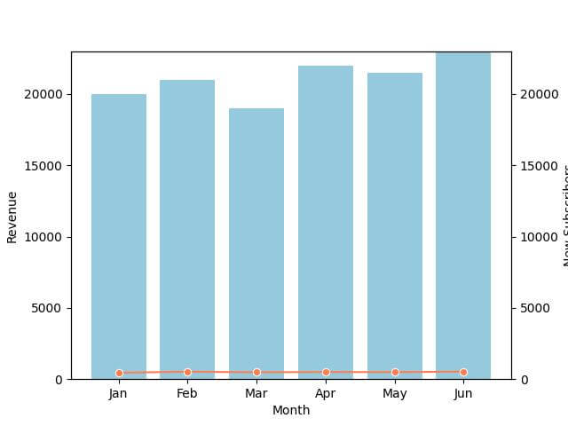
Now, let’s create a bar plot for revenue and overlay a line plot for new subscribers:
# Creating the figure and primary axis
fig, ax1 = plt.subplots()
sns.barplot(x='Month', y='Revenue', data=df, ax=ax1, color='skyblue')
ax1.set_ylabel('Revenue')
ax2 = ax1.twinx()
sns.lineplot(x='Month', y='New Subscribers', data=df, ax=ax2, color='coral', marker='o')
ax2.set_ylabel('New Subscribers')
plt.show()
Output:
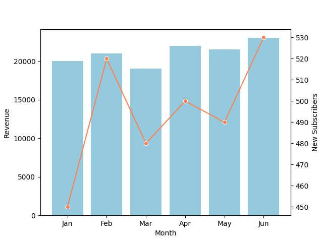
The primary y-axis on the left displays the revenue scale, and the secondary y-axis on the right shows the new subscribers count.
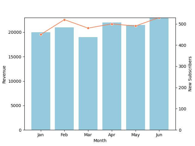
Customization Options for the Secondary Y-Axis
Adjusting the Scale
Sometimes, the scale of your secondary y-axis might not align well with the primary y-axis. Adjusting the scale can be essential for accuracy.
ax2.set_ylim(400, 600)
Output:
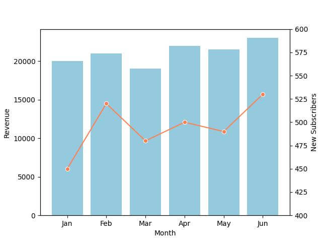
The range of the secondary y-axis (new subscribers) is now set between 400 and 600.
Customizing Labels
Let’s change the labels to be more descriptive:
ax1.set_ylabel('Monthly Revenue ($)', fontsize=12, color='blue')
ax2.set_ylabel('Number of New Subscribers', fontsize=12, color='darkred')
Output:
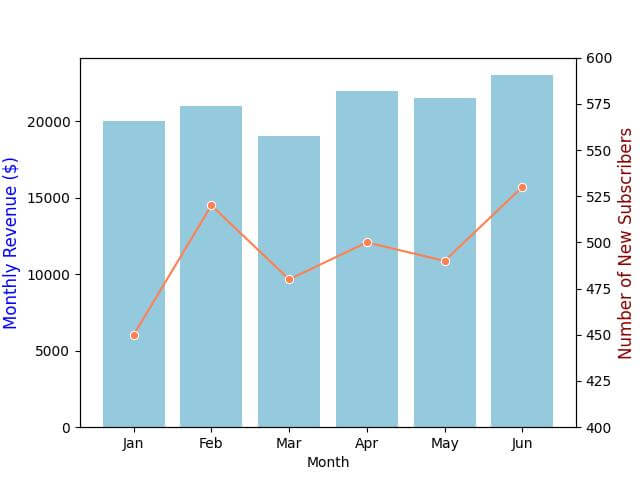
The labels for both y-axes are now more descriptive, with ‘Monthly Revenue ($)’ for the primary axis and ‘Number of New Subscribers’ for the secondary axis, each labeled in different colors matching their respective data plots.
Changing Axis and Tick Colors
To enhance readability, it’s a good practice to match the color of the axis and its ticks to the color of the corresponding data plot:
# Changing the color of the secondary y-axis ticks and labels
ax2.tick_params(axis='y', colors='darkred')
Output:
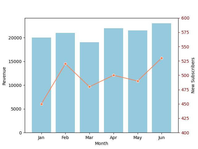
The ticks on the secondary y-axis are now colored dark red, aligning with the color of the new subscribers’ line plot.
Synchronization of Dual Axes
Aligning the Axes
Alignment is the first step to ensure that the start and end points of both y-axes match.
This is important when the scales are different but need to represent correlated data points.
# Finding the maximum values for both datasets
max_revenue = df['Revenue'].max()
max_subscribers = df['New Subscribers'].max()

# Setting the same upper limit for both axes based on the max values
upper_limit = max(max_revenue, max_subscribers)
ax1.set_ylim(0, upper_limit)
ax2.set_ylim(0, upper_limit)
Output:
Both y-axes now share the same upper limit, ensuring that they are aligned and start and end at the same points.
Synchronizing the Axes
Synchronization is about ensuring that the data points on both axes correspond to each other in a meaningful way.
This is especially important in time series data where the time points must align.
To synchronize the axes, consider using a ratio to adjust the scales:
ratio = max_revenue / max_subscribers
ax2.set_ylim(0, upper_limit / ratio)
Output:
The secondary y-axis (new subscribers) is now synchronized with the primary y-axis (revenue) using a calculated ratio.
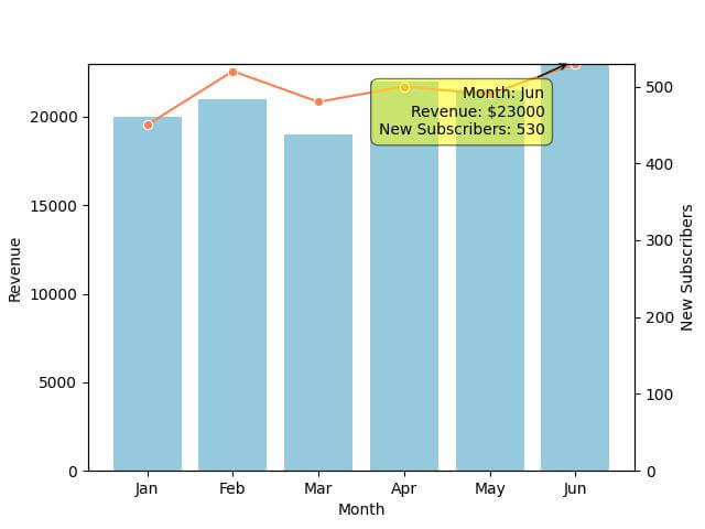
Interactive Dual Y-Axis Plots
Python offers several libraries for creating interactive plots, such as mplcursors, Plotly, and Bokeh.
We can use mplcursors, a Matplotlib extension, to add basic interactivity to our dual-axis plot.
First, ensure you have mplcursors installed:
pip install mplcursors
Now, let’s add interactivity to our telecommunications dataset plot:
import mplcursors
cursor = mplcursors.cursor(hover=True)

# Function to display data on hover
@cursor.connect("add")
def on_add(sel):
    sel.annotation.set_text(
        f'Month: {df["Month"][sel.index]}\n'
        f'Revenue: ${df["Revenue"][sel.index]}\n'
        f'New Subscribers: {df["New Subscribers"][sel.index]}'
    )
plt.show()
Output:
Mokhtar is the founder of LikeGeeks.com. He is a seasoned technologist and accomplished author, with expertise in Linux system administration and Python development. Since 2010, Mokhtar has built an impressive career, transitioning from system administration to Python development in 2015. His work spans large corporations to freelance clients around the globe. Alongside his technical work, Mokhtar has authored some insightful books in his field. Known for his innovative solutions, meticulous attention to detail, and high-quality work, Mokhtar continually seeks new challenges within the dynamic field of technology.