Create Faceted Grid of Seaborn Bar plots in Python
In this tutorial, you’ll learn how to use Seaborn to create faceted bar plots.
These plots allow you to break down complex data into sub-plots based on categorical variables.
We’ll start by understanding the basics of creating faceted grids and then move on to more advanced customization techniques.
Create Faceted Bar Plots
First, let’s create a sample dataset to work with:
import pandas as pd
import seaborn as sns
import matplotlib.pyplot as plt
data = pd.DataFrame({
    'Region': ['North', 'South', 'East', 'West']*6,
    'Plan': ['Basic', 'Premium']*12,
    'Average_Usage': [450, 600, 550, 500, 700, 800, 750, 650, 480, 620, 580, 530, 720, 820, 770, 670, 460, 610, 560, 510, 710, 810, 760, 660]
})
print(data.head())
Output:
  Region    Plan  Average_Usage
0  North   Basic            450
1  South Premium            600
2   East   Basic            550
3   West Premium            500
...
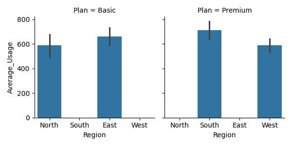
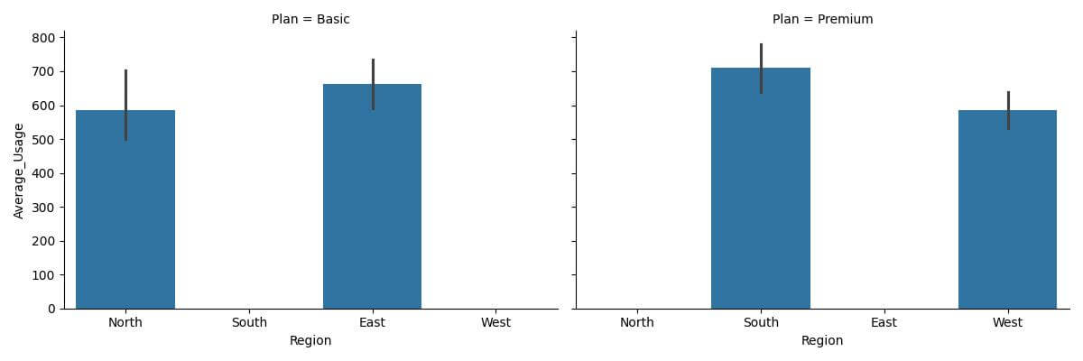
Now, let’s create a faceted grid of bar plots using sns.FacetGrid. We will plot the average usage for each region, segmented by the type of plan (Basic or Premium).
g = sns.FacetGrid(data, col="Plan")
g.map(sns.barplot, "Region", "Average_Usage", order=["North", "South", "East", "West"])
plt.show()
Output:
Adjust the Order of Facets
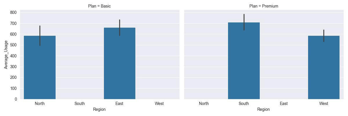
Let’s reorder the facets by the plan types.
g = sns.FacetGrid(data, col="Plan", col_order=["Premium", "Basic"])
g.map(sns.barplot, "Region", "Average_Usage", order=["North", "South", "East", "West"])
plt.show()
Output:
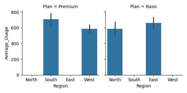
This ordering places the ‘Premium’ plan before the ‘Basic’ plan.
Add Annotations and Labels
Let’s explore how to add informative annotations and labels to individual facets in our plots.
Add Annotations
Annotations can help highlight specific data points or trends in each facet. For instance, you might want to annotate the highest average usage in each plan type.
g = sns.FacetGrid(data, col="Plan", height=4, aspect=1.2)
g.map(sns.barplot, "Region", "Average_Usage", order=["North", "South", "East", "West"])
for ax, title in zip(g.axes.flat, ["Premium", "Basic"]):
    # Find the maximum average usage in each facet
    max_usage = data[data['Plan'] == title]['Average_Usage'].max()
    max_region = data[(data['Average_Usage'] == max_usage) & (data['Plan'] == title)]['Region'].values[0]
    ax.text(x=max_region, y=max_usage, s=f'Max: {max_usage}', color='red', va='bottom')
plt.show()
Output:

The annotation ‘Max’ clearly marks the highest average usage in each plan type, making it easier for viewers to spot key data points.
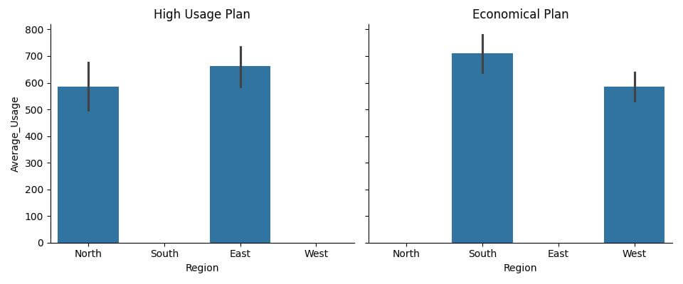
Add Labels
Labels for each subplot can enhance the understandability of your faceted grid. Let’s add custom labels that provide insights about each plan.
g = sns.FacetGrid(data, col="Plan", height=4, aspect=1.2)
g.map(sns.barplot, "Region", "Average_Usage", order=["North", "South", "East", "West"])
labels = {
    "Premium": "High Usage Plan",
    "Basic": "Economical Plan"
}
for ax, title in zip(g.axes.flat, ["Premium", "Basic"]):
    ax.set_title(labels[title])
plt.show()
Output:
Adjust the Scale and Aspect Ratio
Adjusting the scale and aspect ratio of individual facets in a Seaborn grid can significantly improve the readability and aesthetic appeal of your visualizations.
Adjust Aspect Ratio
You can adjust the aspect ratio of a plot:
g = sns.FacetGrid(data, col="Plan", height=4, aspect=1.5)
g.map(sns.barplot, "Region", "Average_Usage", order=["North", "South", "East", "West"])
plt.show()
Output:
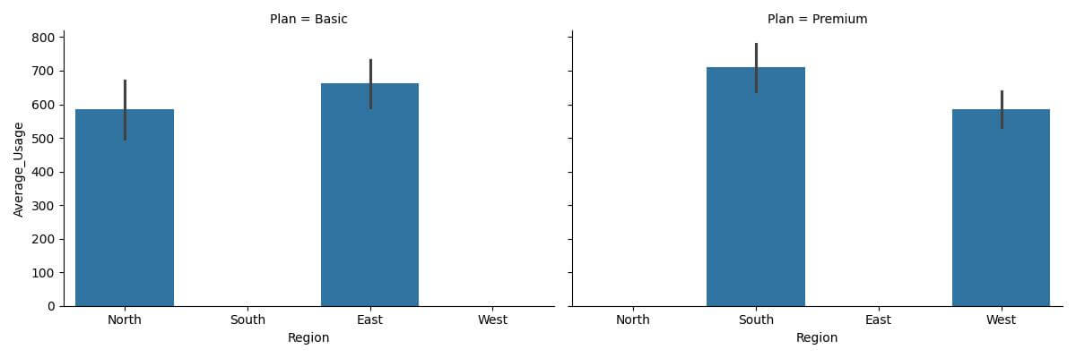
In this example, the elongated aspect ratio makes it easier to differentiate between the bars and discern the data.
Adjust Scale
You can also adjust the scale of the y-axis across facets for a consistent comparison, especially when dealing with varying ranges of data.
g = sns.FacetGrid(data, col="Plan", height=4, aspect=1.5, sharey=True)
g.map(sns.barplot, "Region", "Average_Usage", order=["North", "South", "East", "West"])
plt.show()
Output:
With sharey=True, all facets now share the same y-axis scale, making it easier to compare the data across different plan types.
Using Different Seaborn Styles and Color Palettes
Applying different styles and color palettes can change the look and feel of your plots, making them more suitable for your specific context or audience.
Apply Different Seaborn Styles
Seaborn comes with several built-in themes that can be applied globally to all plots. Let’s try out a different style for our faceted grid.
sns.set_style("darkgrid")
g = sns.FacetGrid(data, col="Plan", height=4, aspect=1.5)
g.map(sns.barplot, "Region", "Average_Usage", order=["North", "South", "East", "West"])
plt.show()
Output:
Using Color Palettes
Seaborn also allows for easy manipulation of color palettes, which can be very effective in differentiating elements within your plots.
sns.set_palette("viridis")
g = sns.FacetGrid(data, col="Plan", height=4, aspect=1.5)
g.map(sns.barplot, "Region", "Average_Usage", order=["North", "South", "East", "West"])
plt.show()
Output:
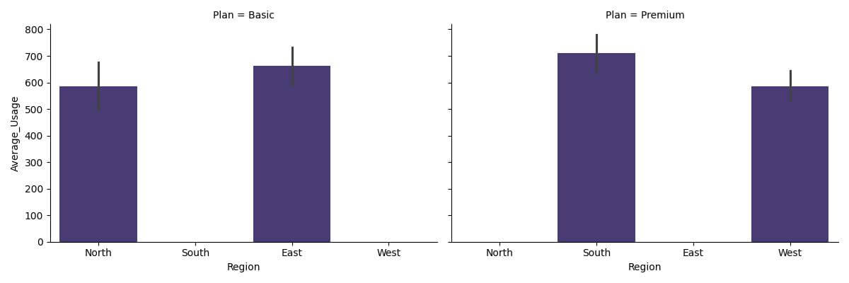
The ‘viridis’ palette offers a range of colors that are both visually appealing and distinct.
Mokhtar is the founder of LikeGeeks.com. He is a seasoned technologist and accomplished author, with expertise in Linux system administration and Python development. Since 2010, Mokhtar has built an impressive career, transitioning from system administration to Python development in 2015. His work spans large corporations to freelance clients around the globe. Alongside his technical work, Mokhtar has authored some insightful books in his field. Known for his innovative solutions, meticulous attention to detail, and high-quality work, Mokhtar continually seeks new challenges within the dynamic field of technology.