Add Percentage Annotations on Seaborn Bar Plot
In this tutorial, you’ll learn how to add percentage annotations to various types of bar plots using Seaborn and Matplotlib in Python.
Whether you’re working with simple, horizontal, stacked, grouped, or overlaid bar plots, these annotations enhance the readability of your charts.
Create a Simple Bar Plot
First, let’s create a simple bar plot to visualize our sample data:
import matplotlib.pyplot as plt
import seaborn as sns
import pandas as pd
data = {
    'Region': ['North', 'South', 'East', 'West'],
    'Number of Customers': [1200, 1500, 800, 950]
}
df = pd.DataFrame(data)
sns.barplot(x='Region', y='Number of Customers', data=df)
plt.show()
Output:

Calculate Percentages for Data Points
After creating a basic bar plot, the next step is to calculate the percentages for each data point.
You can calculate the percentages based on the number of customers in each region and then add these calculated percentages to your DataFrame.
total_customers = df['Number of Customers'].sum()
df['Percentage'] = (df['Number of Customers'] / total_customers) * 100
print(df)
Output:
   Region  Number of Customers  Percentage
0   North                 1200   30.769231
1   South                 1500   38.461538
2    East                  800   20.512821
3    West                  950   24.358974
This output shows the updated DataFrame with a new column, ‘Percentage’, representing the proportion of customers in each region relative to the total.
Add Percentage on Bar Plot
Now that you have calculated the percentages, the next step is to add these as annotations on your bar plot.
Here’s how to add percentage annotations to your bar plot:
sns.barplot(x='Region', y='Number of Customers', data=df)
for index, row in df.iterrows():
    plt.text(index, row['Number of Customers'], f"{row['Percentage']:.2f}%",
             color='black', ha="center")
plt.show()
Output:

By positioning the text in the center horizontally (ha="center"), the percentages are associated with their respective bars.
We used (:.2f) to format the percentage value to two decimal places.
Add Percentage on Horizontal Bar Plot
The process is similar, but you’ll adjust the axis and the positioning of the annotations accordingly.
Here’s how to create a horizontal bar plot with percentage annotations:
sns.barplot(x='Number of Customers', y='Region', data=df)
for index, row in df.iterrows():
    plt.text(row['Number of Customers'], index, f"{row['Percentage']:.2f}%",
             color='black', va="center")
plt.show()
Output:
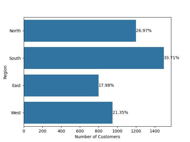
Each bar has a percentage annotation aligned in the center vertically (va="center"), next to the end of the bar, displaying the proportion of customers.
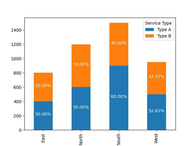
Add Percentage on Stacked Bar Plot
Imagine your dataset includes another dimension, like ‘Service Type’, and you want to visualize the distribution of customers across regions and service types.
You’ll create a stacked bar plot and annotate each segment with its respective percentage.
First, modify the dataset to include the ‘Service Type’ dimension:
expanded_data = {
    'Region': ['North', 'North', 'South', 'South', 'East', 'East', 'West', 'West'],
    'Service Type': ['Type A', 'Type B', 'Type A', 'Type B', 'Type A', 'Type B', 'Type A', 'Type B'],
    'Number of Customers': [600, 600, 900, 600, 400, 400, 500, 450]
}
expanded_df = pd.DataFrame(expanded_data)
total_customers_by_region = expanded_df.groupby('Region')['Number of Customers'].sum().reset_index()
expanded_df = expanded_df.merge(total_customers_by_region, on='Region', suffixes=('', '_Total'))

# Calculating the percentage
expanded_df['Percentage'] = (expanded_df['Number of Customers'] / expanded_df['Number of Customers_Total']) * 100
Then, create a stacked bar plot and add percentage annotations:
pivot_df = expanded_df.pivot(index='Region', columns='Service Type', values='Number of Customers')
pivot_df.plot(kind='bar', stacked=True)
for n, region in enumerate(pivot_df.index):
    for service_type in pivot_df.columns:
        value = pivot_df.loc[region, service_type]
        if value > 0:
            percentage = expanded_df[(expanded_df['Region'] == region) & (expanded_df['Service Type'] == service_type)]['Percentage'].iloc[0]
            plt.text(n, pivot_df.loc[region, :service_type].sum() - value/2, f"{percentage:.2f}%",
                     color='white', ha='center')
plt.show()
Output:
Add Percentage on Grouped Bar Plot
Suppose you want to compare the number of customers between different service types across regions.
You’ll create a grouped bar plot and annotate each bar with its respective percentage.
First, calculate the percentages for each service type within each region:
expanded_df['Percentage'] = expanded_df.apply(lambda row: (row['Number of Customers'] / row['Number of Customers_Total']) * 100, axis=1)
Now, create the grouped bar plot and add the percentage annotations:
sns.barplot(x='Region', y='Number of Customers', hue='Service Type', data=expanded_df)
for p in plt.gca().patches:
    width = p.get_width()
    height = p.get_height()
    percentage = expanded_df.loc[(expanded_df['Number of Customers'] >= height - 0.01) & (expanded_df['Number of Customers'] <= height + 0.01), 'Percentage']
    if not percentage.empty:
        plt.text(p.get_x() + width / 2, height, f"{percentage.values[0]:.2f}%", ha="center", va="bottom", color='black')
plt.show()
Output:
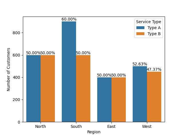
The use of horizontal alignment (ha="center") and vertical alignment (va="bottom") ensures that the annotations are positioned right above each bar.
Add Percentage on Overlaid Bar Plot
Let’s say you want to overlay the number of customers for two different service types across regions.
You’ll create an overlaid bar plot and add percentage annotations for each bar.
First, prepare your data for the overlaid plot:
type_a_df = expanded_df[expanded_df['Service Type'] == 'Type A']
type_b_df = expanded_df[expanded_df['Service Type'] == 'Type B']
type_a_df = type_a_df.set_index('Region')
type_b_df = type_b_df.set_index('Region')
Next, create the overlaid bar plot and add the percentage annotations:
ax = type_a_df['Number of Customers'].plot(kind='bar', color='blue', alpha=0.6)
type_b_df['Number of Customers'].plot(kind='bar', color='green', alpha=0.6, ax=ax)
for index, value in enumerate(type_a_df['Number of Customers']):
    plt.text(index, value, f"{type_a_df.loc[type_a_df.index[index], 'Percentage']:.2f}%", ha="center", va="bottom", color='black')
for index, value in enumerate(type_b_df['Number of Customers']):
    plt.text(index, value, f"{type_b_df.loc[type_b_df.index[index], 'Percentage']:.2f}%", ha="center", va="top", color='black')
plt.show()
Output:
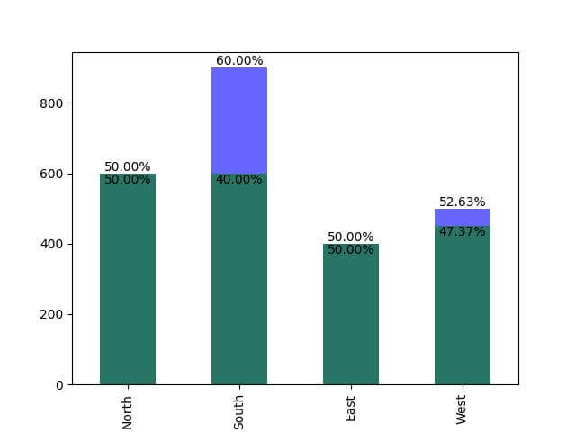
The bars for ‘Type A’ are blue, and those for ‘Type B’ are green.
Mokhtar is the founder of LikeGeeks.com. He is a seasoned technologist and accomplished author, with expertise in Linux system administration and Python development. Since 2010, Mokhtar has built an impressive career, transitioning from system administration to Python development in 2015. His work spans large corporations to freelance clients around the globe. Alongside his technical work, Mokhtar has authored some insightful books in his field. Known for his innovative solutions, meticulous attention to detail, and high-quality work, Mokhtar continually seeks new challenges within the dynamic field of technology.