Add Tables to Seaborn Plots in Python
In this tutorial, you will learn how to integrate tables into your Seaborn plots.
We will cover many aspects, from basic table addition to advanced customizations like formatting, positioning, and more.
Add Table to Seaborn Plot
Let’s begin by importing necessary libraries and preparing a sample dataset:
import seaborn as sns
import matplotlib.pyplot as plt
import pandas as pd
data = {
    'CustomerID': [1, 2, 3, 4, 5],
    'MonthlyCharges': [70, 80, 90, 60, 100],
    'TotalCharges': [500, 800, 1200, 300, 1500]
}
df = pd.DataFrame(data)
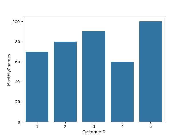
After preparing the dataset, we create a simple Seaborn plot. Let’s say a bar plot showing MonthlyCharges for each CustomerID.
sns.barplot(x='CustomerID', y='MonthlyCharges', data=df)
plt.show()
Output:
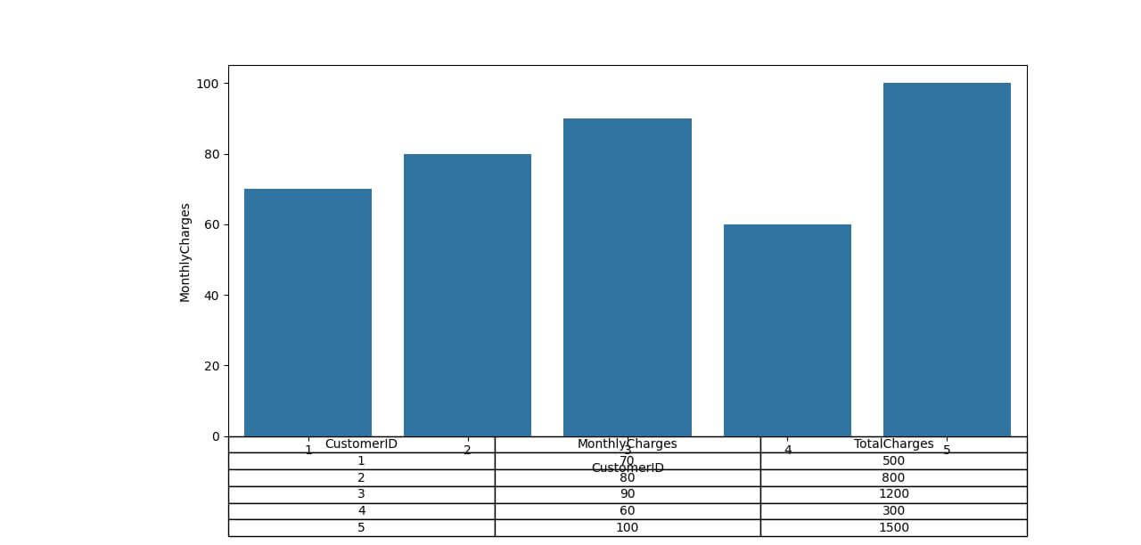
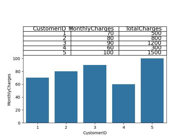
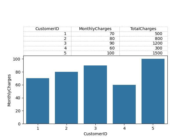
Next, we add a table to this plot. The table will display the TotalCharges for each customer, providing a more comprehensive view of the data.
sns.barplot(x='CustomerID', y='MonthlyCharges', data=df)
plt.table(cellText=df.values, colLabels=df.columns, cellLoc = 'center', loc='bottom')
plt.subplots_adjust(left=0.2, bottom=0.2)
plt.show()
Output:
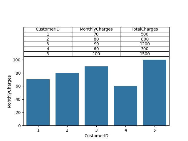
Adjust Table Position
Table Above the Plot:
# Adjusting top margin and repositioning the table
plt.subplots_adjust(top=0.6)
plt.table(cellText=df.values, colLabels=df.columns, cellLoc='center', loc='top')
Output:

Control Cell Contents
Formatted Numerical Data: Sometimes, you might want to format these numbers for better readability, like rounding them or adding units.
formatted_data = df.round(2).values  # Assuming you need to round off to two decimal places
plt.subplots_adjust(top=0.6)
plt.table(cellText=formatted_data, colLabels=df.columns, cellLoc='center', loc='top')
Output:
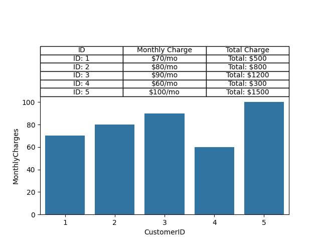
Incorporating Textual Data: You can also mix text with numbers to provide context or additional details in the table.
textual_data = [[f"ID: {row['CustomerID']}", f"${row['MonthlyCharges']}/mo", f"Total: ${row['TotalCharges']}"] for index, row in df.iterrows()]
plt.table(cellText=textual_data, colLabels=["ID", "Monthly Charge", "Total Charge"], cellLoc='center', loc='top')
Output:
Cell Formatting
Adjusting Font Size: To ensure your table is easily readable, you might need to change the font size. This is especially important for presentations or large-format displays.
cell_text = df.values
table = plt.table(cellText=cell_text, colLabels=df.columns, cellLoc='center', loc='top')
table.auto_set_font_size(False)
table.set_fontsize(14)  # Set to desired font size
Output:

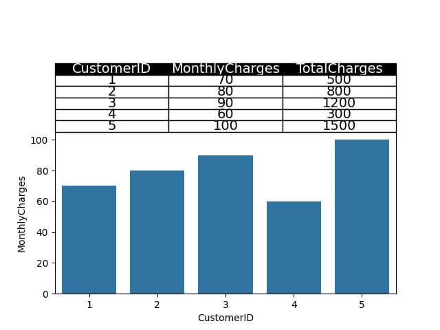
Changing Font Color: Font color can be used to differentiate types of data, highlight important figures, or simply to match your company’s branding.
for key, cell in table.get_celld().items():
    if key[0] == 0:  # Header row
        cell.set_text_props(color='white')
        cell.set_facecolor('black')
    else:
        cell.set_text_props(color='black')
Output:
Text Alignment: Proper text alignment within cells ensures that your data is presented in an organized and aesthetically pleasing manner.
for key, cell in table.get_celld().items():
    cell.set_text_props(ha='right')  # 'ha' is horizontal alignment
Output:
Adjust Cell Size
Let’s explore how to adjust cell sizes for optimal content fit.
Adjusting Cell Width: Modifying the width of the cells can help accommodate longer text entries or provide a more spacious layout for numerical data.
cell_text = df.values
table = plt.table(cellText=cell_text, colLabels=df.columns, cellLoc='center', loc='top')
table.auto_set_column_width(col=list(range(len(df.columns))))  # Adjust the column width automatically
Output:
Modifying Cell Height: Changing the height of the cells is useful when dealing with multiple lines of text or to ensure that the table doesn’t appear cramped.
for key, cell in table.get_celld().items():
    cell.set_height(0.1)  # Set to desired height
Output:

Add Headers for Rows and Columns
Adding Column Headers: Column headers are essential for identifying what each column represents. In Seaborn tables, this is straightforward as the column headers are typically derived from your DataFrame.
cell_text = df.values
table = plt.table(cellText=cell_text, colLabels=df.columns, cellLoc='center', loc='top')
Output:

Formatting Column Headers: To make these headers stand out, you can format them with different font sizes, colors, and backgrounds.
for key, cell in table.get_celld().items():
    if key[0] == 0:  # Header row
        cell.set_text_props(fontweight='bold', color='white')
        cell.set_facecolor('gray')
Output:

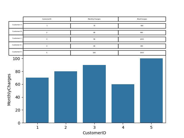
Adding and Aligning Row Headers: While Seaborn tables don’t automatically add row headers, you can manually insert them to label each row effectively.
# Adding and aligning row headers
row_headers = ['Customer A', 'Customer B', 'Customer C', 'Customer D', 'Customer E']
for i, header in enumerate(row_headers):
    table.add_cell(i + 1, -1, width=0.1, height=0.1, text=header, loc='right')
Output:
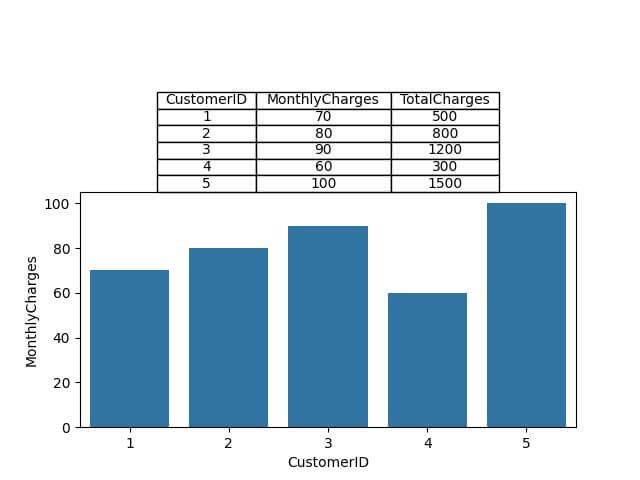
Borders and Grids
Controlling the visibility, color, and style of these elements allows you to either highlight specific data points or maintain a clean, minimalistic look.
Controlling Border Visibility: You can choose to either highlight the borders of each cell for clarity or make them invisible for a cleaner look.
table = plt.table(cellText=df.values, colLabels=df.columns, loc='bottom')
for key, cell in table.get_celld().items():
    cell.set_edgecolor('white')  # Set to 'white' or the background color to make borders invisible
Output:

Adding Grids:
for key, cell in table.get_celld().items():
    if key[1] == -1:  # Skip row labels
        continue
    cell.set_linestyle(':')  # Adding a dotted line for the grid
    cell.set_linewidth(0.5)
    cell.set_edgecolor('gray')
Output:
Set Background Color
Coloring Individual Cells: You can highlight particular cells to emphasize specific data points or outliers.
table = plt.table(cellText=df.values, colLabels=df.columns, loc='top')
table.get_celld()[(1, 1)].set_facecolor("#FFDDC1")  # Example to color the cell at row 1, column 1
Output:

Setting Background Colors for Rows: Coloring entire rows can help in differentiating sections of the table or categorizing data.
table = plt.table(cellText=df.values, colLabels=df.columns, loc='top')
colors = ["#FFF0F5", "#F0FFFF", "#F5FFFA", "#F0FFF0", "#FFFFE0"]
for i in range(len(df)):
    for j in range(len(df.columns)):
        table.get_celld()[(i + 1, j)].set_facecolor(colors[i % len(colors)])
Output:

Applying Colors to Columns: This approach is useful for highlighting specific variables or data types across your dataset.
desired_column = 'MonthlyCharges'
for i, column in enumerate(df.columns):
    if column == desired_column:
        for j in range(len(df) + 1):
            table.get_celld()[(j, i)].set_facecolor("#E6E6FA")
Output:

Mokhtar is the founder of LikeGeeks.com. He is a seasoned technologist and accomplished author, with expertise in Linux system administration and Python development. Since 2010, Mokhtar has built an impressive career, transitioning from system administration to Python development in 2015. His work spans large corporations to freelance clients around the globe. Alongside his technical work, Mokhtar has authored some insightful books in his field. Known for his innovative solutions, meticulous attention to detail, and high-quality work, Mokhtar continually seeks new challenges within the dynamic field of technology.