Matplotlib tutorial (Plotting Graphs Using pyplot)
Matplotlib is a library in Python that creates 2D graphs to visualize data. Visualization always helps in better analysis of data and enhance the decision-making abilities of the user. In this matplotlib tutorial, we will plot some graphs and change some properties like fonts, labels, ranges, etc.,
First, we will install matplotlib; then we will start plotting some basics graphs. Before that, let’s see some of the graphs that matplotlib can draw.
Plot Types
There are a number of different plot types in matplotlib. This section briefly explains some plot types in matplotlib.
Line Plot
A line plot is a simple 2D line in the graph.
Contouring and Pseudocolor
We can represent a two-dimensional array in color by using the function pcolormesh() even if the dimensions are unevenly spaced. Similarly, the contour() function does the same job.
Histograms
To return the bin counts and probabilities in the form of a histogram, we use the function hist().
Paths
To add an arbitrary path in Matplotlib we use matplotlib.path module.
Streamplot
We can use the streamplot() function to plot the streamlines of a vector. We can also map the colors and width of the different parameters such as speed time etc.
Bar Charts
We can use the bar() function to make bar charts with a lot of customizations.
Other Types
Some other examples of plots in Matplotlib include:
- Ellipses
- Pie Charts
- Tables
- Scatter Plots
- GUI widgets
- Filled curves
- Date handling
- Log plots
- Legends
- TeX- Notations for text objects
- Native TeX rendering
- EEG GUI
- XKCD-style sketch plots
Installation
Assuming that the path of Python is set in environment variables, you just need to use the pip command to install matplotlib package to get started.
Use the following command:
$ pip install matplotlib
If the package isn’t already there, it will be downloaded and installed.
To import the package into your Python file, use the following statement:
import matplotlib.pyplot as plt
Where matplotlib is the library, pyplot is a package that includes all MATLAB functions to use MATLAB functions in Python.
Finally, we can use plt to call functions within the python file.
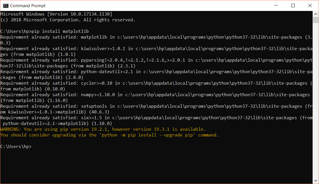
Vertical Line
To plot a vertical line with pyplot, you can use the axvline() function.
The syntax of axvline is as follows:
plt.axvline(x=0, ymin=0, ymax=1, **kwargs)
In this syntax: x is the coordinate for the x-axis. This point is from where the line would be generated vertically. ymin is the bottom of the plot; ymax is the top of the plot. **kwargs are the properties of the line such as color, label, line style, etc.
import matplotlib.pyplot as plt
plt.axvline(0.2, 0, 1, label='pyplot vertical line')
plt.legend()
plt.show()
In this example, we draw a vertical line. 0.2 means the line will be drawn at point 0.2 on the graph. 0 and 1 are ymin and ymax respectively.
The label is one of the line properties. legend() is the MATLAB function which enables label on the plot. Finally, show() will open the plot or graph screen.
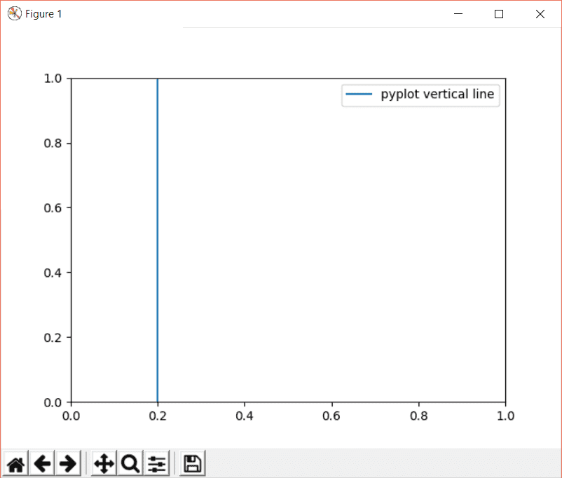
Horizontal Line
The axhline() plots a horizontal line along. The syntax to axhline() is as follows:
plt.axhline(y=0, xmin=0, xmax=1, **kwargs)
In the syntax: y is the coordinates along the y-axis. These points are from where the line would be generated horizontally. xmin is the left of the plot; xmax is the right of the plot. **kwargs are the properties of the line such as color, label, line style, etc.
Replacing axvline() with axhline() in the previous example and you will have a horizontal line on the plot:
import matplotlib.pyplot as plt
ypoints = 0.2
plt.axhline(ypoints, 0, 1, label='pyplot horizontal line')
plt.legend()
plt.show()
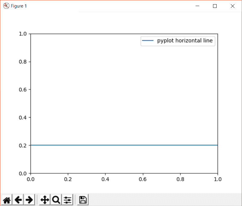
Multiple Lines
To plot multiple vertical lines, we can create an array of x points/coordinates, then iterate through each element of array to plot more than one line:
import matplotlib.pyplot as plt
xpoints = [0.2, 0.4, 0.6]
for p in xpoints:
    plt.axvline(p,  label='pyplot vertical line')
plt.legend()
plt.show()
The output will be:
The above output doesn’t look really attractive; we can use different colors for each line as well in the graph.
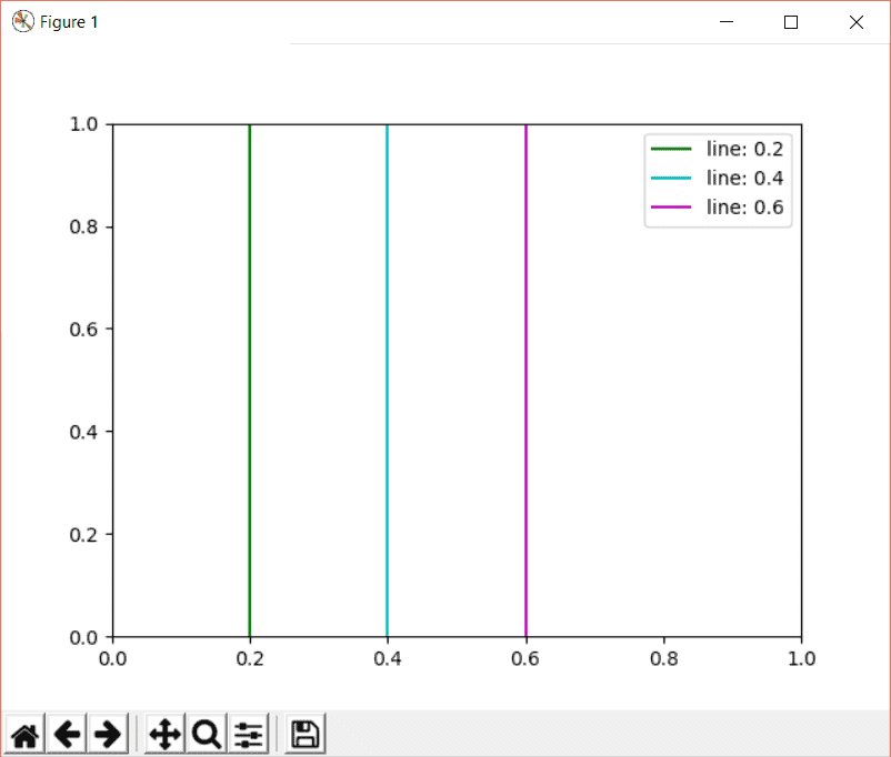
Consider the example below:
import matplotlib.pyplot as plt
xpoints = [0.2, 0.4, 0.6]
colors = ['g', 'c', 'm']
for p, c in zip(xpoints, colors):
    plt.axvline(p,  label='line: {}'.format(p), c=c)
plt.legend()
plt.show()
In this example, we have an array of lines and an array of Python color symbols. Using the zip() function, both arrays are merged together: the first element of xpoints[] with the first element of the color[] array. This way, the first line = green, second line = cyan, etc.
The braces {} act as a place holder to add Python variables to printing with the help of the format() function. Therefore, we have xpoints[] in the plot.
The output of the above code:
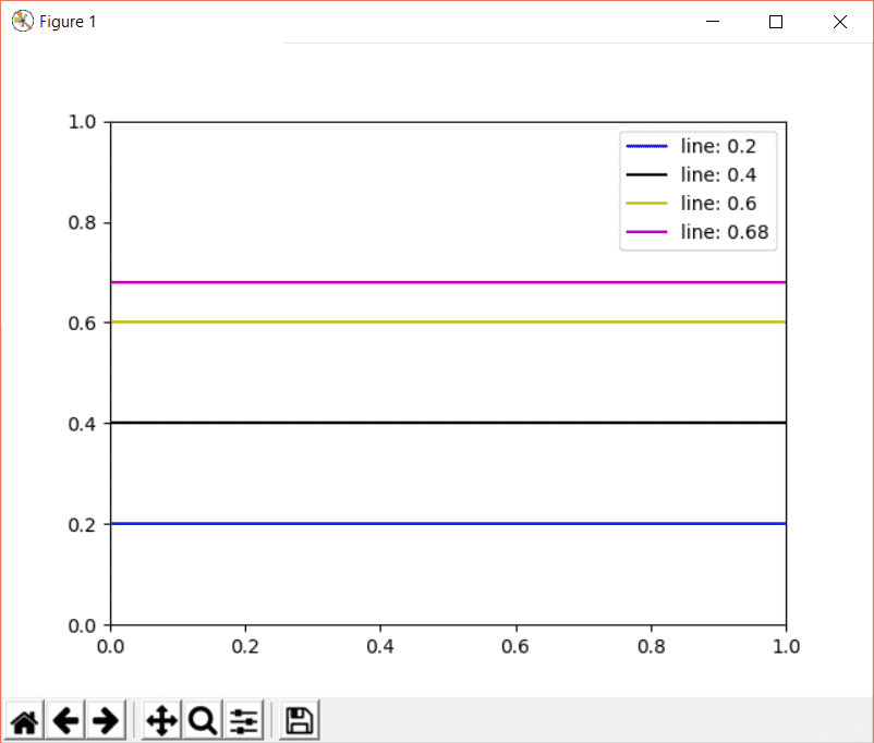
Just replace the axvline() with axhline() in the previous example, and you will have multiple horizontal lines on the plot:
import matplotlib.pyplot as plt
ypoints = [0.2, 0.4, 0.6, 0.68]
colors = ['b', 'k', 'y', 'm']
for p, c in zip(ypoints, colors):
    plt.axhline(p,  label='line: {}'.format(p), c=c)
plt.legend()
plt.show()
The code is the same; we have an array of four points of the y-axis and different colors this time. Both arrays are merged together with zip() function, iterated through the final array and axhline() plots the lines as shown in the output below:
Save Figure
After plotting your graph, how to save the output plot?
To save the plot, use savefig() of pyplot.
plt.savefig(fname, **kwargs)
Where fname is the name of the file, the destination or path can also be specified along with the name of the file. The kwargs parameter is optional. You can use it to change the orientation, format, facecolor, quality, dpi, etc.
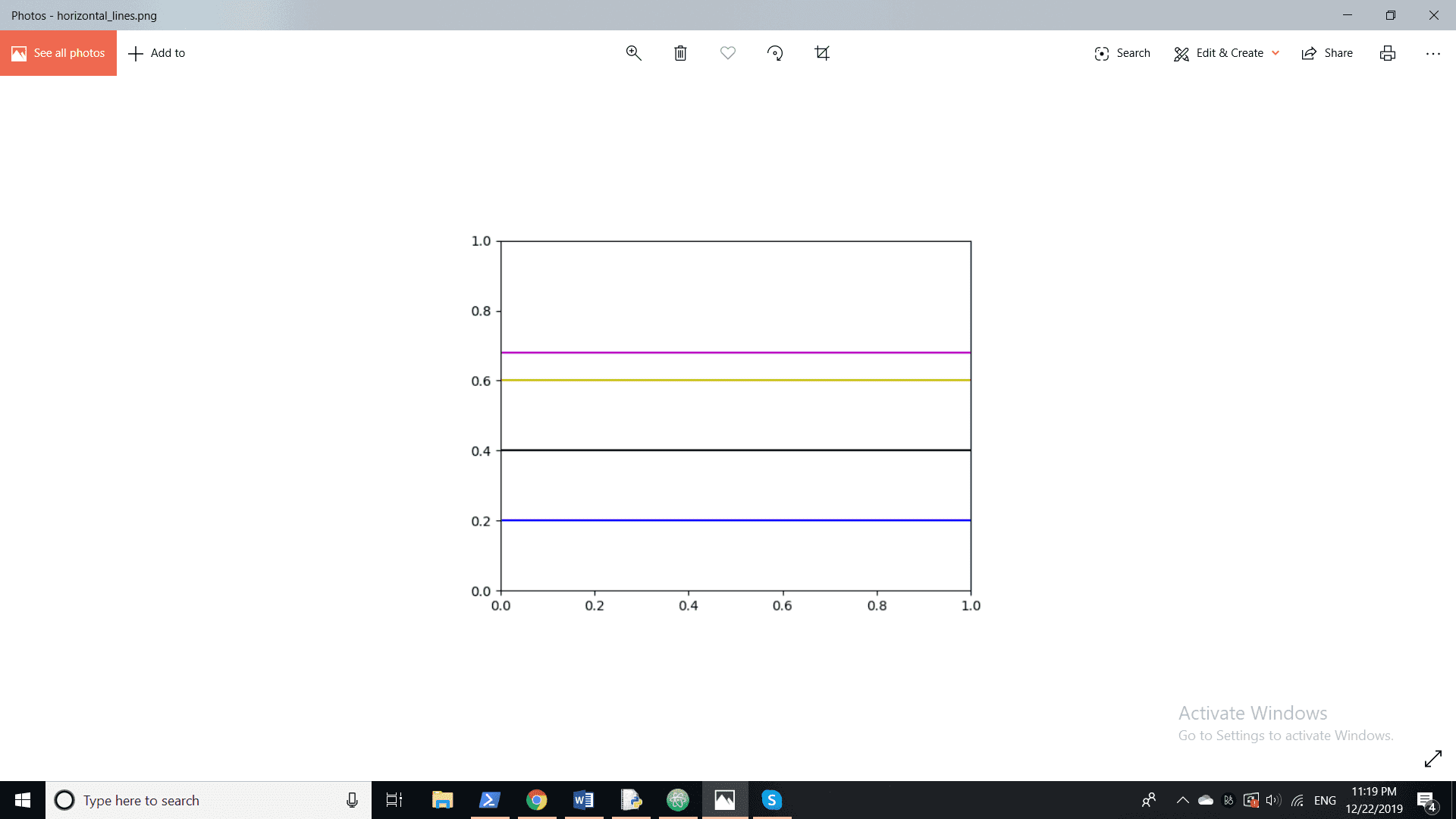
import matplotlib.pyplot as plt
ypoints = [0.2, 0.4, 0.6, 0.68]
colors = ['b','k','y', 'm']
for p, c in zip(ypoints, colors):
    plt.axhline(p,  label='line: {}'.format(p), c=c)
plt.savefig('horizontal_lines.png')
plt.legend()
plt.show()
The name of the file is horizontal_lines.png; the file will be in the same working directory:
Multiple Plots
All of the previous examples were about plotting in one plot. What about plotting multiple plots in the same figure?
You can generate multiple plots in the same figure with the help of the subplot() function of Python pyplot.
matplotlib.pyplot.subplot(nrows, ncols, index, **kwargs)
In arguments, we have three integers to specify, the number of plots in a row and in a column, then at which index the plot should be. You can consider it as a grid, and we are drawing on its cells.
The first number would be nrows the number of rows; the second would be ncols the number of columns and then the index. Other optional arguments (**kwargs) include, color, label, title, snap, etc.
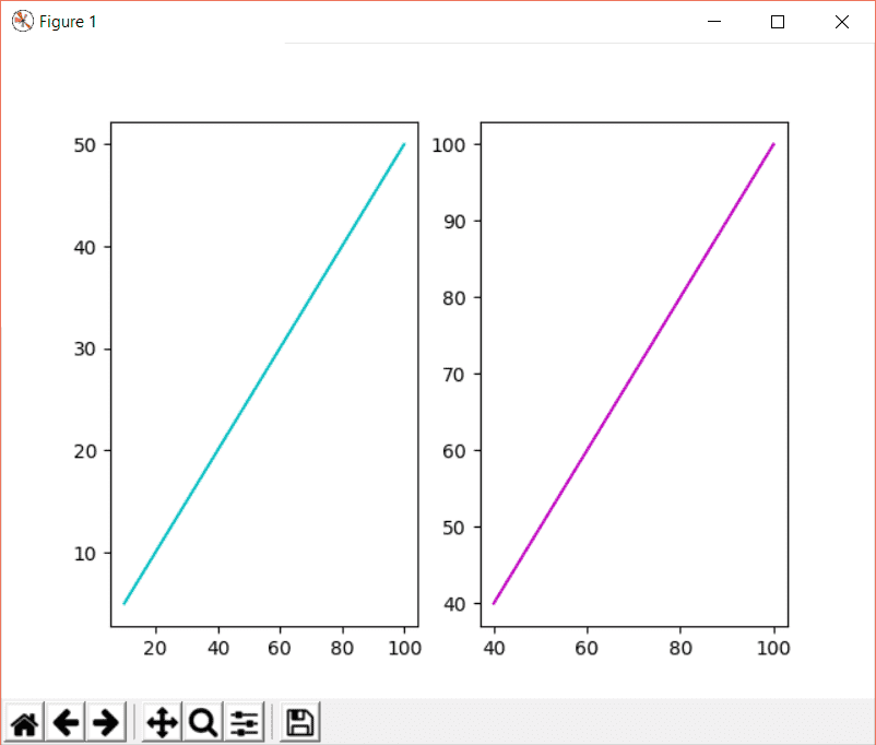
Consider the following code to get a better understanding of how to plot more than one graph in one figure.
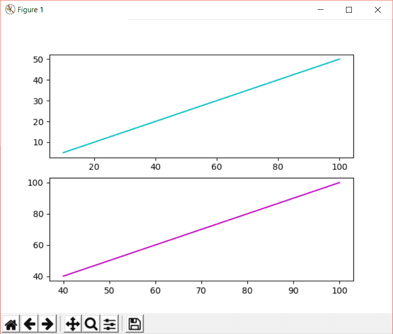
from matplotlib import pyplot as plt
plt.subplot(1, 2, 1)
x1 = [10, 20, 30, 40, 50, 60, 70, 80, 90, 100]
y1 = [5, 10, 15, 20, 25, 30, 35, 40, 45, 50]
plt.plot(x1, y1, color = "c")
plt.subplot(1, 2, 2)
x2 = [40, 50, 60, 70, 80, 90, 100]
y2 = [40, 50, 60, 70, 80, 90, 100]
plt.plot(x2, y2, color = "m")
plt.show()
The first thing is to define the location of the plot. In the first subplot, 1, 2, 1 states that we have 1 row, 2 columns, and the current plot is going to be plotted at index 1. Similarly, 1, 2, 2 tells that we have 1 row, 2 columns, but this time the plot at index 2.
The next step is to create arrays to plot integer points in the graph. Check out the output below:
To plot horizontal graphs, change the subplot rows and columns values as:
plt.subplot(2, 1, 1)
plt.subplot(2, 1, 2)
This means we have 2 rows and 1 column. The output will be like this:
Now let’s create a 2×2 grid of plots.
Consider the code below:
from matplotlib import pyplot as plt
plt.subplot(2, 2, 1)
x1 = [40, 50, 60, 70, 80, 90, 100]
y1 = [40, 50, 60, 70, 80, 90, 100]
plt.plot(x1, y1, color = "c")
plt.subplot(2, 2, 2)
x2 = [40, 50, 60, 70, 80, 90, 100]
x2 = [40, 50, 60, 70, 80, 90, 100]
plt.plot(x2, y2, color = "m")
plt.subplot(2, 2, 3)
x3 = [40, 50, 60, 70, 80, 90, 100]
y3 = [40, 50, 60, 70, 80, 90, 100]
plt.plot(x3, y3, color = "g")
plt.subplot(2, 2, 4)
x4 = [40, 50, 60, 70, 80, 90, 100]
y4 = [40, 50, 60, 70, 80, 90, 100]
plt.plot(x4, y4, color = "r")
plt.show()
The output is going to be:
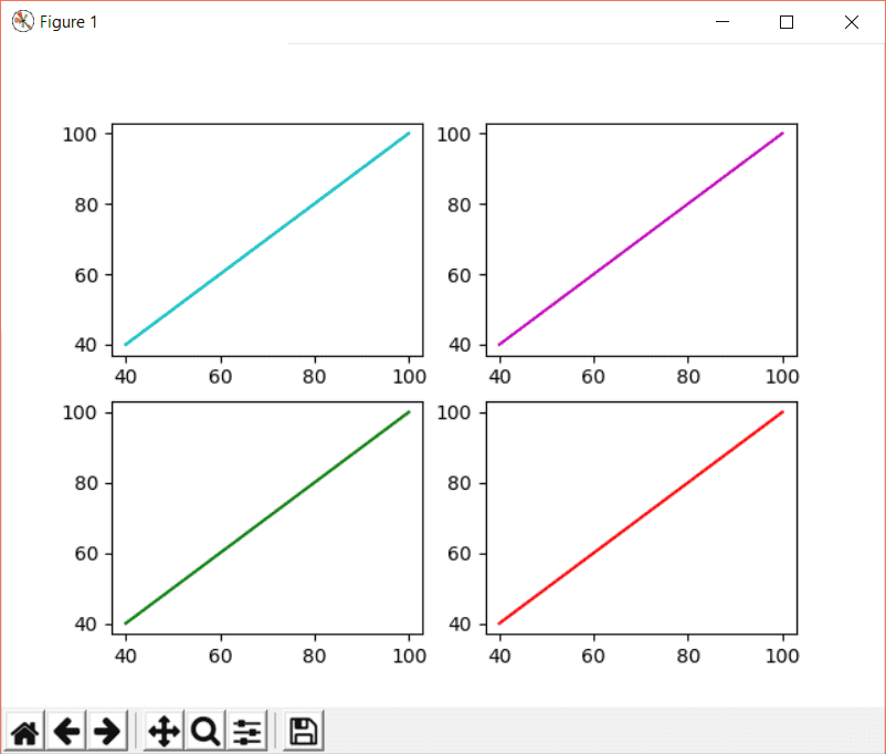
In this example, 2,2,1 means 2 rows, 2 columns, and the plot will be at index 1. Similarly, 2,2,2 means 2 rows, 2 columns, and the plot will be at index 2 of the grid.
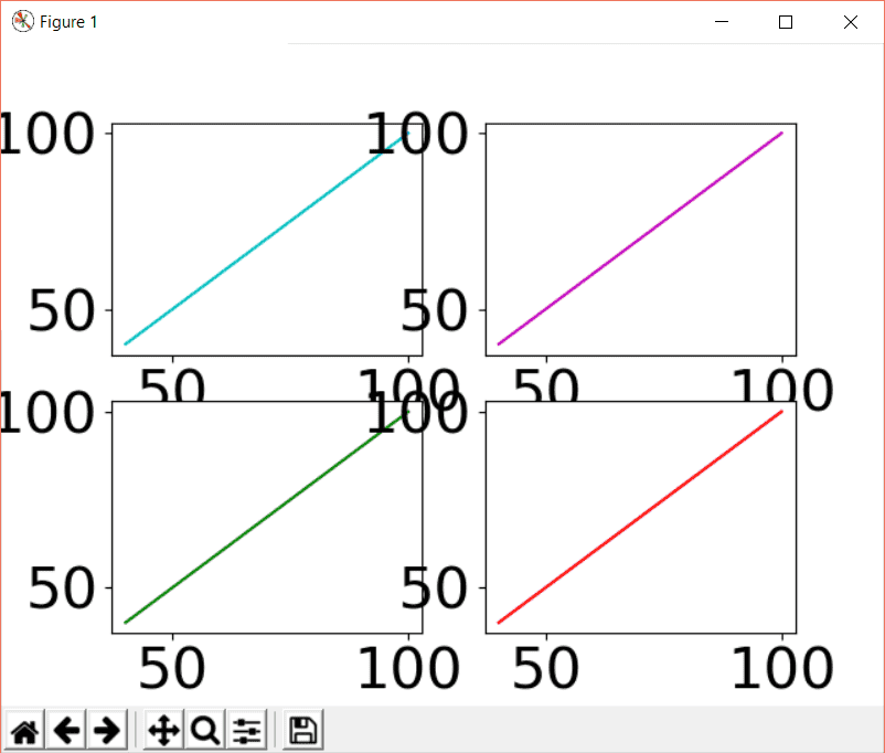
Font Size
We can change the font size of a plot with the help of a function called rc(). The rc() function is used to customize the rc settings. To use rc() to change font size, use the syntax below:
matplotlib.pyplot.rc('fontname', **font)
Or
matplotlib.pyplot.rc('font', size=sizeInt)
The font in the syntax above is a user-defined dictionary that specifies the weight, font family, font size, etc. of the text.
plt.rc('font', size=30)
This will change the font to 30; the output is going to be:
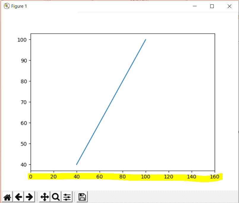
Axis Range
You can set the range or limit of the x and y-axis by using the xlim() and ylim() functions of pyplot respectively.
matplotlib.pyplot.xlim([starting_point, ending_point])
matplotlib.pyplot.ylim([starting_point, ending_point])
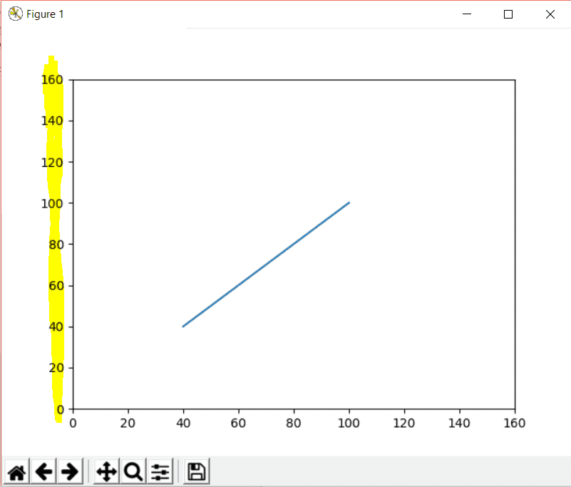
Consider the example below to set the x-axis limit for the plot:
from matplotlib import pyplot as plt
x1 = [40, 50, 60, 70, 80, 90, 100]
y1 = [40, 50, 60, 70, 80, 90, 100]
plt.plot(x1, y1)
plt.xlim([0,160])
plt.show()
In this example, the points in the x-axis will start from 0 till 160 like this:
Similarly, to limit y-axis coordinates, you will put the following line of code:
plt.ylim([0,160])
The output will be:
Label Axis
You can create the labels for the x and the y-axis using the xlabel() and ylabel() functions of pyplot.
matplotlib.pyplot.xlabel(labeltext, labelfontdict, **kwargs)
matplotlib.pyplot.ylabel(labeltext, labelfontdict, **kwargs)
In the above syntax, labeltext is the text of the label and is a string; labelfont describes the font size, weight, family of the label text, and it’s optional.
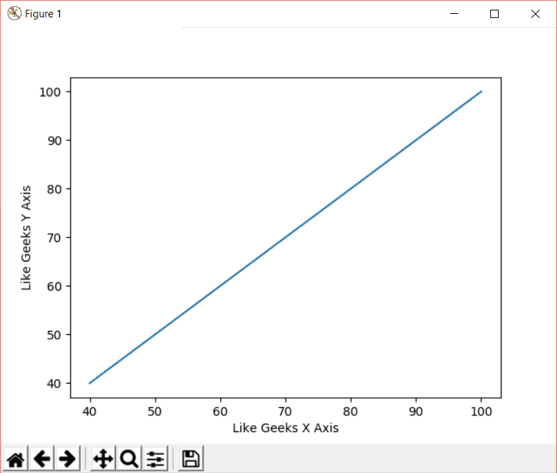
from matplotlib import pyplot as plt
x1 = [40, 50, 60, 70, 80, 90, 100]
y1 = [40, 50, 60, 70, 80, 90, 100]
plt.plot(x1, y1)
plt.xlabel('Like Geeks X Axis')
plt.ylabel('Like Geeks Y Axis')
plt.show()
In the above example, we have regular x and y arrays for x and y coordinates respectively. Then plt.xlabel() generates a text for x-axis and plt.ylabel() generates a text for y-axis.
Clear Plot
The clf() function of the pyplot clears the plot.
matplotlib.pyplot.clf()
In the clf() function, we don’t have any arguments.
from matplotlib import pyplot as plt
x1 = [40, 50, 60, 70, 80, 90, 100]
y1 = [40, 50, 60, 70, 80, 90, 100]
plt.plot(x1, y1)
plt.xlabel('Like Geeks X Axis')
plt.ylabel('Like Geeks Y Axis')
plt.clf()
plt.show()
In this code, we created a plot and defined labels as well. After that, we have used the clf() function to clear the plot as follows:
I hope you find the tutorial useful to start with matplotlib.
Keep coming back.
Mokhtar is the founder of LikeGeeks.com. He is a seasoned technologist and accomplished author, with expertise in Linux system administration and Python development. Since 2010, Mokhtar has built an impressive career, transitioning from system administration to Python development in 2015. His work spans large corporations to freelance clients around the globe. Alongside his technical work, Mokhtar has authored some insightful books in his field. Known for his innovative solutions, meticulous attention to detail, and high-quality work, Mokhtar continually seeks new challenges within the dynamic field of technology.