Using Hue Parameter in Seaborn Barplot
In this tutorial, you will learn how to use the hue parameter in Seaborn barplot.
We will explore various aspects of this parameter, including adding hue to differentiate data categories, customizing hue colors, ordering hue categories, and creating multiple plots with hue.
Adding Hue
The hue parameter allows you to add a nested categorical variable to your bar plots.
First, let’s import the necessary libraries and prepare some sample data.
import seaborn as sns
import pandas as pd
import numpy as np
import matplotlib.pyplot as plt
np.random.seed(0)
data = {
    'Region': np.random.choice(['North', 'South', 'East', 'West'], 100),
    'Customer Satisfaction Score': np.random.randint(1, 10, 100),
    'Plan Type': np.random.choice(['Basic', 'Premium'], 100)
}
df = pd.DataFrame(data)
Now, let’s create a bar plot using Seaborn, where we will compare the average customer satisfaction score across different regions, and use the ‘Plan Type’ as the hue to differentiate between Basic and Premium plans.
sns.set_theme(style="whitegrid")
barplot = sns.barplot(x='Region', y='Customer Satisfaction Score', hue='Plan Type', data=df)
plt.show()
Output:
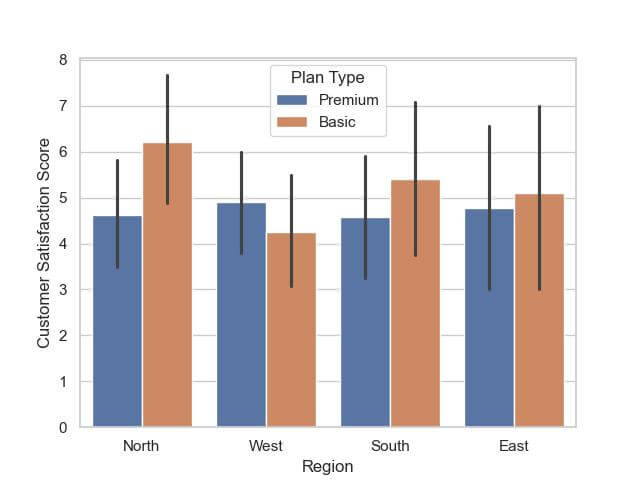
Within each set, there are two bars corresponding to the ‘Basic’ and ‘Premium’ plan types, colored differently.
The height of each bar indicates the average customer satisfaction score for that category.
Customizing Hue Colors
Seaborn’s palette parameter provides the flexibility to choose specific colors for different categories in your plots.
Let’s customize the colors of the ‘Basic’ and ‘Premium’ plan types in our bar plot.
palette_colors = {"Basic": "lightblue", "Premium": "salmon"}
custom_barplot = sns.barplot(x='Region', y='Customer Satisfaction Score', hue='Plan Type', data=df, palette=palette_colors)
plt.show()
Output:
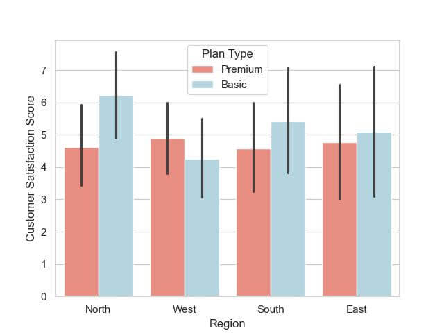
The bar plot now displays the ‘Basic’ and ‘Premium’ categories in light blue and salmon colors, respectively.
Ordering Hue Categories
The hue_order parameter in Seaborn allows you control the order in which hue categories are displayed in your plots.
Let’s demonstrate how to order the ‘Plan Type’ categories in our dataset.
hue_order = ['Premium', 'Basic']
ordered_barplot = sns.barplot(x='Region', y='Customer Satisfaction Score', hue='Plan Type', data=df, palette=palette_colors, hue_order=hue_order)
plt.show()
Output:

In this bar plot, the ‘Premium’ plan type bars are displayed before the ‘Basic’ plan type bars in each region.
Multiple Plots with Hue
Faceting is an excellent way to create multiple plots that can help in comparing different subsets of your data side by side.
You can use the FacetGrid along with barplots to split your data by one or more variables and analyze them in separate subplots.
Let’s create multiple barplots, each showing customer satisfaction scores for a specific region, split by the ‘Plan Type’.
g = sns.FacetGrid(df, col="Region", height=4, aspect=1)
g.map(sns.barplot, 'Plan Type', 'Customer Satisfaction Score', order=['Basic', 'Premium'], palette=palette_colors)
g.set_titles("{col_name} Region")
g.set_axis_labels("Plan Type", "Avg. Customer Satisfaction Score")
g.tight_layout()
plt.show()
Output:
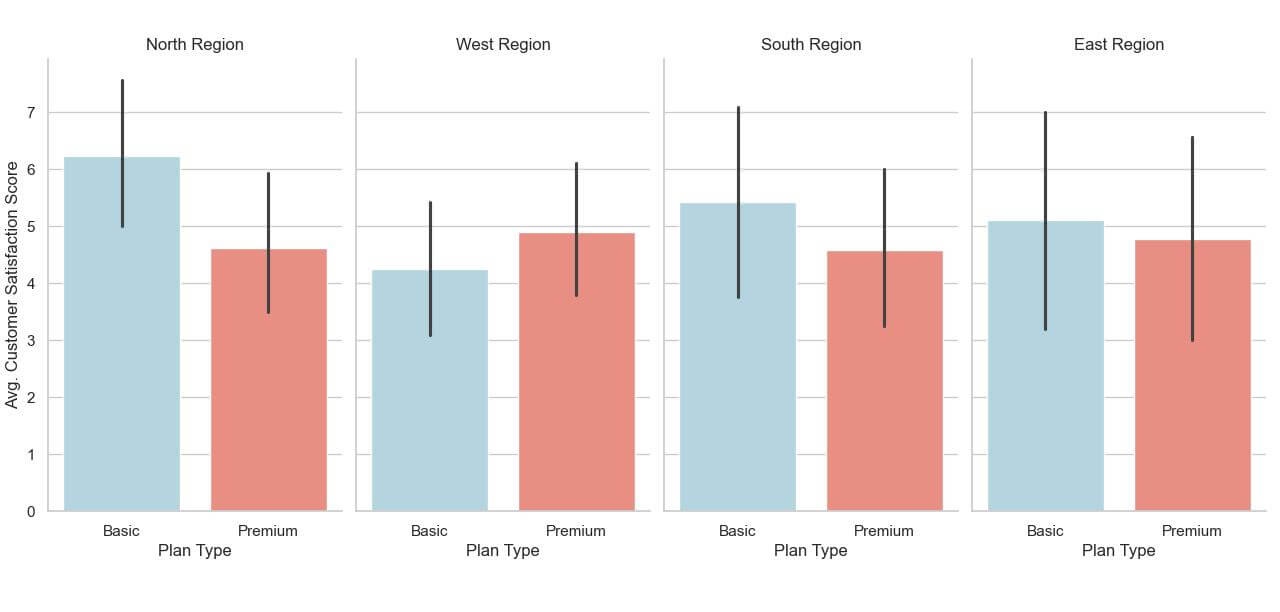
The output consists of four barplots, one for each region (‘North’, ‘South’, ‘East’, ‘West’). Each plot compares the average customer satisfaction scores for ‘Basic’ and ‘Premium’ plan types within that region.
Adjusting Bar Order and Orientation Concerning Hue
Adjusting the order helps in aligning the data presentation with your analytical goals, while changing the orientation enhances readability.
Let’s apply these adjustments to our dataset, focusing on the ‘Plan Type’ hue.
ordered_hue = ['Premium', 'Basic']
flipped_barplot = sns.barplot(x='Customer Satisfaction Score', y='Region', hue='Plan Type', data=df, palette=palette_colors, hue_order=ordered_hue, orient='h')
plt.show()
Output:
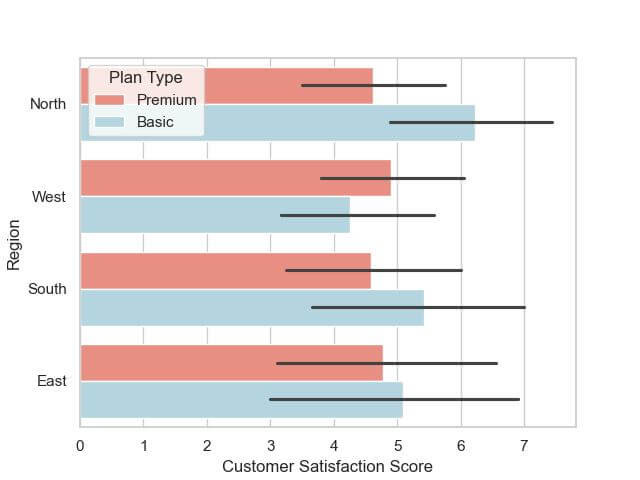
In this horizontal bar plot, the regions are listed on the y-axis, providing an easy-to-read format, especially if there are many regions or if their names are lengthy.
Mokhtar is the founder of LikeGeeks.com. He is a seasoned technologist and accomplished author, with expertise in Linux system administration and Python development. Since 2010, Mokhtar has built an impressive career, transitioning from system administration to Python development in 2015. His work spans large corporations to freelance clients around the globe. Alongside his technical work, Mokhtar has authored some insightful books in his field. Known for his innovative solutions, meticulous attention to detail, and high-quality work, Mokhtar continually seeks new challenges within the dynamic field of technology.