Fill Area Between Seaborn Line Plots: Highlight Data Trends
In this tutorial, you’ll learn how to fill areas between Seaborn line plots.
We’ll explore methods ranging from simple fills against a constant value to filling between multiple line plots, handling overlaps, and applying gradient fill.
- 1 Fill Between Single Line Plot and Constant Value
- 2 Fill Area Between Two Line Plots
- 3 Handle Overlapping Lines and Intersection Points
- 4 Fill Areas Based on Conditions
- 5 Custom Fill Patterns
- 6 Fill Multiple Areas Between Different Sets of Lines
- 7 Gradient Fills
- 8 Implement Dynamic Upper and Lower Bounds for Filling
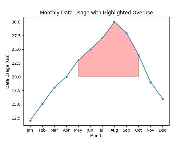
Fill Between Single Line Plot and Constant Value
Imagine you have a dataset that tracks the average monthly data usage of users over a year.
You want to visualize this data and highlight the months where data usage exceeded a certain threshold.
First, let’s import the necessary libraries and prepare a sample dataset:
import pandas as pd
import seaborn as sns
import matplotlib.pyplot as plt
data = {
    'Month': ['Jan', 'Feb', 'Mar', 'Apr', 'May', 'Jun', 'Jul', 'Aug', 'Sep', 'Oct', 'Nov', 'Dec'],
    'Data_Usage_GB': [12, 15, 18, 20, 23, 25, 27, 30, 28, 24, 19, 16]
}
df = pd.DataFrame(data)
Next, create a line plot and fill the area between the line and the x-axis for data usage exceeding 20 GB:
sns.lineplot(x='Month', y='Data_Usage_GB', data=df, marker='o')
plt.fill_between(x=df['Month'], y1=df['Data_Usage_GB'], y2=20, where=(df['Data_Usage_GB'] > 20), color='red', alpha=0.3)
plt.title('Monthly Data Usage with Highlighted Overuse')
plt.xlabel('Month')
plt.ylabel('Data Usage (GB)')
plt.show()
Output:
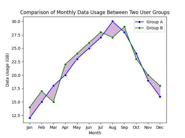
Fill Area Between Two Line Plots
Suppose you now have data for the average monthly data usage for two different user groups over the same period.
You want to compare these two groups to identify patterns.
First, let’s include this additional information:
data = {
    'Month': ['Jan', 'Feb', 'Mar', 'Apr', 'May', 'Jun', 'Jul', 'Aug', 'Sep', 'Oct', 'Nov', 'Dec'],
    'Group_A_Data_Usage_GB': [12, 15, 18, 20, 23, 25, 27, 30, 28, 24, 19, 16],
    'Group_B_Data_Usage_GB': [14, 17, 15, 22, 24, 26, 28, 27, 29, 23, 20, 18]
}
df = pd.DataFrame(data)
Now, create two line plots for each user group and fill the area between them:
sns.lineplot(x='Month', y='Group_A_Data_Usage_GB', data=df, marker='o', color='blue', label='Group A')
sns.lineplot(x='Month', y='Group_B_Data_Usage_GB', data=df, marker='o', color='green', label='Group B')

# Fill the area between the two line plots
plt.fill_between(x=df['Month'], y1=df['Group_A_Data_Usage_GB'], y2=df['Group_B_Data_Usage_GB'], color='purple', alpha=0.3)
plt.title('Comparison of Monthly Data Usage Between Two User Groups')
plt.xlabel('Month')
plt.ylabel('Data Usage (GB)')
plt.legend()
plt.show()
Output:
Handle Overlapping Lines and Intersection Points
Suppose your data overlaps at certain points throughout the year.
You’ll want to not only fill the area between these lines but also handle and highlight their intersection points.
First, let’s create some overlapping points:
data = {
    'Month': ['Jan', 'Feb', 'Mar', 'Apr', 'May', 'Jun', 'Jul', 'Aug', 'Sep', 'Oct', 'Nov', 'Dec'],
    'Group_A_Data_Usage_GB': [12, 15, 18, 20, 23, 22, 27, 25, 28, 24, 19, 16],
    'Group_B_Data_Usage_GB': [14, 17, 15, 22, 21, 22, 28, 27, 29, 23, 20, 18]
}
df = pd.DataFrame(data)
Now, let’s plot the lines, fill the areas, and highlight the intersection points:
sns.lineplot(x='Month', y='Group_A_Data_Usage_GB', data=df, marker='o', color='blue', label='Group A')
sns.lineplot(x='Month', y='Group_B_Data_Usage_GB', data=df, marker='o', color='green', label='Group B')
plt.fill_between(x=df['Month'], y1=df['Group_A_Data_Usage_GB'], y2=df['Group_B_Data_Usage_GB'], where=(df['Group_A_Data_Usage_GB'] > df['Group_B_Data_Usage_GB']), color='lightblue', alpha=0.3, interpolate=True)
plt.fill_between(x=df['Month'], y1=df['Group_A_Data_Usage_GB'], y2=df['Group_B_Data_Usage_GB'], where=(df['Group_A_Data_Usage_GB'] <= df['Group_B_Data_Usage_GB']), color='lightgreen', alpha=0.3, interpolate=True)
for i in range(1, len(df)):
    if (df.loc[i, 'Group_A_Data_Usage_GB'] - df.loc[i - 1, 'Group_A_Data_Usage_GB']) * (df.loc[i, 'Group_B_Data_Usage_GB'] - df.loc[i - 1, 'Group_B_Data_Usage_GB']) < 0:
        plt.plot(df.loc[i, 'Month'], df.loc[i, 'Group_A_Data_Usage_GB'], 'ro')
plt.title('Overlap and Intersection in Monthly Data Usage Between Two User Groups')
plt.xlabel('Month')
plt.ylabel('Data Usage (GB)')
plt.legend()
plt.show()
Output:
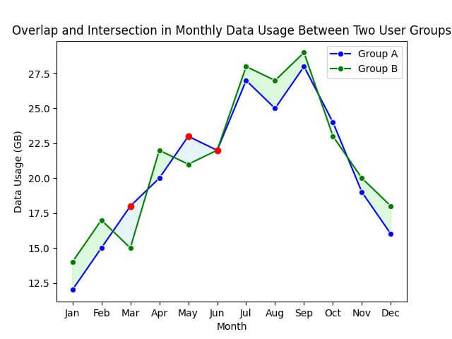
Intersection points, where the lines cross, are marked with red dots.
Fill Areas Based on Conditions
Imagine you want to highlight the months where one user group’s data usage exceeds the other’s.
Let’s use the following sample data:
data = {
    'Month': ['Jan', 'Feb', 'Mar', 'Apr', 'May', 'Jun', 'Jul', 'Aug', 'Sep', 'Oct', 'Nov', 'Dec'],
    'Group_A_Data_Usage_GB': [12, 15, 18, 20, 23, 22, 27, 25, 28, 24, 19, 16],
    'Group_B_Data_Usage_GB': [14, 17, 15, 22, 21, 22, 28, 27, 29, 23, 20, 18]
}
df = pd.DataFrame(data)
Now, let’s create the plot and fill the areas based on our condition:
sns.lineplot(x='Month', y='Group_A_Data_Usage_GB', data=df, marker='o', color='blue', label='Group A')
sns.lineplot(x='Month', y='Group_B_Data_Usage_GB', data=df, marker='o', color='green', label='Group B')

# Fill the area where Group A's data usage is more than Group B's
plt.fill_between(x=df['Month'], y1=df['Group_A_Data_Usage_GB'], y2=df['Group_B_Data_Usage_GB'], where=(df['Group_A_Data_Usage_GB'] > df['Group_B_Data_Usage_GB']), color='lightblue', alpha=0.3)

# Fill the area where Group B's data usage is more than Group A's
plt.fill_between(x=df['Month'], y1=df['Group_A_Data_Usage_GB'], y2=df['Group_B_Data_Usage_GB'], where=(df['Group_B_Data_Usage_GB'] > df['Group_A_Data_Usage_GB']), color='lightgreen', alpha=0.3)
plt.title('Conditional Area Filling Based on Data Usage Comparison')
plt.xlabel('Month')
plt.ylabel('Data Usage (GB)')
plt.legend()
plt.show()
Output:
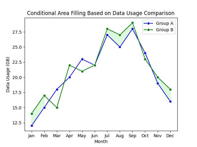
In the resulting plot, you will see that the areas where Group A’s data usage is higher than Group B’s are filled with light blue, and conversely, where Group B’s is higher, the area is filled with light green.
Custom Fill Patterns
Continuing with our existing dataset:
data = {
    'Month': ['Jan', 'Feb', 'Mar', 'Apr', 'May', 'Jun', 'Jul', 'Aug', 'Sep', 'Oct', 'Nov', 'Dec'],
    'Group_A_Data_Usage_GB': [12, 15, 18, 20, 23, 22, 27, 25, 28, 24, 19, 16],
    'Group_B_Data_Usage_GB': [14, 17, 15, 22, 21, 22, 28, 27, 29, 23, 20, 18]
}
df = pd.DataFrame(data)
Now, let’s apply custom fill patterns to our plot:
sns.lineplot(x='Month', y='Group_A_Data_Usage_GB', data=df, marker='o', color='blue', label='Group A')
sns.lineplot(x='Month', y='Group_B_Data_Usage_GB', data=df, marker='o', color='green', label='Group B')

# Custom fill patterns
plt.fill_between(x=df['Month'], y1=df['Group_A_Data_Usage_GB'], y2=df['Group_B_Data_Usage_GB'],
                 where=(df['Group_A_Data_Usage_GB'] >= df['Group_B_Data_Usage_GB']),
                 color='none', hatch='///', edgecolor='blue', linewidth=0.0, alpha=0.5)
plt.fill_between(x=df['Month'], y1=df['Group_A_Data_Usage_GB'], y2=df['Group_B_Data_Usage_GB'],
                 where=(df['Group_A_Data_Usage_GB'] < df['Group_B_Data_Usage_GB']),
                 color='none', hatch='\\\\\\', edgecolor='green', linewidth=0.0, alpha=0.5)
plt.title('Data Usage with Custom Fill Patterns')
plt.xlabel('Month')
plt.ylabel('Data Usage (GB)')
plt.legend()
plt.show()
Output:
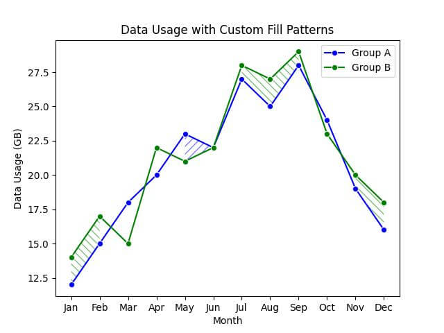
The areas where Group A’s data usage is higher than Group B’s are marked with a blue forward slash pattern (‘///’), while the areas where Group B’s data usage is higher are indicated with a green backslash pattern (‘\\’).
The use of hatch patterns, as opposed to solid fills, adds a layer of texture to the visualization.
Fill Multiple Areas Between Different Sets of Lines
Imagine you want to compare data usage trends across multiple user groups, not just two.
Let’s add another group to our comparison:
data['Group_C_Data_Usage_GB'] = [10, 13, 17, 19, 20, 21, 26, 24, 23, 22, 18, 15]
df = pd.DataFrame(data)
Now, let’s fill multiple areas between these different sets of lines:
sns.lineplot(x='Month', y='Group_A_Data_Usage_GB', data=df, marker='o', color='blue', label='Group A')
sns.lineplot(x='Month', y='Group_B_Data_Usage_GB', data=df, marker='o', color='green', label='Group B')
sns.lineplot(x='Month', y='Group_C_Data_Usage_GB', data=df, marker='o', color='red', label='Group C')

# Fill areas between the different sets of lines
plt.fill_between(x=df['Month'], y1=df['Group_A_Data_Usage_GB'], y2=df['Group_B_Data_Usage_GB'], color='lightblue', alpha=0.3)
plt.fill_between(x=df['Month'], y1=df['Group_B_Data_Usage_GB'], y2=df['Group_C_Data_Usage_GB'], color='lightgreen', alpha=0.3)
plt.fill_between(x=df['Month'], y1=df['Group_A_Data_Usage_GB'], y2=df['Group_C_Data_Usage_GB'], color='lightcoral', alpha=0.3)
plt.title('Comparative Data Usage Across Multiple Groups')
plt.xlabel('Month')
plt.ylabel('Data Usage (GB)')
plt.legend()
plt.show()
Output:
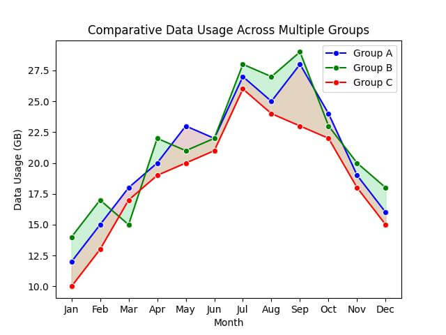
In the plot, you’ll see three distinct areas filled with different colors. Each area represents the space between two different sets of lines:
- The light blue area shows the difference between Group A and Group B.
- The light green area highlights the difference between Group B and Group C.
- The light coral area illustrates the difference between Group A and Group C.
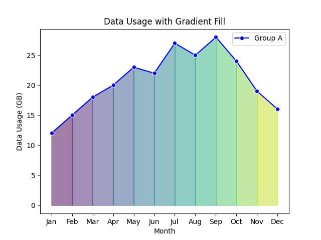
Gradient Fills
Let’s use the following dataset:
data = {
    'Month': ['Jan', 'Feb', 'Mar', 'Apr', 'May', 'Jun', 'Jul', 'Aug', 'Sep', 'Oct', 'Nov', 'Dec'],
    'Group_A_Data_Usage_GB': [12, 15, 18, 20, 23, 22, 27, 25, 28, 24, 19, 16]
}
df = pd.DataFrame(data)
Now, let’s implement the gradient fill:
import numpy as np
sns.lineplot(x='Month', y='Group_A_Data_Usage_GB', data=df, marker='o', color='blue', label='Group A')

# Creating a gradient fill
num_points = len(df['Month'])
gradient = np.linspace(0, 1, num_points)
colors = plt.cm.viridis(gradient)
for i in range(num_points - 1):
    plt.fill_between(df['Month'][i:i+2], df['Group_A_Data_Usage_GB'][i:i+2], color=colors[i], alpha=0.5)
plt.title('Data Usage with Gradient Fill')
plt.xlabel('Month')
plt.ylabel('Data Usage (GB)')
plt.legend()
plt.show()
Output:
Implement Dynamic Upper and Lower Bounds for Filling
This method allows you to dynamically adjust the filled areas based on the underlying data’s statistical properties.
Let’s illustrate this by filling areas within one standard deviation above and below the mean of a user group’s data usage.
This will highlight the range within which most of the data points fall.
We’ll use the dataset for Group A:
data = {
    'Month': ['Jan', 'Feb', 'Mar', 'Apr', 'May', 'Jun', 'Jul', 'Aug', 'Sep', 'Oct', 'Nov', 'Dec'],
    'Group_A_Data_Usage_GB': [12, 15, 18, 20, 23, 22, 27, 25, 28, 24, 19, 16]
}
df = pd.DataFrame(data)
Now, let’s calculate the mean and standard deviation, and create a plot with dynamic bounds:
# Calculating mean and standard deviation
mean_usage = df['Group_A_Data_Usage_GB'].mean()
std_deviation = df['Group_A_Data_Usage_GB'].std()
sns.lineplot(x='Month', y='Group_A_Data_Usage_GB', data=df, marker='o', color='blue', label='Group A')

# Fill between mean ± standard deviation
plt.fill_between(x=df['Month'], y1=mean_usage - std_deviation, y2=mean_usage + std_deviation, color='lightblue', alpha=0.3)
plt.title('Data Usage with Dynamic Bounds Based on Statistical Measures')
plt.xlabel('Month')
plt.ylabel('Data Usage (GB)')
plt.axhline(y=mean_usage, color='blue', linestyle='--')
plt.legend()
plt.show()
Output:
This shaded area represents the typical range of data usage, with the dashed line indicating the mean. The fill dynamically adjusts to the data.
Mokhtar is the founder of LikeGeeks.com. He is a seasoned technologist and accomplished author, with expertise in Linux system administration and Python development. Since 2010, Mokhtar has built an impressive career, transitioning from system administration to Python development in 2015. His work spans large corporations to freelance clients around the globe. Alongside his technical work, Mokhtar has authored some insightful books in his field. Known for his innovative solutions, meticulous attention to detail, and high-quality work, Mokhtar continually seeks new challenges within the dynamic field of technology.