Display Pandas Pivot table as Seaborn Line Plot
In this tutorial, you’ll learn how to create and visualize Pandas pivot table as Seaborn line plot.
You will learn how to:
- Create pivot tables with both single and multiple indices.
- Apply various aggregation functions like sum, mean, and median to your data.
- Implement and visualize custom aggregate functions.
Pivot Tables with Single Index
First, let’s import the necessary libraries and create a sample dataset.
import pandas as pd
import numpy as np
import seaborn as sns
import matplotlib.pyplot as plt
data = {
    'Month': ['January', 'January', 'February', 'February', 'March', 'March'],
    'Region': ['North', 'South', 'North', 'South', 'North', 'South'],
    'Data Usage': [320, 234, 456, 342, 487, 521]
}
df = pd.DataFrame(data)
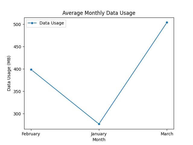
Now, create a pivot table to summarize this data. We’ll use ‘Month’ as the index and ‘Data Usage’ as the value to analyze.
pivot_table = df.pivot_table(values='Data Usage', index='Month', aggfunc="mean")
print(pivot_table)
Output:
          Data Usage
Month
February   399.0
January    277.0
March      504.0
Next, let’s visualize these trends using a Seaborn line plot.
sns.lineplot(data=pivot_table, marker='o')
plt.title('Average Monthly Data Usage')
plt.ylabel('Data Usage (MB)')
plt.xlabel('Month')
plt.show()
Output:
Aggregating Data in Pivot Tables
Sum
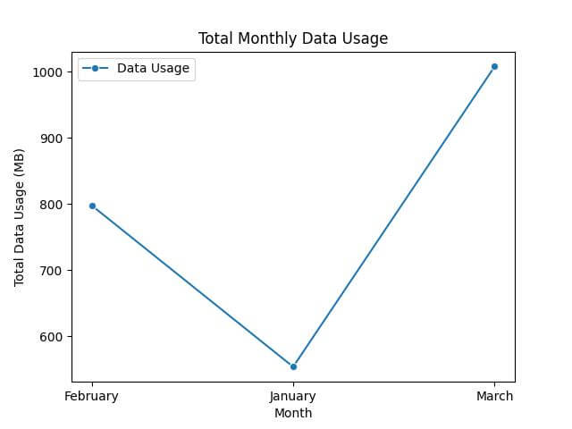
First, let’s calculate the total data usage per month across all regions.
sum_pivot = df.pivot_table(values='Data Usage', index='Month', aggfunc='sum')
print(sum_pivot)
Output:
          Data Usage
Month
February         798
January          554
March           1008
Then, we’ll create a line plot for the total data usage per month.
sns.lineplot(data=sum_pivot, marker='o')
plt.title('Total Monthly Data Usage')
plt.ylabel('Total Data Usage (MB)')
plt.xlabel('Month')
plt.show()
Output:
Mean
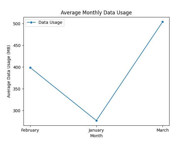
Next, calculate the average data usage per month.
mean_pivot = df.pivot_table(values='Data Usage', index='Month', aggfunc='mean')
print(mean_pivot)
Output:
          Data Usage
Month
February   399.0
January    277.0
March      504.0
Next, let’s visualize the average data usage per month.
sns.lineplot(data=mean_pivot, marker='o', color='green')
plt.title('Average Monthly Data Usage')
plt.ylabel('Average Data Usage (MB)')
plt.xlabel('Month')
plt.show()
Output:
Median
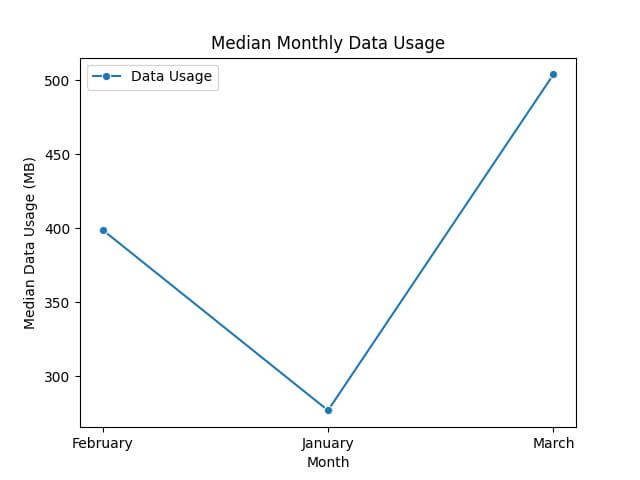
Finally, let’s find the median data usage per month.
median_pivot = df.pivot_table(values='Data Usage', index='Month', aggfunc='median')
print(median_pivot)
Output:
          Data Usage
Month
February         399
January          277
March            504
Finally, we’ll create a plot for the median data usage per month.
sns.lineplot(data=median_pivot, marker='o', color='red')
plt.title('Median Monthly Data Usage')
plt.ylabel('Median Data Usage (MB)')
plt.xlabel('Month')
plt.show()
Output:
Pivot Tables with Custom Aggregate Functions
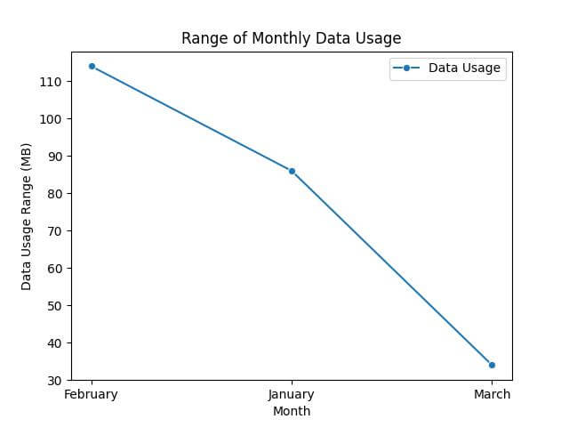
Let’s start by defining a custom aggregation function. For instance, the range (difference between max and min) of data usage.
def range_function(series):
    return series.max() - series.min()
custom_agg_pivot = df.pivot_table(values='Data Usage', index='Month', aggfunc=range_function)
print(custom_agg_pivot)
Output:
          Data Usage
Month
February         114
January           86
March             34
Let’s plot this using a Seaborn line plot.
sns.lineplot(data=custom_agg_pivot, marker='o', color='purple')
plt.title('Range of Monthly Data Usage')
plt.ylabel('Data Usage Range (MB)')
plt.xlabel('Month')
plt.show()
Output:
Mokhtar is the founder of LikeGeeks.com. He is a seasoned technologist and accomplished author, with expertise in Linux system administration and Python development. Since 2010, Mokhtar has built an impressive career, transitioning from system administration to Python development in 2015. His work spans large corporations to freelance clients around the globe. Alongside his technical work, Mokhtar has authored some insightful books in his field. Known for his innovative solutions, meticulous attention to detail, and high-quality work, Mokhtar continually seeks new challenges within the dynamic field of technology.