Seaborn Line Plot with Categorical Data (Visualize Trends)
To create a Seaborn line plot with categorical data, follow these steps:
- Put your data in a Pandas DataFrame with a categorical column (e.g., ‘Month’) and a numerical column (e.g., ‘CustomerCount’).
- Convert the categorical column to a ‘category’ data type and ensure it’s in the desired order (if necessary).
- Use Seaborn
lineplotfunction to specify the categorical column as the x-axis and the numerical column as the y-axis.
data['Month'] = data['Month'].astype('category')
months_in_order = ['January', 'February', 'March', 'April', 'May', 'June',
                   'July', 'August', 'September', 'October', 'November', 'December']
data['Month'] = pd.Categorical(data['Month'], categories=months_in_order, ordered=True)
sns.lineplot(data=data, x='Month', y='CustomerCount')
In this tutorial, you’ll learn the essential steps of working with categorical data in line plots using Python Seaborn and Pandas libraries.
Load Data Using Pandas
Load Data from Excel
To load data from an Excel file, you’ll need to use the pandas.read_excel() function:
import pandas as pd
data_excel = pd.read_excel('sample_data.xlsx')
print(data_excel.head())
Output:
   Month  CustomerCount
0    Jan            250
1    Feb            300
2    Mar            275
3    Apr            320
4    May            350
Load Data from JSON
For JSON files, use the pandas.read_json() function:
data_json = pd.read_json('sample_data.json')
print(data_json.head())
Output:
   Month  CustomerCount
0    Jan            250
1    Feb            300
2    Mar            275
3    Apr            320
4    May            350
Load Data from XML
To load data from XML, you can use the pandas.read_xml() function:
data_xml = pd.read_xml('sample_data.xml')
print(data_xml.head())
Output:
   Month  CustomerCount
0    Jan            250
1    Feb            300
2    Mar            275
3    Apr            320
4    May            350
Categorical Variables
First, let’s inspect the data types in your DataFrame using the .dtypes attribute:
print(data_excel.dtypes)
Output:
Month            object
CustomerCount     int64
dtype: object
This output indicates that ‘Month’ is an object (typically strings in Pandas) and ‘CustomerCount’ is an integer (int64).
Categorical variables are often represented as object types in Pandas.
In our example, ‘Month’ is a categorical variable as it represents distinct categories.
To explicitly convert an object type to a categorical type, use the astype('category') method:
data_excel['Month'] = data_excel['Month'].astype('category')
print(data_excel.dtypes)
Output:
Month           category
CustomerCount      int64
dtype: object
Now, ‘Month’ is explicitly categorized and ready for categorical data operations and visualizations.
Create Line Plot with Categorical Data
You can use the sns.lineplot() function and specify your categorical and numerical columns:
import seaborn as sns
import matplotlib.pyplot as plt
import pandas as pd
import numpy as np
np.random.seed(0)
months = pd.date_range('2021-01', periods=12, freq='ME').month_name()
data = pd.DataFrame({
'Month': np.repeat(months, 5),
'CustomerCount': np.random.randint(100, 1000, size=60)
})
data['Month'] = data['Month'].astype('category')
months_in_order = ['January', 'February', 'March', 'April', 'May', 'June',
'July', 'August', 'September', 'October', 'November', 'December']
data['Month'] = pd.Categorical(data['Month'], categories=months_in_order, ordered=True)
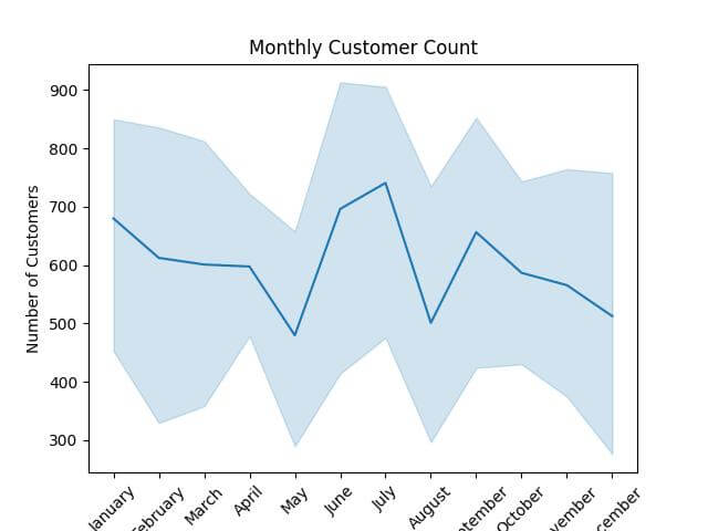
sns.lineplot(data=data, x='Month', y='CustomerCount')
plt.title('Monthly Customer Count')
plt.xlabel('Month')
plt.ylabel('Number of Customers')
plt.xticks(rotation=45)
plt.show()
Output:
Using the x and hue Arguments
The x argument specifies the categorical variable for the x-axis, while hue allows you to group data by another categorical variable, creating multiple lines in the plot.
This method is useful for comparing trends across different categories.
import seaborn as sns
import matplotlib.pyplot as plt
import pandas as pd
import numpy as np
np.random.seed(0)
months = pd.date_range('2021-01', periods=12, freq='ME').month_name()
data_excel = pd.DataFrame({
    'Month': np.repeat(months, 5),
    'CustomerCount': np.random.randint(100, 1000, size=60)
})
region_sequence = ['North', 'South', 'East', 'West', 'North']
repeat_times = len(data_excel) // len(region_sequence) + 1
data_excel['Region'] = (region_sequence * repeat_times)[:len(data_excel)]
data_excel['Region'] = data_excel['Region'].astype('category')
data_excel['Month'] = data_excel['Month'].astype('category')
sns.lineplot(data=data_excel, x='Month', y='CustomerCount', hue='Region')
plt.title('Monthly Customer Count by Region')
plt.xlabel('Month')
plt.ylabel('Number of Customers')
plt.xticks(rotation=45)
plt.show()
Output:
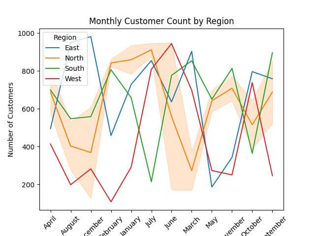
The output is a line plot with different lines for each ‘Region’. The x-axis shows the months, and the y-axis represents the number of customers.
Mokhtar is the founder of LikeGeeks.com. He is a seasoned technologist and accomplished author, with expertise in Linux system administration and Python development. Since 2010, Mokhtar has built an impressive career, transitioning from system administration to Python development in 2015. His work spans large corporations to freelance clients around the globe. Alongside his technical work, Mokhtar has authored some insightful books in his field. Known for his innovative solutions, meticulous attention to detail, and high-quality work, Mokhtar continually seeks new challenges within the dynamic field of technology.