Plot Dates In Seaborn Line Plot: Time Series Visualization
In this tutorial, you’ll learn how to plot dates in Seaborn line plot.
We’ll learn how to ensure your date format is correct, sort your data, plot dates, customize date formatting, set tick intervals, and highlight specific time periods.
Ensure Date Format
First, let’s create sample data:
import pandas as pd
data = {
    'Date': ['2024-01-01', '2024-01-02', '2024-01-03', '2024-01-04'],
    'Metric': [120, 130, 125, 135]
}
df = pd.DataFrame(data)
print(df.head())
Output:
         Date  Metric
0  2024-01-01     120
1  2024-01-02     130
2  2024-01-03     125
3  2024-01-04     135
Here, the ‘Date’ column is in the “YYYY-MM-DD” format.
Convert to Pandas Datetime Object
Next, convert the ‘Date’ column to a Pandas datetime object. This conversion ensures that Python recognizes these as dates, enabling various date-related functionalities.
df['Date'] = pd.to_datetime(df['Date'])
print(df.info())
Output:
<class 'pandas.core.frame.DataFrame'>
RangeIndex: 4 entries, 0 to 3
Data columns (total 2 columns):
 #   Column  Non-Null Count  Dtype
---  ------  --------------  -----
 0   Date    4 non-null      datetime64[ns]
 1   Metric  4 non-null      int64
dtypes: datetime64[ns](1), int64(1)
memory usage: 192.0 bytes
None
The ‘Date’ column now has the dtype ‘datetime64[ns]’.
Sort Data df.sort_values()
Sorting your dataset is important in time series analysis to maintain the integrity and relevance of your data.
You can use the sort_values method to sort your data by the ‘Date’ column.
df_sorted = df.sort_values(by='Date')
print(df_sorted)
Output:
        Date  Metric
0 2024-01-01     120
1 2024-01-02     130
2 2024-01-03     125
3 2024-01-04     135
This output shows that your dataframe is now sorted by the ‘Date’ column in ascending order.
Plot Dates
You can use lineplot function to plot time series data.
import seaborn as sns
import matplotlib.pyplot as plt
import matplotlib.dates as mdates
df = df.sort_values(by='Date')
sns.lineplot(x='Date', y='Metric', data=df)
plt.gca().xaxis.set_major_formatter(mdates.DateFormatter('%Y-%m-%d'))
plt.xticks(rotation=45)
plt.show()
Output:
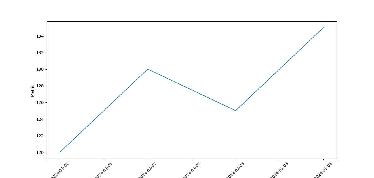
To format the dates displayed on your x-axis, we used matplotlib.dates.DateFormatter.
Show Months Only
To show months only, you can use “%Y-%m” format:
import seaborn as sns
import matplotlib.pyplot as plt
import matplotlib.dates as mdates
sns.lineplot(x='Date', y='Metric', data=df)
plt.gca().xaxis.set_major_formatter(mdates.DateFormatter('%Y-%m'))
plt.xticks(rotation=45)
plt.show()
Output:
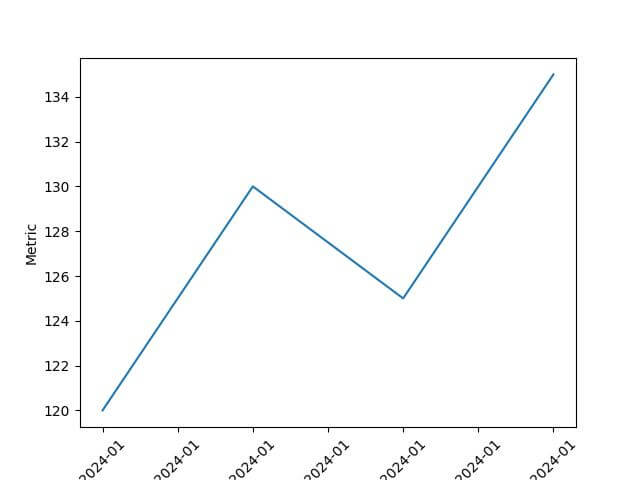
As you can see, the same month is shown multiple times. We can set the tick interval to resolve this.
Set Tick Intervals
To set the tick intervals, you can use various locators from the matplotlib.dates module.
Options like DayLocator, MonthLocator, or YearLocator allow you to set daily, monthly, or yearly intervals, respectively.
We can use DayLocator with a parameter that specifies the interval of days to display.
import matplotlib.pyplot as plt
import matplotlib.dates as mdates
import seaborn as sns
import pandas as pd
df['Date'] = pd.to_datetime(df['Date'])
df_sorted = df.sort_values(by='Date')
sns.lineplot(x='Date', y='Metric', data=df)
plt.gca().xaxis.set_major_formatter(mdates.DateFormatter('%Y-%m-%d'))
plt.gca().xaxis.set_major_locator(mdates.DayLocator())
plt.xticks(rotation=45)
plt.show()
Output:
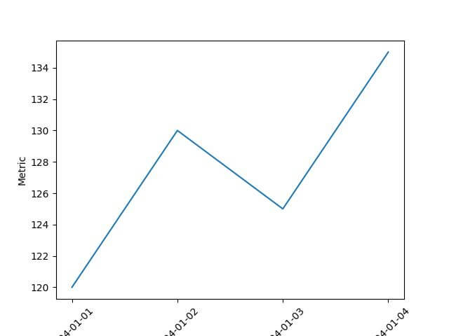
The line plot shows each date in the dataset, given our range covers only a few days.
Highlight Specific Time Periods
Highlight Specific Dates
If you want to draw attention to specific dates in your dataset, you can use plt.axvline. It adds a vertical line at the specified date.
import matplotlib.pyplot as plt
import seaborn as sns
import matplotlib.dates as mdates
sns.lineplot(x='Date', y='Metric', data=df)

# Highlighting a specific date - for example, '2024-01-03'
highlight_date = pd.to_datetime('2024-01-03')
plt.axvline(highlight_date, color='red', linestyle='--', label='Special Event')
plt.gca().xaxis.set_major_formatter(mdates.DateFormatter('%Y-%m-%d'))
plt.gca().xaxis.set_major_locator(mdates.DayLocator(interval=1))
plt.xticks(rotation=45)
plt.legend()
plt.show()
Output:
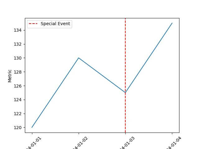
This plot will have a red dashed vertical line on the date ‘2024-01-03’, highlighting a specific event.
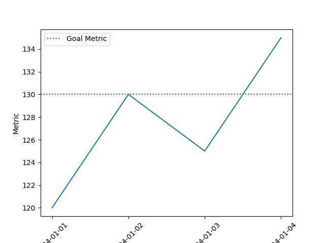
Indicate Specific Metric Values
Alternatively, if there’s a specific metric value you want to emphasize, such as a threshold or a goal, you can use plt.axhline to draw horizontal line:
import matplotlib.pyplot as plt
import seaborn as sns
import matplotlib.dates as mdates
sns.lineplot(x='Date', y='Metric', data=df)

# Highlighting a specific metric value - for example, 130
highlight_metric = 130
plt.axhline(highlight_metric, color='green', linestyle=':', label='Goal Metric')
plt.gca().xaxis.set_major_formatter(mdates.DateFormatter('%Y-%m-%d'))
plt.gca().xaxis.set_major_locator(mdates.DayLocator(interval=1))
plt.xticks(rotation=45)
plt.legend()
plt.show()
Output:
Mokhtar is the founder of LikeGeeks.com. He is a seasoned technologist and accomplished author, with expertise in Linux system administration and Python development. Since 2010, Mokhtar has built an impressive career, transitioning from system administration to Python development in 2015. His work spans large corporations to freelance clients around the globe. Alongside his technical work, Mokhtar has authored some insightful books in his field. Known for his innovative solutions, meticulous attention to detail, and high-quality work, Mokhtar continually seeks new challenges within the dynamic field of technology.