Create Seaborn Line Plot with Secondary y Axis
To create a Seaborn line plot with a secondary Y-axis, you can use Matplotlib twinx() method:
sns.lineplot(x='Month', y='Data Usage', data=df, ax=ax1, color='blue', label='Data Usage')
ax2 = ax1.twinx()
sns.lineplot(x='Month', y='Revenue', data=df, ax=ax2, color='green', label='Revenue')
In this tutorial, you’ll learn how to create dual y-axis Seaborn line plots. This method allows you to work with datasets that have different scales or units but are related in context.
You’ll customize these plots with different styles, synchronize axes, focus on specific data ranges, and add annotations.
Differences Between Primary and Secondary Y-Axes
The primary y-axis is the main scale of measurement that appears on the left side of a plot.
It’s used to represent the primary data series in a graph.
On the other hand, a secondary y-axis, usually positioned on the right, allows you to plot a second data series on the same graph with a different scale.
Create Secondary Y-Axis
The ax.twinx() method creates a new y-axis that shares the same x-axis with your current plot.
Assume we have two sets of data: the monthly average call duration and the corresponding monthly revenue. These datasets are related, but they vary greatly in scale.
First, import the necessary libraries and create a sample dataset:
import seaborn as sns
import matplotlib.pyplot as plt
import pandas as pd
data = {
    "Month": ["January", "February", "March", "April", "May", "June"],
    "Avg_Call_Duration": [200, 210, 190, 180, 220, 210],
    "Revenue": [10000, 10500, 9500, 9000, 11000, 10800]
}
df = pd.DataFrame(data)
Next, create a line plot for the primary y-axis and add a secondary y-axis:
sns.set_style("whitegrid")
fig, ax1 = plt.subplots(figsize=(10, 6))

# Plot the primary y-axis data
sns.lineplot(data=df, x="Month", y="Avg_Call_Duration", ax=ax1, color="blue", marker="o")

# Create the secondary y-axis
ax2 = ax1.twinx()
sns.lineplot(data=df, x="Month", y="Revenue", ax=ax2, color="green", marker="s")
ax1.set_ylabel('Average Call Duration (minutes)', color='blue')
ax2.set_ylabel('Revenue ($)', color='green')
plt.show()
Output:
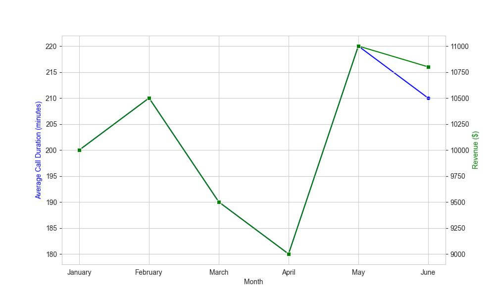
In this plot, you can compare the trends in call duration and revenue over the months.
Adjust Line Styles and Colors for Secondary Axis
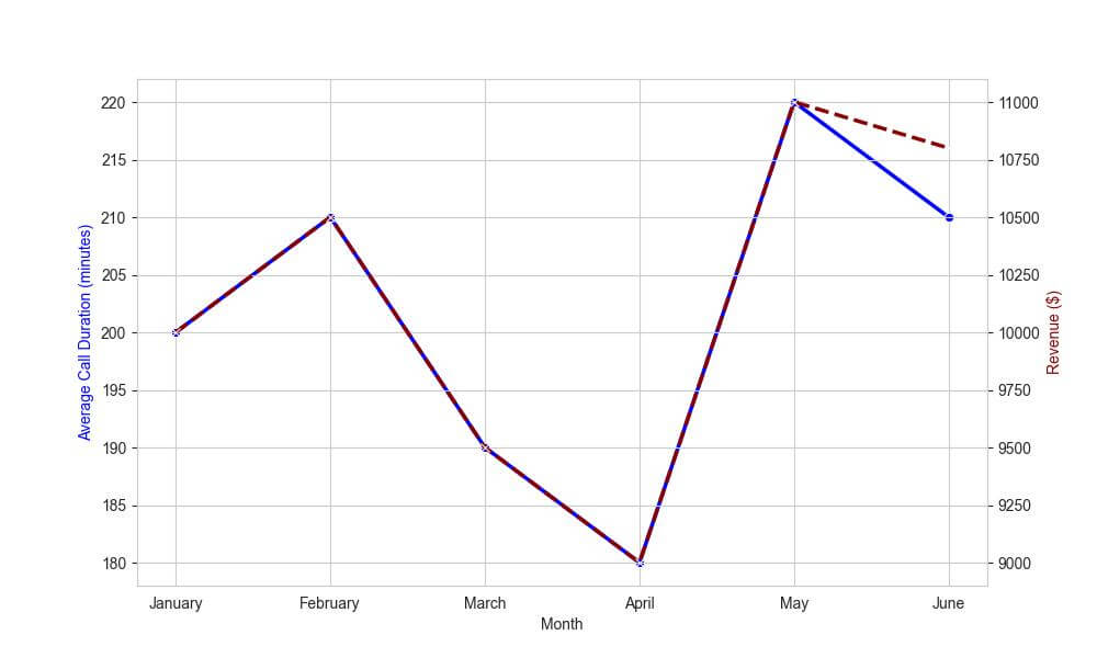
Let’s adjust the line styles and colors to clearly distinguish between the average call duration and the monthly revenue.
# Plot the primary y-axis data with specific style
sns.lineplot(data=df, x="Month", y="Avg_Call_Duration", ax=ax1,
             color="blue", marker="o", linestyle='-', linewidth=2.5)

# Plot the secondary y-axis data with different style
ax2 = ax1.twinx()
sns.lineplot(data=df, x="Month", y="Revenue", ax=ax2,
             color="darkred", marker="x", linestyle='--', linewidth=2.5)

# Set labels with matching colors
ax1.set_ylabel('Average Call Duration (minutes)', color='blue')
ax2.set_ylabel('Revenue ($)', color='darkred')
plt.show()
Output:
Synchronize Axes
Suppose you want to highlight how changes in average call duration relate to changes in revenue.
If these two metrics are expected to move in tandem or have a direct correlation, synchronizing the axes can make this relationship more clear.
# Plot the primary y-axis data
sns.lineplot(data=df, x="Month", y="Avg_Call_Duration", ax=ax1,
             color="blue", marker="o", linestyle='-', linewidth=2.5)

# Create the secondary y-axis
ax2 = ax1.twinx()
sns.lineplot(data=df, x="Month", y="Revenue", ax=ax2,
             color="darkred", marker="x", linestyle='--', linewidth=2.5)

# Synchronize the axes
ax2.set_ylim(0, ax1.get_ylim()[1] * 50)  # Example: Scaling factor of 50
ax1.set_ylabel('Average Call Duration (minutes)', color='blue')
ax2.set_ylabel('Revenue ($)', color='darkred')
plt.show()
Output:
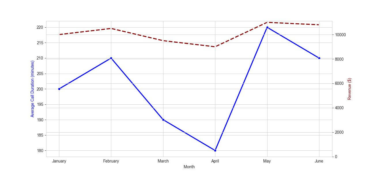
The secondary axis (revenue) is now synchronized with the primary axis (average call duration), with a scaling factor to adjust for the different units.
However, it’s important to choose the scaling factor wisely to avoid misleading representations.
Add Multiple Lines to Each Axis
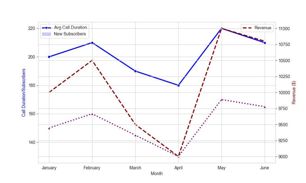
Let’s expand our dataset by adding another data series: the number of new subscribers per month.
We’ll plot this on the primary y-axis alongside the average call duration, and continue to display revenue on the secondary y-axis.
Here’s how to add multiple lines to each axis:
# additional column
data['New_Subscribers'] = [150, 160, 145, 130, 170, 165]
df = pd.DataFrame(data)

# Plot the first data series on the primary y-axis
sns.lineplot(data=df, x="Month", y="Avg_Call_Duration", ax=ax1,
             color="blue", marker="o", linestyle='-', linewidth=2.5)

# Plot the second data series on the primary y-axis
sns.lineplot(data=df, x="Month", y="New_Subscribers", ax=ax1,
             color="purple", marker="^", linestyle=':', linewidth=2.5)

# Create and plotting the secondary y-axis data
ax2 = ax1.twinx()
sns.lineplot(data=df, x="Month", y="Revenue", ax=ax2,
             color="darkred", marker="x", linestyle='--', linewidth=2.5)

# Set labels with matching colors
ax1.set_ylabel('Call Duration/Subscribers', color='blue')
ax2.set_ylabel('Revenue ($)', color='darkred')
ax1.legend(['Avg Call Duration', 'New Subscribers'], loc='upper left')
ax2.legend(['Revenue'], loc='upper right')
plt.show()
Output:
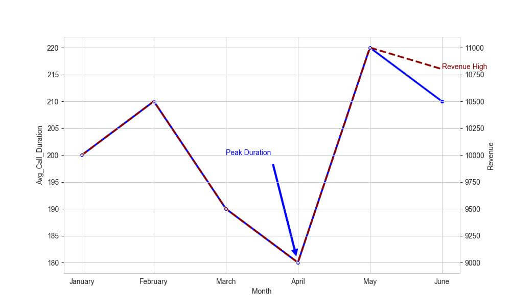
Add Annotations and Text
Seaborn and Matplotlib provide functions like ax1.text() and ax2.annotate() to place text elements or annotations on your plot.
Suppose you want to highlight a specific month’s data on both the average call duration and the revenue.
Here’s how you can add annotations and text for each axis:
# Plot the primary y-axis data
sns.lineplot(data=df, x="Month", y="Avg_Call_Duration", ax=ax1,
             color="blue", marker="o", linestyle='-', linewidth=2.5)

# Create and plot the secondary y-axis data
ax2 = ax1.twinx()
sns.lineplot(data=df, x="Month", y="Revenue", ax=ax2,
             color="darkred", marker="x", linestyle='--', linewidth=2.5)

# Add annotation to the primary y-axis
ax1.annotate('Peak Duration', xy=('April', 180), xytext=('March', 200),
             arrowprops=dict(facecolor='blue', shrink=0.05), color='blue')

# Add text element to the secondary y-axis
ax2.text('June', 10800, 'Revenue High', color='darkred')
plt.show()
Output:
Mokhtar is the founder of LikeGeeks.com. He is a seasoned technologist and accomplished author, with expertise in Linux system administration and Python development. Since 2010, Mokhtar has built an impressive career, transitioning from system administration to Python development in 2015. His work spans large corporations to freelance clients around the globe. Alongside his technical work, Mokhtar has authored some insightful books in his field. Known for his innovative solutions, meticulous attention to detail, and high-quality work, Mokhtar continually seeks new challenges within the dynamic field of technology.