Seaborn Line Plot (Visualize Data With Lines)
Among numerous plots supported by Seaborn, the line plot is the most common statistical data plotting library.
In this article, we will discuss the lineplot() method and how to set various attributes to customize the plot.
- 1 Plot a line using lineplot()
- 2 Plot multiple lines
- 3 Change the title
- 4 Customize line style
- 5 Change line color
- 6 Change the marker size
- 7 Mark a specific point
- 8 Set line plot opacity
- 9 Change background color
- 10 Change legend position
- 11 Set/change legend title
- 12 Order Legend
- 13 Remove the legend
- 14 Add labels
- 15 Rotate labels
- 16 Save/export figure
- 17 Attribute error module Seaborn has no attribute line plot
Plot a line using lineplot()
Seaborn’s lineplot() method allows us to plot connected lines across the data points. We have to provide the x and y-axis values to the lineplot().
The syntax for using lineplot() is:
sns.lineplot(x = None, y = None, hue = None, size = None, style = None, data = None, palette = None, hue_order = None, hue_norm = None, sizes = None, size_order = None, size_norm = None, dashes = True, markers = None, style_order = None, units = None, estimator = ‘mean’, ci= 95, n_boot = 1000, sort =True, err_style = ‘band’, err_kws = None, legend = ‘brief’, ax = None, **kwargs,)
Here is a code snippet to show how to plot a line using lineplot().
import pandas as pd
import seaborn as sns
import matplotlib.pyplot as plt
yr = [2014, 2016, 2017, 2018, 2020, 2019, 2022]
revenuePercent = [60.2, 89.8, 78, 81, 73.3, 69, 93.2]
datf = pd.DataFrame({"Year":yr, "Profit":revenuePercent})
sns.lineplot(x = "Year", y = "Profit", data=datf)
plt.show()
Output

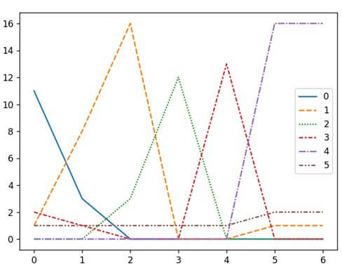
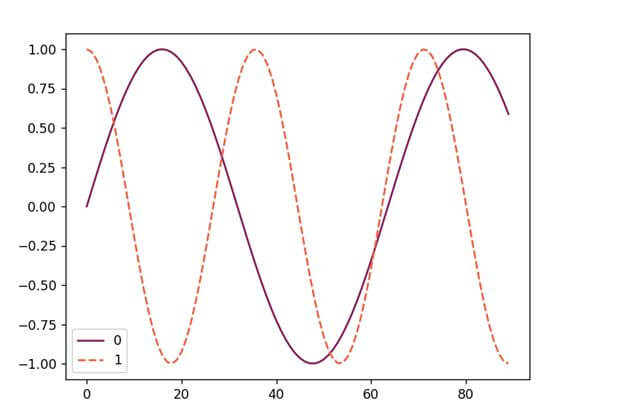
Plot multiple lines
Using Seaborn’s lineplot(), we can plot multiple lines. Here is a code snippet showing how to generate one.
import seaborn as sns
import pandas as pd
import matplotlib.pyplot as plt
arry = [[11, 1, 0, 2, 0, 1],
         [3, 8, 0, 1, 0, 1],
         [0, 16, 3, 0, 0, 1],
         [0, 0, 12, 0, 0, 1],
         [0, 0, 0, 13, 0, 1],
         [0, 1, 0, 0, 16, 2],
         [0, 1, 0, 0, 16, 2]]
datf = pd.DataFrame(arry, range(7), range(6))
sns.lineplot(data = datf)
plt.show()
Output
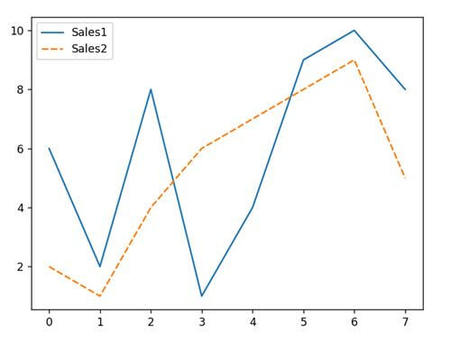
Another way of generating multiple lines using Seaborn’s lineplot() without using random values is:
import pandas as pd
import matplotlib.pyplot as plt
import seaborn as sns
dataf = pd.DataFrame({"Sales1": [6, 2, 8, 1, 4, 9, 10, 8],
                 "Sales2" : [2, 1, 4, 6, 7, 8, 9, 5]})
p = sns.lineplot(data = dataf)
plt.show()
Output
Change the title
There are three different ways to set the title for the line plot. These are:
Method 1: Using set_title() method: The set_title() method can help accept strings as a parameter to set the title for the plot. The code snippet below can explain how to use it.
import seaborn as sns
import pandas as pd
import matplotlib.pyplot as plt
arry = [[11, 1, 0, 2, 0, 1],
         [3, 8, 0, 1, 0, 1],
         [0, 16, 3, 0, 0, 1],
         [0, 0, 12, 0, 0, 1],
         [0, 0, 0, 13, 0, 1],
         [0, 1, 0, 0, 16, 2],
         [0, 1, 0, 0, 16, 2]]
datf = pd.DataFrame(arry, range(7), range(6))
sns.lineplot(data = datf).set_title('RANDOM LINE GENERATOR')
plt.show()
Output

Method 2: Using the set() method: In this method, we use the set() method and pass a string with the title parameter to display the title for our plot. The code snippet below can explain how to use it.
import seaborn as sns
import pandas as pd
import matplotlib.pyplot as plt
arry = [[11, 1, 0, 2, 0, 1],
         [3, 8, 0, 1, 0, 1],
         [0, 16, 3, 0, 0, 1],
         [0, 0, 12, 0, 0, 1],
         [0, 0, 0, 13, 0, 1],
         [0, 1, 0, 0, 16, 2],
         [0, 1, 0, 0, 16, 2]]
datf = pd.DataFrame(arry, range(7), range(6))
sns.lineplot(data = datf).set(title = "RANDOM LINE GENERATOR")
plt.show()
Output

Method 3: Using Matplotlib’s title() method: Seaborn leverages Matplotlib to render various plots.
Hence, it becomes easy to utilize Matplotlib’s title() method for specifying the title for the plot. The code snippet below can explain how to use it.
import seaborn as sns
import pandas as pd
import matplotlib.pyplot as plt
arry = [[11, 1, 0, 2, 0, 1],
         [3, 8, 0, 1, 0, 1],
         [0, 16, 3, 0, 0, 1],
         [0, 0, 12, 0, 0, 1],
         [0, 0, 0, 13, 0, 1],
         [0, 1, 0, 0, 16, 2],
         [0, 1, 0, 0, 16, 2]]
datf = pd.DataFrame(arry, range(7), range(6))
sns.lineplot(data = datf)
plt.title("RANDOM LINE GENERATOR")
plt.show()
Output

Customize line style
We can set customized line style by different methods. These are:
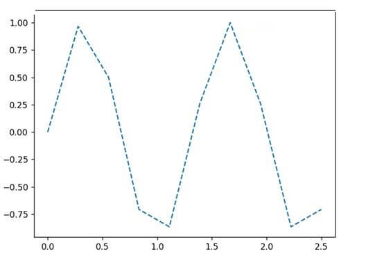
Method 1: set_linestyle():
We can use the set_linestyle() method and pass the strings with its parameters. Here is a code snippet showing how to use it.
import seaborn as sns
import numpy as np
import matplotlib.pyplot as plt
s = 10
g = np.linspace(0, 2.5, s)
k = np.sin(1.5*np.pi*g)
z = sns.lineplot(g, k)
z.lines[0].set_linestyle("--")
plt.show()
Output
We can use the following parameters here.
- Solid
- Dashed
- Dotted
- Dashdot
- None
Or,
- ‘-‘
- ‘:’
- ‘–‘
- ‘-.’
- ‘ ‘
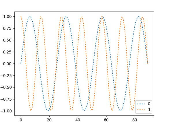
Method 2: Using the dashes parameter: The Seaborn lineplot() has a dashes parameter that also helps set custom lines for the line plot. Here is a code snippet showing how to use it.
import seaborn as sns
import numpy as np
import matplotlib.pyplot as plt
import pandas as pd
s = 90
g = np.linspace(0, 5, s)
y1 = np.sin(1.4*np.pi*g)
y2 = np.cos(2.5*np.pi*g)
dataf = pd.DataFrame(np.c_[y1, y2])
ax = sns.lineplot(data = dataf, dashes=[(2, 2), (2, 2)])
plt.show()
Output

Method 3: Using the linestyle parameter: Using the linestyle parameter of the Seaborn lineplot(), we can determine customized styles for our lines. Here is a code snippet showing how to implement it.
import seaborn as sns
import numpy as np
import matplotlib.pyplot as plt
import pandas as pd
s = 90
g = np.linspace(0, 5, s)
y1 = np.sin(1.4*np.pi*g)
y2 = np.cos(2.5*np.pi*g)
dataf = pd.DataFrame(np.c_[y1, y2])
ax = sns.lineplot(data = dataf, linestyle='-.')
plt.show()
Output
Change line color
There are two different ways to change the line color of a line plot by seaborn. These are;
Method 1: Using the color parameter: We can use the color parameter of the lineplot() and pass the color code or color name as a string to change the line color. Here is a code snippet showing how to use it.
import pandas as pd
import seaborn as sns
import matplotlib.pyplot as plt
yr = [2014, 2016, 2017, 2018, 2020, 2019, 2022]
revenuePercent = [60.2, 89.8, 78, 81, 73.3, 69, 93.2]
datf = pd.DataFrame({"Year":yr, "Profit":revenuePercent})
sns.lineplot(x = "Year", y = "Profit", data=datf, color="r")
plt.show()
Output

Method 2: Using the palette parameter: We can use the palette parameter of the lineplot() and pass the palette color code or color name as a string to change the line color. Here is a code snippet showing how to use it.
import seaborn as sns
import numpy as np
import matplotlib.pyplot as plt
import pandas as pd
s = 90
g = np.linspace(0, 2, s)
y1 = np.sin(1.4*np.pi*g)
y2 = np.cos(2.5*np.pi*g)
dataf = pd.DataFrame(np.c_[y1, y2])
sns.lineplot(data=dataf, palette="rocket")
plt.show()
Output
Change the marker size
A graph contains various indicators as icons that show what the data wants to say about the plot. Markers are special symbols used to represent data visualization creators and data analysts to beautify the process of demonstrating the visual.
We can customize the marker using the marker attribute while plotting the graph.
Here is a list of symbols and their associated shapes and a description of what they form when used within a plot.
| Markers | What mark/shape do they create? |
|---|---|
| “.” | It creates a point |
| “, “ | It creates a pixel |
| “o” | It creates a circle |
| “v” | It creates a triangle_downward |
| “^” | It creates a triangle_upward |
| “<“ | It creates a triangle left-facing |
| “>” | It creates a triangle right-facing |
| “1” | It creates a tri_down |
| “2” | It creates a tri_up |
| “3” | It creates a tri_left |
| “4” | It creates a tri_right |
| “8” | It creates an octagon |
| “s” | It creates a square |
| “p” | It creates a pentagon |
| “P” | It creates a plus (filled) |
| “*” | It creates a star |
| “h” | It creates a hexagon1 |
| “H” | It creates a hexagon2 |
| “+” | It creates a plus-shaped marker |
| “x” | It creates a ‘x’-shaped marker |
| “X” | It creates a ‘x’ (filled) |
| “D” | It creates a diamond-shaped marker |
| “d” | It creates a thin diamond-shaped marker |
| “|” | It creates a vline |
| “_” | It creates a hline |
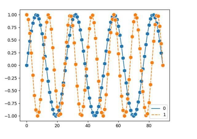
We can also change the size of the marker in a Seaborn line plot by changing the value of the markersize parameter of the seaborn.lineplot(). Here is a code snippet showing how to use it.
import seaborn as sns
import numpy as np
import matplotlib.pyplot as plt
import pandas as pd
s = 90
g = np.linspace(0, 5, s)
y1 = np.sin(1.4*np.pi*g)
y2 = np.cos(2.5*np.pi*g)
dataf = pd.DataFrame(np.c_[y1, y2])
ax = sns.lineplot(data=dataf, marker= 'h', markersize=10)
plt.show()
Output
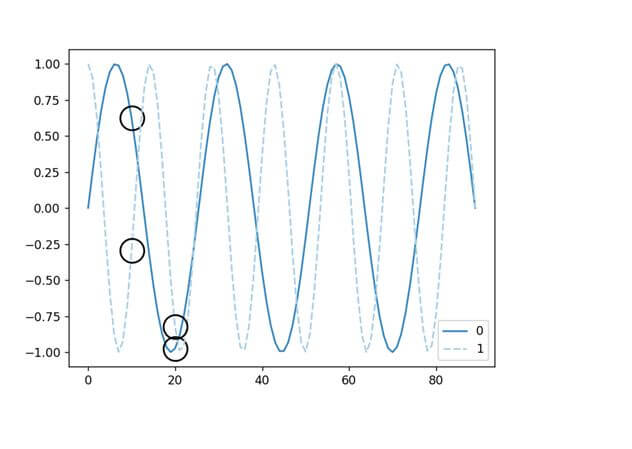
Mark a specific point
Often we need to mark a specific point in the line plot to highlight that point for clarity. That is when we need to use the markevery parameter.
We have to pass a list with values for marking different points with a small black circle. Here is a code snippet showing how to use it.
import seaborn as sns
import numpy as np
import matplotlib.pyplot as plt
import pandas as pd
s = 90
g = np.linspace(0, 5, s)
y1 = np.sin(1.4*np.pi*g)
y2 = np.cos(2.5*np.pi*g)
dataf = pd.DataFrame(np.c_[y1, y2])
sns.lineplot(data=dataf, palette="Blues_r", marker = 'o', markersize=20, fillstyle='none', markeredgewidth=1.5, markeredgecolor='black', markevery=[10, 20])
plt.show()
Output
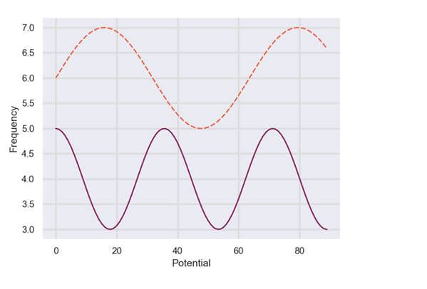
Set line plot opacity
We can tweak with the transparency of the line plot by changing the alpha parameter’s value.
As the alpha parameter’s value decreases, the opacity decreases making the line translucent and vice versa to increase the opacity.
Here is a code segment showing how to implement the alpha parameter within the Seaborn’s lineplot() method.
import seaborn as sns
import numpy as np
import matplotlib.pyplot as plt
import pandas as pd
s = 90
g = np.linspace(0, 2, s)
y1 = np.sin(1.4*np.pi*g)
y2 = np.cos(2.5*np.pi*g)
dataf = pd.DataFrame(np.c_[y1, y2])
dataf2 = pd.DataFrame(np.c_[y2+4, y1+6])
sns.lineplot(data=dataf, palette="rocket", alpha = 0.08)
sns.lineplot(data=dataf2, palette="Blues_r", alpha = 0.9)
plt.show()
Output
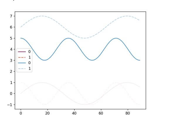
In this code, you can see two different pairs of line graphs with varied alpha values.
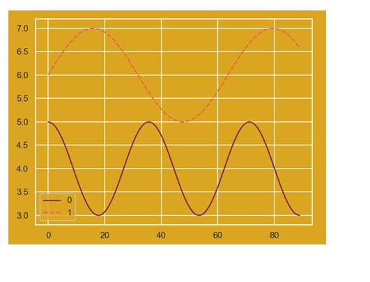
Change background color
We can add or change the background of the Seaborn line plot through different techniques. These are:
Method 1: Using the seaborn.set() method: To configure the aesthetics of the line plot, we usually use the set() method.
There is no direct argument or method to change the background from white or add background color to a plot. Here is a code snippet showing how to implement it.
import seaborn as sns
import numpy as np
import matplotlib.pyplot as plt
import pandas as pd
s = 90
g = np.linspace(0, 2, s)
y1 = np.sin(1.4*np.pi*g)
y2 = np.cos(2.5*np.pi*g)
dataf = pd.DataFrame(np.c_[y1, y2])
dataf2 = pd.DataFrame(np.c_[y2+4, y1+6])
sns.set(rc={'axes.facecolor':'goldenrod', 'figure.facecolor':'goldenrod'})
sns.lineplot(data=dataf2, palette="rocket", alpha = 1.0)
plt.show()
Output
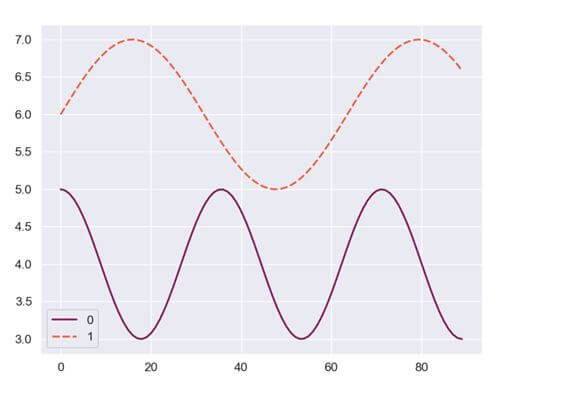
Method 2: Using the set_style() method: We can use the set_style() method to set the background theme for the line plot, hence changing the color. Here is a code showing how to do it.
import seaborn as sns
import numpy as np
import matplotlib.pyplot as plt
import pandas as pd
s = 90
g = np.linspace(0, 2, s)
y1 = np.sin(1.4*np.pi*g)
y2 = np.cos(2.5*np.pi*g)
dataf = pd.DataFrame(np.c_[y1, y2])
dataf2 = pd.DataFrame(np.c_[y2+4, y1+6])
sns.set_style("darkgrid")
sns.lineplot(data = dataf2, palette = "rocket", alpha = 1.0)
plt.show()
Output
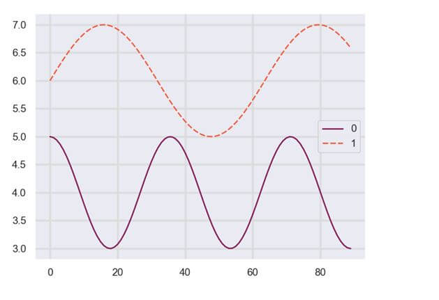
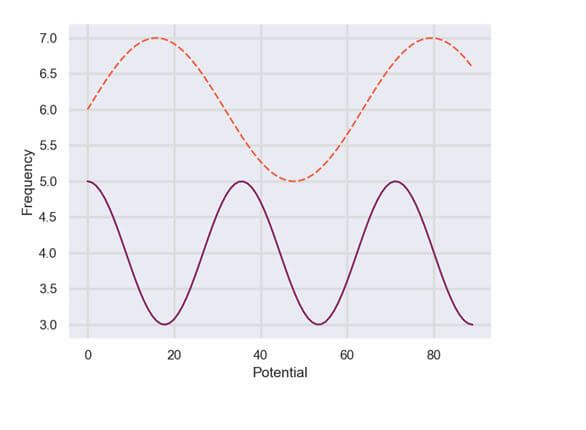
Change legend position
A legend is a small box that exists on any one side or corner of the plot containing multiple color lines associated with some text to determine various element types associated with the plot.
Legends act as indicators of the component the data is representing.
We can also change the position of the legend using the matplotlib.pyplot’s legend() method’s loc parameter. We can also specify other location values to the loc:
- upper right
- center left
- center right
- upper left
- lower left
- lower center
- upper center
- lower right
- right
- center
Here is a code snippet showing how to use it.
import seaborn as sns
import numpy as np
import matplotlib.pyplot as plt
import pandas as pd
s = 90
g = np.linspace(0, 2, s)
y1 = np.sin(1.4*np.pi*g)
y2 = np.cos(2.5*np.pi*g)
dataf = pd.DataFrame(np.c_[y1, y2])
dataf2 = pd.DataFrame(np.c_[y2+4, y1+6])
sns.set()
plt.grid(color = 'gainsboro', linestyle = '-', linewidth = 2)
sns.lineplot(data = dataf2, palette = "rocket", alpha = 1.0)
plt.legend(loc = 'center right')
plt.show()
Output
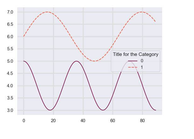
Set/change legend title
We can add a legend title by using the title parameter of the legend() method. To further change it, we can use that same title parameter. Here is a code snippet showing how to use it.
import seaborn as sns
import numpy as np
import matplotlib.pyplot as plt
import pandas as pd
s = 90
g = np.linspace(0, 2, s)
y1 = np.sin(1.4*np.pi*g)
y2 = np.cos(2.5*np.pi*g)
dataf = pd.DataFrame(np.c_[y1, y2])
dataf2 = pd.DataFrame(np.c_[y2+4, y1+6])
sns.set()
plt.grid(color = 'gainsboro', linestyle = '-', linewidth = 2)
sns.lineplot(data = dataf2, palette = "rocket", alpha = 1.0)
plt.legend(loc = 'center right', title = 'Title for the Category')
plt.show()
Output
Order Legend
import seaborn as sns
import pandas as pd
import matplotlib.pyplot as plt
data = {
    'Month': ['Jan', 'Feb', 'Mar', 'Apr']*3,
    'Value': [50, 60, 55, 65, 70, 75, 72, 77, 80, 82, 85, 87],
    'Plan': ['Plan A', 'Plan A', 'Plan A', 'Plan A',
             'Plan B', 'Plan B', 'Plan B', 'Plan B',
             'Plan C', 'Plan C', 'Plan C', 'Plan C']
}
df = pd.DataFrame(data)
sns.lineplot(data=df, x='Month', y='Value', hue='Plan')

# Reordering the legend
handles, labels = plt.gca().get_legend_handles_labels()
order = [2, 0, 1]  # custom order (index based)
plt.legend([handles[idx] for idx in order],[labels[idx] for idx in order])
plt.show()
Output:
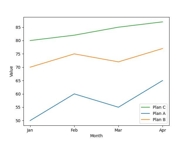
In this code, the order list determines the new order of the legend items.
Remove the legend
There are two different ways to remove a legend from seaborn’s line plot.
Method 1: Using the legend parameter: The lineplot() comes with a legend parameter that is set to True. We can use the False keyword as value to disable the legend in a plot. Here is a code snippet showing how to use it.
import seaborn as sns
import pandas as pd
import matplotlib.pyplot as plt
arry = [[11, 1, 0, 2, 0, 1],
         [3, 8, 0, 1, 2, 11],
         [0, 10, 3, 1, 6, 10],
         [0, 0, 10, 4, 3, 7]]

datf = pd.DataFrame(arry, range(4), range(6))
sns.lineplot(data = datf, legend = False)
plt.title("RANDOM LINE GENERATOR")
plt.show()
Output

Method 2: Using the Matplotlib.pyplot.legend() method: Seaborn runs on top of matplotlib. The matplotlib.pyplot.legend() function helps in adding a customized legend to the Seaborn plots.
We can use the legend() from matplotlib.pyplot to remove it also. We can pass blank lists and set the frameon parameter as False. Here is a code showing how to use it.
import seaborn as sns
import pandas as pd
import matplotlib.pyplot as plt
arry = [[11, 1, 0, 2, 0, 1],
         [3, 8, 0, 1, 2, 11],
         [0, 10, 3, 1, 6, 10],
         [0, 0, 10, 4, 3, 7]]

datf = pd.DataFrame(arry, range(4), range(6))
sns.lineplot(data = datf)
plt.title("RANDOM LINE GENERATOR")
plt.legend([],[], frameon=False)
plt.show()
Output

Method 3: Using the remove() method: The legend_.remove() method is another popular way of removing a legend from a plot. Here is a code snippet showing how to implement it.
import seaborn as sns
import pandas as pd
import matplotlib.pyplot as plt
arry = [[11, 1, 0, 2, 0, 1],
         [3, 8, 0, 1, 2, 11],
         [0, 10, 3, 1, 6, 10],
         [0, 0, 10, 4, 3, 7]]

datf = pd.DataFrame(arry, range(4), range(6))
gk = sns.lineplot(data = datf)
plt.title("RANDOM LINE GENERATOR")
gk.legend_.remove()
plt.show()
Output

Add labels
Method 1: Using set() method: In the set() method, we have to pass the xlabel and ylabel parameter values to determine the labels for the x and y axes. Here is a code snippet showing how to use it.
import seaborn as sns
import numpy as np
import matplotlib.pyplot as plt
import pandas as pd
s = 90
g = np.linspace(0, 2, s)
y1 = np.sin(1.4*np.pi*g)
y2 = np.cos(2.5*np.pi*g)
dataf = pd.DataFrame(np.c_[y1, y2])
dataf2 = pd.DataFrame(np.c_[y2+4, y1+6])
sns.set()
plt.grid(color = 'gainsboro', linestyle = '-', linewidth = 2)
gk = sns.lineplot(data = dataf2, palette = "rocket", alpha = 1.0, legend = False)
gk.set(xlabel = "Potential", ylabel = "Frequency")
plt.show()
Output
Method 2: Using matplotlib’s xlabel() and ylabel(): Seaborn uses matplotlib, which is why it becomes easy to integrate matplotlib methods with Seaborn.
We can use the xlabel() and ylabel() methods to set labels for the x and y axes. Here is a code snippet showing how to use it.
import seaborn as sns
import numpy as np
import matplotlib.pyplot as plt
import pandas as pd
s = 90
g = np.linspace(0, 2, s)
y1 = np.sin(1.4*np.pi*g)
y2 = np.cos(2.5*np.pi*g)
dataf = pd.DataFrame(np.c_[y1, y2])
dataf2 = pd.DataFrame(np.c_[y2+4, y1+6])
sns.set()
plt.grid(color='gainsboro', linestyle='-', linewidth=2)
gk = sns.lineplot(data=dataf2, palette="rocket", alpha = 1.0, legend=False)
plt.xlabel('Potential')
plt.ylabel('Frequency')
plt.show()
Output
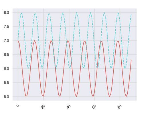
Rotate labels
Method 1: using xticks() method: We can use the matplotlib’s xticks() method to rotate the labels for x-axis. Here is a code snippet showing how to use it.
import seaborn as sns
import numpy as np
import matplotlib.pyplot as plt
import pandas as pd
s = 90
g = np.linspace(0, 2, s)
y1 = np.sin(8.2*np.pi*g)
y2 = np.cos(6.8*np.pi*g)
dataf = pd.DataFrame(np.c_[y1, y2])
dataf2 = pd.DataFrame(np.c_[y2+6, y1+7])
sns.set()
plt.grid(color='gainsboro', linestyle='-', linewidth=2)
gk = sns.lineplot(data=dataf2, palette="hls", alpha = 1.0, legend=False)
plt.xticks(rotation=45)
plt.show()
Output
Method 2: Using the setp() method: This method also allows us to rotate the x-axis labels. Here is the code snippet on how to implement it.
import seaborn as sns
import numpy as np
import matplotlib.pyplot as plt
import pandas as pd
s = 90
g = np.linspace(0, 2, s)
y1 = np.sin(8.2*np.pi*g)
y2 = np.cos(6.8*np.pi*g)
dataf = pd.DataFrame(np.c_[y1, y2])
dataf2 = pd.DataFrame(np.c_[y2+6, y1+7])
sns.set()
plt.grid(color='gainsboro', linestyle='-', linewidth=2)
gk = sns.lineplot(data=dataf2, palette="hls", alpha = 1.0, legend=False)
locs, labels = plt.xticks()
plt.setp(labels, rotation=45)
plt.show()
Output
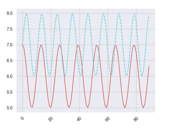
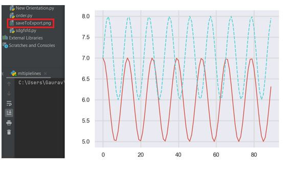
Save/export figure
We can use the matplotlib’s savefig() method to save the figure in PNG or JPG files.
We can then export it or use it in various other cases. Here is a code snippet showing how to save a file to export it.
import seaborn as sns
import numpy as np
import matplotlib.pyplot as plt
import pandas as pd
s = 90
g = np.linspace(0, 2, s)
y1 = np.sin(8.2*np.pi*g)
y2 = np.cos(6.8*np.pi*g)
dataf = pd.DataFrame(np.c_[y1, y2])
dataf2 = pd.DataFrame(np.c_[y2+6, y1+7])
sns.set()
plt.grid(color='gainsboro', linestyle='-', linewidth=2)
gk = sns.lineplot(data=dataf2, palette="hls", alpha = 1.0, legend=False)
plt.savefig('saveToExport.png')
plt.show()
Output
Attribute error module Seaborn has no attribute line plot
It is a common error you might encounter dealing with Seaborn. If the seaborn in your system is not up-to-date or requires an immediate upgrade, you might encounter such an error.
Again when the latest Seaborn version is not compatible with your system or IDE, this error might generate. To fix such an error, you should update your seaborn library.
To do this, run your command and type the following command:
pip install -U seaborn
If you are using Jupyter Notebook, then type:
pip install seaborn –upgrade
Gaurav is a Full-stack (Sr.) Tech Content Engineer (6.5 years exp.) & has a sumptuous passion for curating articles, blogs, e-books, tutorials, infographics, and other web content. Apart from that, he is into security research and found bugs for many govt. & private firms across the globe. He has authored two books and contributed to more than 500+ articles and blogs. He is a Computer Science trainer and loves to spend time with efficient programming, data science, Information privacy, and SEO. Apart from writing, he loves to play foosball, read novels, and dance.