Highlight Cells & Rows in Seaborn Heatmap
In this tutorial, you’ll learn how to highlight cells, and rows in Seaborn heatmaps.
These methods are invaluable for confirming particular aspects of your data, be it outliers, critical thresholds, or specific categories.
Highlight Based on Threshold Values
First, let’s import the necessary libraries and create a sample dataset. For this example, we’re using a dataset that represents metrics like call duration, data usage, and customer satisfaction scores for a telecom company.
import seaborn as sns
import pandas as pd
import numpy as np
np.random.seed(0)
data = np.random.rand(10, 3)
columns = ['Call Duration', 'Data Usage', 'Satisfaction Score']
df = pd.DataFrame(data, columns=columns)
print(df)
Output:
   Call Duration  Data Usage  Satisfaction Score
0       0.548814    0.715189            0.602763
1       0.544883    0.423655            0.645894
2       0.437587    0.891773            0.963663
3       0.383442    0.791725            0.528895
4       0.568045    0.925597            0.071036
5       0.087129    0.020218            0.832620
6       0.778157    0.870012            0.978618
7       0.799159    0.461479            0.780529
8       0.118274    0.639921            0.143353
9       0.944669    0.521848            0.414662
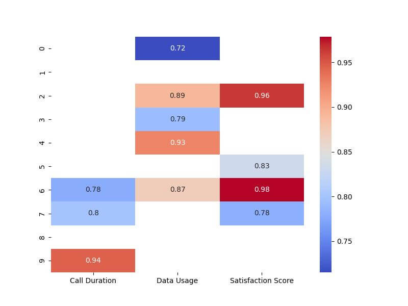
Next, let’s create a heatmap and highlight cells where values exceed a certain threshold. For instance, we want to highlight cells where values are greater than 0.7.
import matplotlib.pyplot as plt
threshold = 0.7
mask = df > threshold
plt.figure(figsize=(8, 6))
sns.heatmap(df, mask=~mask, annot=True, cmap='coolwarm')
plt.show()
Output:
Highlight Cells with Lowest or Highest Value
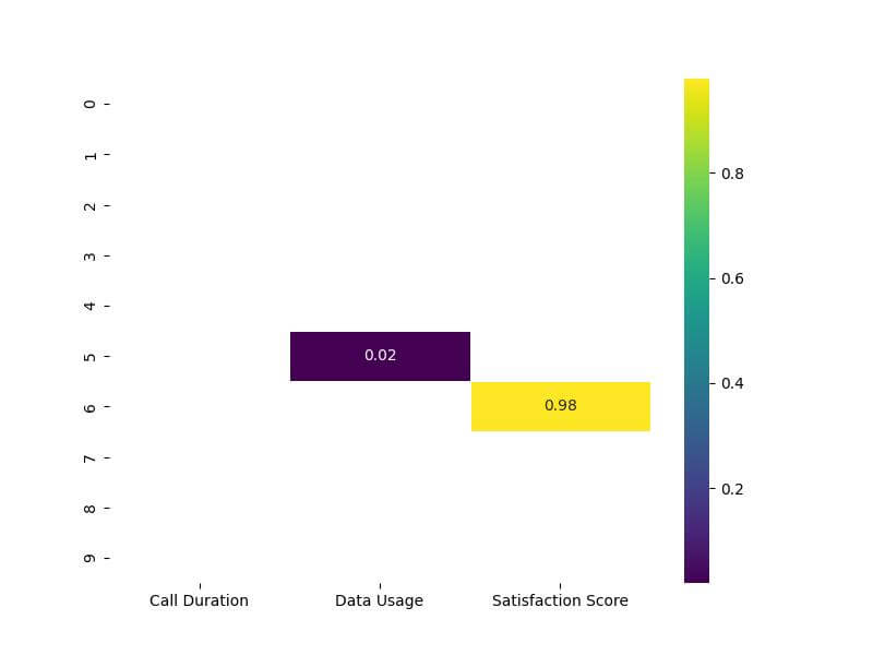
Continuing from our previous example with the telecom dataset, we will first find the minimum and maximum values in the DataFrame. Then, we’ll create a mask to highlight these values in the heatmap.
# Finding the minimum and maximum values
min_val = df.min().min()
max_val = df.max().max()

# Creating masks for the min and max values
min_mask = df == min_val
max_mask = df == max_val

# Combining masks
combined_mask = min_mask | max_mask
Now, let’s plot the heatmap and apply our combined mask to highlight the cells with the lowest and highest values.
# Plotting the heatmap
plt.figure(figsize=(8, 6))
sns.heatmap(df, mask=~combined_mask, annot=True, cmap='viridis', linewidths=.5)
plt.show()
Output:
Conditional Highlighting Using Custom Functions
First, let’s define a custom function that will determine our highlighting criteria. For instance, suppose we want to highlight cells where the call duration is unusually long and the satisfaction score is low.
def highlight_criteria(cell_value, max_duration, low_satisfaction):
    if cell_value > max_duration or cell_value < low_satisfaction:
        return True
    return False

# Applying the custom function to create a mask
mask = df.map(lambda x: highlight_criteria(x, 0.8, 0.2))
A mask is created based on the custom function, where cells are marked for highlighting if the call duration is greater than 0.8 or the satisfaction score is less than 0.2.
Now, let’s apply this mask to our heatmap to visualize the results.
# Plotting the heatmap with conditional highlighting
plt.figure(figsize=(8, 6))
sns.heatmap(df, mask=~mask, annot=True, cmap='plasma', linewidths=.5)
plt.show()
Output:
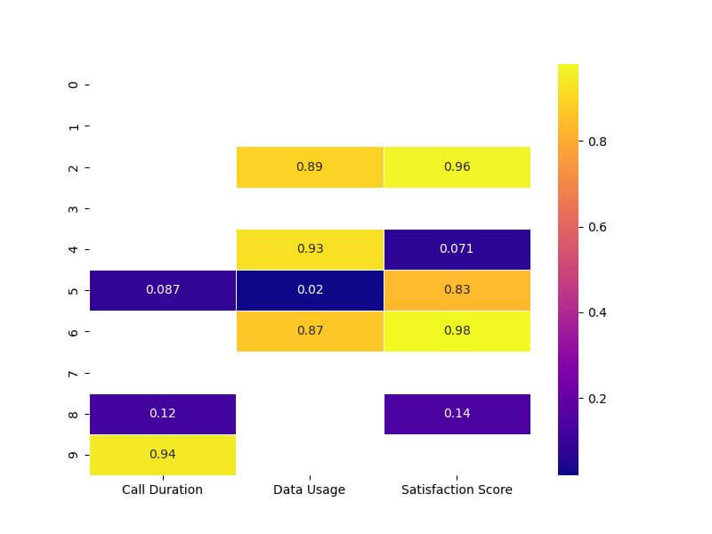
The mask is applied inversely (~mask) to ensure that only the specified cells are emphasized.
Highlight Entire Row
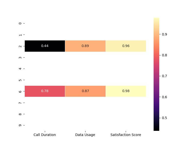
Assuming we want to highlight rows based on a specific condition, such as rows where the average value across all metrics exceeds a certain threshold, we’ll first calculate these averages and then create a row-wise mask.
row_avg = df.mean(axis=1)
avg_threshold = 0.7
row_mask = row_avg > avg_threshold
row_mask = row_mask.to_numpy()[:, np.newaxis]
row_mask = np.repeat(row_mask, 3, axis=1)
A boolean mask, row_mask, is generated where each row is marked True if its average is greater than 0.7, otherwise False.
This mask is aligned for row-wise application in the heatmap.
Now, let’s apply this row mask to our heatmap to highlight the entire rows that meet our condition.
plt.figure(figsize=(8, 6))
sns.heatmap(df, mask=~row_mask, annot=True, cmap='magma', linewidths=.5)
plt.show()
Output:
Mokhtar is the founder of LikeGeeks.com. He is a seasoned technologist and accomplished author, with expertise in Linux system administration and Python development. Since 2010, Mokhtar has built an impressive career, transitioning from system administration to Python development in 2015. His work spans large corporations to freelance clients around the globe. Alongside his technical work, Mokhtar has authored some insightful books in his field. Known for his innovative solutions, meticulous attention to detail, and high-quality work, Mokhtar continually seeks new challenges within the dynamic field of technology.