Seaborn histplot (Visualize data with histograms)
Seaborn is one of the most widely known data visualization libraries that run on top of Matplotlib.
Through Seaborn, we can render various types of plots and offers a straightforward, intuitive, yet highly customizable API to generate visualizations around data.
Without rich visualization, it becomes difficult to understand and communicate with data.
Data analysts and data science professionals who want to visualize data points and histogram plots or show distribution data instead of count data should use histogram plots in Seaborn.
In this tutorial, we will discuss what is histplot() and how to use it in different ways to generate histograms.
- 1 What is a histogram?
- 2 What is Seaborn histplot and how to use it?
- 3 Plot Histogram from Dictionary
- 4 Plotting Histogram from NumPy Array
- 5 Add labels
- 6 Remove xlabel or ylabel
- 7 histogram with KDE
- 8 Add a title
- 9 Set font size
- 10 Set custom palette
- 11 Histograms with different colors
- 12 Histogram with conditional color
- 13 Change opacity
- 14 Change axis range
- 15 Add space between bars
- 16 Changing the orientation
- 17 Histogram with dates
- 18 Change Histogram Bar Width
- 19 Show Count Labels
- 20 No attribute error
What is a histogram?
The histogram is a graphical representation of data points formed under a fixed range specified by the programmer or user.
Actually, it’s a bar plot but condensed under data series into an easily interpreted visual by carrying many data points & groups them into logical bins or ranges.
On the horizontal X-axis, the graph holds a range of classes & the vertical y-axis represents the number count or rate of occurrences of a data for each column.
What is Seaborn histplot and how to use it?
We use the seaborn.histplot() to generate a histogram plot through seaborn. The syntax of histplot() is:
seaborn.histplot(data, x, y, hue, stat, bins, bandwidth, discrete, KDE, log_scale)
The parameters are:
- data: It is the input data provided mostly as a DataFrame or NumPy array.
- x, y (optional parameters): The key of the data to be positioned on the x & y axes respectively
- hue (optional parameter): semantic data key which is mapped to determine the color of plot elements
- stat (optional): It measures the frequency, count, density, or probability
- Kernel Density Estimation (KDE): It is one of the mechanisms used to smoothen a histogram plot.
Here is a code snippet:
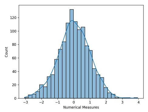
import seaborn as sns
import numpy as np
import pandas as pd
import matplotlib.pyplot as plt
# Creating arbitrary dataset from random numbers
np.random.seed(1)
numb_var = np.random.randn(1200)
numb_var = pd.Series(numb_var, name = "Numerical Measures")

# Plotting the histogram
sns.histplot(data = numb_var, kde=True)
plt.show()
Output
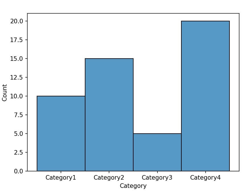
Plot Histogram from Dictionary
You can convert the dictionary into a Pandas DataFrame and then plot a histogram.
import seaborn as sns
import pandas as pd
import matplotlib.pyplot as plt
data_dict = {'Category1': 10, 'Category2': 15, 'Category3': 5, 'Category4': 20}
df = pd.DataFrame(list(data_dict.items()), columns=['Category', 'Frequency'])
sns.histplot(data=df, x='Category', weights='Frequency', bins=len(data_dict))
plt.show()
Output
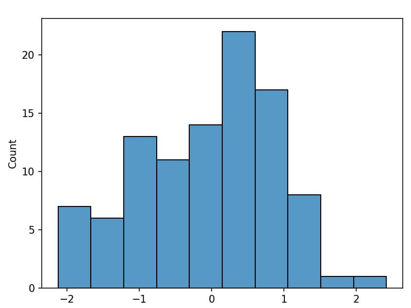
Plotting Histogram from NumPy Array
If your data is in a NumPy array, you can directly plot a histogram using Seaborn:
import seaborn as sns
import numpy as np
import matplotlib.pyplot as plt
data_array = np.random.normal(size=100)
sns.histplot(data_array, bins=10)
plt.show()
Output
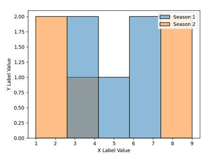
Add labels
We often need to label the x-axis and y-axis for better identification of or give meaning to the plot. Seaborn offers two different ways to set the labels for the x and y axes.
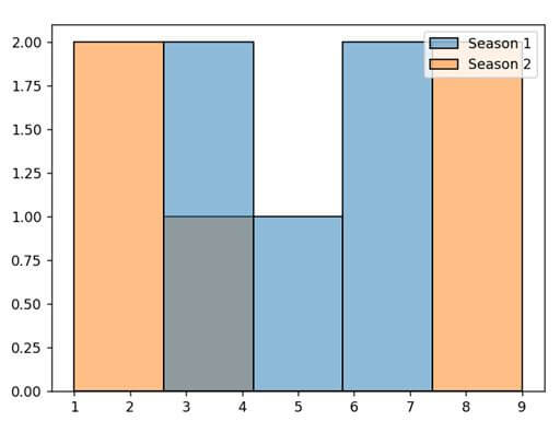
Method 1: Using the set() method: The set() method allows us to set the labels where we have to pass the strings for xlabel and ylabel parameters. Here is a code snippet showing how we can perform that.
import pandas as pd
import matplotlib.pyplot as plt
import seaborn as sns
datf = pd.DataFrame({"Season 1": [7, 4, 5, 6, 3],
                 "Season 2" : [1, 2, 8, 4, 9]})
p = sns.histplot(data = datf)
p.set(xlabel="X Label Value", ylabel = "Y Label Value")
plt.show()
Output
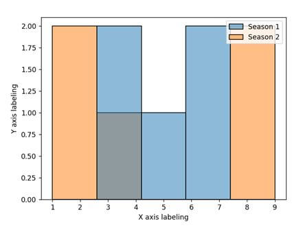
Method 2: Using Matplotlib’s xlabel() and ylabel(): Seaborn runs on top of Matplotlib. Thus, it allows us to leverage Matplotlib pyplot’s xlabel() and ylabel() to create so. The code snippet will look like:
import pandas as pd
import matplotlib.pyplot as plt
import seaborn as sns
datf = pd.DataFrame({"Season 1": [7, 4, 5, 6, 3],
                 "Season 2" : [1, 2, 8, 4, 9]})
p = sns.histplot(data = datf)
plt.xlabel('X axis labeling')
plt.ylabel('Y axis labeling')
plt.show()
Output
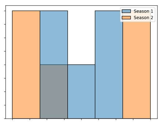
Remove xlabel or ylabel
Removing the xlabel and ylabel from a histogram is possible in two different ways. These are:
Method 1: Using the set() method: The set() method allows us to specify the parameter name & pass the strings for xlabel and ylabel parameters with None value.
Setting the value as None (keyword) will make the labels blank and hence will not be displayed in the plot. Here is a code snippet for the same.
import pandas as pd
import matplotlib.pyplot as plt
import seaborn as sns
datf = pd.DataFrame({"Season 1": [7, 4, 5, 6, 3],
                 "Season 2" : [1, 2, 8, 4, 9]})
p = sns.histplot(data = datf)
p.set(xlabel = None)
p.set(ylabel = None)
plt.show()
Output
Method 2: Using set_ticklabels() method: This is another method to create empty labels is by using yte xaxis.set_ticklabels() and yaxis.set_ticklabels() and pass an empty list [] as parameter.
In this case, along with the labels, it also removes the tick values or units from the plot. The code snippet will look like:
Output
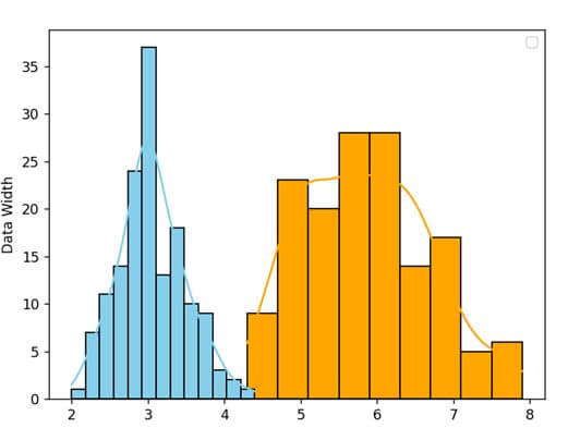
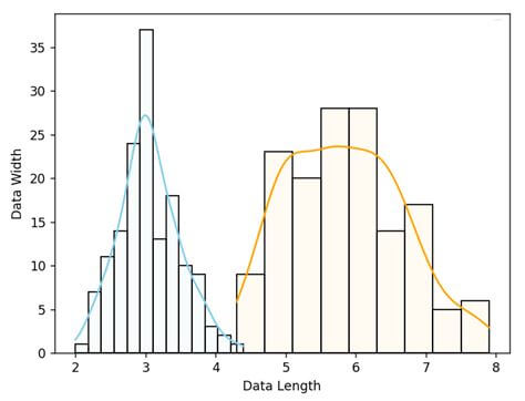
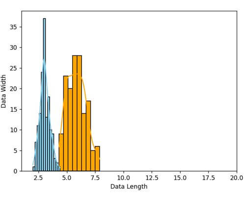
histogram with KDE
Kernel Density Estimation (KDE) is a method of gauging the continuous random variable’s probability density and probability function.
It will generate a wavy line mainly used for non-parametric analysis of the plot. In seaborn’s histplot(), the method has a KDE parameter that accepts True or False.
If you set it to true, it will display the line to measure the probability density. Here is a code snippet showing how to disable and enable it with histogram plots.
import seaborn as sns
import matplotlib.pyplot as plt
datf = sns.load_dataset("iris")
z= sns.histplot(data=datf, x="sepal_length", color="orange", alpha = 1.0, kde = True)
z= sns.histplot(data=datf, x="sepal_width", color="skyblue", alpha = 1.0, kde = True)
z.set_xlabel("Data Length")
z.set_ylabel("Data Width")
plt.legend()
plt.show()
Output
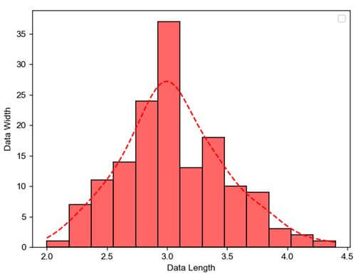
We can also customize the KDE line using the line_kws parameter that accepts a dictionary as a parameter.
import seaborn as sns
import matplotlib.pyplot as plt
datf = sns.load_dataset("iris")
z = sns.histplot(data=datf, x = "sepal_width", color = "red", alpha = 0.6, kde = True, line_kws = {'color':'red','linestyle': 'dashed'})
z.set_xlabel("Data Length")
z.set_ylabel("Data Width")
plt.legend()
plt.show()
Output
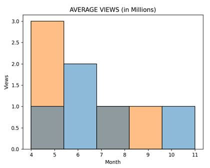
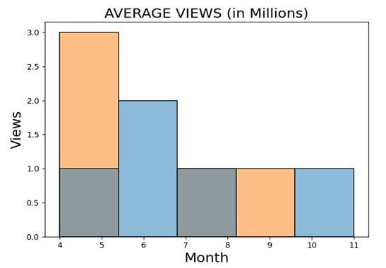
Add a title
There are different ways we can provide a Title to a Graph. These are:
Method 1: Using the set() method: It will take a single argument “title” as a parameter and will accept strings as values to it.
import pandas as pd
import matplotlib.pyplot as plt
import seaborn as sns
datf = pd.DataFrame({"Season 1": [8, 6, 6, 11, 4],
                 "Season 2" : [4, 5, 7, 4, 9]})
p = sns.histplot(data = datf).set(title = "AVERAGE VIEWS (in Millions)")
plt.xlabel('Month')
plt.ylabel('Views')
plt.legend([],[], frameon = False)
plt.show()
Output
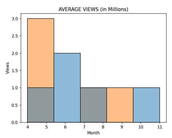
Method 2: Using the set_title() method: This method works as a helping substitute method for string and takes the string as a parameter within the plot. Here is a code snippet on how to use it.
import pandas as pd
import matplotlib.pyplot as plt
import seaborn as sns
datf = pd.DataFrame({"Season 1": [8, 6, 6, 11, 4],
                 "Season 2" : [4, 5, 7, 4, 9]})
p = sns.histplot(data = datf).set_title('AVERAGE VIEWS (in Millions)')
plt.xlabel('Month')
plt.ylabel('Views')
plt.legend([],[], frameon = False)
plt.show()
Output
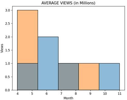
Method 3: Using Matplotlib’s title() method: Since Seaborn runs on top of Matplotlib, we can efficiently utilize Matplotlib’s title() method to specify the title for the plot. Here is a code snippet showing its use.
import pandas as pd
import matplotlib.pyplot as plt
import seaborn as sns
datf = pd.DataFrame({"Season 1": [8, 6, 6, 11, 4],
                 "Season 2" : [4, 5, 7, 4, 9]})
p = sns.histplot(data = datf)
plt.title("AVERAGE VIEWS (in Millions)")
plt.xlabel('Month')
plt.ylabel('Views')
plt.legend([],[], frameon = False)
plt.show()
Output
Set font size
Font size in a plot carries a value in creating a nice visual. There are 2 different techniques we can set the font size for the visualization. These are:
Method 1: Using the fontsize parameter: We can use this parameter with multiple Matplotlib methods like xlabel(), ylabel(), title(), etc. Here is a code snippet showing how to use it.
import pandas as pd
import matplotlib.pyplot as plt
import seaborn as sns
datf = pd.DataFrame({"Season 1": [8, 6, 6, 11, 4],
                 "Season 2" : [4, 5, 7, 4, 9]})
p = sns.histplot(data = datf)
p.set_xlabel("Month", fontsize = 18)
p.set_ylabel("Views", fontsize = 18)
p.set_title("AVERAGE VIEWS (in Millions)", fontsize = 18)
plt.legend([],[], frameon = False)
plt.show()
Output
Method 2: Using the set() method: The set() method also helps to set up the font size for all the fonts related to the plot and font_scale parameter. Here’s how to use it.
import pandas as pd
import matplotlib.pyplot as plt
import seaborn as sns
datf = pd.DataFrame({"Season 1": [8, 6, 6, 11, 4],
                 "Season 2" : [4, 5, 7, 4, 9]})
sns.set(font_scale = 3)
p = sns.histplot(data = datf)
p.set_xlabel("Month")
p.set_ylabel("Views")
p.set_title("AVERAGE VIEWS (in Millions)")
plt.legend([],[], frameon = False)
plt.show()
Output
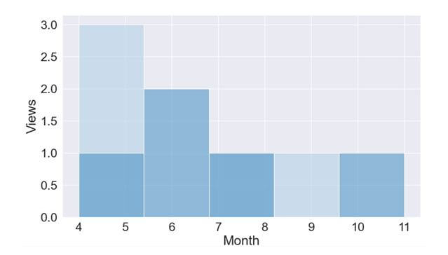
Set custom palette
Palettes are a way of representing various color gradients under one name. We can set the color palette for our histogram using the palette parameter of the histplot() method.
Some well-known palette values are tab10, hls, husl, set2, Paired, rocket, mako, flare, Blues_r, etc. Here is a code snippet showing how to use palettes.
import pandas as pd
import matplotlib.pyplot as plt
import seaborn as sns
datf = pd.DataFrame({"Season 1": [8, 6, 6, 11, 4],
                 "Season 2" : [4, 5, 7, 4, 9]})
sns.set(font_scale = 2)
p = sns.histplot(data = datf, legend=False, palette="Blues_r")
p.set_xlabel("Month")
p.set_ylabel("Views")
plt.show()
Output
 Or,
Or,
p = sns.histplot(data = datf, legend=False, palette="rocket ")
Output
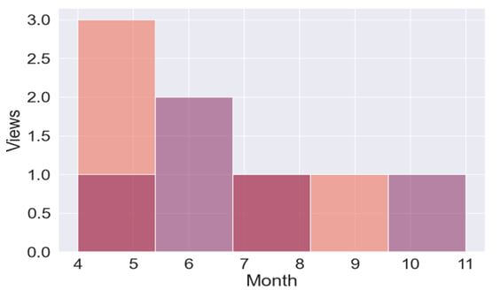
Note that palette names are case sensitive.
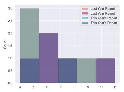
Histograms with different colors
In a single plot, we can generate two histograms having different colors showing two different insights about the data. We can generate in two different ways.
- Using Palette parameter: We can use the palette parameter to generate a histogram plot with different colors. Here is a code snippet showing how to generate a plot with different colors.
import seaborn as sns
import matplotlib.pyplot as plt
import pandas as pd
sns.set(style = "darkgrid")
datf = pd.DataFrame({"Season 1": [8, 6, 6, 11, 4],
                 "Season 2" : [4, 5, 7, 4, 9]})
sns.histplot(data=datf, palette="rocket", label="Last Year Report")
sns.histplot(data=datf, palette="mako", label="This Year's Report")
plt.legend()
plt.show()
Output

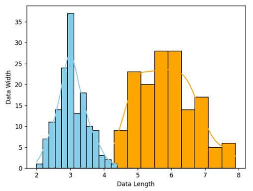
- Using Color parameter: We can use the color parameter to generate a histogram plot with different colors. Here is a code snippet showing how to generate a plot with different colors.
import seaborn as sns
import matplotlib.pyplot as plt
datf = sns.load_dataset("iris")
z= sns.histplot(data=datf, x="sepal_length", color="orange", kde = True)
z= sns.histplot(data=datf, x="sepal_width", color="skyblue", kde = True)
z.set_xlabel("Data Length")
z.set_ylabel("Data Width")
plt.legend()
plt.show()
Output


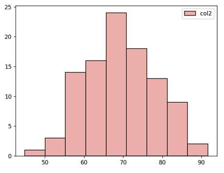
Histogram with conditional color
We can simply use the if statements to determine the conditions. Also, we can generate the plot with color using palette values and random module.
Here is the program showing how to generate a histogram with conditions for colors.
import pandas as pd
import matplotlib.pyplot as plt
import numpy as np
import seaborn as sns
x=int(input("Enter the number to generate a histogram with different color palettes: "))
if x==1:
    df = pd.DataFrame({'col1':'A',
                    'col2':np.random.randn(100) * 10 + 50})
    sns.histplot(data = df, palette = "husl")
if x==2:
    df = pd.DataFrame({'col1':'B',
                    'col2':np.random.randn(100) * 10 + 60})
    sns.histplot(data = df, palette = "Blues_r")
if x==3:
    df = pd.DataFrame({'col1':'C',
                    'col2':np.random.randn(100) * 10 + 70})
    sns.histplot(data = df, palette = "rocket")
if x==4:
    df = pd.DataFrame({'col1':'C',
                    'col2':np.random.randn(100) * 10 + 70})
    sns.histplot(data = df, palette = "hls")
plt.show()
Output
Change opacity
We can change the alpha parameter’s value to change the transparency of the histogram plot. As the alpha value decreases, the opacity decreases.
With the increase in the alpha value, the opacity increases. Here is a code snippet showing how to use the alpha parameter of the histplot() method.
import seaborn as sns
import matplotlib.pyplot as plt
datf = sns.load_dataset("iris")
z= sns.histplot(data=datf, x="sepal_length", color="orange", alpha = 0.05, kde = True)
z= sns.histplot(data=datf, x="sepal_width", color="skyblue", alpha = 0.05, kde = True)
z.set_xlabel("Data Length")
z.set_ylabel("Data Width")
plt.legend()
plt.show()
Output
Now, let us change (increasing value) the alpha value to increase the opacity.
import seaborn as sns
import matplotlib.pyplot as plt
datf = sns.load_dataset("iris")
z= sns.histplot(data=datf, x="sepal_length", color="orange", alpha = 1.0, kde = True)
z= sns.histplot(data=datf, x="sepal_width", color="skyblue", alpha = 1.0, kde = True)
z.set_xlabel("Data Length")
z.set_ylabel("Data Width")
plt.legend()
plt.show()
Output
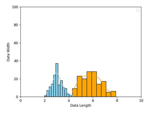
Change axis range
Seaborn allows us to change the axis range for the x and y axes.
Method 1: By using the Matplotlib’s matplotlib.axes.Axes.set_xlim() and matplotlib.axes.Axes.set_ylim() function, we can change the axis range.
Here is a code snippet showing how to change the axis range.
import seaborn as sns
import matplotlib.pyplot as plt
datf = sns.load_dataset("iris")
z= sns.histplot(data=datf, x="sepal_length", color="orange", alpha = 1.0, kde = True)
z= sns.histplot(data=datf, x="sepal_width", color="skyblue", alpha = 1.0, kde = True)
z.set_xlabel("Data Length")
z.set_ylabel("Data Width")
z.set_xlim(1, 20)
#z.set_ylim(1, 10)
plt.legend()
plt.show()
Output
Method 2: We can also use the set() method to change the axis range. Here is a code snippet showing how to change the axis range using set().
import seaborn as sns
import matplotlib.pyplot as plt
datf = sns.load_dataset("iris")
z= sns.histplot(data=datf, x="sepal_length", color="orange", alpha = 1.0, kde = True)
z= sns.histplot(data=datf, x="sepal_width", color="skyblue", alpha = 1.0, kde = True)
z.set_xlabel("Data Length")
z.set_ylabel("Data Width")
z.set(xlim=(0,10),ylim=(0,100))
plt.legend()
plt.show()
Output
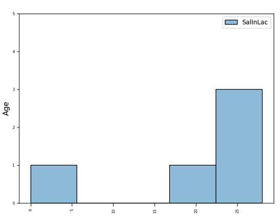
Add space between bars
We can provide spaces between histogram bars. Here is a code snippet showing how to do it.
import matplotlib.pyplot as plt
import seaborn as sns
import pandas as pd
datf = pd.DataFrame({'Name': ['Karl', 'Ray', 'Sue', 'Dee'], 'SalInLac': [25, 28, 21, 26], 'Gender': ['M', 'M', 'F', 'F']})
datf = pd.concat([datf[datf.Gender == 'M'], pd.DataFrame({'Name': [''], 'SalInLac': [0], 'Gender': ['M']}), datf[datf.Gender == 'F']])
age_plot = sns.histplot(data = datf)
plt.setp(age_plot.get_xticklabels(), rotation=90)
plt.ylim(0, 5)
age_plot.tick_params(labelsize = 6)
age_plot.tick_params(length = 5, axis='x')
age_plot.set_ylabel("Age", fontsize=12)
age_plot.set_xlabel("", fontsize=1.5)
plt.tight_layout()
plt.show()
Output
Changing the orientation
We can tweak the x and y parameters to change the orientation of the histogram plot and change it from vertical to horizontal.
We can put the data on the y axis rather than typically putting it in x.
Here is a code snippet showing how to do so:
import matplotlib.pyplot as plt
import seaborn as sns
tips = sns.load_dataset("tips")
tips.head()
#Changing the orientation of the plot
g = sns.histplot(data=tips, y="total_bill", color="lime")
g.set_ylabel("Bill", fontsize=12)
g.set_xlabel("")
plt.show()
Output

Histogram with dates
We can plot dates in all the independent ticks of the histplot. For this, we will take these dates as a list of strings under the DataFrame.
Then, we will use them as x or y values to display them. Here is a code snippet to show how to display dates.
import pandas as pd
import matplotlib.pyplot as plt
import seaborn as sns
datf = pd.DataFrame({'date': ['1/11/2022', '3/21/2022', '5/31/2022', '8/28/2022'],
                   'salesPoint': [11, 9, 10, 16],
                   'Branding_Group': ['A','B','A','B']})
sns.set(font_scale = 2)
ax = sns.histplot(x = 'date', y = 'salesPoint', hue = 'Branding_Group', data = datf)
plt.legend()
plt.show()
Output

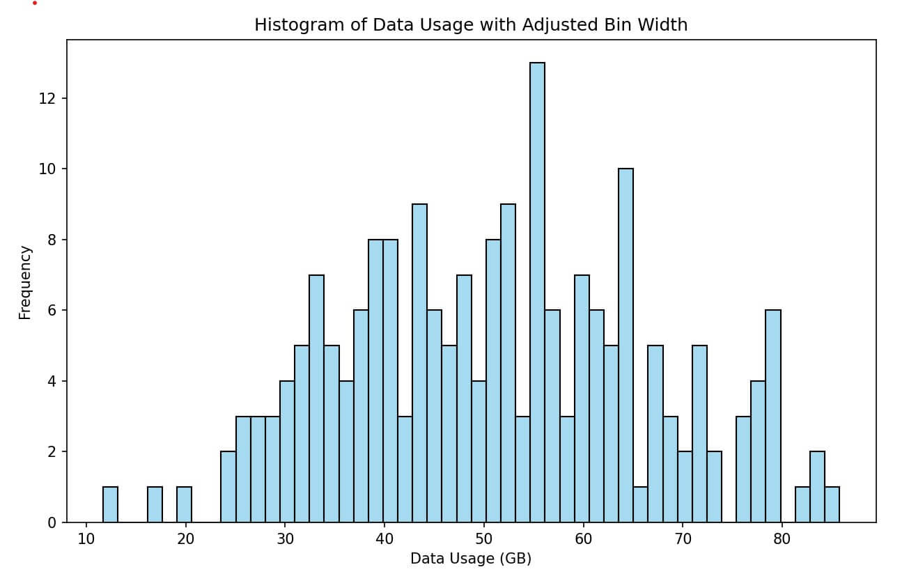
Change Histogram Bar Width
Seaborn itself does not provide a direct parameter to control the bar width of a histogram.
However, you can change the appearance of the bar width by manipulating the bins parameter.
The bins parameter in this function determines the number of bins (or bars) in the histogram.
By increasing the number of bins, each bar becomes narrower, and by decreasing the number of bins, each bar becomes wider.
import seaborn as sns
import matplotlib.pyplot as plt
import pandas as pd
import numpy as np
np.random.seed(0)
data = pd.DataFrame({
    'Data_Usage': np.random.normal(50, 15, 200)  # Example data
})

# Create a histogram with adjusted bin size
plt.figure(figsize=(10, 6))
sns.histplot(data['Data_Usage'], bins=50, color='skyblue')  # Adjust bins here
plt.title('Histogram of Data Usage with Adjusted Bin Width')
plt.xlabel('Data Usage (GB)')
plt.ylabel('Frequency')
plt.show()
Output
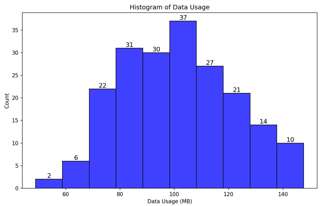
Show Count Labels
You can iterate over the bars in the histogram and use Matplotlib’s text function to add count labels.
import matplotlib.pyplot as plt
import seaborn as sns
import numpy as np
np.random.seed(0)
data_usage = np.random.normal(100, 20, 200) # 200 random data points
plt.figure(figsize=(10, 6))
ax = sns.histplot(data_usage, bins=10, kde=False, color='blue')

# Add count labels to each bar
for p in ax.patches:
    ax.text(p.get_x() + p.get_width() / 2., p.get_height(), int(p.get_height()),
            fontsize=12, ha='center', va='bottom')
plt.title('Histogram of Data Usage')
plt.xlabel('Data Usage (MB)')
plt.ylabel('Count')
plt.show()
Output
No attribute error
It is a prominent error you can face while working with Seaborn and histplot. It usually occurs when your Seaborn is not up to date or requires an upgrade.
Again such an error occurs when there is the latest system but the Seaborn version that you have installed in your system is not compatible with the newer one.
In that case, this error will pop up. To fix this error, you have to update your seaborn library. Run the command in the Notebook or app’s command-line section to fix the issue.
pip install -U seaborn
If you are using Jupyter, then, this code will also work.
pip install seaborn –upgrade
Gaurav is a Full-stack (Sr.) Tech Content Engineer (6.5 years exp.) & has a sumptuous passion for curating articles, blogs, e-books, tutorials, infographics, and other web content. Apart from that, he is into security research and found bugs for many govt. & private firms across the globe. He has authored two books and contributed to more than 500+ articles and blogs. He is a Computer Science trainer and loves to spend time with efficient programming, data science, Information privacy, and SEO. Apart from writing, he loves to play foosball, read novels, and dance.