Tkinter Checkbox Styling (Using ttk Themes & Custom Styling)
In this tutorial, you’ll learn how to customize Tkinter checkboxes (Checkbuttons) using ttk themes, create custom styles, integrate images, and manipulate checkbox properties to reflect different states.
Built-in ttk Themes for Checkboxes
The ttk module in Tkinter provides themed widgets, which are an extension of Tk widgets.
Here’s how you can explore and apply these themes:
import tkinter as tk
from tkinter import ttk
root = tk.Tk()
def change_theme(theme_name):
    style.theme_use(theme_name)
available_themes = ttk.Style().theme_names()
style = ttk.Style()

# Create checkboxes with each theme
for theme in available_themes:
    ttk.Checkbutton(root, text=f"Theme: {theme}", command=lambda t=theme: change_theme(t)).pack()
root.mainloop()
Output:
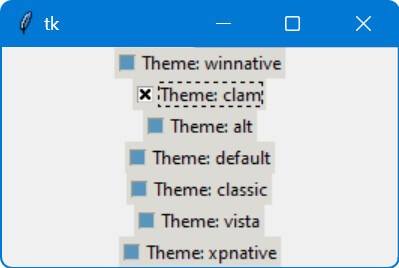
The change_theme function updates the theme of the checkbox and the entire application.
Create Custom ttk Styles for Checkboxes
You can create custom styles for checkboxes using ttk.Style().define().
First, import the necessary modules and create a root window:
import tkinter as tk
from tkinter import ttk
root = tk.Tk()
root.title("Custom Checkbox Styling")
Next, create an instance of ttk.Style and define a new style for the checkbox:
style = ttk.Style()
style.theme_use('default') # Use the default theme as a base
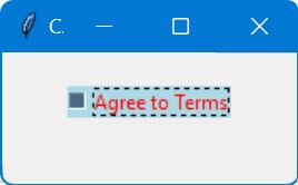
style.configure('CustomCheckbutton.TCheckbutton', background='lightblue', foreground='red')
Now, let’s create a checkbox using this custom style:
checkbox = ttk.Checkbutton(root, text="Agree to Terms", style='CustomCheckbutton.TCheckbutton')
checkbox.pack(pady=20)
root.mainloop()
Output:
Create New Styles From Existing Theme Styles
Inheriting from existing theme styles and overriding properties is a powerful way to create unique and visually appealing interfaces in Tkinter using ttk.
First, import the necessary modules and set up the main window:
import tkinter as tk
from tkinter import ttk
root = tk.Tk()
root.title("Enhanced Checkbox Styling")
Now, create a ttk.Style object and choose a base theme.
Then, use the layout method to inherit from an existing checkbox style:
style = ttk.Style()
style.theme_use('default')
style.layout("Custom.TCheckbutton",
             [('Checkbutton.background', {'sticky': 'nswe'}),
              ('Checkbutton.padding', {'sticky': 'nswe'}),
              ('Checkbutton.label', {'sticky': 'nswe'}),
              ('Checkbutton.checkarea', {'sticky': 'w'})])
Next, override specific properties of the new style:
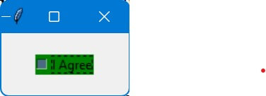
style.configure('Custom.TCheckbutton', background='lightgreen', foreground='blue')
style.map('Custom.TCheckbutton', background=[('selected', 'green'), ('active', 'lightgreen')])
Create a checkbox with this custom style:
checkbox = ttk.Checkbutton(root, text="Subscribe to Newsletter", style='Custom.TCheckbutton')
checkbox.pack(pady=20)
root.mainloop()
Output:

The checkbox has a light green background and blue text.
Also, the background color changes to green when selected and to a lighter green when hovered over.
Manipulate Checkbox Properties with Style Maps
Style maps in Tkinter ttk module allow you to change the appearance of widgets based on their state.
For checkboxes, this means you can customize how they look when they are in different states like ‘selected’ or ‘hovered over’.
First, set up the initial environment:
import tkinter as tk
from tkinter import ttk
root = tk.Tk()
root.title("Dynamic Checkbox Styling")
Next, create an instance of ttk.Style and define a new style:
style = ttk.Style()
style.theme_use('default')
style.configure('Dynamic.TCheckbutton', background='lightgray')
Now, use a style map to change the background color when the checkbox is selected or hovered over:
style.map('Dynamic.TCheckbutton',
          background=[('selected', 'green'), ('active', 'lightgreen')])
Create a checkbox with this dynamic style:
checkbox = ttk.Checkbutton(root, text="I Agree", style='Dynamic.TCheckbutton')
checkbox.pack(pady=20)
root.mainloop()
Output:
When you hover over the checkbox, the background will change to light green. When selected, it turns green.
Integrate Images and Icons with Checkboxes
First, ensure you have the required modules and initialize your main window:
import tkinter as tk
from tkinter import ttk
root = tk.Tk()
root.title("Checkbox with Images")
Next, load the images or icons you want to use. Ensure these images are appropriately sized for your checkboxes:
checked_image = tk.PhotoImage(file='checked.png')  # Replace with your image file
unchecked_image = tk.PhotoImage(file='unchecked.png')  # Replace with your image file
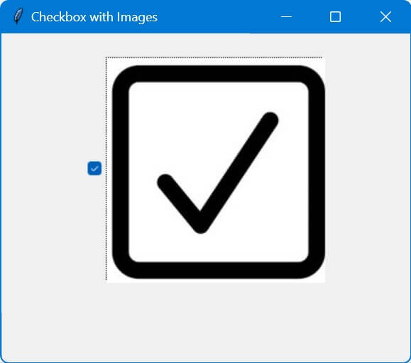
I used these images:

Now, define a custom style for your checkbox and use the images:
style = ttk.Style()
style.configure('ImgCheckbutton.TCheckbutton', indicatoron=False)  # Disable default indicator
style.map('ImgCheckbutton.TCheckbutton',
          image=[('selected', checked_image), ('!selected', unchecked_image)])
Create a checkbox with the custom style:
checkbox = ttk.Checkbutton(root, style='ImgCheckbutton.TCheckbutton')
checkbox.pack(pady=20)
root.mainloop()
Output:
Mokhtar is the founder of LikeGeeks.com. He is a seasoned technologist and accomplished author, with expertise in Linux system administration and Python development. Since 2010, Mokhtar has built an impressive career, transitioning from system administration to Python development in 2015. His work spans large corporations to freelance clients around the globe. Alongside his technical work, Mokhtar has authored some insightful books in his field. Known for his innovative solutions, meticulous attention to detail, and high-quality work, Mokhtar continually seeks new challenges within the dynamic field of technology.