Handle NaN values in Seaborn heatmap
One common challenge faced when creating heatmaps is the presence of NaN (Not a Number) values.
These NaNs can impact the visual output, leading to misleading interpretations or an unclear representation of the data.
In this tutorial, you’ll learn how to handle NaN values in Seaborn heatmaps.
Whether you are dealing with sparse NaNs that can be easily dropped, or require more nuanced approaches like filling, interpolating, or visually distinguishing NaNs, this tutorial covers it all.
Remove NaN Values
In scenarios where NaNs are sparse and not critical to your analysis, one effective method is to remove them using the dropna() method.
First, you’ll need to import the necessary libraries and create a sample dataset.
import seaborn as sns
import pandas as pd
import numpy as np
data = {
    'Call Quality': [3.5, np.nan, 4.2, 3.8],
    'Internet Speed': [50, 45, np.nan, 60],
    'Customer Satisfaction': [4.0, 3.6, np.nan, 4.5]
}
df = pd.DataFrame(data)
print(df)
Output:
   Call Quality  Internet Speed  Customer Satisfaction
0           3.5            50.0                    4.0
1           NaN            45.0                    3.6
2           4.2             NaN                    NaN
3           3.8            60.0                    4.5
Note the NaN values in the dataset.
Next, let’s remove these NaN values:
cleaned_df = df.dropna()
print(cleaned_df)
Output:
   Call Quality  Internet Speed  Customer Satisfaction
0           3.5            50.0                    4.0
3           3.8            60.0                    4.5
In the above step, dropna() removes rows with any NaN values.
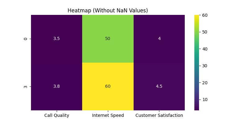
Let’s plot the heatmap using Seaborn after we’ve dropped the NaN values.
This will help visualize how the removal of NaN values impacts the heatmap representation.
import matplotlib.pyplot as plt
plt.figure(figsize=(8, 4))
sns.heatmap(cleaned_df, annot=True, cmap='viridis')
plt.title('Heatmap (Without NaN Values)')
plt.show()
Output:
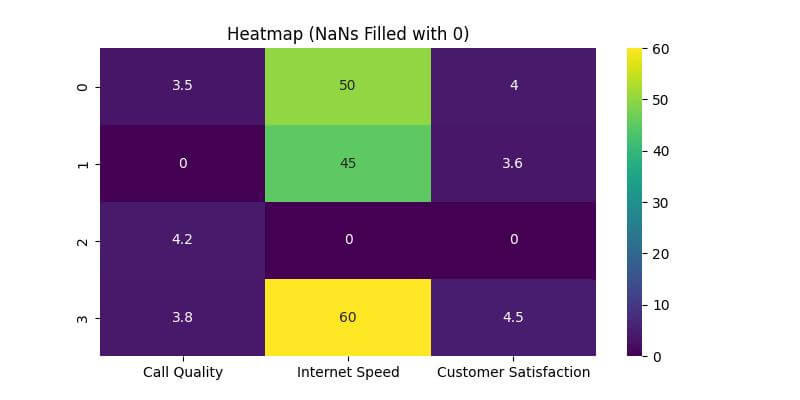
Fill NaNs with a Specific Value
In certain situations, you want to retain the original size of your dataset, especially when the presence of each row is significant for your analysis.
In such cases, rather than removing NaN values, you can fill them with a specific value.
The .fillna() function in Pandas allows you to do this.
filled_df = df.fillna(0)
print(filled_df)
Output:
   Call Quality  Internet Speed  Customer Satisfaction
0           3.5            50.0                    4.0
1           0.0            45.0                    3.6
2           4.2             0.0                    0.0
3           3.8            60.0                    4.5
In the code above, fillna(0) replaces all NaN values in the dataset with 0.
Now, let’s create a heatmap with the NaN values filled:
plt.figure(figsize=(8, 4))
sns.heatmap(filled_df, annot=True, cmap='viridis')
plt.title('Heatmap (NaNs Filled with 0)')
plt.show()
Output:
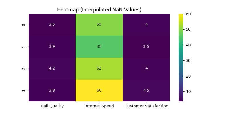
Interpolate NaNs
Interpolation is another method to handle NaN values in datasets, especially when a linear relationship can be assumed between data points.
By interpolating, you estimate the NaN values based on neighboring data points.
This method is useful in time-series data or when the data points have a logical sequence.
interpolated_df = df.interpolate()
print(interpolated_df)
Output:
   Call Quality  Internet Speed  Customer Satisfaction
0          3.50            50.0                   4.00
1          3.85            45.0                   3.60
2          4.20            52.5                   4.05
3          3.80            60.0                   4.50
Here, interpolate() function calculates the NaN values by estimating them based on adjacent values. For example, in the ‘Call Quality’ column, the NaN value is replaced with an average of its neighboring values.
Now, let’s visualize this interpolated data using a heatmap:
# Plotting the heatmap with interpolated values
plt.figure(figsize=(8, 4))
sns.heatmap(interpolated_df, annot=True, cmap='viridis')
plt.title('Heatmap (Interpolated NaN Values)')
plt.show()
Output:
Mask NaNs in the Heatmap
Masking NaNs in a heatmap allows you to visually distinguish these values from the rest of the data.
This method is useful when you want to maintain the original dataset’s structure, including the NaN values, while still providing a clear visual representation of where data is missing.
nan_mask = df.isna()
plt.figure(figsize=(8, 4))
sns.heatmap(df, annot=True, cmap='viridis', mask=nan_mask)
plt.title('Heatmap (NaNs Masked)')
plt.show()
Output:
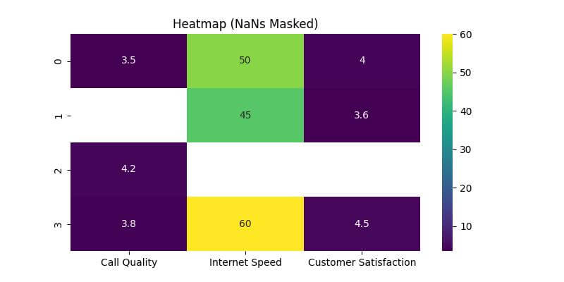
The masked areas do not have annotations and color, clearly indicating the absence of data.
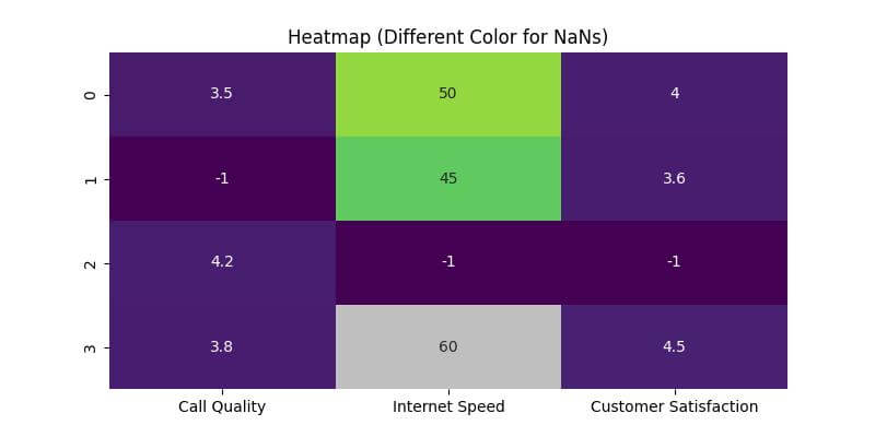
Use a Different Color for NaNs
Another method to handle NaNs in heatmaps is using a different color for these values.
This method highlights the NaNs distinctly and makes them easily identifiable.
First, we’ll prepare a colormap that distinguishes NaNs:
from matplotlib.colors import ListedColormap

# Custom colormap: NaNs will be shown in grey
cmap = ListedColormap(sns.color_palette("viridis", as_cmap=True).colors + [(0.75, 0.75, 0.75)])

# Preparing the data: NaNs are set to a unique number
unique_number_for_nans = -1
heatmap_data = df.fillna(unique_number_for_nans)
plt.figure(figsize=(8, 4))
sns.heatmap(heatmap_data, annot=True, cmap=cmap, cbar=False)
plt.title('Heatmap (Different Color for NaNs)')
plt.show()
Output:
Mokhtar is the founder of LikeGeeks.com. He is a seasoned technologist and accomplished author, with expertise in Linux system administration and Python development. Since 2010, Mokhtar has built an impressive career, transitioning from system administration to Python development in 2015. His work spans large corporations to freelance clients around the globe. Alongside his technical work, Mokhtar has authored some insightful books in his field. Known for his innovative solutions, meticulous attention to detail, and high-quality work, Mokhtar continually seeks new challenges within the dynamic field of technology.