Customize Seaborn Heatmap x-axis and y-axis Tick Labels
In this tutorial, you’ll learn how to customize Seaborn heatmap tick labels, covering aspects like setting custom labels, adjusting label rotation and font size, automatic label rotation, and even hiding labels.
Set Custom Labels
You can use set_xticklabels and set_yticklabels methods to set custom labels for both axes.
First, import the necessary libraries and prepare your data:
import seaborn as sns
import matplotlib.pyplot as plt
import pandas as pd
import numpy as np
np.random.seed(0)
data = np.random.rand(4, 6)
metrics = ['Metric A', 'Metric B', 'Metric C', 'Metric D']
days = ['Monday', 'Tuesday', 'Wednesday', 'Thursday', 'Friday', 'Saturday']
df = pd.DataFrame(data, index=metrics, columns=days)
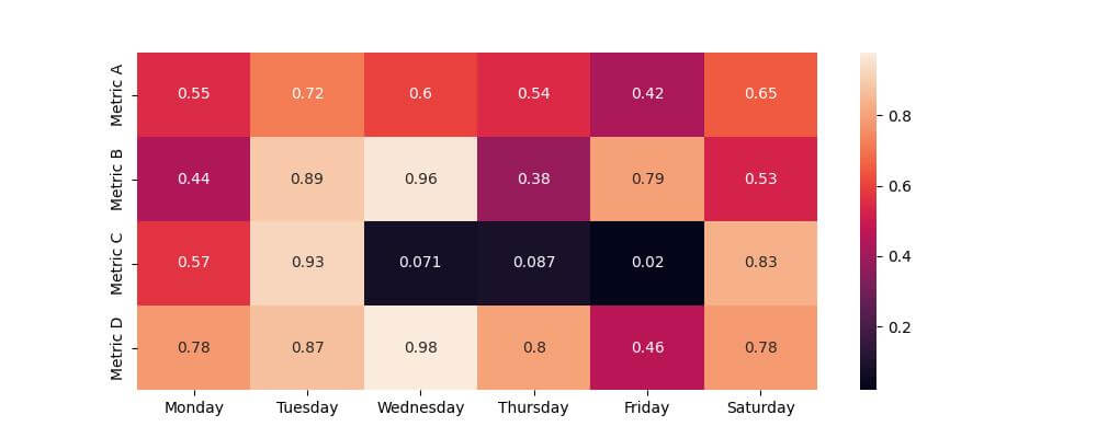
Now, let’s create a basic Seaborn heatmap:
plt.figure(figsize=(10, 4))
sns.heatmap(df, annot=True)
plt.show()
Output:
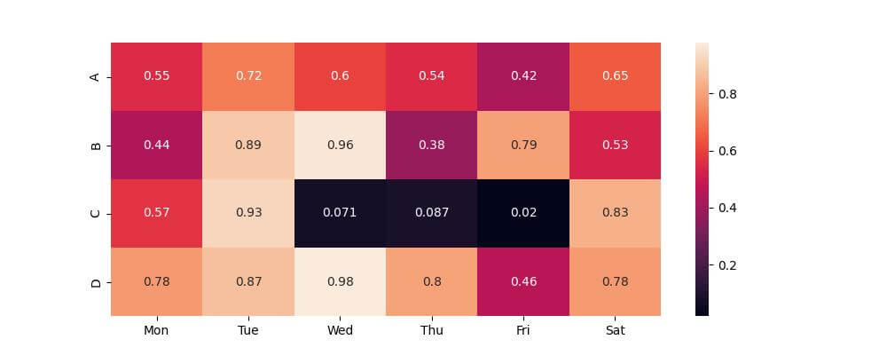
Next, customize the tick labels:
plt.figure(figsize=(10, 4))
ax = sns.heatmap(df, annot=True)
ax.set_xticklabels(['Mon', 'Tue', 'Wed', 'Thu', 'Fri', 'Sat'], rotation=45)
ax.set_yticklabels(['A', 'B', 'C', 'D'], rotation=0)
plt.show()
Output:
Rotate Labels
Rotating these labels can help avoid overlap and make each label distinct.
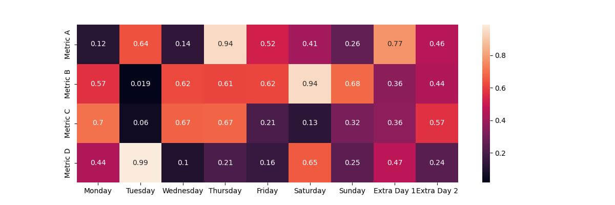
First, let’s update our dataset to include more days:
extended_days = days + ['Sunday', 'Extra Day 1', 'Extra Day 2']
extended_data = np.random.rand(4, len(extended_days))
df_extended = pd.DataFrame(extended_data, index=metrics, columns=extended_days)
Now, create a heatmap with these extended labels:
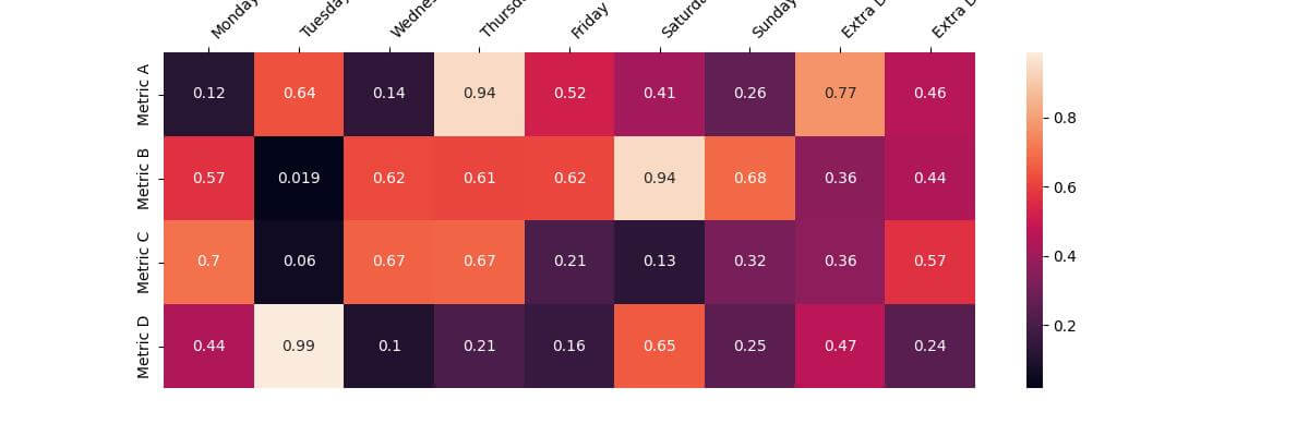
plt.figure(figsize=(12, 4))
sns.heatmap(df_extended, annot=True)
plt.show()
Output:
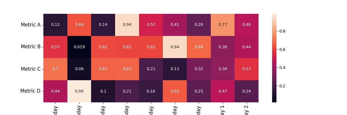
To rotate the labels, you can set rotation property to the rotation angel you want:
plt.figure(figsize=(12, 4))
ax = sns.heatmap(df_extended, annot=True)
ax.set_xticklabels(ax.get_xticklabels(), rotation=90)
ax.set_yticklabels(ax.get_yticklabels(), rotation=0)
plt.show()
Output:

Adjust Label Font Size
You can increase the font size of the labels using the fontsize property:
plt.figure(figsize=(12, 4))
ax = sns.heatmap(df_extended, annot=True)
plt.xticks(fontsize=12, rotation=90)
plt.yticks(fontsize=12, rotation=0)
plt.show()
Output:
Automatically Rotating Labels
You can apply automatic rotation using labelrotation property:
plt.figure(figsize=(12, 4))
ax = sns.heatmap(df_extended, annot=True)
ax.tick_params(axis='x', labelrotation=45)
ax.tick_params(axis='y', labelrotation=45)
plt.show()
Output:

Set Tick Label Alignment
You can adjust the alignment of the labels using ha property for horizontal alignment and va property for vertical alignment:
plt.figure(figsize=(12, 4))
ax = sns.heatmap(df_extended, annot=True)
ax.set_xticklabels(ax.get_xticklabels(), ha='center')  # Horizontal alignment
ax.set_yticklabels(ax.get_yticklabels(), va='center')  # Vertical alignment
plt.show()
Output:

Move x-axis Labels to Top
You can move the x-axis labels to the top using tick_top() function:
plt.figure(figsize=(12, 4))
ax = sns.heatmap(df_extended, annot=True)
ax.xaxis.tick_top()  # Move x-axis labels to top
ax.set_xticklabels(ax.get_xticklabels(), rotation=45, ha='left')
plt.show()
Output:
Order y-axis Labels
You can reorder the y-axis by reindexing the DataFrame with the new order:
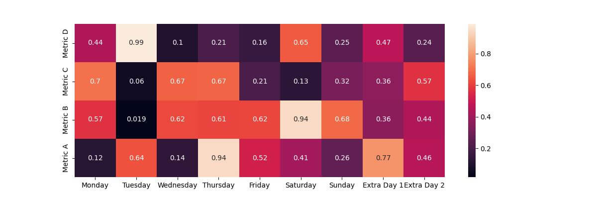
new_order = ['Metric D', 'Metric C', 'Metric B', 'Metric A']  # Define new order
reordered_df = df_extended.reindex(new_order)
plt.figure(figsize=(12, 4))
sns.heatmap(reordered_df, annot=True)
plt.show()
Output:

Reverse Axis
To reverse the y-axis, you can use invert_ yaxis function:
# Reversing the y-axis
plt.figure(figsize=(12, 4))
ax = sns.heatmap(df_extended, annot=True)
ax.invert_yaxis()
plt.show()
Output:
The output heatmap is similar to the above ordered one.
Hide Labels
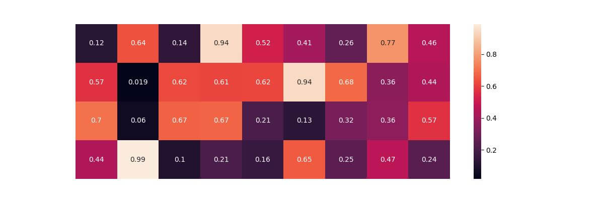
You can hide labels by sending an empty array to xticks or yticks:
plt.figure(figsize=(12, 4))
ax = sns.heatmap(df_extended, annot=True)
plt.xticks([])
plt.yticks([])
plt.show()
Output:
Mokhtar is the founder of LikeGeeks.com. He is a seasoned technologist and accomplished author, with expertise in Linux system administration and Python development. Since 2010, Mokhtar has built an impressive career, transitioning from system administration to Python development in 2015. His work spans large corporations to freelance clients around the globe. Alongside his technical work, Mokhtar has authored some insightful books in his field. Known for his innovative solutions, meticulous attention to detail, and high-quality work, Mokhtar continually seeks new challenges within the dynamic field of technology.