Customize Colorbar in Seaborn Heatmap
In this tutorial, we’ll learn how to customize colorbar properties such as position, size, color palette, and more.
We’ll cover everything from basic adjustments like changing the color palette to more advanced customizations like tweaking the padding between the heatmap and the colorbar.
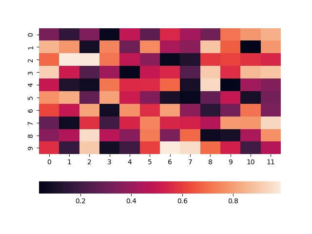
Adjust the Position
To adjust the position of the colorbar in a Seaborn heatmap, you can use the cbar_kws argument within the sns.heatmap() function and use location parameter.
This argument accepts a dictionary of parameters, allowing detailed customization.
import seaborn as sns
import matplotlib.pyplot as plt
import numpy as np
data = np.random.rand(10, 12)
sns.heatmap(data, cbar_kws={'location': 'bottom'})
plt.show()
Output:
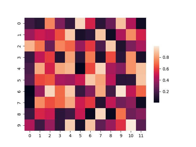
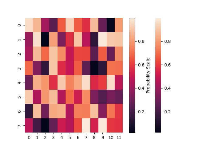
Modify Size and Aspect Ratio
You can use the cbar_kws argument with parameters shrink and aspect:
sns.heatmap(data, cbar_kws={'shrink': 0.5, 'aspect': 10})
plt.show()
Output:
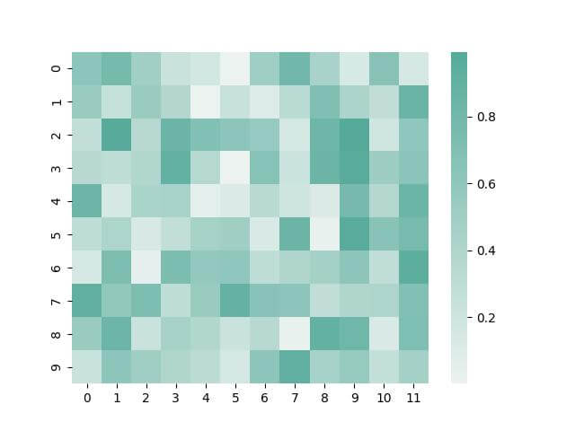
Create Custom Color Palette
Sometimes, the built-in palettes do not fit your specific needs. In such cases, creating a custom color palette is the way to go.
Here’s how you can create and apply a custom palette:
custom_palette = sns.color_palette("light:#5A9", as_cmap=True)
sns.heatmap(data, cmap=custom_palette)
plt.show()
Output:
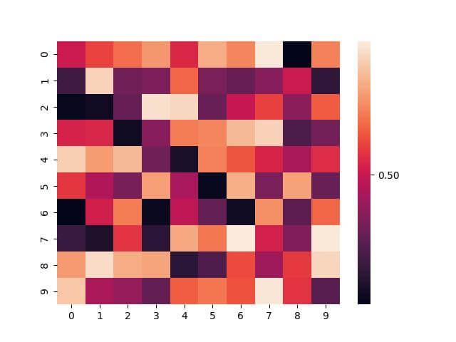
Set the Number of Ticks
Controlling the number of ticks on the colorbar can help in making the heatmap more readable, especially when dealing with a wide range of data values.
Seaborn allows you to adjust this through the cbar_kws argument by setting the ticks array parameter.
import seaborn as sns
import numpy as np
import matplotlib.pyplot as plt
data = np.random.rand(10, 10)
sns.heatmap(data, cbar_kws={'ticks': [0, 0.5, 1]})
plt.show()
Output:
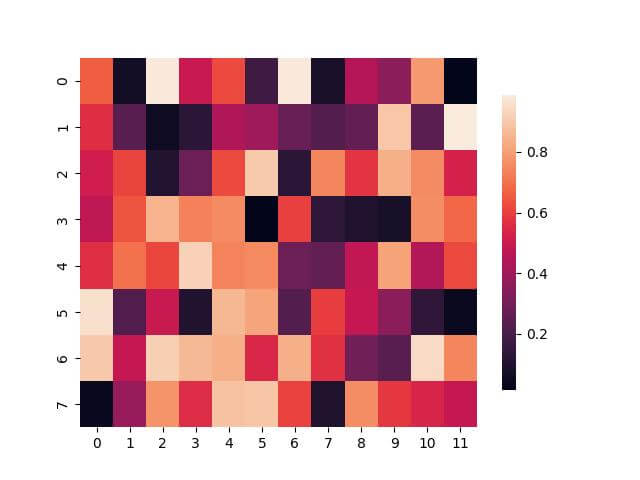
Customize Tick Labels Format
You can customize the tick labels format by setting the format parameter:
sns.heatmap(data, cbar_kws={'ticks': [0, 0.5, 1], 'format': '%.2f'})
plt.show()
Output:
Add Label to Colorbar
You can add a label to the colorbar that describes the data range by using Matplotlib functions in conjunction with Seaborn.
import seaborn as sns
import numpy as np
import matplotlib.pyplot as plt
data = np.random.rand(8, 12)
ax = sns.heatmap(data)
ax.figure.colorbar(ax.collections[0]).set_label('Probability Scale')
plt.show()
Output:
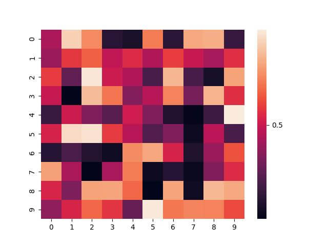
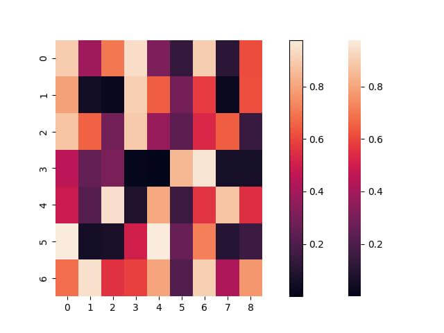
Set Shrink Parameter
The shrink parameter allows you to adjust the size of the colorbar to the heatmap.
It helps ensure that the colorbar does not dominate the plot, especially when dealing with smaller heatmaps.
Adjust the shrink parameter as follows:
sns.heatmap(data, cbar_kws={'shrink': 0.8})
plt.show()
Output:
Adjust the Padding
Too little padding can make the plot look crowded, while too much can disconnect the colorbar from the data.
You can set the pad parameter of matplotlib to set the padding:
import seaborn as sns
import numpy as np
import matplotlib.pyplot as plt
data = np.random.rand(7, 9)
ax = sns.heatmap(data)
plt.colorbar(ax.collections[0], pad=0.1)  # Adjusting the padding
plt.show()
Output:
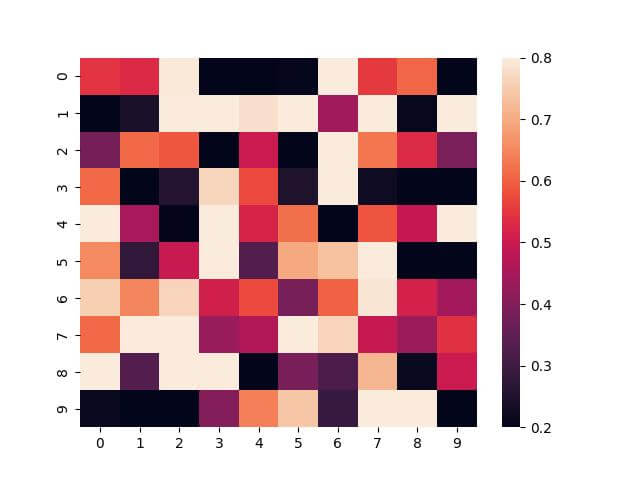
Adjust the Scale (Range) of the Colorbar
To adjust the scale of the color bar in Seaborn, you can modify the vmin and vmax parameters in the sns.heatmap() function.
These parameters define the data values that correspond to the lower and upper bounds of the color scale.
import seaborn as sns
import numpy as np
import matplotlib.pyplot as plt
data = np.random.rand(10, 10)
sns.heatmap(data, vmin=0.2, vmax=0.8)
plt.show()
Output:
Mokhtar is the founder of LikeGeeks.com. He is a seasoned technologist and accomplished author, with expertise in Linux system administration and Python development. Since 2010, Mokhtar has built an impressive career, transitioning from system administration to Python development in 2015. His work spans large corporations to freelance clients around the globe. Alongside his technical work, Mokhtar has authored some insightful books in his field. Known for his innovative solutions, meticulous attention to detail, and high-quality work, Mokhtar continually seeks new challenges within the dynamic field of technology.