Customizing Bin Statistics: stat in Seaborn histplot
Histograms are essential for summarizing the distribution of a dataset in a visually appealing and intuitive manner.
By adjusting the stat parameter in Seaborn histplot, you can transform how your data is represented, providing different perspectives of your dataset.
In this tutorial, we’ll discuss various stat options such as ‘count’, ‘frequency’, ‘density’, ‘probability’, and ‘percentage’, each serving a unique purpose.
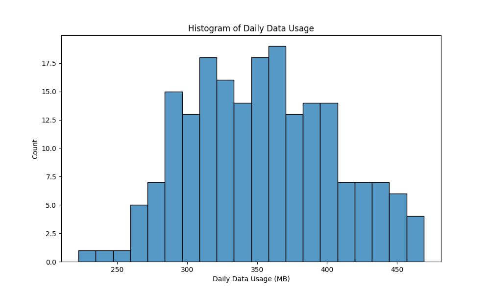
Count-based Histogram
A count-based histogram represents the frequency of occurrence of data points within specified bins.
Let’s begin by importing the necessary libraries and preparing a sample dataset.
import seaborn as sns
import pandas as pd
import numpy as np
import matplotlib.pyplot as plt
np.random.seed(0)
data = pd.DataFrame({'DailyDataUsageMB': np.random.normal(350, 50, 200)})
Now, we will create the histogram. We’re aiming to understand the frequency distribution of daily data usage among users.
plt.figure(figsize=(10, 6))
sns.histplot(data['DailyDataUsageMB'], bins=20, stat="count")
plt.xlabel('Daily Data Usage (MB)')
plt.ylabel('Count')
plt.title('Histogram of Daily Data Usage')
plt.show()
Output:
Frequency Histogram
Frequency histograms display the proportion of the dataset that falls into each bin, rather than just the count. This is especially useful when comparing distributions across different sized datasets.
This time, we aim to understand not just how many users fall into each bin, but what proportion of the total data usage they represent.
plt.figure(figsize=(10, 6))
sns.histplot(data['DailyDataUsageMB'], bins=20, stat="frequency")
plt.xlabel('Daily Data Usage (MB)')
plt.ylabel('Frequency')
plt.title('Frequency Histogram of Daily Data Usage')
plt.show()
Output:

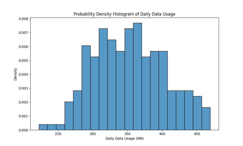
Probability Density Histogram
When you set stat='density', the histogram shows the probability density of the data.
This means each bin’s height will represent the probability of finding a data point in that interval, allowing for a normalized representation of the data distribution.
We’ll now use the probability density to understand the distribution of daily data usage in MB in a way that is not influenced by the number of observations.
plt.figure(figsize=(10, 6))
sns.histplot(data['DailyDataUsageMB'], bins=20, stat="density")
plt.xlabel('Daily Data Usage (MB)')
plt.ylabel('Density')
plt.title('Probability Density Histogram of Daily Data Usage')
plt.show()
Output:
Probability Histogram
Probability histograms display the probability of data falling within each bin relative to the total number of bins.
In the context of our data example, using a probability histogram will allow us to understand the likelihood of various ranges of daily data usage among users.
plt.figure(figsize=(10, 6))
sns.histplot(data['DailyDataUsageMB'], bins=20, stat="probability")
plt.xlabel('Daily Data Usage (MB)')
plt.ylabel('Probability')
plt.title('Probability Histogram of Daily Data Usage')
plt.show()
Output:

Each bin’s height represents its share of the total number of data points, providing an intuitive understanding of how likely users are to have a certain level of data usage.
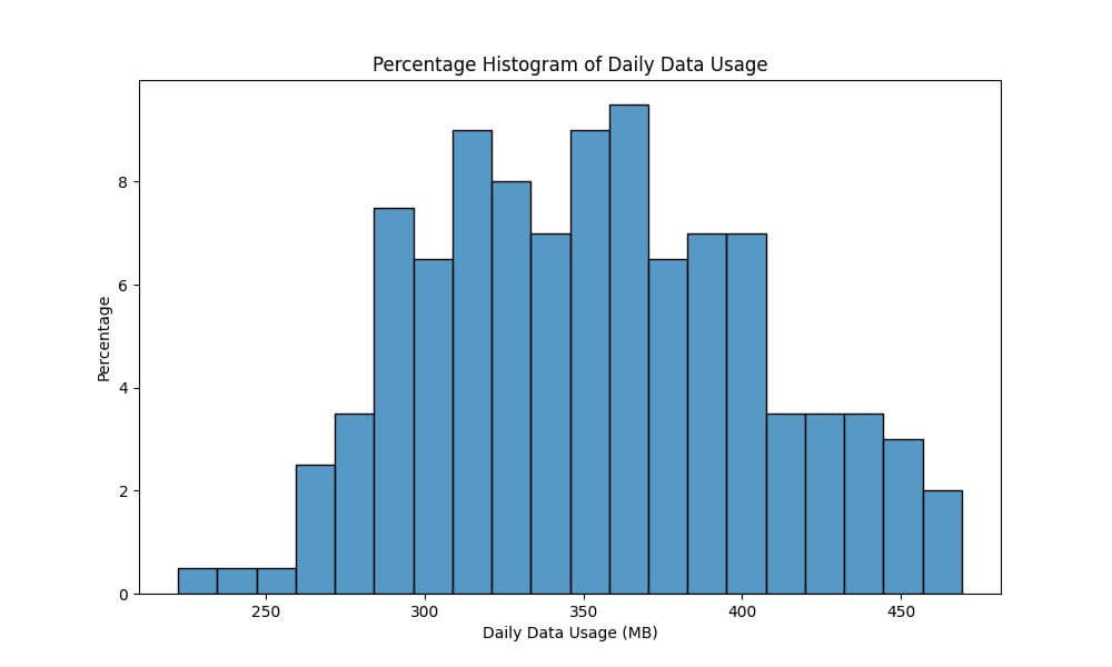
Visualize Data Distributions as Percentages
The stat='percentage' option in Seaborn histplot transforms the histogram to display the distribution of data as percentages.
Each bin’s height represents the percentage of the total dataset that falls within that bin.
We’ll use the percentage histogram to gain insights into how large a part of the dataset falls into each usage category.
plt.figure(figsize=(10, 6))
sns.histplot(data['DailyDataUsageMB'], bins=20, stat="percent")
plt.xlabel('Daily Data Usage (MB)')
plt.ylabel('Percentage')
plt.title('Percentage Histogram of Daily Data Usage')
plt.show()
Output:
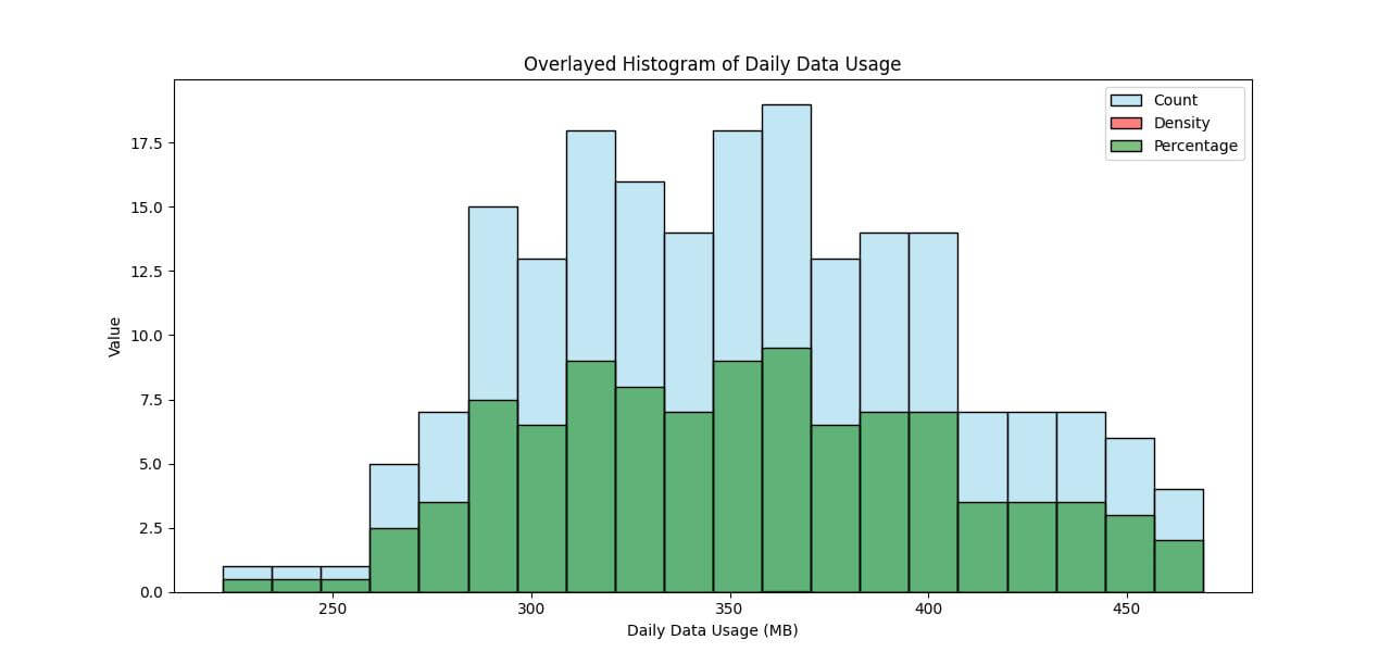
Overlay Histograms with Different stat Values
Overlaying histograms with different stat values in Seaborn can provide a multifaceted view of your data.
This technique is useful when you want to compare different aspects of your dataset simultaneously.
plt.figure(figsize=(12, 8))
sns.histplot(data['DailyDataUsageMB'], bins=20, stat="count", color="skyblue", alpha=0.5, label='Count')
sns.histplot(data['DailyDataUsageMB'], bins=20, stat="density", color="red", alpha=0.5, label='Density')
sns.histplot(data['DailyDataUsageMB'], bins=20, stat="percent", color="green", alpha=0.5, label='Percentage')
plt.xlabel('Daily Data Usage (MB)')
plt.ylabel('Value')
plt.title('Overlayed Histogram of Daily Data Usage')
plt.legend()
plt.show()
Output:
Mokhtar is the founder of LikeGeeks.com. He is a seasoned technologist and accomplished author, with expertise in Linux system administration and Python development. Since 2010, Mokhtar has built an impressive career, transitioning from system administration to Python development in 2015. His work spans large corporations to freelance clients around the globe. Alongside his technical work, Mokhtar has authored some insightful books in his field. Known for his innovative solutions, meticulous attention to detail, and high-quality work, Mokhtar continually seeks new challenges within the dynamic field of technology.