Seaborn Histogram By Group using histplot hue parameter
In this tutorial, we’ll learn how to group histograms using the hue parameter in Seaborn histplot.
You’ll learn how to specify a single hue column, use multiple hue columns, assign custom colors to specific hue groups, and control the appearance of legends.
Specify a Single Hue Column
The hue parameter separates the data points into different categories, each represented by a unique color.
First, you’ll need to import the necessary libraries and prepare your dataset:
import seaborn as sns
import matplotlib.pyplot as plt
import pandas as pd
data = pd.DataFrame({
    'MonthlyCharges': [56, 45, 71, 80, 50, 75, 65, 48, 60, 70],
    'CustomerType': ['Business', 'Personal', 'Personal', 'Business', 'Personal', 'Business', 'Business', 'Personal', 'Personal', 'Business']
})
Next, use Seaborn’s histplot to create a histogram and specify the hue parameter:
sns.histplot(data=data, x='MonthlyCharges', hue='CustomerType', bins=5, element='bars', stat='count')
plt.show()
Output:
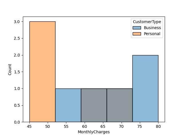
Each bin represents a range of charges, and the height indicates the count of customers in that range, segregated by customer type.
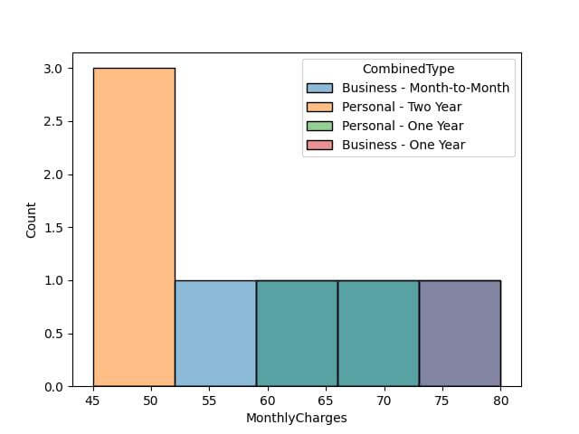
Using Multiple Hue Columns
While the hue parameter accepts only one column or data series directly, you can manipulate your dataset to visualize multi-dimensional categories.
Combine Columns into a Single Hue: You can Create a new column in your DataFrame that merges information from multiple columns.
This new column can then be used with the hue parameter:
data['ContractType'] = ['Month-to-Month', 'Two Year', 'One Year', 'Month-to-Month', 'Two Year', 'One Year', 'Month-to-Month', 'Two Year', 'One Year', 'Month-to-Month']
data['CombinedType'] = data['CustomerType'] + " - " + data['ContractType']
sns.histplot(data=data, x='MonthlyCharges', hue='CombinedType')
plt.show()
Output:
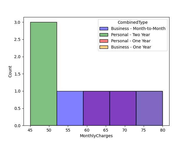
Assign Custom Colors to Specific Hue Groups
Seaborn allows you to assign specific colors to different hue groups, ensuring that each category is distinct and easily identifiable.
Assign Colors Using a Dictionary: You can use a dictionary where keys correspond to hue categories and values to desired colors.
This method gives you full control over the color scheme.
# Custom color palette
color_palette = {
    'Business - Month-to-Month': 'blue',
    'Personal - Two Year': 'green',
    'Personal - One Year': 'red',
    'Business - Two Year': 'purple',
    'Business - One Year': 'orange',
    'Personal - Month-to-Month': 'yellow'
}
sns.histplot(data=data, x='MonthlyCharges', hue='CombinedType', palette=color_palette)
plt.show()
Output:
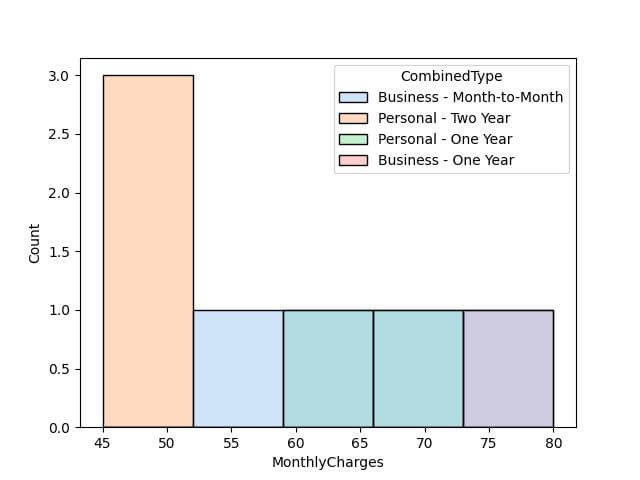
Using Seaborn Color Palettes: Alternatively, if you prefer a pre-defined color scheme, you can specify these palettes directly in the palette argument.
sns.histplot(data=data, x='MonthlyCharges', hue='CombinedType', palette='pastel')
plt.show()
Output:
Different Histogram Types (Layer, Stack, Fill, Dodge)
Seaborn histplot function offers the multiple argument that allows you to represent data in different histogram types such as layering, stacking, filling, and dodging.
These options enable you to choose the best way to display your data based on its nature and the story you want to tell.
Layer Histogram: The layer option overlaps the histograms, making it easier to compare the distributions directly.
sns.histplot(data=data, x='MonthlyCharges', hue='CombinedType', multiple='layer', palette='Set2')
plt.show()
Output:
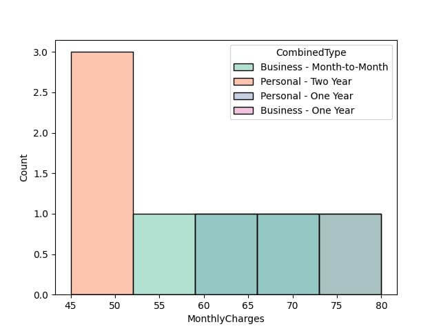
In this histogram, different categories are layered on top of each other with transparency, allowing for direct comparison of distributions across categories.
Stack Histogram: The stack option stacks the histograms, providing a cumulative view of the distributions.
sns.histplot(data=data, x='MonthlyCharges', hue='CombinedType', multiple='stack', palette='Set1')
plt.show()
Output:
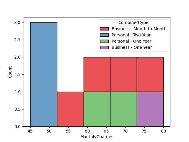
Here, the histogram categories are stacked, giving a sense of the total distribution while also showing the contribution of each category.
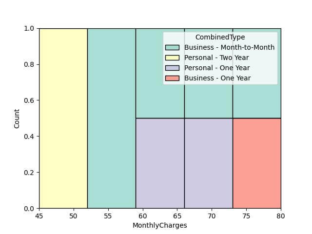
Fill Histogram: Using fill will normalize the histograms, making it easier to compare their shapes.
sns.histplot(data=data, x='MonthlyCharges', hue='CombinedType', multiple='fill', palette='Set3')
plt.show()
Output:
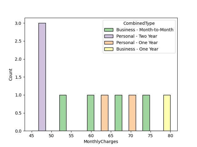
Dodge Histogram: The dodge option separates the histograms side by side, which can be clearer for comparing individual categories.
sns.histplot(data=data, x='MonthlyCharges', hue='CombinedType', multiple='dodge', palette='Accent')
plt.show()
Output:
Mokhtar is the founder of LikeGeeks.com. He is a seasoned technologist and accomplished author, with expertise in Linux system administration and Python development. Since 2010, Mokhtar has built an impressive career, transitioning from system administration to Python development in 2015. His work spans large corporations to freelance clients around the globe. Alongside his technical work, Mokhtar has authored some insightful books in his field. Known for his innovative solutions, meticulous attention to detail, and high-quality work, Mokhtar continually seeks new challenges within the dynamic field of technology.