Customizing Bins in Seaborn Histogram (hisplot)
In this tutorial, we’ll learn various methods to customize bins in Seaborn hisplot.
You’ll learn how to dynamically adjust bin sizes, from determining the optimal number of bins to implementing advanced strategies like logarithmic binning and quantile-based binning.
Whether your data is evenly distributed, skewed, or includes outliers, the methods we explore will handle any dataset.
Determining the Number of Bins
By default, Seaborn chooses a bin number that generally represents your data well, but there are cases where you need to customize this number.
First, let’s import the necessary libraries and prepare some sample dataset:
import seaborn as sns
import matplotlib.pyplot as plt
import numpy as np
import pandas as pd
np.random.seed(0)
data = pd.DataFrame({
    'MonthlyCharges': np.random.normal(70, 30, 1000)
})
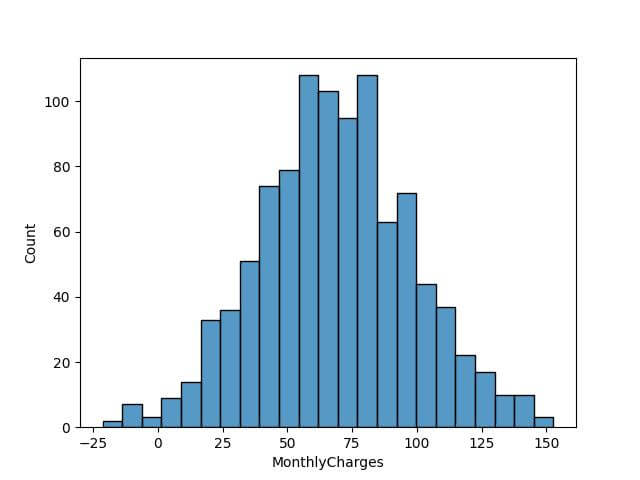
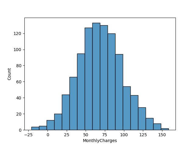
Now, let’s visualize the distribution of MonthlyCharges using the default bin setting in Seaborn:
sns.histplot(data['MonthlyCharges'])
plt.show()
Code Output:
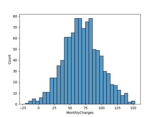
To customize the bin number, let’s apply the Sturges’ formula, which is a popular choice for determining bin count:
bin_count_sturges = int(1 + 3.322 * np.log10(len(data)))
sns.histplot(data['MonthlyCharges'], bins=bin_count_sturges)
plt.show()
Code Output:
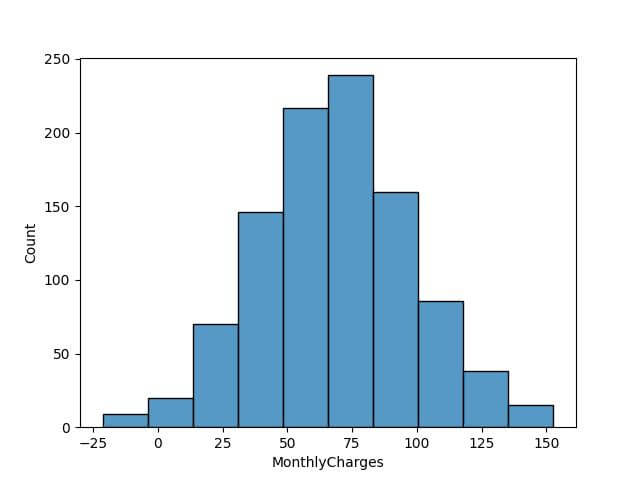
For comparison, let’s apply the square-root rule:
bin_count_sqrt = int(np.sqrt(len(data)))
sns.histplot(data['MonthlyCharges'], bins=bin_count_sqrt)
plt.show()
Code Output:
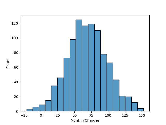
Lastly, let’s look at the Rice Rule:
bin_count_rice = int(2 * len(data) ** (1/3))
sns.histplot(data['MonthlyCharges'], bins=bin_count_rice)
plt.show()
Code Output:
Set Fixed Bin Widths
Setting fixed bin widths in Seaborn’s histplot allows you to maintain consistent bin sizes across different plots, making it easier to draw comparisons.
Assuming we still have our dataset data loaded, we first decide on the fixed width for each bin. For instance, suppose we want each bin to represent a range of $10 in monthly charges:
fixed_bin_width = 10
bins = np.arange(start=data['MonthlyCharges'].min(),
                 stop=data['MonthlyCharges'].max() + fixed_bin_width,
                 step=fixed_bin_width)
sns.histplot(data['MonthlyCharges'], bins=bins)
plt.show()
Code Output:
Now, let’s see what happens when we compare two distributions with the same fixed bin width. Suppose we have another set of monthly charges from a different year in our dataset:
data['MonthlyCharges_2ndYear'] = np.random.normal(75, 35, 1000)

# Plotting histograms for both sets of data with fixed bin widths
sns.histplot(data['MonthlyCharges'], bins=bins, color='blue', alpha=0.5)
sns.histplot(data['MonthlyCharges_2ndYear'], bins=bins, color='red', alpha=0.5)
plt.show()
Code Output:
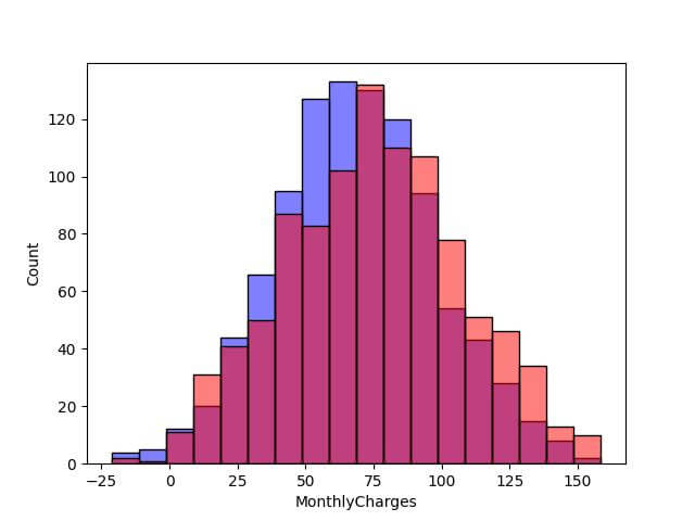
This direct comparison is made possible due to the consistent bin size across both histograms.
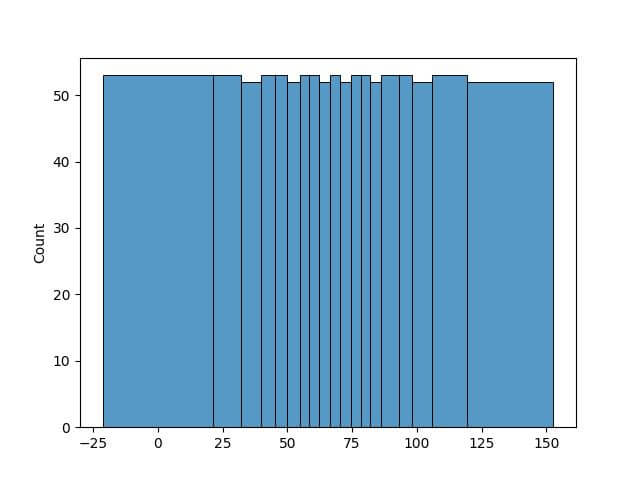
Define Custom Bin Edges (Range)
Defining custom bin edges in Seaborn histplot allows you to tailor the histogram to specific data ranges or to highlight particular aspects of your dataset.
This method is useful when the data includes outliers or when you want to focus on a specific range of values.
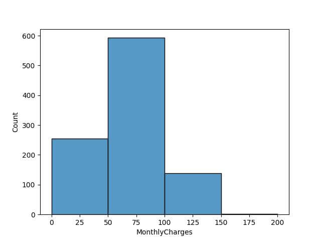
First, suppose we want to create bins that focus on specific ranges of monthly charges, like low, medium, and high spending categories:
custom_bins = [0, 50, 100, 150, 200]
sns.histplot(data['MonthlyCharges'], bins=custom_bins)
plt.show()
Code Output:
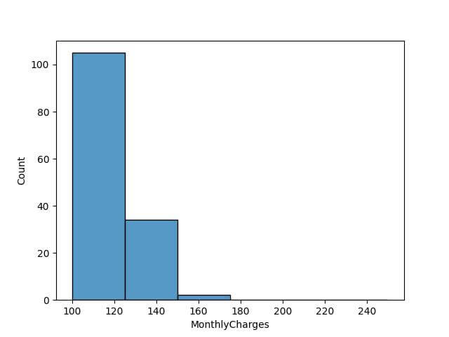
Now, let’s say we want to explore the higher end of the spending scale in more detail. We can adjust our custom bins to focus on the upper range of monthly charges:
# Adjusting custom bins to focus on higher charges
custom_bins_high_end = [100, 125, 150, 175, 200, 225, 250]

# Plotting the histogram with the new set of custom bins
sns.histplot(data['MonthlyCharges'], bins=custom_bins_high_end)
plt.show()
Code Output:
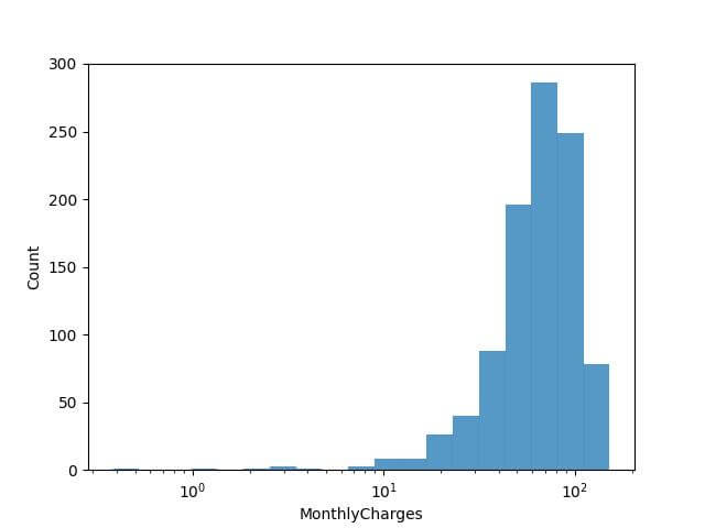
Logarithmic Binning for Skewed Data
This method is useful for datasets with a wide range of values, where the majority of data points are clustered in one part of the spectrum.
First, ensure that there are no non-positive values in your data, as the logarithm of zero or negative numbers is undefined. Then, proceed with the logarithmic binning:
# Filtering out non-positive values
data_filtered = data[data['MonthlyCharges'] > 0]

# Applying logarithmic binning
bin_edges = np.logspace(start=np.log10(data_filtered['MonthlyCharges'].min()),
                        stop=np.log10(data_filtered['MonthlyCharges'].max()),
                        num=20) # You can adjust the number of bins

sns.histplot(data_filtered['MonthlyCharges'], bins=bin_edges)
plt.xscale('log') # Setting the x-axis to a logarithmic scale
plt.show()
Code Output:
Adaptive Binning Strategies
Adaptive binning strategies in histogram plotting provide a dynamic way to visualize data, where the bin widths are not uniform but instead vary according to the density of the data points.
This method is useful for datasets with unevenly distributed values, it allows for more detailed representation in areas with higher data concentration and a broader view in sparser areas.
To implement adaptive binning, you can use kernel density estimation (KDE) to identify dense regions of data and adjust bin sizes accordingly.
from scipy.stats import gaussian_kde

# Estimate the density of the data
kde = gaussian_kde(data['MonthlyCharges'])
density = kde(data['MonthlyCharges'])
sorted_data, sorted_density = zip(*sorted(zip(data['MonthlyCharges'], density)))

# Adaptive binning based on density
adaptive_bins = np.interp(np.linspace(0, len(data), 20),
                          np.arange(len(data)),
                          sorted_data)
sns.histplot(sorted_data, bins=adaptive_bins)
plt.show()
Code Output:
Areas with a high concentration of data points have narrower bins, whereas sparser areas are represented with wider bins.
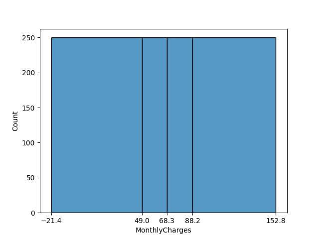
Binning based on Data Distribution
This method is effective for datasets with a skewed distribution as it helps in visualizing the spread and concentration of data across different segments.
This will divide the data into bins such that each bin has an equal number of data points.
num_quantile_bins = 4

# Calculate quantiles
quantile_bins = data['MonthlyCharges'].quantile(np.linspace(0, 1, num_quantile_bins + 1))
sns.histplot(data['MonthlyCharges'], bins=quantile_bins)
plt.xticks(quantile_bins)
plt.show()
Code Output:
Underflow and Overflow Bins
Underflow and overflow bins are used to capture the data points that fall below or above the specified range of the histogram.
To manage underflow and overflow in Seaborn’s histplot, we can set explicit lower and upper bounds for our bins.
Data points falling outside these bounds will be accumulated in the underflow and overflow bins.
lower_bound = 20
upper_bound = 180
bins = np.arange(lower_bound, upper_bound, 10)
sns.histplot(data['MonthlyCharges'], bins=bins, binrange=(lower_bound, upper_bound))
plt.show()
Code Output:
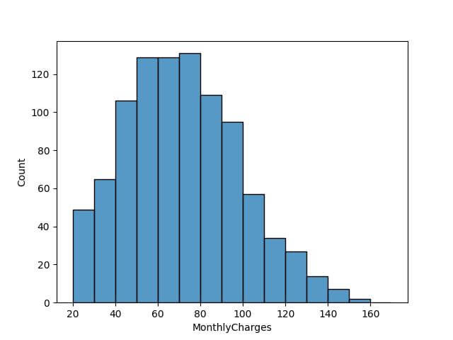
It’s important to note that the choice of bounds should be based on your understanding of the dataset and the specific requirements of your analysis.
For instance, if you know that certain extreme values are anomalies or errors, you might want to set your bounds to exclude these points.
Mokhtar is the founder of LikeGeeks.com. He is a seasoned technologist and accomplished author, with expertise in Linux system administration and Python development. Since 2010, Mokhtar has built an impressive career, transitioning from system administration to Python development in 2015. His work spans large corporations to freelance clients around the globe. Alongside his technical work, Mokhtar has authored some insightful books in his field. Known for his innovative solutions, meticulous attention to detail, and high-quality work, Mokhtar continually seeks new challenges within the dynamic field of technology.