Plot Multiple Python Histograms in a Single Graph
In this tutorial, you’ll learn various methods to plot multiple Python histograms in a single visualization using Matplotlib.
We’ll cover side-by-side histograms, overlaid histograms, stacked histograms, cumulative histograms, and faceted histograms (small multiples).
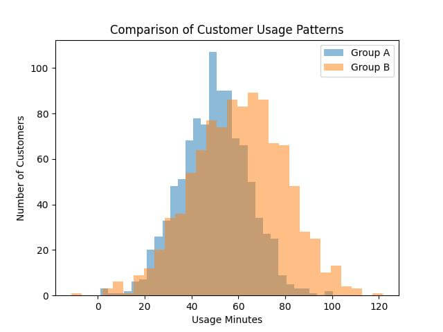
Side-by-Side Histograms
Let’s start by importing the necessary libraries and preparing some sample data.
We’ll compare two different sets of data – representing two different user groups or two different periods.
import matplotlib.pyplot as plt
import numpy as np
data1 = np.random.normal(50, 15, 1000)  # usage for group A
data2 = np.random.normal(60, 20, 1000)  # usage for group B
plt.hist(data1, bins=30, alpha=0.5, label='Group A')
plt.hist(data2, bins=30, alpha=0.5, label='Group B')
plt.xlabel('Usage Minutes')
plt.ylabel('Number of Customers')
plt.title('Comparison of Customer Usage Patterns')
plt.legend()
plt.show()
Code Output:
Overlaid Histograms
Overlaid histograms place the data directly on top of each other, using different colors or levels of transparency.
plt.hist(data1, bins=30, alpha=0.7, label='Group A', color='blue')
plt.hist(data2, bins=30, alpha=0.7, label='Group B', color='red')
plt.xlabel('Usage Minutes')
plt.ylabel('Number of Customers')
plt.title('Overlaid Histograms of Customer Usage Patterns')
plt.legend()
plt.show()
Code Output:
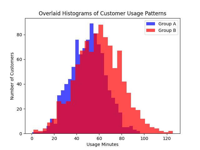
The transparency (controlled by the alpha parameter) allows both histograms to be visible, despite being in the same plot area.
The use of distinct colors (blue and red) helps in differentiating between ‘Group A’ and ‘Group B’.
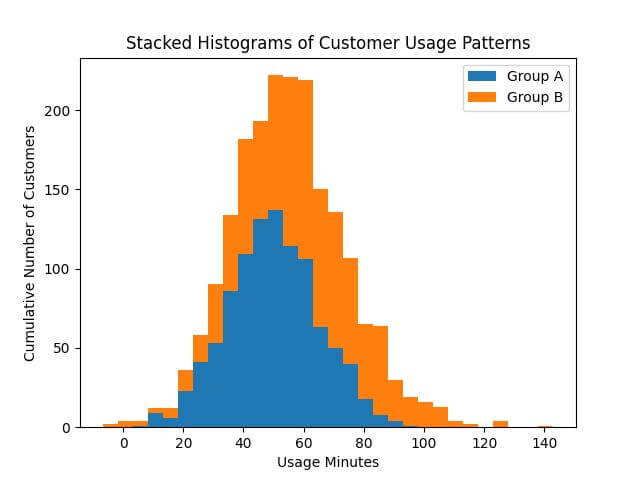
Stacked Histograms
In stacked histograms, data from different groups are piled on top of each other rather than being overlaid or placed side-by-side.
Let’s plot stacked histograms to compare the customer usage patterns of two different groups.
plt.hist([data1, data2], bins=30, stacked=True, label=['Group A', 'Group B'])
plt.xlabel('Usage Minutes')
plt.ylabel('Cumulative Number of Customers')
plt.title('Stacked Histograms of Customer Usage Patterns')
plt.legend()
plt.show()
Code Output:
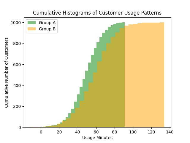
Cumulative Histograms
Cumulative histograms are a distinctive type of visualization where each bin’s height is the sum of its own frequency and the frequencies of all previous bins.
This method provides a sense of the running total, making it easier to perceive the proportion of data points below a certain value.
It’s useful for understanding the distribution of data in a more holistic manner.
plt.hist(data1, bins=30, cumulative=True, alpha=0.5, label='Group A', color='green')
plt.hist(data2, bins=30, cumulative=True, alpha=0.5, label='Group B', color='orange')
plt.xlabel('Usage Minutes')
plt.ylabel('Cumulative Number of Customers')
plt.title('Cumulative Histograms of Customer Usage Patterns')
plt.legend()
plt.show()
Code Output:
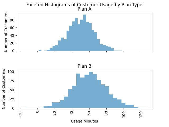
Faceted Histograms (Small Multiples)
Faceted histograms, also known as small multiples, are a technique where multiple histograms are plotted side by side, each representing a slice or facet of the data.
Let’s assume we have an additional categorization in our data, such as different plan types or customer segments.
import pandas as pd
df = pd.DataFrame({
    'Usage': np.concatenate([data1, data2]),
    'Category': ['Plan A']*1000 + ['Plan B']*1000
})
g = df.hist(column='Usage', by='Category', bins=30, layout=(2, 1), sharex=True, alpha=0.6)
plt.suptitle('Faceted Histograms of Customer Usage by Plan Type')
for ax in g.flatten():
    ax.set_xlabel('Usage Minutes')
    ax.set_ylabel('Number of Customers')
plt.show()
Code Output:
Mokhtar is the founder of LikeGeeks.com. He is a seasoned technologist and accomplished author, with expertise in Linux system administration and Python development. Since 2010, Mokhtar has built an impressive career, transitioning from system administration to Python development in 2015. His work spans large corporations to freelance clients around the globe. Alongside his technical work, Mokhtar has authored some insightful books in his field. Known for his innovative solutions, meticulous attention to detail, and high-quality work, Mokhtar continually seeks new challenges within the dynamic field of technology.