3D plotting in Python using matplotlib
Data visualization is one such area where a large number of libraries have been developed in Python.
Among these, Matplotlib is the most popular choice for data visualization.
While initially developed for plotting 2-D charts like histograms, bar charts, scatter plots, line plots, etc., Matplotlib has extended its capabilities to offer 3D plotting modules as well.
In this tutorial, we will look at various aspects of 3D plotting in Python.
We will begin by plotting a single point in a 3D coordinate space. We will then learn how to customize our plots, and then we’ll move on to more complicated plots like 3D Gaussian surfaces, 3D polygons, etc. Specifically, we will look at the following topics:
Plot a single point in a 3D space
Let us begin by going through every step necessary to create a 3D plot in Python, with an example of plotting a point in 3D space.
Step 1: Import the libraries
import matplotlib.pyplot as plt

from mpl_toolkits.mplot3d import Axes3D
The first one is a standard import statement for plotting using matplotlib, which you would see for 2D plotting as well.
The second import of the Axes3D class is required for enabling 3D projections. It is, otherwise, not used anywhere else.
Note that the second import is required for Matplotlib versions before 3.2.0. For versions 3.2.0 and higher, you can plot 3D plots without importing mpl_toolkits.mplot3d.Axes3D.
Step 2: Create figure and axes
fig = plt.figure(figsize=(4,4))

ax = fig.add_subplot(111, projection='3d')
Output: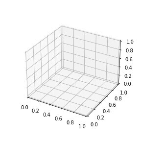
Here we are first creating a figure of size 4 inches X 4 inches.
We then create a 3-D axis object by calling the add_subplot method and specifying the value ‘3d’ to the projection parameter.
We will use this axis object ‘ax’ to add any plot to the figure.
Note that these two steps will be common in most of the 3D plotting you do in Python using Matplotlib.
Step 3: Plot the point
After we create the axes object, we can use it to create any type of plot we want in the 3D space.
To plot a single point, we will use the scatter()method, and pass the three coordinates of the point.
fig = plt.figure(figsize=(4,4))

ax = fig.add_subplot(111, projection='3d')

ax.scatter(2,3,4) # plot the point (2,3,4) on the figure

plt.show()
Output: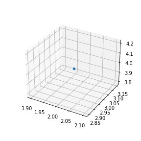
As you can see, a single point has been plotted (in blue) at (2,3,4).
Plotting a 3D continuous line
Now that we know how to plot a single point in 3D, we can similarly plot a continuous line passing through a list of 3D coordinates.
We will use the plot() method and pass 3 arrays, one each for the x, y, and z coordinates of the points on the line.
import numpy as np

x = np.linspace(−4*np.pi,4*np.pi,50)

y = np.linspace(−4*np.pi,4*np.pi,50)

z = x**2 + y**2

fig = plt.figure()

ax = fig.add_subplot(111, projection='3d')

ax.plot(x,y,z)

plt.show()
Output: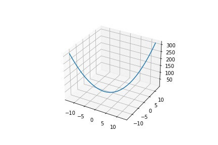
We are generating x, y, and z coordinates for 50 points.
The x and y coordinates are generated usingnp.linspace to generate 50 uniformly distributed points between -4π and +4π. The z coordinate is simply the sum of the squares of the corresponding x and y coordinates.
Customizing a 3D plot
Let us plot a scatter plot in 3D space and look at how we can customize its appearance in different ways based on our preferences. We will use NumPy random seed so you can generate the same random number as the tutorial.
np.random.seed(42)

xs = np.random.random(100)*10+20

ys = np.random.random(100)*5+7

zs = np.random.random(100)*15+50

fig = plt.figure()

ax = fig.add_subplot(111, projection='3d')

ax.scatter(xs,ys,zs)

plt.show()
Output: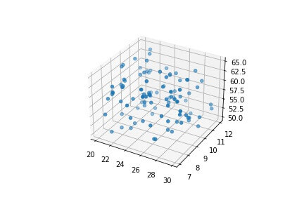
Let us now add a title to this plot
Adding a title
We will call the set_title method of the axes object to add a title to the plot.
ax.set_title("Atom velocity distribution")

plt.show()
Output: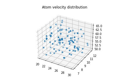
NOTE that I have not added the preceding code (to create the figure and add scatter plot) here, but you should do it.
Let us now add labels to each axis on the plot.
Adding axes labels
We can set a label for each axis in a 3D plot by calling the methods set_xlabel, set_ylabel and set_zlabel on the axes object.
ax.set_xlabel("Atomic mass (dalton)")

ax.set_ylabel("Atomic radius (pm)")

ax.set_zlabel("Atomic velocity (x10⁶ m/s)")

plt.show()
Output: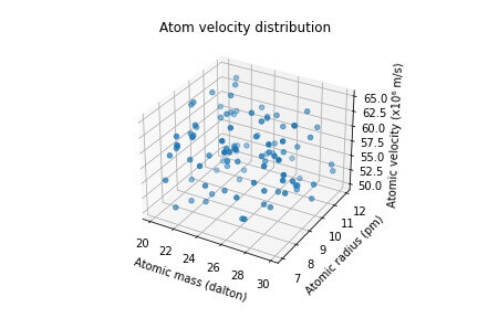
Modifying the markers
As we have seen in our previous examples, the marker for each point, by default, is a filled blue circle of constant size.
We can alter the appearance of the markers to make them more expressive.
Let us begin by changing the color and style of the marker
ax.scatter(xs,ys,zs, marker="x", c="red")

plt.show()
Output: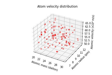
We have used the parameters marker and c to change the style and color of the individual points
Modifying the axes limits and ticks
The range and interval of values on the axes are set by default based on the input values.
We can however alter them to our desired values.
Let us create another scatter plot representing a new set of data points, and then modify its axes range and interval.
np.random.seed(42)

ages = np.random.randint(low = 8, high = 30, size=35)

heights = np.random.randint(130, 195, 35)

weights = np.random.randint(30, 160, 35)

fig = plt.figure()

ax = fig.add_subplot(111, projection='3d')

ax.scatter(xs = heights, ys = weights, zs = ages)

ax.set_title("Age-wise body weight-height distribution")

ax.set_xlabel("Height (cm)")

ax.set_ylabel("Weight (kg)")

ax.set_zlabel("Age (years)")

plt.show()
Output: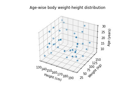
We have plotted data of 3 variables, namely, height, weight and age on the 3 axes.
As you can see, the limits on the X, Y, and Z axes have been assigned automatically based on the input data.
Let us modify the minimum and maximum limit on each axis, by calling the set_xlim, set_ylim, and set_zlim methods.
ax.set_xlim(100,200)

ax.set_ylim(20,160)

ax.set_zlim(5,35)

plt.show()
Output: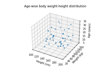
The limits for the three axes have been modified based on the min and max values we passed to the respective methods.
We can also modify the individual ticks for each axis. Currently, the X-axis ticks are [100,120,140,160,180,200].
Let us update this to [100,125,150,175,200]
ax.set_xticks([100,125,150,175,200])

plt.show()
Output: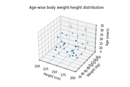
Similarly, we can update the Y and Z ticks using the set_yticks and set_zticks methods.
ax.set_yticks([20,55,90,125,160])

ax.set_zticks([5,15,25,35])

plt.show()
Output: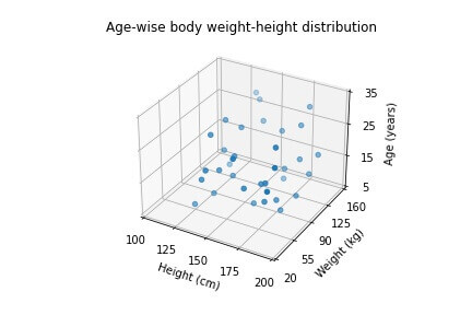
Change the size of the plot
If we want our plots to be bigger or smaller than the default size, we can easily set the size of the plot either when initializing the figure – using the figsize parameter of the plt.figure method,
or we can update the size of an existing plot by calling the set_size_inches method on the figure object.
In both approaches, we must specify the width and height of the plot in inches.
Since we have seen the first method of specifying the size of the plot earlier, let us look at the second approach now i.e modifying the size of an existing plot.
We will change the size of our scatter plot to 6×6 inches.
fig.set_size_inches(6, 6)

plt.show()
Output: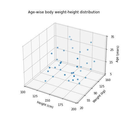
The size of our scatter plot has been increased compared to its previous default size.
Turn off/on gridlines
All the plots that we have plotted so far have gridlines on them by default.
We can change this by calling the grid method of the axes object, and pass the value ‘False.’
If we want the gridlines back again, we can call the same method with the parameter ‘True.’.
ax.grid(False)

plt.show()
Output: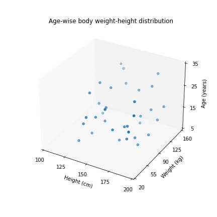
Set 3D plot colors based on class
Let us suppose that the individuals represented by our scatter plot were further divided into two or more categories.
We can represent this information by plotting the individuals of each category with a different color.
For instance, let us divide our data into ‘Male’ and ‘Female’ categories.
We will create a new array of the same size as the number of data points, and assign the values 0 for ‘Male’ and 1 for the ‘Female’ category.
We will then pass this array to the color parameter c when creating the scatter plot.
np.random.seed(42)

ages = np.random.randint(low = 8, high = 30, size=35)

heights = np.random.randint(130, 195, 35)

weights = np.random.randint(30, 160, 35)

gender_labels = np.random.choice([0, 1], 35) #0 for male, 1 for female

fig = plt.figure()

ax = fig.add_subplot(111, projection='3d')

ax.scatter(xs = heights, ys = weights, zs = ages, c=gender_labels)

ax.set_title("Age-wise body weight-height distribution")

ax.set_xlabel("Height (cm)")

ax.set_ylabel("Weight (kg)")

ax.set_zlabel("Age (years)")

plt.show()
Output: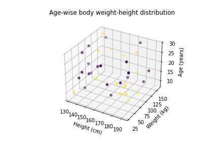
The plot now shows each of the two categories with a different color.
But how would we know which color corresponds to which category?
We can add a ‘colorbar’ to solve this problem.
scat_plot = ax.scatter(xs = heights, ys = weights, zs = ages, c=gender_labels)

cb = plt.colorbar(scat_plot, pad=0.2)

cb.set_ticks([0,1])

cb.set_ticklabels(["Male", "Female"])

plt.show()
Output: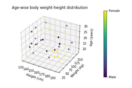
Putting legends
Often we have more than 1 set of data that we want to plot on the same figure.
In such a situation, we must assign labels to each plot and add a legend to the figure to distinguish the different plots from each other.
For eg, let us suppose that our age-height-weight data were collected from 3 states of the United States, namely, Florida, Georgia and California.
We want to plot scatter plots for the 3 states and add a legend to distinguish them from each other.
Let us create the 3 plots in a for-loop and assign a different label to them each time.
labels = ["Florida", "Georgia", "California"]

for l in labels:

    ages = np.random.randint(low = 8, high = 20, size=20)

    heights = np.random.randint(130, 195, 20)

    weights = np.random.randint(30, 160, 20)

    ax.scatter(xs = heights, ys = weights, zs = ages, label=l)

ax.set_title("Age-wise body weight-height distribution")

ax.set_xlabel("Height (cm)")

ax.set_ylabel("Weight (kg)")

ax.set_zlabel("Age (years)")

ax.legend(loc="best")

plt.show()
Output: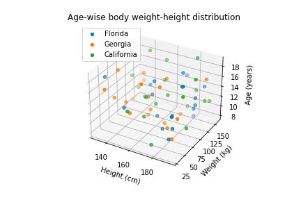
Plot markers of varying size
In the scatter plots that we have seen so far, all the point markers have been of constant sizes.
We can alter the size of markers by passing custom values to the parameter s of the scatter plot.
We can either pass a single number to set all the markers to a new fixed size, or we can provide an array of values, where each value represents the size of one marker.
In our example, we will calculate a new variable called ‘bmi’ from the heights and weights of individuals and make the sizes of individual markers proportional to their BMI values.
np.random.seed(42)

ages = np.random.randint(low = 8, high = 30, size=35)

heights = np.random.randint(130, 195, 35)

weights = np.random.randint(30, 160, 35)

bmi = weights/((heights*0.01)**2)

fig = plt.figure()

ax = fig.add_subplot(111, projection='3d')

ax.scatter(xs = heights, ys = weights, zs = ages, s=bmi*5 )

ax.set_title("Age-wise body weight-height distribution")

ax.set_xlabel("Height (cm)")

ax.set_ylabel("Weight (kg)")

ax.set_zlabel("Age (years)")

plt.show()
Output: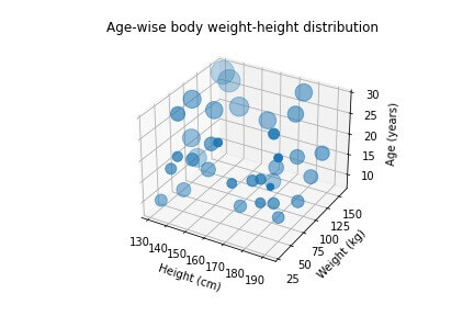
The greater the sizes of markers in this plot, the higher are the BMI’s of those individuals, and vice-versa.
Plotting a Gaussian distribution
You may be aware of a univariate Gaussian distribution plotted on a 2D plane, popularly known as the ‘bell-shaped curve.’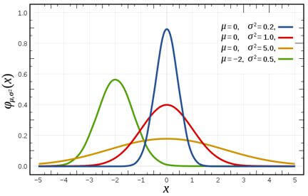
source: https://en.wikipedia.org/wiki/File:Normal_Distribution_PDF.svg
We can also plot a Gaussian distribution in a 3D space, using the multivariate normal distribution.
We must define the variables X and Y and plot a probability distribution of them together.
from scipy.stats import multivariate_normal

X = np.linspace(-5,5,50)

Y = np.linspace(-5,5,50)

X, Y = np.meshgrid(X,Y)

X_mean = 0; Y_mean = 0

X_var = 5; Y_var = 8

pos = np.empty(X.shape+(2,))

pos[:,:,0]=X

pos[:,:,1]=Y

rv = multivariate_normal([X_mean, Y_mean],[[X_var, 0], [0, Y_var]])

fig = plt.figure()

ax = fig.add_subplot(111, projection='3d')

ax.plot_surface(X, Y, rv.pdf(pos), cmap="plasma")

plt.show()
Output: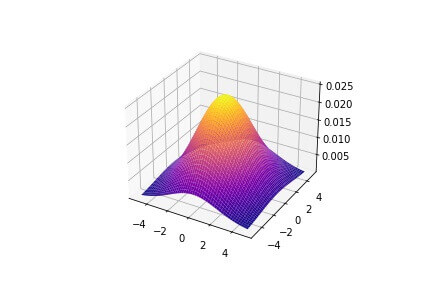
Using the plot_surface method, we can create similar surfaces in a 3D space.
Plotting a 3D Polygon
We can also plot polygons with 3-dimensional vertices in Python.
from mpl_toolkits.mplot3d.art3d import Poly3DCollection

fig = plt.figure()

ax = fig.add_subplot(111, projection='3d')

x = [1, 0, 3, 4]

y = [0, 5, 5, 1]

z = [1, 3, 4, 0]

vertices = [list(zip(x,y,z))]

poly = Poly3DCollection(vertices, alpha=0.8)

ax.add_collection3d(poly)

ax.set_xlim(0,5)

ax.set_ylim(0,5)

ax.set_zlim(0,5)
Output: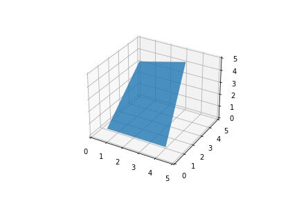
Rotate a 3D plot with the mouse
To create an interactive plot in a Jupyter Notebook, you should run the
magic command %matplotlib notebook at the beginning of the notebook.
This enables us to interact with the 3D plots, by zooming in and out of the plot, as well as rotating them in any direction.
%matplotlib notebook
import matplotlib.pyplot as plt

from mpl_toolkits.mplot3d import Axes3D

import numpy as np

from scipy.stats import multivariate_normal

X = np.linspace(-5,5,50)

Y = np.linspace(-5,5,50)

X, Y = np.meshgrid(X,Y)

X_mean = 0; Y_mean = 0

X_var = 5; Y_var = 8

pos = np.empty(X.shape+(2,))

pos[:,:,0]=X

pos[:,:,1]=Y

rv = multivariate_normal([X_mean, Y_mean],[[X_var, 0], [0, Y_var]])

fig = plt.figure()

ax = fig.add_subplot(111, projection='3d')

ax.plot_surface(X, Y, rv.pdf(pos), cmap="plasma")

plt.show()
Output: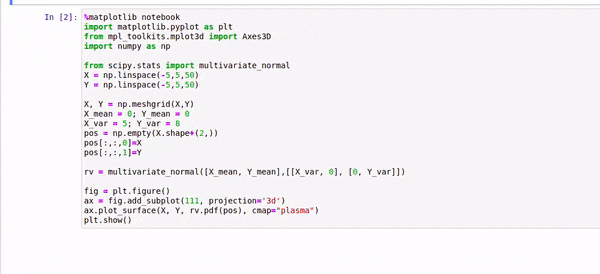
Plot two different 3D distributions
We can add two different 3D plots to the same figure, with the help of the fig.add_subplot method.
The 3-digit number we supply to the method indicates the number of rows and columns in the grid and the position of the current plot in the grid.
The first two digits indicate the total number of rows and columns we need to divide the figure in.
The last digit indicates the position of the subplot in the grid.
For example, if we pass the value 223 to the add_subplot method, we are referring to the 3rd plot in the 2×2 grid (considering row-first ordering).
Let us now look at an example where we plot two different distributions on a single plot.
#data generation for 1st plot
np.random.seed(42)

xs = np.random.random(100)*10+20

ys = np.random.random(100)*5+7

zs = np.random.random(100)*15+50

#data generation for 2nd plot
np.random.seed(42)

ages = np.random.randint(low = 8, high = 30, size=35)

heights = np.random.randint(130, 195, 35)

weights = np.random.randint(30, 160, 35)

fig = plt.figure(figsize=(8,4))

#First plot
ax = fig.add_subplot(121, projection='3d')

ax.scatter(xs,ys,zs, marker="x", c="red")

ax.set_title("Atom velocity distribution")

ax.set_xlabel("Atomic mass (dalton)")

ax.set_ylabel("Atomic radius (pm)")

ax.set_zlabel("Atomic velocity (x10⁶ m/s)")

#Second plot
ax = fig.add_subplot(122, projection='3d')

ax.scatter(xs = heights, ys = weights, zs = ages)

ax.set_title("Age-wise body weight-height distribution")

ax.set_xlabel("Height (cm)")

ax.set_ylabel("Weight (kg)")

ax.set_zlabel("Age (years)")

plt.show()
Output: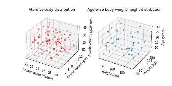
We can plot as many subplots as we want in this way, as long as we fit them right in the grid.
Output Python 3D plot to HTML
If we want to embed a 3D plot figure to an HTML page, without first saving it as an image file,
we can do so by encoding the figure into ‘base64’ and then inserting it at the correct position in an HTML img tag
import base64

from io import BytesIO

np.random.seed(42)

xs = np.random.random(100)*10+20

ys = np.random.random(100)*5+7

zs = np.random.random(100)*15+50

fig = plt.figure()

ax = fig.add_subplot(111, projection='3d')

ax.scatter(xs,ys,zs)

#encode the figure
temp = BytesIO()

fig.savefig(temp, format="png")

fig_encode_bs64 = base64.b64encode(temp.getvalue()).decode('utf-8')

html_string = """
<h2>This is a test html</h2>
<img src = 'data:image/png;base64,{}'/>
""".format(fig_encode_bs64)
We can now write this HTML code string to an HTML file, which we can then view in a browser
with open("test.html", "w") as f:

    f.write(html_string)
Output: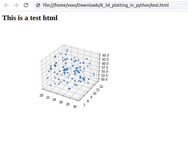
Conclusion
In this tutorial, we learned how to plot 3D plots in Python using the matplotlib library.
We began by plotting a point in the 3D coordinate space, and then plotted 3D curves and scatter plots.
Then we learned various ways of customizing a 3D plot in Python, such as adding a title, legends, axes labels to the plot, resizing the plot, switching on/off the gridlines on the plot, modifying the axes ticks, etc.
We also learned how to vary the size and color of the markers based on the data point category.
After that, we learned how to plot surfaces in a 3D space. We plotted a Gaussian distribution and a 3D polygon in Python.
We then saw how we can interact with a Python 3D plot in a Jupyter notebook.
Finally, we learned how to plot multiple subplots on the same figure, and how to output a figure into an HTML code.
Machine Learning Engineer & Software Developer working on challenging problems in Computer Vision at IITK Research and Development center.
3+ years of coding experience in Python, 1+ years of experience in Data Science and Machine Learning.
Skills: C++, OpenCV, Pytorch, Darknet, Pandas, ReactJS, Django.
good
Thanks!
Hello. I have data consisting of 30,000 data points and these data points have 3 features. I want to find (joint) probability density for each data point considering those features and then plot the density surface plot in the x y z coordinates, where x-y-z correspond to those 3 features, separately. Is there any Python library that you can suggest to me? I really appreciate it if you can help me.
Hi Ecem,
You can use SciPy library because it has gaussian_kde function that will calculate the joint probability density.
Let’s assume this is your data
data = np.load('data.npy')Then you can define the grid for computing like this:
x = np.linspace(data[:,0].min(), data[:,0].max(), 100)y = np.linspace(data[:,1].min(), data[:,1].max(), 100)
X, Y = np.meshgrid(x, y)
Z = kde.evaluate(np.vstack([X.ravel(), Y.ravel()]))
Finally, you can plot your density surface and add the data points
fig = plt.figure()ax = fig.gca(projection='3d')
ax.plot_surface(X, Y, Z.reshape(X.shape), cmap='viridis')
ax.scatter(data[:,0], data[:,1], data[:,2], c='black')
plt.show()
Hope that helps!
hello , i have epicenter of disaster and i want to make spear around 3d and there will be many speares with different color based on there location,
ex., for near points impact will be higher so that spear will be red , then next spear will have slietly larger radius but other colour than red
how to make something like this?
Hi,
Can you elaborate more and share some code so we can help?