Python correlation matrix tutorial (Using Pandas)
In this blog, we will go through an important descriptive statistic of multi-variable data called the correlation matrix. We will learn how to create, plot, and manipulate correlation matrices in Python using Pandas.
We will be looking at the following topics:
- 1 What is the correlation matrix?
- 2 Finding the correlation matrix of the given data
- 3 Plotting the correlation matrix
- 4 Interpreting the correlation matrix
- 5 Adding title and labels to the plot
- 6 Sorting the correlation matrix
- 7 Selecting negative correlation pairs
- 8 Selecting strong correlation pairs (magnitude greater than 0.5)
- 9 Converting a covariance matrix into the correlation matrix
- 10 Exporting the correlation matrix to an image
- 11 Conclusion
What is the correlation matrix?
A correlation matrix is a tabular data representing the ‘correlations’ between pairs of variables in a given data.

We will construct this correlation matrix by the end of this blog.
Each row and column represents a variable, and each value in this matrix is the correlation coefficient between the variables represented by the corresponding row and column.
The Correlation matrix is an important data analysis metric that is computed to summarize data to understand the relationship between various variables and make decisions accordingly.
It is also an important pre-processing step in Machine Learning pipelines to compute and analyze the correlation matrix where dimensionality reduction is desired on a high-dimension data.
We mentioned how each cell in the correlation matrix is a ‘correlation coefficient‘ between the two variables corresponding to the row and column of the cell.
Let us understand what a correlation coefficient is before we move ahead.
What is the correlation coefficient?
A correlation coefficient is a number that denotes the strength of the relationship between two variables.
There are several types of correlation coefficients, but the most common of them all is the Pearson’s coefficient denoted by the Greek letter ρ (rho).
It is defined as the covariance between two variables divided by the product of the standard deviations of the two variables.
Where the covariance between X and Y COV(X, Y) is further defined as the ‘expected value of the product of the deviations of X and Y from their respective means’.
The formula for covariance would make it clearer.![]()
So the formula for Pearson’s correlation would then become: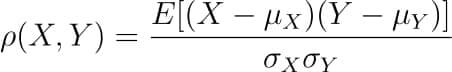
The value of ρ lies between -1 and +1.
Values nearing +1 indicate the presence of a strong positive relation between X and Y, whereas those nearing -1 indicate a strong negative relation between X and Y.
Values near to zero mean there is an absence of any relationship between X and Y.
Finding the correlation matrix of the given data
Let us generate random data for two variables and then construct the correlation matrix for them.
import numpy as np
np.random.seed(10)
# generating 10 random values for each of the two variables
X = np.random.randn(10)
Y = np.random.randn(10)
# computing the corrlation matrix
C = np.corrcoef(X,Y)
print(C)
Output: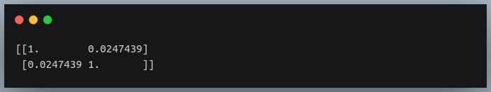
Since we compute the correlation matrix of 2 variables, its dimensions are 2 x 2.
The value 0.02 indicates there doesn’t exist a relationship between the two variables. This was expected since their values were generated randomly.
In this example, we used NumPy’s `corrcoef` method to generate the correlation matrix.
However, this method has a limitation in that it can compute the correlation matrix between 2 variables only.
Hence, going ahead, we will use DataFrames to store the data and to compute the correlation matrix on them.
Plotting the correlation matrix
For this explanation, we will use a data set that has more than just two features.
We will use the Breast Cancer data, a popular binary classification data used in introductory ML lessons.
We will load this data set from the scikit-learn’s dataset module.
It is returned in the form of NumPy arrays, but we will convert them into Pandas DataFrame.
from sklearn.datasets import load_breast_cancer
import pandas as pd
breast_cancer = load_breast_cancer()
data = breast_cancer.data
features = breast_cancer.feature_names
df = pd.DataFrame(data, columns = features)
print(df.shape)
print(features)
Output: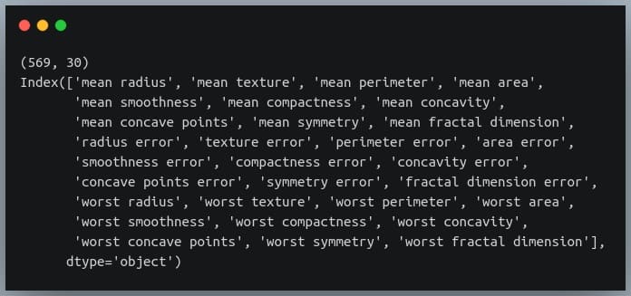
There are 30 features in the data, all of which are listed in the output above.
Our goal is now to determine the relationship between each pair of these columns. We will do so by plotting the correlation matrix.
To keep things simple, we’ll only use the first six columns and plot their correlation matrix.
To plot the matrix, we will use a popular visualization library called seaborn, which is built on top of matplotlib.
import seaborn as sns
import matplotlib.pyplot as plt
# taking all rows but only 6 columns
df_small = df.iloc[:,:6]
correlation_mat = df_small.corr()
sns.heatmap(correlation_mat, annot = True)
plt.show()
Output:
The plot shows a 6 x 6 matrix and color-fills each cell based on the correlation coefficient of the pair representing it.
Pandas DataFrame’s corr() method is used to compute the matrix. By default, it computes the Pearson’s correlation coefficient.
We could also use other methods such as Spearman’s coefficient or Kendall Tau correlation coefficient by passing an appropriate value to the parameter 'method'.
We’ve used seaborn’s heatmap() method to plot the matrix. The parameter ‘annot=True‘ displays the values of the correlation coefficient in each cell.
Let us now understand how to interpret the plotted correlation coefficient matrix.
Interpreting the correlation matrix
Let’s first reproduce the matrix generated in the earlier section and then discuss it.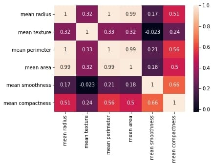
You must keep the following points in mind with regards to the correlation matrices such as the one shown above:
- Each cell in the grid represents the value of the correlation coefficient between two variables.
- The value at position (a, b) represents the correlation coefficient between features at row a and column b. This will be equal to the value at position (b, a)
- It is a square matrix – each row represents a variable, and all the columns represent the same variables as rows, hence the number of rows = number of columns.
- It is a symmetric matrix – this makes sense because the correlation between a,b will be the same as that between b, a.
- All diagonal elements are 1. Since diagonal elements represent the correlation of each variable with itself, it will always be equal to 1.
- The axes ticks denote the feature each of them represents.
- A large positive value (near to 1.0) indicates a strong positive correlation, i.e., if the value of one of the variables increases, the value of the other variable increases as well.
- A large negative value (near to -1.0) indicates a strong negative correlation, i.e., the value of one variable decreases with the other’s increasing and vice-versa.
- A value near to 0 (both positive or negative) indicates the absence of any correlation between the two variables, and hence those variables are independent of each other.
- Each cell in the above matrix is also represented by shades of a color. Here darker shades of the color indicate smaller values while brighter shades correspond to larger values (near to 1).
This scale is given with the help of a color-bar on the right side of the plot.
Adding title and labels to the plot
We can tweak the generated correlation matrix, just like any other Matplotlib plot. Let us see how we can add a title to the matrix and labels to the axes.
correlation_mat = df_small.corr()
sns.heatmap(correlation_mat, annot = True)
plt.title("Correlation matrix of Breast Cancer data")
plt.xlabel("cell nucleus features")
plt.ylabel("cell nucleus features")
plt.show()
Output: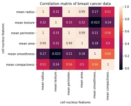
If we want, we could also change the position of the title to bottom by specifying the y position.
correlation_mat = df_small.corr()
sns.heatmap(correlation_mat, annot = True)
plt.title("Correlation matrix of Breast Cancer data", y=-0.75)
plt.xlabel("cell nucleus features")
plt.ylabel("cell nucleus features")
plt.show()
Output: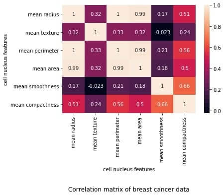
Sorting the correlation matrix
If the given data has a large number of features, the correlation matrix can become very big and hence difficult to interpret.
Sometimes we might want to sort the values in the matrix and see the strength of correlation between various feature pairs in an increasing or decreasing order.
Let us see how we can achieve this.
First, we will convert the given matrix into a one-dimensional Series of values.
correlation_mat = df_small.corr()
corr_pairs = correlation_mat.unstack()
print(corr_pairs)
Output: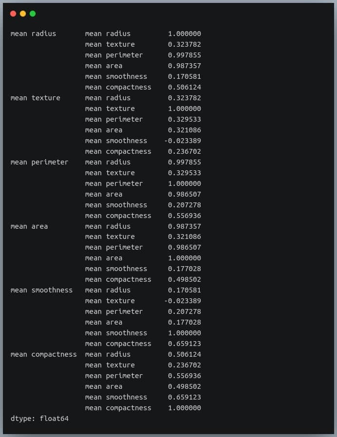
The unstack method on the Pandas DataFrame returns a Series with MultiIndex.That is, each value in the Series is represented by more than one indices, which in this case are the row and column indices that happen to be the feature names.
Let us now sort these values using the sort_values() method of the Pandas Series.
sorted_pairs = corr_pairs.sort_values(kind="quicksort")
print(sorted_pairs)
Output: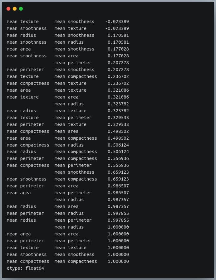
We can see each value is repeated twice in the sorted output. This is because our correlation matrix was a symmetric matrix, and each pair of features occurred twice in it.
Nonetheless, we now have the sorted correlation coefficient values of all pairs of features and can make decisions accordingly.
Selecting negative correlation pairs
We may want to select feature pairs having a particular range of values of the correlation coefficient.
Let’s see how we can choose pairs with a negative correlation from the sorted pairs we generated in the previous section.
negative_pairs = sorted_pairs[sorted_pairs < 0]
print(negative_pairs)
Output: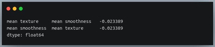
Selecting strong correlation pairs (magnitude greater than 0.5)
Let us use the same approach to choose strongly related features. That is, we will try to filter out those feature pairs whose correlation coefficient values are greater than 0.5 or less than -0.5.
strong_pairs = sorted_pairs[abs(sorted_pairs) > 0.5]
print(strong_pairs)
Output: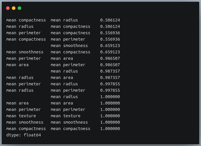
Converting a covariance matrix into the correlation matrix
We have seen the relationship between the covariance and correlation between a pair of variables in the introductory sections of this blog.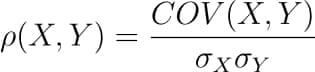
Let us understand how we can compute the covariance matrix of a given data in Python and then convert it into a correlation matrix. We’ll compare it with the correlation matrix we had generated using a direct method call.
First of all, Pandas doesn’t provide a method to compute covariance between all pairs of variables, so we’ll use NumPy’s cov() method.
cov = np.cov(df_small.T)
print(cov)
Output: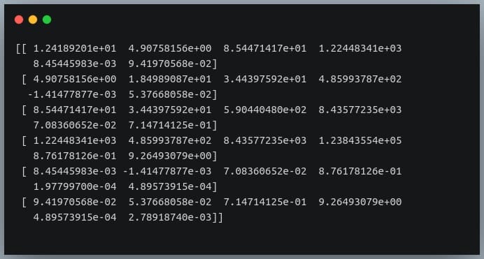
We’re passing the transpose of the matrix because the method expects a matrix in which each of the features is represented by a row rather than a column.
So we have gotten our numerator right.
Now we need to compute a 6×6 matrix in which the value at i, j is the product of standard deviations of features at positions i and j.
We’ll then divide the covariance matrix by this standard deviations matrix to compute the correlation matrix.
Let us first construct the standard deviations matrix.
#compute standard deviations of each of the 6 features
stds = np.std(df_small, axis = 0) #shape = (6,)
stds_matrix = np.array([[stds[i]*stds[j] for j in range(6)] for i in range(6)])
print("standard deviations matrix of shape:",stds_matrix.shape)
Output:
Now that we have the covariance matrix of shape (6,6) for the 6 features, and the pairwise product of features matrix of shape (6,6), we can divide the two and see if we get the desired resultant correlation matrix.
new_corr = cov/std_matrix
We have stored the new correlation matrix (derived from a covariance matrix) in the variable new_corr.
Let us check if we got it right by plotting the correlation matrix and juxtaposing it with the earlier one generated directly using the Pandas method corr().
plt.figure(figsize=(18,4))
plt.subplot(1,2,1)
sns.heatmap(correlation_mat, annot = True)
plt.title("Earlier correlation matrix (from Pandas)")
plt.xlabel("cell nucleus features")
plt.ylabel("cell nucleus features")
plt.subplot(1,2,2)
sns.heatmap(correlation_mat, annot = True)
plt.title("Newer correlation matrix (from Covariance mat)")
plt.xlabel("cell nucleus features")
plt.ylabel("cell nucleus features")
plt.show()
Output: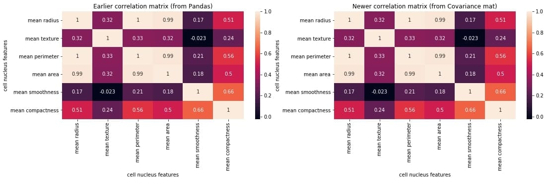
We can compare the two matrices and notice that they are identical.
Exporting the correlation matrix to an image
Plotting the correlation matrix in a Python script is not enough. We might want to save it for later use.
We can save the generated plot as an image file on disk using the plt.savefig() method.
correlation_mat = df_small.corr()
sns.heatmap(correlation_mat, annot = True)
plt.title("Correlation matrix of Breast Cancer data")
plt.xlabel("cell nucleus features")
plt.ylabel("cell nucleus features")
plt.savefig("breast_cancer_correlation.png")
After you run this code, you can see an image file with the name ‘breast_cancer_correlation.png’ in the same working directory.
Conclusion
In this tutorial, we learned what a correlation matrix is and how to generate them in Python. We began by focusing on the concept of a correlation matrix and the correlation coefficients.
Then we generated the correlation matrix as a NumPy array and then as a Pandas DataFrame. Next, we learned how to plot the correlation matrix and manipulate the plot labels, title, etc. We also discussed various properties used for interpreting the output correlation matrix.
We also saw how we could perform certain operations on the correlation matrix, such as sorting the matrix, finding negatively correlated pairs, finding strongly correlated pairs, etc.
Then we discussed how we could use a covariance matrix of the data and generate the correlation matrix from it by dividing it with the product of standard deviations of individual features.
Finally, we saw how we could save the generated plot as an image file.
Mokhtar is the founder of LikeGeeks.com. He is a seasoned technologist and accomplished author, with expertise in Linux system administration and Python development. Since 2010, Mokhtar has built an impressive career, transitioning from system administration to Python development in 2015. His work spans large corporations to freelance clients around the globe. Alongside his technical work, Mokhtar has authored some insightful books in his field. Known for his innovative solutions, meticulous attention to detail, and high-quality work, Mokhtar continually seeks new challenges within the dynamic field of technology.