Add Color to Python Matplotlib 3D Quiver (Vector) Plots
This tutorial will guide you through various methods to add color to your 3D Quiver plots using Python Matplotlib.
By adding color to these plots, you can enhance their visual appeal.
Single color for all arrows
To create a basic 3D Quiver plot with a single color for all arrows, you can use the following code:
import numpy as np
import matplotlib.pyplot as plt
from mpl_toolkits.mplot3d import Axes3D
x, y, z = np.meshgrid(np.arange(-2, 3), np.arange(-2, 3), np.arange(-2, 3))
u = np.sin(np.pi * x) * np.cos(np.pi * y) * np.cos(np.pi * z)
v = -np.cos(np.pi * x) * np.sin(np.pi * y) * np.cos(np.pi * z)
w = np.sqrt(2.0 / 3.0) * np.cos(np.pi * x) * np.cos(np.pi * y) * np.sin(np.pi * z)
fig = plt.figure(figsize=(10, 8))
ax = fig.add_subplot(111, projection='3d')
ax.quiver(x, y, z, u, v, w, color='red', length=0.5, normalize=True)
ax.set_xlabel('X')
ax.set_ylabel('Y')
ax.set_zlabel('Z')
ax.set_title('3D Quiver Plot with Single Color')
plt.show()
Output:
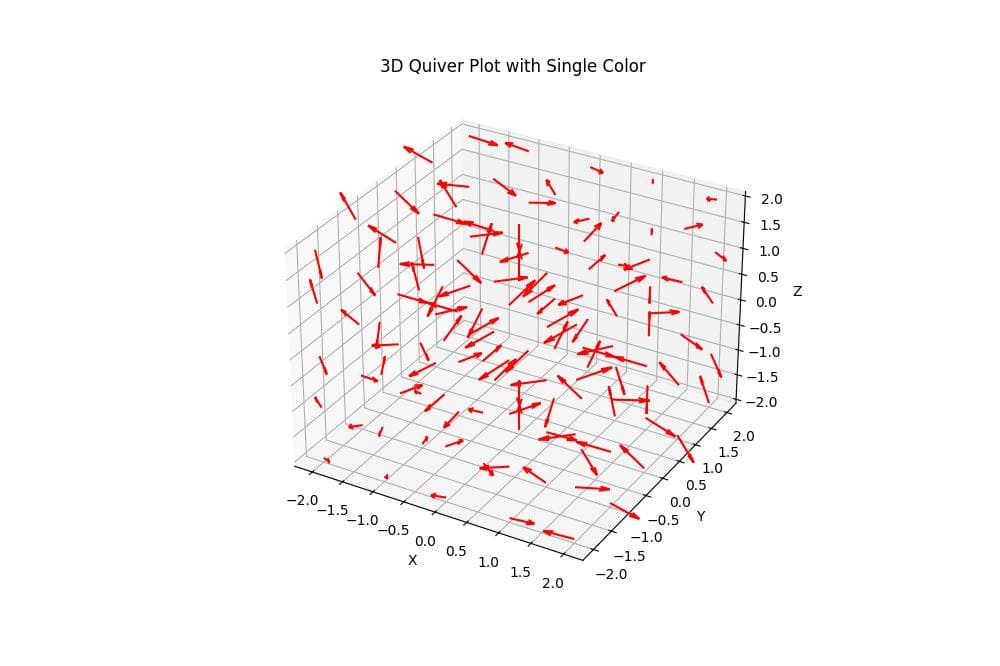
This code creates a 3D Quiver plot with all arrows colored red.
The quiver function is used to plot the arrows, and the color parameter is set to ‘red’.
The resulting plot shows a 3D vector field with uniformly colored arrows.
Color Based on Arrow Magnitude
To color arrows based on their magnitude, you can use the norm parameter:
import numpy as np
import matplotlib.pyplot as plt
from mpl_toolkits.mplot3d import Axes3D
from matplotlib.colors import Normalize
x, y, z = np.meshgrid(np.arange(-2, 3), np.arange(-2, 3), np.arange(-2, 3))
u = np.sin(np.pi * x) * np.cos(np.pi * y) * np.cos(np.pi * z)
v = -np.cos(np.pi * x) * np.sin(np.pi * y) * np.cos(np.pi * z)
w = np.sqrt(2.0 / 3.0) * np.cos(np.pi * x) * np.cos(np.pi * y) * np.sin(np.pi * z)
magnitude = np.sqrt(u**2 + v**2 + w**2)
fig = plt.figure(figsize=(10, 8))
ax = fig.add_subplot(111, projection='3d')

# Flatten the magnitude array and apply the colormap
norm = Normalize()
magnitude_flat = magnitude.flatten()
colors = plt.cm.viridis(norm(magnitude_flat))

# Plot the quiver with color based on magnitude
quiver = ax.quiver(x, y, z, u, v, w, color=colors, length=0.5, normalize=True)
ax.set_xlabel('X')
ax.set_ylabel('Y')
ax.set_zlabel('Z')
ax.set_title('3D Quiver Plot Colored by Magnitude')
cbar = plt.colorbar(plt.cm.ScalarMappable(norm=norm, cmap=plt.cm.viridis), ax=ax)
cbar.set_label('Magnitude')
plt.show()
Output:
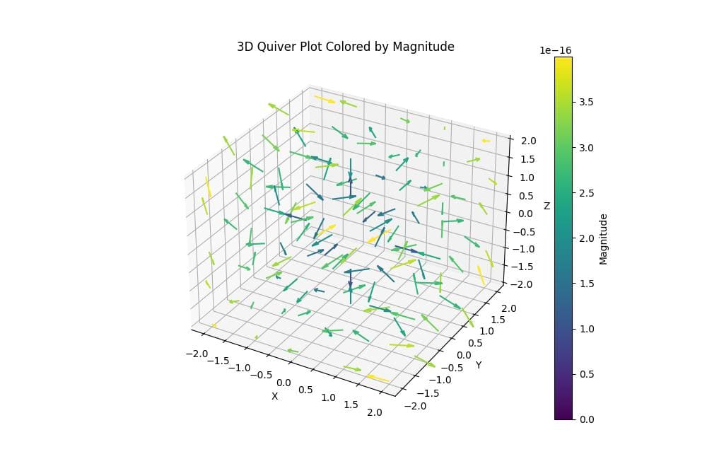
The Normalize function is used to scale the magnitude values.
The resulting plot shows arrows with colors ranging from purple (low magnitude) to yellow (high magnitude).
Multiple Colors for Different Arrows
To assign different colors to specific arrows, you can use a list of colors:
import numpy as np
import matplotlib.pyplot as plt
from mpl_toolkits.mplot3d import Axes3D
x = np.array([0, 1, 2, 0, 1, 2])
y = np.array([0, 0, 0, 1, 1, 1])
z = np.array([0, 0, 0, 1, 1, 1])
u = np.array([1, 1, 1, -1, -1, -1])
v = np.array([1, 1, 1, 1, 1, 1])
w = np.array([1, -1, 1, -1, 1, -1])
colors = ['red', 'green', 'blue', 'cyan', 'magenta', 'yellow']
fig = plt.figure(figsize=(10, 8))
ax = fig.add_subplot(111, projection='3d')
ax.quiver(x, y, z, u, v, w, colors=colors, length=0.5, normalize=True)
ax.set_xlabel('X')
ax.set_ylabel('Y')
ax.set_zlabel('Z')
ax.set_title('3D Quiver Plot with Multiple Colors')
plt.show()
Output:
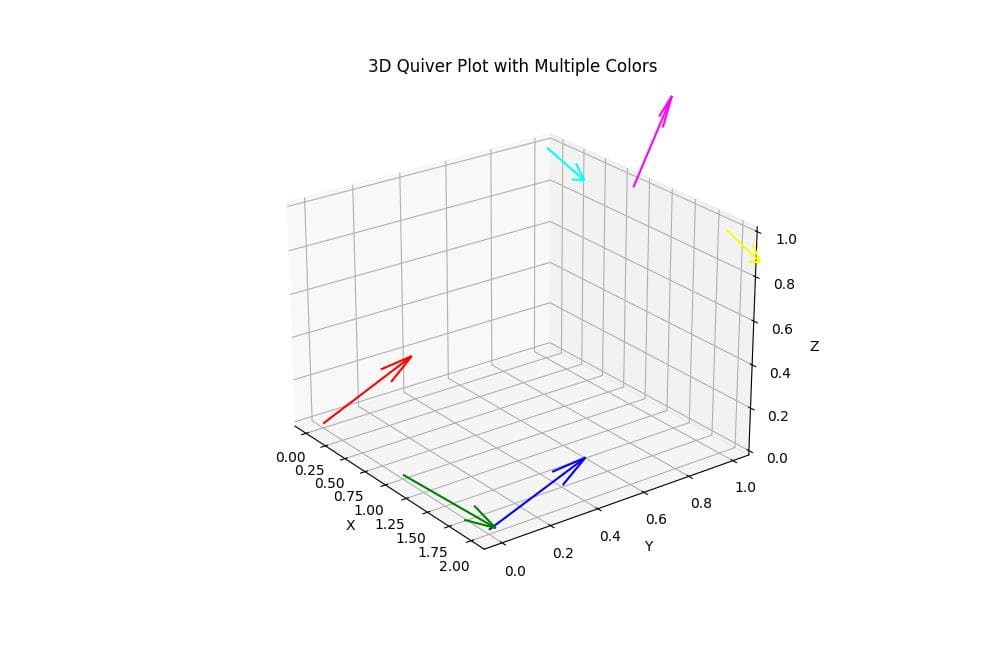
This code creates a 3D Quiver plot with six arrows, each assigned a different color from the colors list.
Color Using Colormap
To apply a colormap to your 3D Quiver plot, you can use the following method:
import numpy as np
import matplotlib.pyplot as plt
from mpl_toolkits.mplot3d import Axes3D
from matplotlib.colors import Normalize
x, y, z = np.meshgrid(np.arange(-2, 3), np.arange(-2, 3), np.arange(-2, 3))
u = np.sin(np.pi * x) * np.cos(np.pi * y) * np.cos(np.pi * z)
v = -np.cos(np.pi * x) * np.sin(np.pi * y) * np.cos(np.pi * z)
w = np.sqrt(2.0 / 3.0) * np.cos(np.pi * x) * np.cos(np.pi * y) * np.sin(np.pi * z)

# Calculate a parameter for coloring (e.g., z-coordinate)
color_param = z.flatten()  # Flatten the array
fig = plt.figure(figsize=(10, 8))
ax = fig.add_subplot(111, projection='3d')
norm = Normalize(vmin=color_param.min(), vmax=color_param.max())
colors = plt.cm.coolwarm(norm(color_param))
quiver = ax.quiver(x, y, z, u, v, w, color=colors, length=0.5, normalize=True)
ax.set_xlabel('X')
ax.set_ylabel('Y')
ax.set_zlabel('Z')
ax.set_title('3D Quiver Plot with Colormap')
cbar = plt.colorbar(plt.cm.ScalarMappable(norm=norm, cmap=plt.cm.coolwarm), ax=ax)
cbar.set_label('Z-coordinate')
plt.show()
Output:
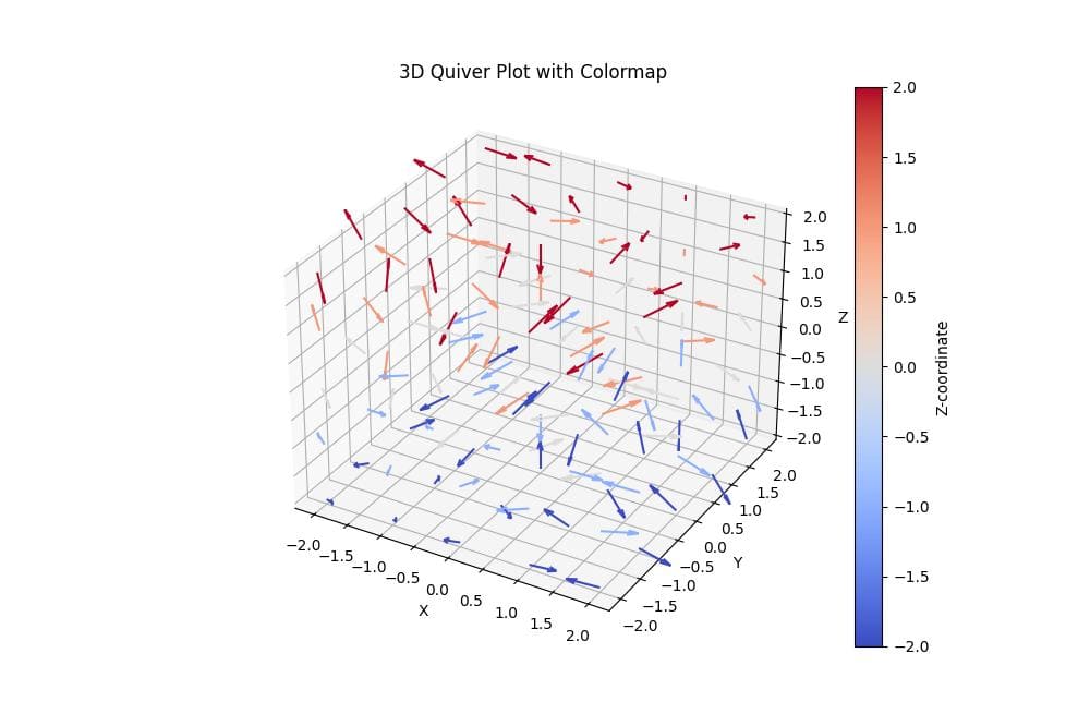
This code applies the ‘coolwarm’ colormap to the arrows based on their z-coordinate.
The plot shows a smooth transition of colors from blue (lower z-values) to red (higher z-values).
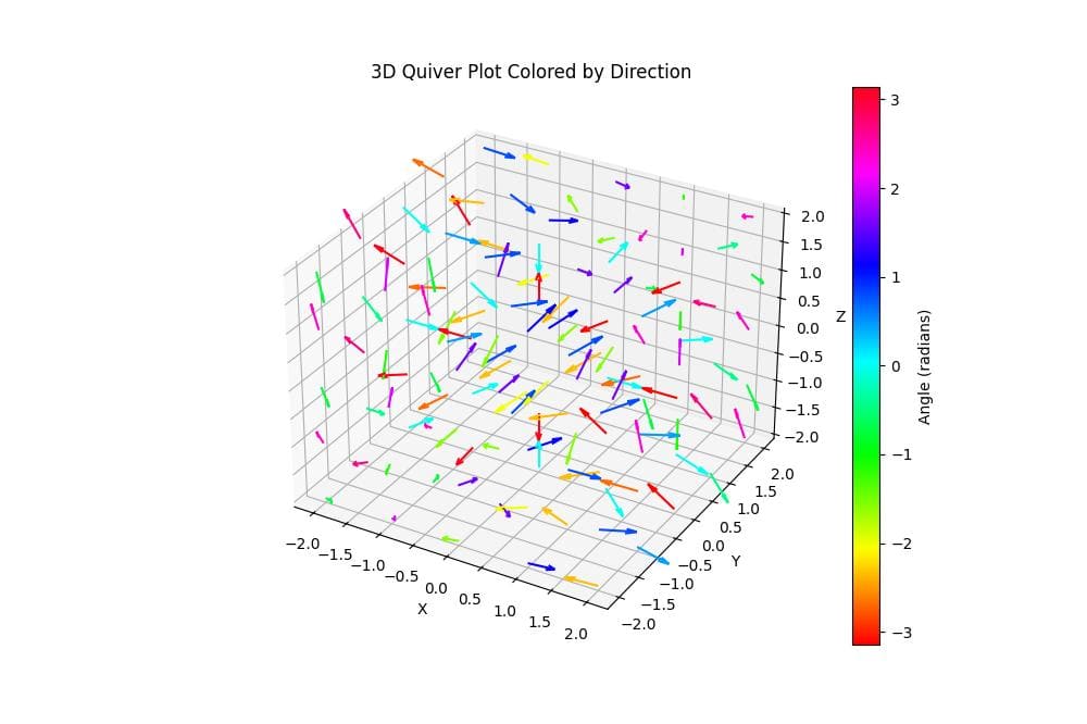
Color Based on Direction
To color arrows based on their direction, you can use the following code:
import numpy as np
import matplotlib.pyplot as plt
from mpl_toolkits.mplot3d import Axes3D
from matplotlib.colors import Normalize
x, y, z = np.meshgrid(np.arange(-2, 3), np.arange(-2, 3), np.arange(-2, 3))
u = np.sin(np.pi * x) * np.cos(np.pi * y) * np.cos(np.pi * z)
v = -np.cos(np.pi * x) * np.sin(np.pi * y) * np.cos(np.pi * z)
w = np.sqrt(2.0 / 3.0) * np.cos(np.pi * x) * np.cos(np.pi * y) * np.sin(np.pi * z)

# Calculate angles for coloring
theta = np.arctan2(v, u)
fig = plt.figure(figsize=(10, 8))
ax = fig.add_subplot(111, projection='3d')

# Create a color map
norm = Normalize(vmin=-np.pi, vmax=np.pi)
colors = plt.cm.hsv(norm(theta))
quiver = ax.quiver(x, y, z, u, v, w, colors=colors.reshape(-1, 4), length=0.5, normalize=True)
ax.set_xlabel('X')
ax.set_ylabel('Y')
ax.set_zlabel('Z')
ax.set_title('3D Quiver Plot Colored by Direction')
sm = plt.cm.ScalarMappable(cmap=plt.cm.hsv, norm=norm)
sm.set_array([])
cbar = fig.colorbar(sm, ax=ax)
cbar.set_label('Angle (radians)')
plt.show()
Output:
This code colors the arrows based on their azimuthal angle (theta) using the HSV colormap.
The plot shows arrows with different colors representing their directions in the xy-plane.
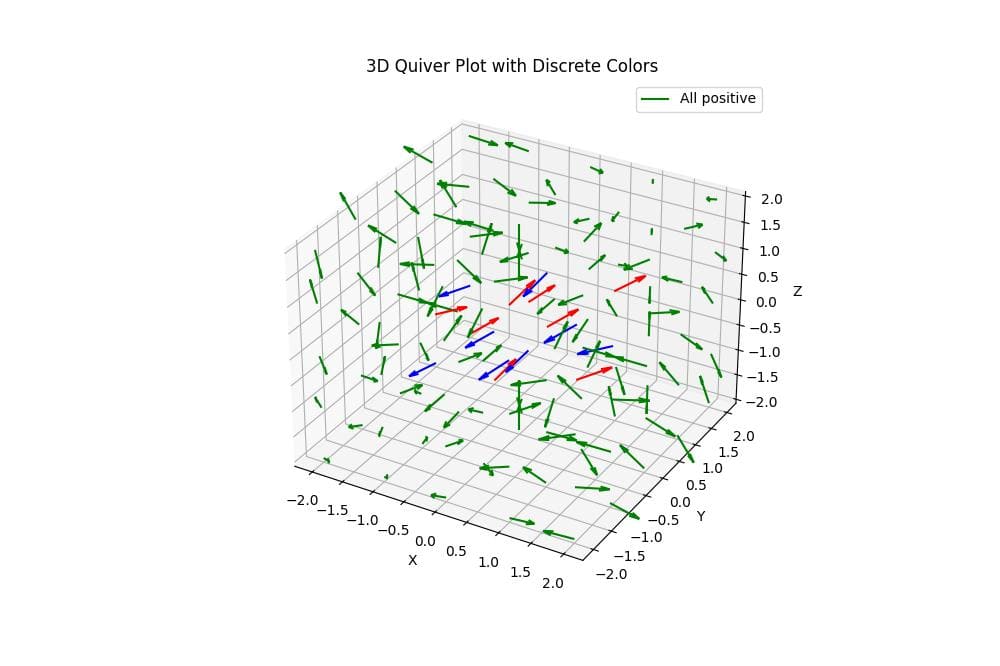
Discrete Colors Based on Conditions
To assign discrete colors based on specific conditions, you can use the following method:
import numpy as np
import matplotlib.pyplot as plt
from mpl_toolkits.mplot3d import Axes3D
x, y, z = np.meshgrid(np.arange(-2, 3), np.arange(-2, 3), np.arange(-2, 3))
u = np.sin(np.pi * x) * np.cos(np.pi * y) * np.cos(np.pi * z)
v = -np.cos(np.pi * x) * np.sin(np.pi * y) * np.cos(np.pi * z)
w = np.sqrt(2.0 / 3.0) * np.cos(np.pi * x) * np.cos(np.pi * y) * np.sin(np.pi * z)
condition1 = (u > 0) & (v > 0) & (w > 0)
condition2 = (u < 0) & (v < 0) & (w < 0)
condition3 = ~(condition1 | condition2)

# Assign colors based on conditions
colors = np.empty(u.shape, dtype=object)
colors[condition1] = 'red'
colors[condition2] = 'blue'
colors[condition3] = 'green'
fig = plt.figure(figsize=(10, 8))
ax = fig.add_subplot(111, projection='3d')
quiver = ax.quiver(x, y, z, u, v, w, colors=colors.flatten(), length=0.5, normalize=True)
ax.set_xlabel('X')
ax.set_ylabel('Y')
ax.set_zlabel('Z')
ax.set_title('3D Quiver Plot with Discrete Colors')
ax.legend(['All positive', 'All negative', 'Mixed'])
plt.show()
Output:
This code assigns discrete colors to arrows based on specific conditions: red for arrows with all positive components, blue for all negative components, and green for mixed cases.
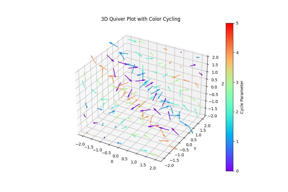
Color Cycling
To create a color-cycling effect in your 3D Quiver plot, you can use the following code:
import numpy as np
import matplotlib.pyplot as plt
from mpl_toolkits.mplot3d import Axes3D
x, y, z = np.meshgrid(np.arange(-2, 3), np.arange(-2, 3), np.arange(-2, 3))
u = np.sin(np.pi * x) * np.cos(np.pi * y) * np.cos(np.pi * z)
v = -np.cos(np.pi * x) * np.sin(np.pi * y) * np.cos(np.pi * z)
w = np.sqrt(2.0 / 3.0) * np.cos(np.pi * x) * np.cos(np.pi * y) * np.sin(np.pi * z)

# Create a parameter for color cycling
cycle_param = (x + y + z) % 5
fig = plt.figure(figsize=(10, 8))
ax = fig.add_subplot(111, projection='3d')
quiver = ax.quiver(x.flatten(), y.flatten(), z.flatten(),
                  u.flatten(), v.flatten(), w.flatten(),
                  length=0.5,
                  normalize=True,
                  color=plt.cm.rainbow(cycle_param.flatten()/5.0))
ax.set_xlabel('X')
ax.set_ylabel('Y')
ax.set_zlabel('Z')
ax.set_title('3D Quiver Plot with Color Cycling')
norm = plt.Normalize(vmin=0, vmax=5)
sm = plt.cm.ScalarMappable(cmap=plt.cm.rainbow, norm=norm)
sm.set_array([])
cbar = plt.colorbar(sm, ax=ax)
cbar.set_label('Cycle Parameter')
plt.show()
Output:
This code creates a color-cycling effect by using a cyclic parameter based on the sum of x, y, and z coordinates.
The ‘rainbow’ colormap is applied to this parameter which gives a visually striking plot where colors repeat in a cyclic pattern throughout the 3D space.
This method can be useful for highlighting periodic patterns or structures in your vector field.
Mokhtar is the founder of LikeGeeks.com. He is a seasoned technologist and accomplished author, with expertise in Linux system administration and Python development. Since 2010, Mokhtar has built an impressive career, transitioning from system administration to Python development in 2015. His work spans large corporations to freelance clients around the globe. Alongside his technical work, Mokhtar has authored some insightful books in his field. Known for his innovative solutions, meticulous attention to detail, and high-quality work, Mokhtar continually seeks new challenges within the dynamic field of technology.

