Create 3D Probability Plots in Python
In this tutorial, you’ll learn how to create 3D probability plots using Python.
You’ll explore various methods to generate, manipulate, and visualize probability data in three dimensions.
Generate Sample Data
To begin, you’ll need to generate sample data for your 3D probability plots.
Let’s create a simple dataset using NumPy.
import numpy as np
import matplotlib.pyplot as plt
from mpl_toolkits.mplot3d import Axes3D
x = np.linspace(-5, 5, 100)
y = np.linspace(-5, 5, 100)
X, Y = np.meshgrid(x, y)
Z = np.sin(np.sqrt(X**2 + Y**2))
fig = plt.figure(figsize=(10, 8))
ax = fig.add_subplot(111, projection='3d')
ax.plot_surface(X, Y, Z, cmap='viridis')
ax.set_xlabel('X')
ax.set_ylabel('Y')
ax.set_zlabel('Z')
ax.set_title('Sample 3D Surface Plot')
plt.show()
Output:
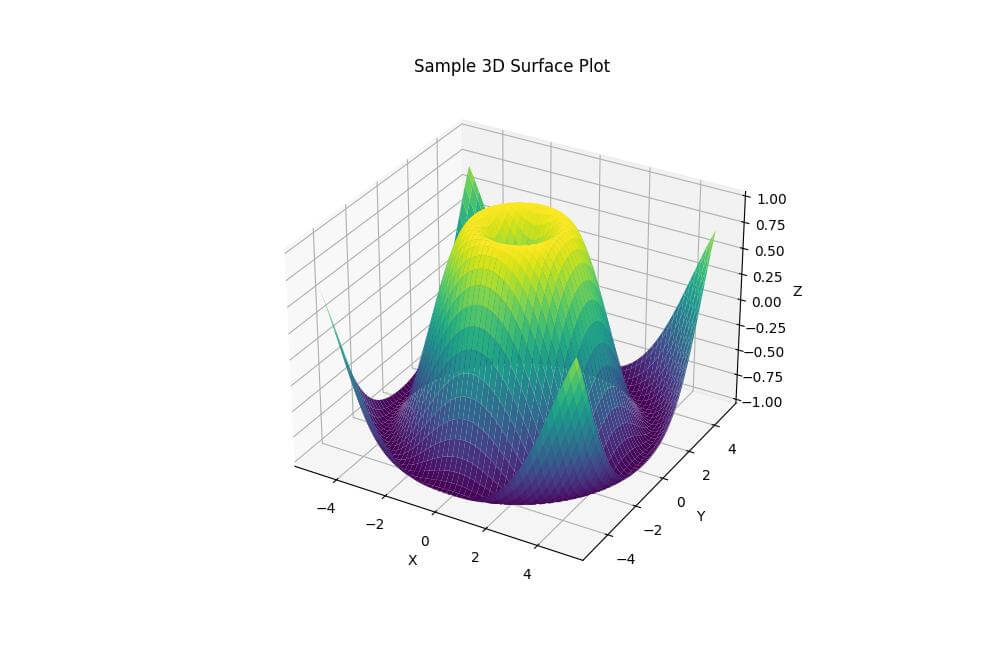
The X and Y axes represent the input variables, while the Z axis shows the probability or function value.
The resulting plot displays a circular wave pattern, with peaks and troughs radiating from the center.
Gaussian Normal Distribution
To create a 3D plot of a Gaussian normal distribution, you can use the following code:
from scipy.stats import multivariate_normal

# Generate data for a 2D Gaussian distribution
mean = [0, 0]
cov = [[1, 0], [0, 1]]
x = np.linspace(-3, 3, 100)
y = np.linspace(-3, 3, 100)
X, Y = np.meshgrid(x, y)
pos = np.dstack((X, Y))
rv = multivariate_normal(mean, cov)
Z = rv.pdf(pos)
fig = plt.figure(figsize=(10, 8))
ax = fig.add_subplot(111, projection='3d')
ax.plot_surface(X, Y, Z, cmap='viridis')
ax.set_xlabel('X')
ax.set_ylabel('Y')
ax.set_zlabel('Probability Density')
ax.set_title('3D Gaussian Normal Distribution')
plt.show()
Output:
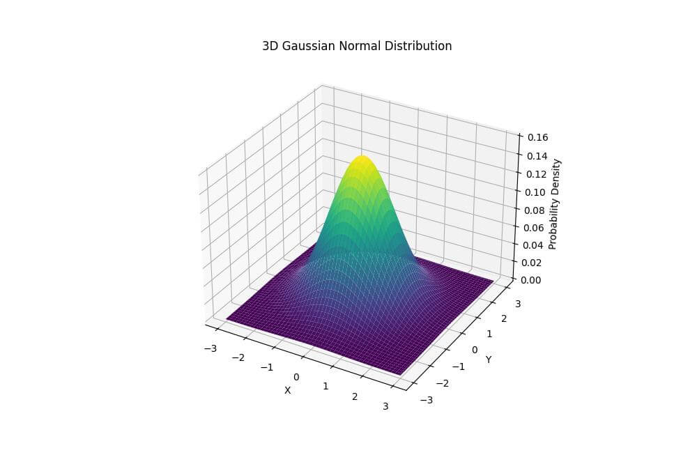
The height of the surface represents the probability density, with the peak at the mean and gradually decreasing values as you move away from the center.
Multivariate Normal Distribution
To visualize a multivariate normal distribution with correlation, use this code:
# Generate data for a 2D multivariate normal distribution with correlation
mean = [1, -1]
cov = [[1, 0.5], [0.5, 2]]
x = np.linspace(-3, 5, 100)
y = np.linspace(-5, 3, 100)
X, Y = np.meshgrid(x, y)
pos = np.dstack((X, Y))
rv = multivariate_normal(mean, cov)
Z = rv.pdf(pos)

# Create the 3D plot
fig = plt.figure(figsize=(10, 8))
ax = fig.add_subplot(111, projection='3d')
ax.plot_surface(X, Y, Z, cmap='plasma')
ax.set_xlabel('X')
ax.set_ylabel('Y')
ax.set_zlabel('Probability Density')
ax.set_title('3D Multivariate Normal Distribution')
plt.show()
Output:
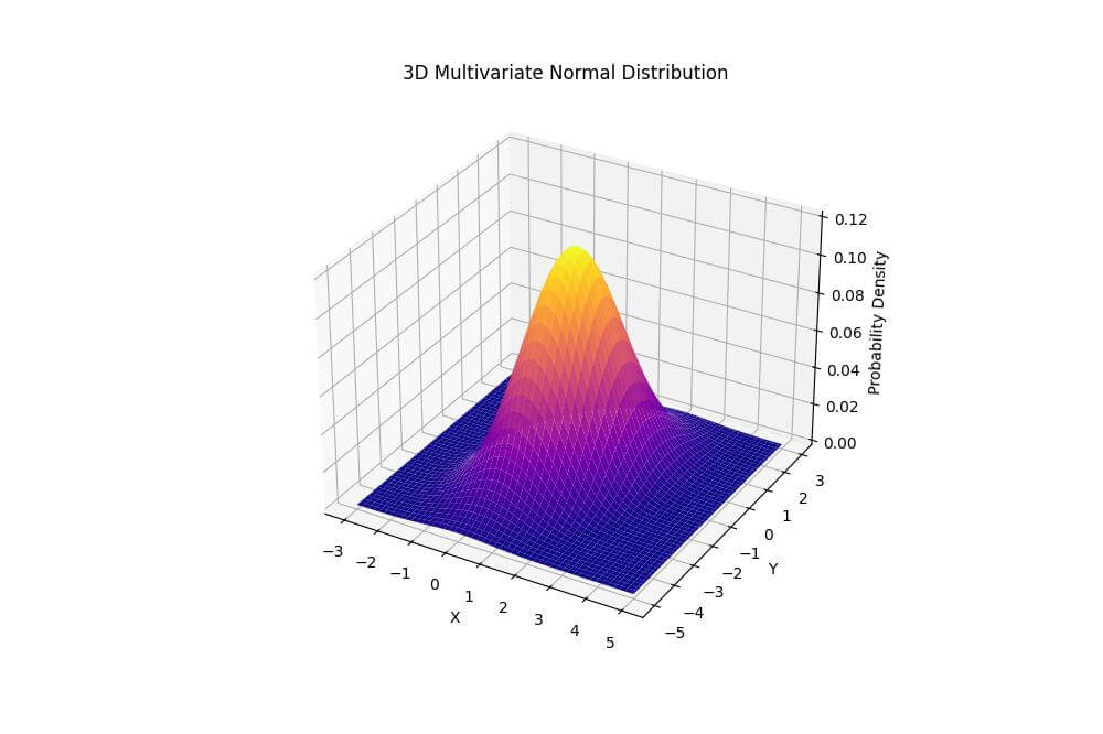
The peak is centered at (1, -1), and the shape is elongated due to the correlation between variables.
The orientation of the ellipse reflects the covariance structure of the distribution.
Custom Probability Distributions
You can create custom probability distributions using mathematical functions. Here’s an example of a bimodal distribution:
def bimodal_distribution(x, y):
    return (1 / (2 * np.pi)) * (np.exp(-((x - 1.5)**2 + (y - 1.5)**2) / 0.5) +
                                np.exp(-((x + 1.5)**2 + (y + 1.5)**2) / 0.5))

x = np.linspace(-4, 4, 100)
y = np.linspace(-4, 4, 100)
X, Y = np.meshgrid(x, y)
Z = bimodal_distribution(X, Y)
fig = plt.figure(figsize=(10, 8))
ax = fig.add_subplot(111, projection='3d')
ax.plot_surface(X, Y, Z, cmap='coolwarm')
ax.set_xlabel('X')
ax.set_ylabel('Y')
ax.set_zlabel('Probability Density')
ax.set_title('3D Custom Bimodal Distribution')
plt.show()
Output:
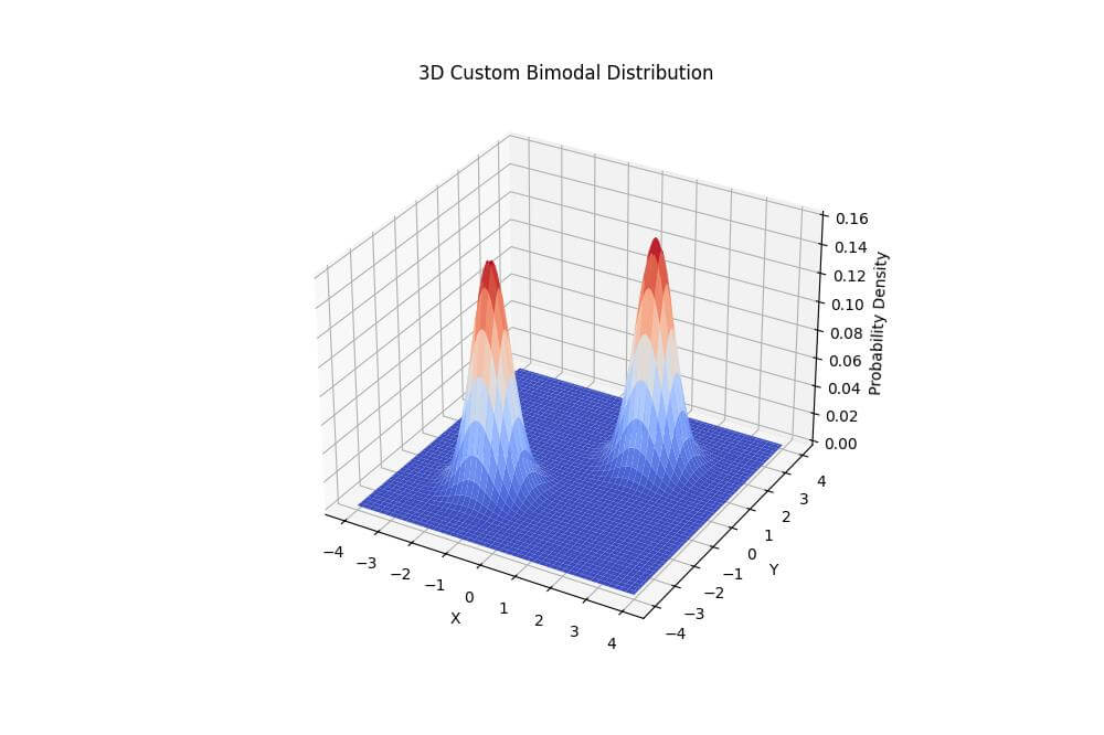
The peaks are centered at (1.5, 1.5) and (-1.5, -1.5).
Overlay Multiple Surfaces
To compare multiple distributions by overlaying surfaces, use the following code:
def distribution1(x, y):
    return multivariate_normal([0, 0], [[1, 0], [0, 1]]).pdf(np.dstack((x, y)))
def distribution2(x, y):
    return multivariate_normal([2, 2], [[1.5, 0.5], [0.5, 1.5]]).pdf(np.dstack((x, y)))
x = np.linspace(-4, 6, 100)
y = np.linspace(-4, 6, 100)
X, Y = np.meshgrid(x, y)
Z1 = distribution1(X, Y)
Z2 = distribution2(X, Y)
fig = plt.figure(figsize=(12, 8))
ax = fig.add_subplot(111, projection='3d')
ax.plot_surface(X, Y, Z1, cmap='viridis', alpha=0.7)
ax.plot_surface(X, Y, Z2, cmap='plasma', alpha=0.7)
ax.set_xlabel('X')
ax.set_ylabel('Y')
ax.set_zlabel('Probability Density')
ax.set_title('Comparison of Two Probability Distributions')
plt.show()
Output:
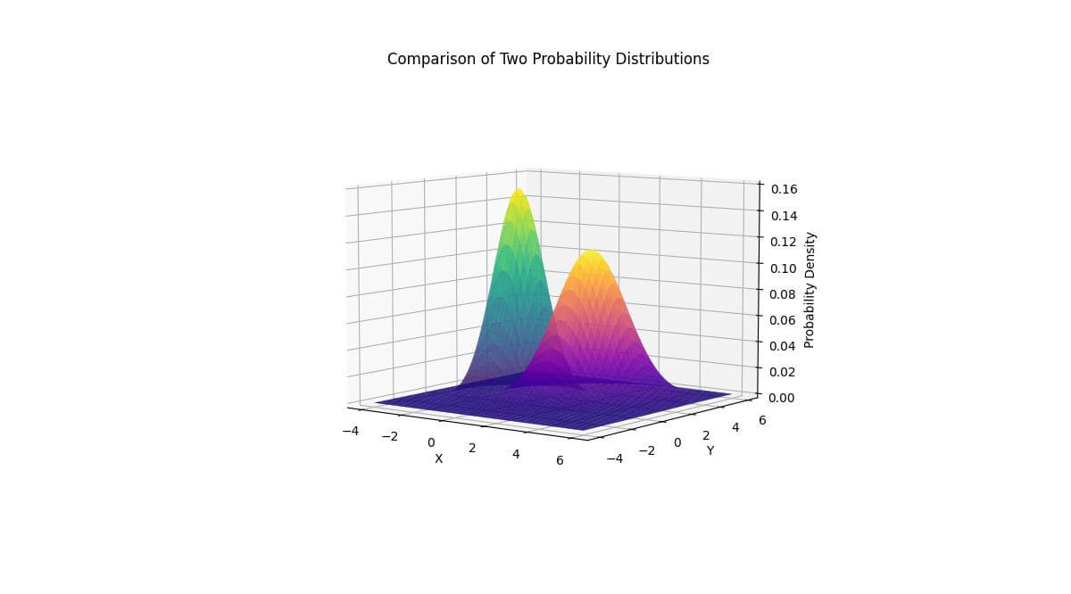
The first distribution (in blue-green) is centered at (0, 0), while the second (in purple-orange) is centered at (2, 2).
This visualization allows you to directly compare the shapes, peaks, and spreads of the two distributions.
Side-by-side Plot Arrangements
To create side-by-side plots for comparing distributions, use this code:
fig = plt.figure(figsize=(16, 8))

ax1 = fig.add_subplot(121, projection='3d')
ax1.plot_surface(X, Y, Z1, cmap='viridis')
ax1.set_xlabel('X')
ax1.set_ylabel('Y')
ax1.set_zlabel('Probability Density')
ax1.set_title('Distribution 1')
ax2 = fig.add_subplot(122, projection='3d')
ax2.plot_surface(X, Y, Z2, cmap='plasma')
ax2.set_xlabel('X')
ax2.set_ylabel('Y')
ax2.set_zlabel('Probability Density')
ax2.set_title('Distribution 2')
plt.tight_layout()
plt.show()
Output:
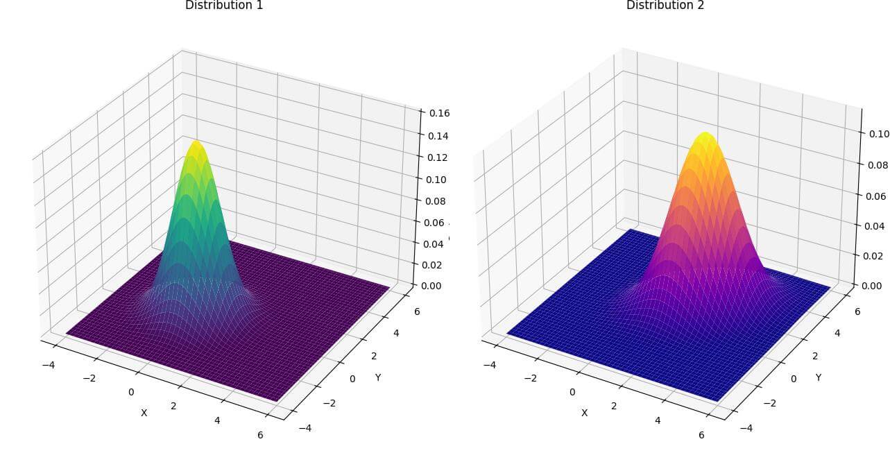
This visualization creates two separate 3D plots side by side.
The left plot shows Distribution 1, while the right plot shows Distribution 2.
Slicing 3D plots
You can visualize conditional probabilities by slicing 3D plots:
fig = plt.figure(figsize=(12, 8))
ax = fig.add_subplot(111, projection='3d')
ax.plot_surface(X, Y, Z1, cmap='viridis', alpha=0.7)

# Plot slices at specific x values
x_slices = [-1, 0, 1]
colors = ['r', 'g', 'b']
for x_val, color in zip(x_slices, colors):
    y = np.linspace(-4, 6, 100)
    x = np.full_like(y, x_val)
    z = distribution1(x, y)
    ax.plot(x, y, z, color=color, linewidth=3, label=f'x = {x_val}')
ax.set_xlabel('X')
ax.set_ylabel('Y')
ax.set_zlabel('Probability Density')
ax.set_title('Conditional Probability Visualization')
ax.legend()
plt.show()
Output:
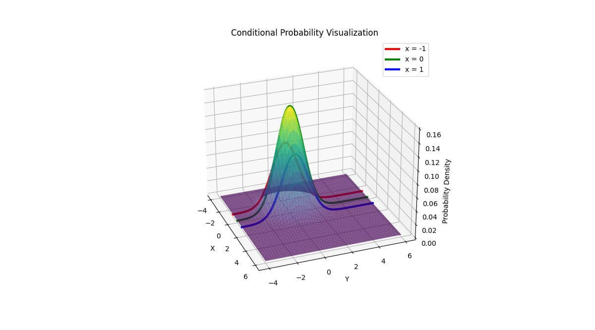
The colored lines represent the conditional probability distributions for different x values.
This allows you to see how the probability distribution changes when you fix one variable (in this case, x) and vary the other (y).
Mokhtar is the founder of LikeGeeks.com. He is a seasoned technologist and accomplished author, with expertise in Linux system administration and Python development. Since 2010, Mokhtar has built an impressive career, transitioning from system administration to Python development in 2015. His work spans large corporations to freelance clients around the globe. Alongside his technical work, Mokhtar has authored some insightful books in his field. Known for his innovative solutions, meticulous attention to detail, and high-quality work, Mokhtar continually seeks new challenges within the dynamic field of technology.