Customize Axis Labels in Python 3D plots
This tutorial will guide you through various methods to customize your Python 3D plot labels using Matplotlib.
You’ll learn how to set basic labels, adjust their positioning, format text, handle multi-line labels, and more.
Set Axis Labels
To set basic axis labels for your 3D plot, you can use the set_xlabel(), set_ylabel(), and set_zlabel() methods.
Here’s how to create a simple 3D surface plot with custom axis labels:
import numpy as np
import matplotlib.pyplot as plt
from mpl_toolkits.mplot3d import Axes3D
x = np.linspace(-5, 5, 100)
y = np.linspace(-5, 5, 100)
X, Y = np.meshgrid(x, y)
Z = np.sin(np.sqrt(X**2 + Y**2))
fig = plt.figure(figsize=(10, 8))
ax = fig.add_subplot(111, projection='3d')
surf = ax.plot_surface(X, Y, Z, cmap='viridis')
ax.set_xlabel('X-axis')
ax.set_ylabel('Y-axis')
ax.set_zlabel('Z-axis')
plt.show()
Output:
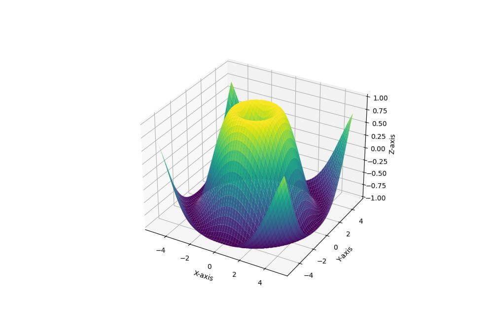
The set_xlabel(), set_ylabel(), and set_zlabel() methods are used to set the labels for the X, Y, and Z axes, respectively.
Label Positioning (Label Padding)
Here’s how to modify label distance:
import numpy as np
import matplotlib.pyplot as plt
from mpl_toolkits.mplot3d import Axes3D
x = np.linspace(-5, 5, 50)
y = np.linspace(-5, 5, 50)
X, Y = np.meshgrid(x, y)
Z = np.sin(X) * np.cos(Y)
fig = plt.figure(figsize=(12, 8))
ax = fig.add_subplot(111, projection='3d')
surf = ax.plot_surface(X, Y, Z, cmap='coolwarm')

# Set and adjust axis labels
ax.set_xlabel('X-axis', labelpad=20)
ax.set_ylabel('Y-axis', labelpad=20)
ax.set_zlabel('Z-axis', labelpad=20)
plt.show()
Output:
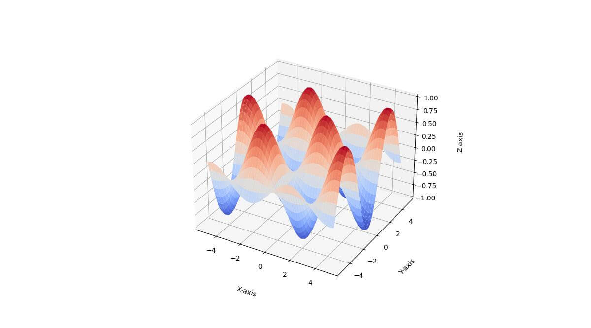
In this example, we use the labelpad parameter to adjust the distance between the axis and its label.
Format Label Text Using LaTeX
You can use LaTeX expressions for mathematical notation.
Matplotlib supports LaTeX rendering so you can format labels with complex mathematical expressions:
import numpy as np
import matplotlib.pyplot as plt
from mpl_toolkits.mplot3d import Axes3D

# Sample data
x = np.linspace(0, 10, 50)
y = np.linspace(0, 10, 50)
X, Y = np.meshgrid(x, y)
Z = X**2 + Y**2
fig = plt.figure(figsize=(12, 8))
ax = fig.add_subplot(111, projection='3d')
surf = ax.plot_surface(X, Y, Z, cmap='plasma')

# Set formatted axis labels using LaTeX
ax.set_xlabel(r'$\mathbf{x}$ (meters)')
ax.set_ylabel(r'$\mathbf{y}$ (meters)')
ax.set_zlabel(r'$z = x^2 + y^2$')
plt.show()
Output:
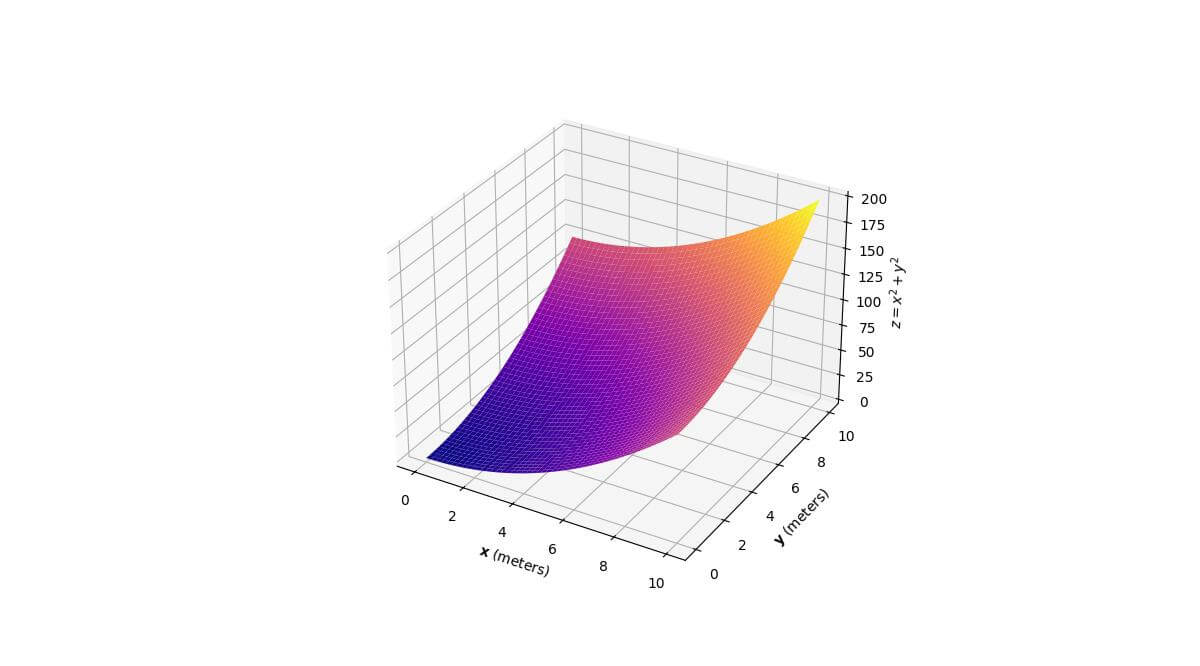
The r prefix before the string indicates a raw string, which is useful for LaTeX expressions.
The $ symbols denote the start and end of LaTeX math mode. This allows you to include mathematical symbols, Greek letters, and equations in your labels.
Handle Units and Scientific notation
Here’s how to add units to labels and use scientific notation:
import numpy as np
import matplotlib.pyplot as plt
from mpl_toolkits.mplot3d import Axes3D
from matplotlib.ticker import ScalarFormatter, FuncFormatter
x = np.linspace(0, 1e-6, 100)
y = np.linspace(0, 1e-6, 100)
X, Y = np.meshgrid(x, y)
Z = np.sin(X*1e6) * np.cos(Y*1e6)
fig = plt.figure(figsize=(12, 8))
ax = fig.add_subplot(111, projection='3d')
surf = ax.plot_surface(X, Y, Z, cmap='viridis')

# Set labels with units
ax.set_xlabel('X (µm)')
ax.set_ylabel('Y (µm)')
ax.set_zlabel('Z (arbitrary units)')

# Use ScalarFormatter for scientific notation
ax.xaxis.set_major_formatter(ScalarFormatter(useMathText=True))
ax.yaxis.set_major_formatter(ScalarFormatter(useMathText=True))

# Custom formatter for unit conversion
def um_formatter(x, pos):
    return f'{x*1e6:.1f}'
ax.xaxis.set_major_formatter(FuncFormatter(um_formatter))
ax.yaxis.set_major_formatter(FuncFormatter(um_formatter))
plt.show()
Output:
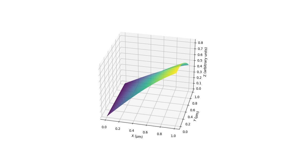
Here we use ScalarFormatter for scientific notation, and create a custom formatter for unit conversion.
The X and Y axes are displayed in micrometers (µm) using a custom formatter.
Multi-line Labels
You can create multi-line labels to include additional information or break long labels into multiple lines.
Here’s how to implement multi-line labels and adjust line spacing:
import numpy as np
import matplotlib.pyplot as plt
from mpl_toolkits.mplot3d import Axes3D
theta = np.linspace(0, 2*np.pi, 100)
z = np.linspace(0, 2, 100)
r = z**2 + 1
x = r * np.sin(theta)
y = r * np.cos(theta)
fig = plt.figure(figsize=(12, 8))
ax = fig.add_subplot(111, projection='3d')
ax.plot(x, y, z)

# Set multi-line labels
ax.set_xlabel('X-axis\n(Horizontal)', linespacing=1.5)
ax.set_ylabel('Y-axis\n(Depth)', linespacing=1.5)
ax.set_zlabel('Z-axis\n(Vertical)\n(Height)', linespacing=1.2)
plt.show()
Output:
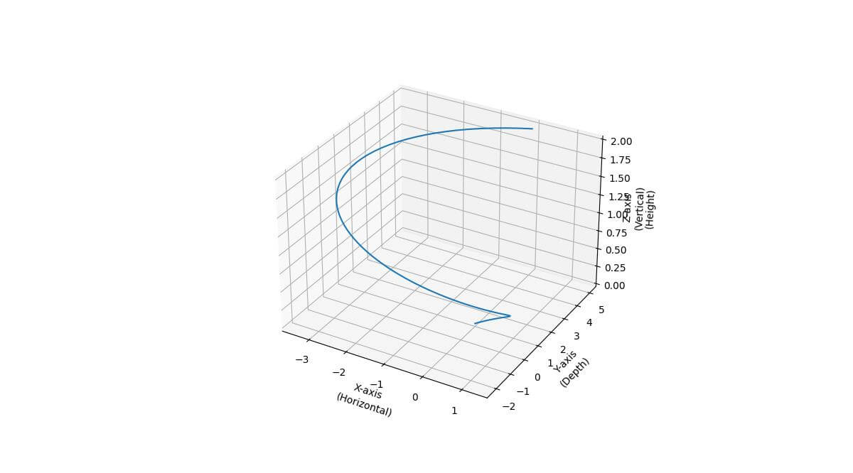
In this example, we use \n to create line breaks in the label text.
The linespacing parameter is used to adjust the spacing between lines in multi-line labels.
A value greater than 1 increases the space between lines, while a value less than 1 decreases it.
Using External Data for Labels (Dynamic Labels)
You can use external data sources to generate dynamic labels for your 3D plots.
Given this CSV file:
X-axis Label,Y-axis Label,Z-axis Label
Here’s an example of how to import labels from a CSV file and use them in your plot:
import numpy as np
import matplotlib.pyplot as plt
from mpl_toolkits.mplot3d import Axes3D
import csv

# Import labels from CSV file
with open('axis_labels.csv', 'r') as file:
    reader = csv.reader(file)
    labels = next(reader)
x = np.random.rand(100)
y = np.random.rand(100)
z = np.random.rand(100)
fig = plt.figure(figsize=(12, 8))
ax = fig.add_subplot(111, projection='3d')
ax.scatter(x, y, z)

# Set labels using imported data
ax.set_xlabel(labels[0])
ax.set_ylabel(labels[1])
ax.set_zlabel(labels[2])
plt.show()
Output:
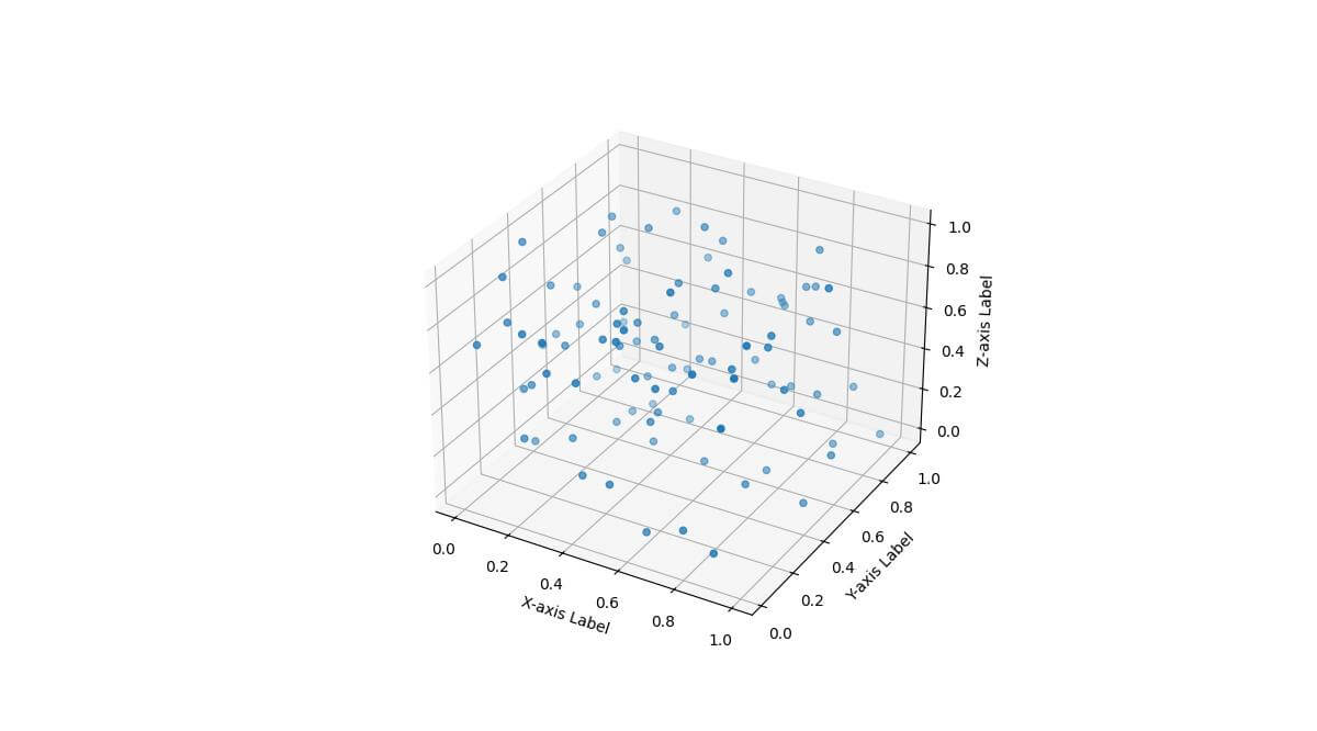
This code reads the labels from the file and applies them to the plot axes.
Label Visibility and Clipping
Here’s how to toggle label visibility and adjust the plot to prevent label clipping:
import numpy as np
import matplotlib.pyplot as plt
from mpl_toolkits.mplot3d import Axes3D
x = np.linspace(-5, 5, 50)
y = np.linspace(-5, 5, 50)
X, Y = np.meshgrid(x, y)
Z = np.sin(np.sqrt(X**2 + Y**2))
fig = plt.figure(figsize=(12, 8))
ax = fig.add_subplot(111, projection='3d')
surf = ax.plot_surface(X, Y, Z, cmap='viridis')
ax.set_xlabel('X-axis')
ax.set_ylabel('Y-axis')
ax.set_zlabel('Z-axis')

# Toggle label visibility
ax.xaxis.label.set_visible(False)

# Adjust plot to prevent label clipping
plt.tight_layout()
plt.subplots_adjust(left=0.1, right=0.9, bottom=0.1, top=0.9)
plt.show()
Output:
In this example, we set labels for all axes but then hide the X-axis label using set_visible(False).
To prevent label clipping in tight layouts, we use plt.tight_layout() and plt.subplots_adjust() to fine-tune the plot margins.
Label Shadow & Outline
You can enhance your axis labels with decorative elements like boxes, shadows, or outlines.
Here’s how to add these decorators to your labels:
import numpy as np
import matplotlib.pyplot as plt
from mpl_toolkits.mplot3d import Axes3D
from matplotlib.patheffects import withStroke
x = np.linspace(-5, 5, 50)
y = np.linspace(-5, 5, 50)
X, Y = np.meshgrid(x, y)
Z = np.sin(X) * np.cos(Y)
fig = plt.figure(figsize=(12, 8))
ax = fig.add_subplot(111, projection='3d')
surf = ax.plot_surface(X, Y, Z, cmap='coolwarm')

# Set labels with decorators
ax.set_xlabel('X-axis', bbox=dict(facecolor='white', edgecolor='black', pad=5))
ax.set_ylabel('Y-axis', path_effects=[withStroke(linewidth=3, foreground='green')])
ax.set_zlabel('Z-axis', bbox=dict(facecolor='yellow', alpha=0.5),
              path_effects=[withStroke(linewidth=3, foreground='black')])
plt.show()
Output:
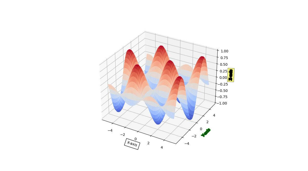
In this example, we apply different decorators to each axis label:
– The X-axis label has a white box with a black edge.
– The Y-axis label has a green outline.
– The Z-axis label has a semi-transparent yellow box and a black outline.
Mokhtar is the founder of LikeGeeks.com. He is a seasoned technologist and accomplished author, with expertise in Linux system administration and Python development. Since 2010, Mokhtar has built an impressive career, transitioning from system administration to Python development in 2015. His work spans large corporations to freelance clients around the globe. Alongside his technical work, Mokhtar has authored some insightful books in his field. Known for his innovative solutions, meticulous attention to detail, and high-quality work, Mokhtar continually seeks new challenges within the dynamic field of technology.