Change 2D Plot to 3D Plot in Python
In this tutorial, you’ll learn various methods to convert different types of 2D plots into their 3D counterparts using popular libraries like Matplotlib and NumPy.
Surface Plot
Let’s create a simple 2D plot and transform it into a 3D surface plot.
To create a 2D plot and then convert it to a 3D surface plot, you can use the following code:
import numpy as np
import matplotlib.pyplot as plt

# Sample data
x = np.linspace(-5, 5, 100)
y = np.linspace(-5, 5, 100)
X, Y = np.meshgrid(x, y)
Z = np.sin(np.sqrt(X**2 + Y**2))
fig = plt.figure(figsize=(12, 5))

# 2D plot
ax1 = fig.add_subplot(121)
c1 = ax1.contourf(X, Y, Z)
ax1.set_title('2D Contour Plot')
fig.colorbar(c1, ax=ax1)

# 3D surface plot
ax2 = fig.add_subplot(122, projection='3d')
surf = ax2.plot_surface(X, Y, Z, cmap='viridis')
ax2.set_title('3D Surface Plot')
fig.colorbar(surf, ax=ax2)
plt.tight_layout()
plt.show()
Output:
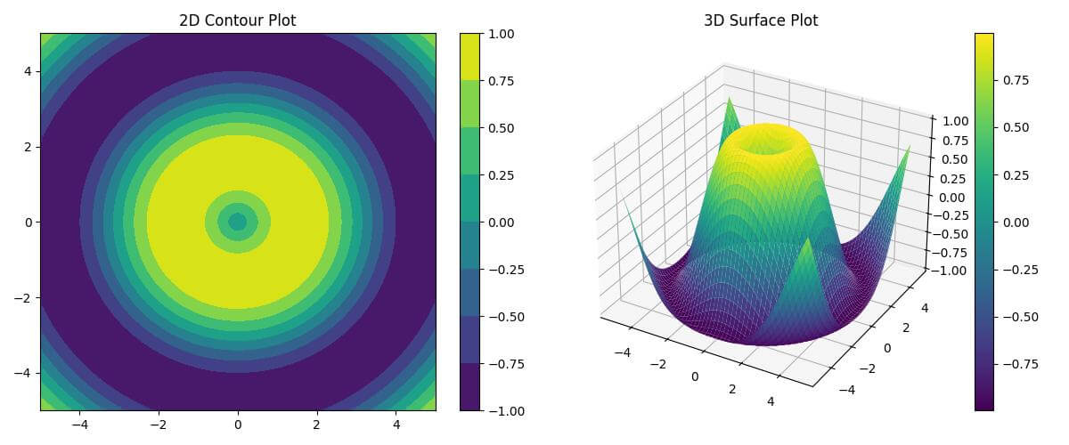
The 2D plot uses contours to represent the Z values, while the 3D plot creates a surface that clearly shows the peaks and valleys of the sine function.
The plot_surface function is used to create the 3D surface, and the cmap parameter adds a color gradient to enhance the visualization.
Contour Plot
You can transform a 2D contour plot into a 3D contour plot to add depth to your visualization.
To create a 2D contour plot and its 3D counterpart, use this code:
import numpy as np
import matplotlib.pyplot as plt
x = np.linspace(-3, 3, 100)
y = np.linspace(-3, 3, 100)
X, Y = np.meshgrid(x, y)
Z = np.exp(-(X**2 + Y**2))
fig = plt.figure(figsize=(12, 5))

# 2D contour plot
ax1 = fig.add_subplot(121)
c1 = ax1.contourf(X, Y, Z, levels=20, cmap='viridis')
ax1.set_title('2D Contour Plot')
fig.colorbar(c1, ax=ax1)

# 3D contour plot
ax2 = fig.add_subplot(122, projection='3d')
c2 = ax2.contourf(X, Y, Z, levels=20, cmap='viridis', offset=-0.5)
ax2.set_title('3D Contour Plot')
fig.colorbar(c2, ax=ax2)
plt.tight_layout()
plt.show()
Output:
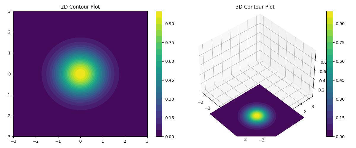
The 2D plot uses contourf to create filled contours, while the 3D plot uses the same function but with a 3D projection.
The offset parameter in the 3D plot places the contours below the XY plane, creating a visually appealing 3D effect.
The levels parameter controls the number of contour levels in both plots.
Heat Map
You can enhance a 2D heat map by converting it to a 3D surface plot with color mapping.
To transform a 2D heat map into a 3D surface plot with color mapping, use the following code:
import numpy as np
import matplotlib.pyplot as plt
x = np.linspace(-5, 5, 50)
y = np.linspace(-5, 5, 50)
X, Y = np.meshgrid(x, y)
Z = np.sin(X) * np.cos(Y)
fig = plt.figure(figsize=(12, 5))

# 2D heat map
ax1 = fig.add_subplot(121)
c1 = ax1.imshow(Z, cmap='hot', extent=[-5, 5, -5, 5])
ax1.set_title('2D Heat Map')
fig.colorbar(c1, ax=ax1)

# 3D surface plot with color mapping
ax2 = fig.add_subplot(122, projection='3d')
surf = ax2.plot_surface(X, Y, Z, cmap='hot', linewidth=0)
ax2.set_title('3D Surface Plot with Color Mapping')
fig.colorbar(surf, ax=ax2)
plt.tight_layout()
plt.show()
Output:
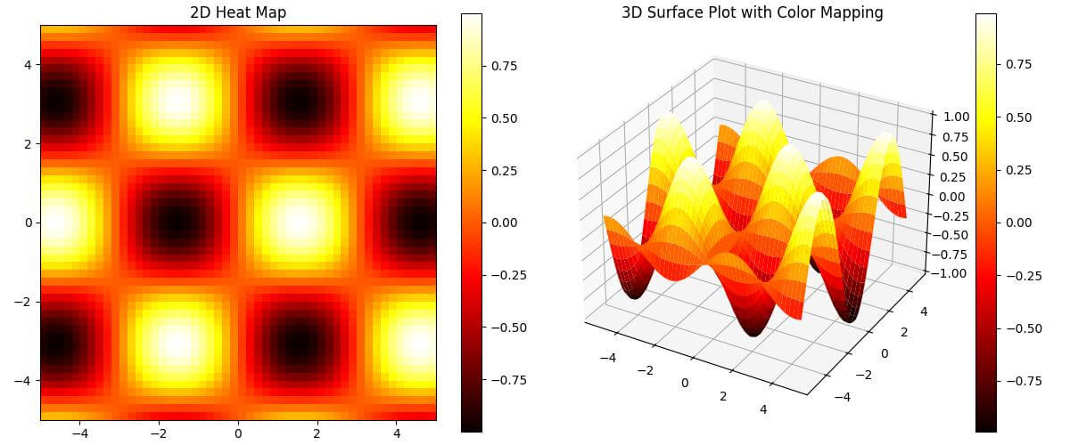
This code generates a 2D heat map using imshow and a 3D surface plot with color mapping using plot_surface.
Both plots use the ‘hot’ colormap to represent the data intensity.
The 3D plot adds depth to the visualization so you can see both the height and color variations in the data.
The linewidth=0 parameter in the 3D plot removes the grid lines.
Vector Field
You can extend this concept to 3D to create more informative visualizations.
To convert a 2D vector field to a 3D vector field, use this code:
import numpy as np
import matplotlib.pyplot as plt
x, y, z = np.meshgrid(np.arange(-2, 3), np.arange(-2, 3), np.arange(-2, 3))
u = -y
v = x
w = z
fig = plt.figure(figsize=(12, 5))

# 2D vector field
ax1 = fig.add_subplot(121)
ax1.quiver(x[:,:,0], y[:,:,0], u[:,:,0], v[:,:,0])
ax1.set_title('2D Vector Field')

# 3D vector field
ax2 = fig.add_subplot(122, projection='3d')
ax2.quiver(x, y, z, u, v, w, length=0.5, normalize=True)
ax2.set_title('3D Vector Field')
plt.tight_layout()
plt.show()
Output:
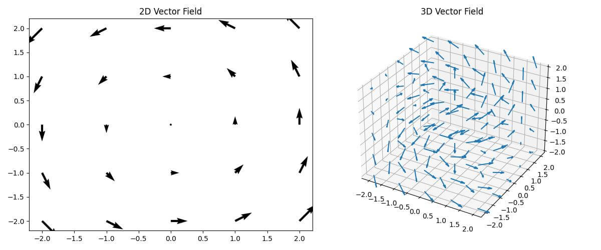
This code creates a 2D vector field using quiver and extends it to a 3D vector field.
The 2D plot shows vectors on a single plane, while the 3D plot displays vectors in three-dimensional space.
The length parameter in the 3D plot controls the size of the arrows, and normalize=True ensures that all arrows have the same length.
Parametric Curve
You can transform a 2D parametric curve into a 3D curve to show additional dimensions.
To convert a 2D parametric curve to a 3D parametric curve, use the following code:
import numpy as np
import matplotlib.pyplot as plt
t = np.linspace(0, 10*np.pi, 1000)
x = np.cos(t)
y = np.sin(t)
z = t
fig = plt.figure(figsize=(12, 5))

# 2D parametric curve
ax1 = fig.add_subplot(121)
ax1.plot(x, y)
ax1.set_title('2D Parametric Curve')

# 3D parametric curve
ax2 = fig.add_subplot(122, projection='3d')
ax2.plot(x, y, z)
ax2.set_title('3D Parametric Curve')
plt.tight_layout()
plt.show()
Output:
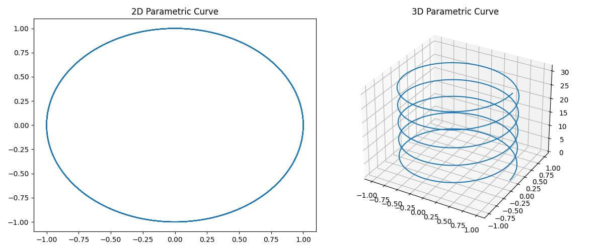
This code generates a 2D parametric curve (a circle) and its 3D counterpart (a helix).
The 2D plot shows the x and y components of the curve, while the 3D plot adds the z component.
The plot function is used for both plots, with the 3D version simply including the additional z parameter.
Polar Plot
You can transform a 2D polar plot into a 3D plot to add an extra dimension to your visualization.
To convert a 2D polar plot to a 3D plot, use this code:
import numpy as np
import matplotlib.pyplot as plt
theta = np.linspace(0, 2*np.pi, 100)
r = 1 + np.cos(theta)
z = np.sin(4*theta)
fig = plt.figure(figsize=(12, 5))

# 2D polar plot
ax1 = fig.add_subplot(121, projection='polar')
ax1.plot(theta, r)
ax1.set_title('2D Polar Plot')

# 3D plot
ax2 = fig.add_subplot(122, projection='3d')
ax2.plot(r*np.cos(theta), r*np.sin(theta), z)
ax2.set_title('3D Plot')
plt.tight_layout()
plt.show()
Output:
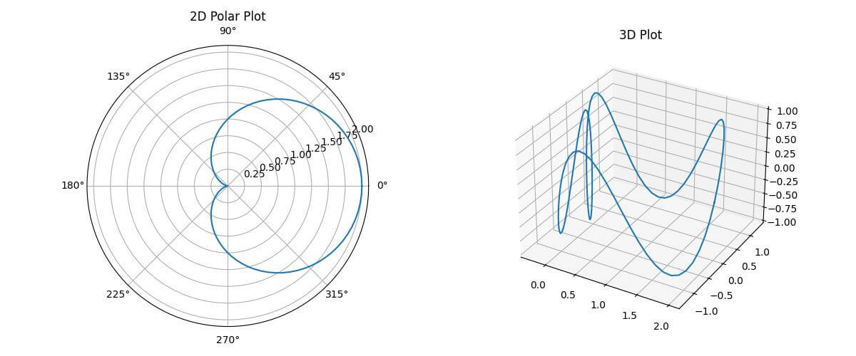
The 2D polar plot shows the relationship between the angle (theta) and radius (r).
The 3D plot extends this by adding a z-component which creates a 3D curve that varies in height based on the sine function.
The conversion from polar to Cartesian coordinates is done using r*np.cos(theta) and r*np.sin(theta) for the x and y components in the 3D plot.
Bar Plot
To convert a 2D bar plot to a 3D bar plot, use the following code:
import numpy as np
import matplotlib.pyplot as plt
categories = ['A', 'B', 'C', 'D', 'E']
values1 = [3, 7, 2, 5, 8]
values2 = [5, 2, 6, 3, 4]
fig = plt.figure(figsize=(12, 5))

# 2D bar plot
ax1 = fig.add_subplot(121)
ax1.bar(categories, values1, label='Group 1')
ax1.bar(categories, values2, bottom=values1, label='Group 2')
ax1.set_title('2D Stacked Bar Plot')
ax1.legend()

# 3D bar plot
ax2 = fig.add_subplot(122, projection='3d')
x = np.arange(len(categories))
y = np.arange(2)
X, Y = np.meshgrid(x, y)
Z = np.array([values1, values2])
ax2.bar3d(X.ravel(), Y.ravel(), np.zeros_like(Z).ravel(), 0.5, 0.5, Z.ravel())
ax2.set_xticks(x)
ax2.set_xticklabels(categories)
ax2.set_yticks(y)
ax2.set_yticklabels(['Group 1', 'Group 2'])
ax2.set_title('3D Bar Plot')
plt.tight_layout()
plt.show()
Output:
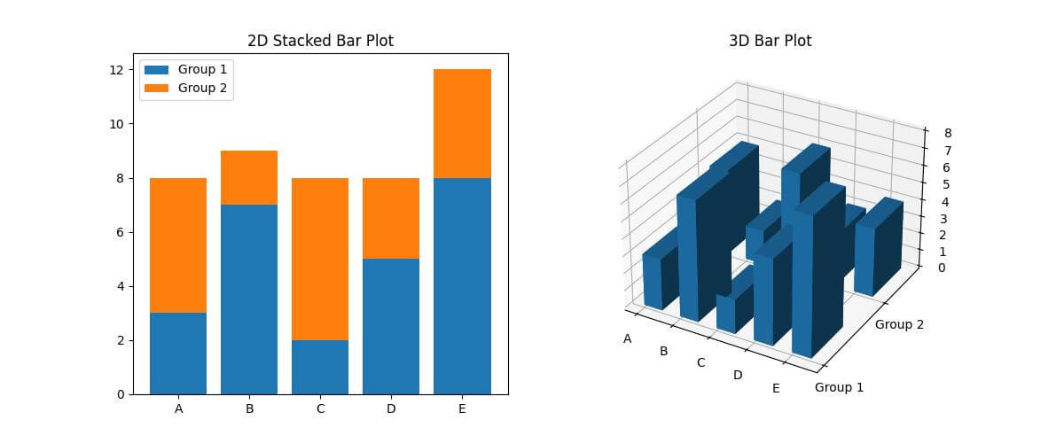
The 2D plot uses bar to create stacked bars for two groups of data.
The 3D plot uses bar3d to create 3D bars, with the x-axis representing categories, the y-axis representing groups, and the z-axis representing values.
The ravel() function is used to flatten the 2D arrays into 1D arrays for the bar3d function.
Mokhtar is the founder of LikeGeeks.com. He is a seasoned technologist and accomplished author, with expertise in Linux system administration and Python development. Since 2010, Mokhtar has built an impressive career, transitioning from system administration to Python development in 2015. His work spans large corporations to freelance clients around the globe. Alongside his technical work, Mokhtar has authored some insightful books in his field. Known for his innovative solutions, meticulous attention to detail, and high-quality work, Mokhtar continually seeks new challenges within the dynamic field of technology.