Coloring Python 3D Plots Using Matplotlib
In this tutorial, you’ll learn how to color your 3D plots using the Python Matplotlib library.
We’ll start with custom colormaps, color gradients, and dynamic coloring.
You’ll learn how to use color to represent additional dimensions of data and highlight specific regions.
- 1 Custom Colormaps
- 2 Coloring Based on z-axis Values
- 3 Using Color to Represent a Fourth Dimension
- 4 Coloring Lines Based on Parameters
- 5 Interpolation Between Colors
- 6 Discrete Color Mapping
- 7 Logarithmic Color Scales
- 8 Represent Categories with colors
- 9 Highlight Specific points or regions
- 10 Dynamic Coloring
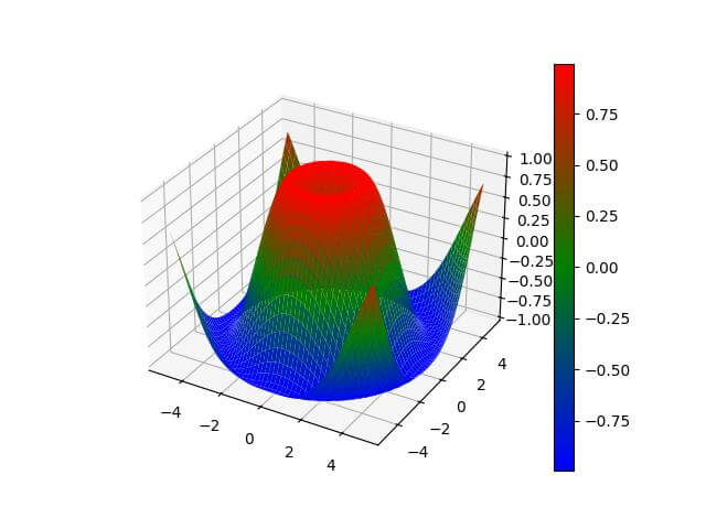
Custom Colormaps
You can create custom colormaps for more specific color schemes:
import numpy as np
import matplotlib.pyplot as plt
from mpl_toolkits.mplot3d import Axes3D
from matplotlib.colors import LinearSegmentedColormap
x = np.linspace(-5, 5, 50)
y = np.linspace(-5, 5, 50)
X, Y = np.meshgrid(x, y)
Z = np.sin(np.sqrt(X**2 + Y**2))
custom_cmap = LinearSegmentedColormap.from_list("custom",
                                                ["darkblue", "skyblue", "yellow", "red"])
fig = plt.figure()
ax = fig.add_subplot(111, projection='3d')
surf = ax.plot_surface(X, Y, Z, cmap=custom_cmap)
fig.colorbar(surf)
plt.show()
Output:
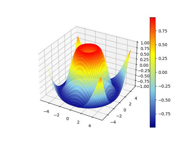
The plot now uses a custom colormap transitioning from dark blue to sky blue to yellow to red.
Coloring Based on z-axis Values
You can color the surface based on the Z values directly:
import numpy as np
import matplotlib.pyplot as plt
from mpl_toolkits.mplot3d import Axes3D
x = np.linspace(-5, 5, 50)
y = np.linspace(-5, 5, 50)
X, Y = np.meshgrid(x, y)
Z = np.sin(np.sqrt(X**2 + Y**2))
fig = plt.figure()
ax = fig.add_subplot(111, projection='3d')
surf = ax.plot_surface(X, Y, Z, facecolors=plt.cm.viridis(Z), shade=False)
fig.colorbar(surf)
plt.show()
Output:
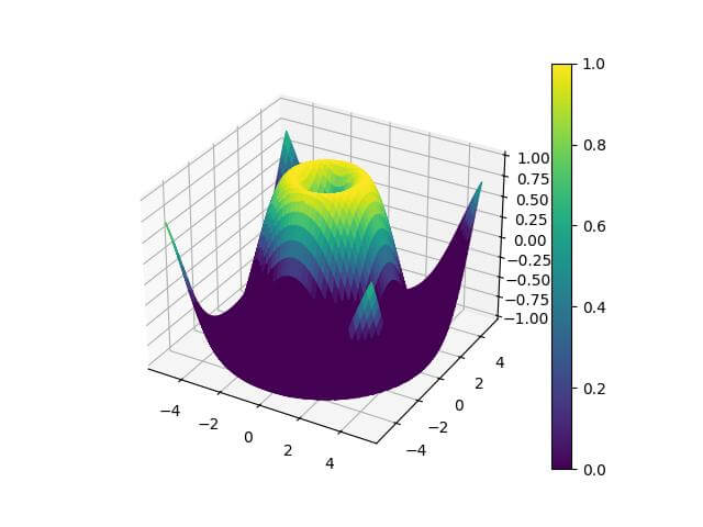
The surface is now colored directly based on the Z values.
Using Color to Represent a Fourth Dimension
You can use color to represent an additional dimension in a 3D scatter plot:
import numpy as np
import matplotlib.pyplot as plt
from mpl_toolkits.mplot3d import Axes3D
n = 1000
x = np.random.rand(n)
y = np.random.rand(n)
z = np.random.rand(n)
c = np.random.rand(n)
fig = plt.figure()
ax = fig.add_subplot(111, projection='3d')
scatter = ax.scatter(x, y, z, c=c, cmap='viridis')
fig.colorbar(scatter)
plt.show()
Output:
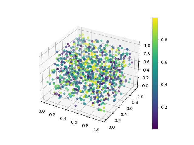
The scatter plot shows 3D points with color representing a fourth dimension of data.
Coloring Lines Based on Parameters
You can color 3D lines based on a parameter:
import numpy as np
import matplotlib.pyplot as plt
from mpl_toolkits.mplot3d import Axes3D
t = np.linspace(0, 10, 1000)
x = np.cos(t)
y = np.sin(t)
z = t
fig = plt.figure()
ax = fig.add_subplot(111, projection='3d')
sc = ax.scatter(x, y, z, c=t, cmap='viridis')
fig.colorbar(sc)
plt.show()
Output:
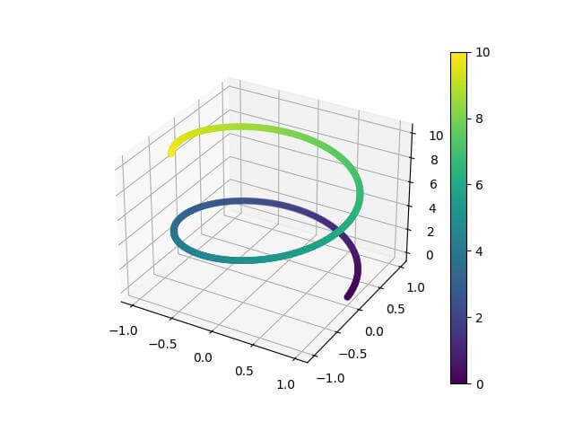
The 3D line is colored based on the parameter t which creates a gradient effect along the line.
Interpolation Between Colors
You can create smooth color transitions by interpolating between colors:
import numpy as np
import matplotlib.pyplot as plt
from mpl_toolkits.mplot3d import Axes3D
from matplotlib.colors import LinearSegmentedColormap
x = np.linspace(-5, 5, 50)
y = np.linspace(-5, 5, 50)
X, Y = np.meshgrid(x, y)
Z = np.sin(np.sqrt(X**2 + Y**2))
colors = ['blue', 'green', 'red']
n_bins = 100
cmap = LinearSegmentedColormap.from_list('custom', colors, N=n_bins)
fig = plt.figure()
ax = fig.add_subplot(111, projection='3d')
surf = ax.plot_surface(X, Y, Z, cmap=cmap)
fig.colorbar(surf)
plt.show()
Output:
The plot uses a custom colormap with smooth transitions between blue, green, and red.
Discrete Color Mapping
You can create a 3D plot with discrete color levels. Here’s an example:
import numpy as np
import matplotlib.pyplot as plt
from mpl_toolkits.mplot3d import Axes3D
from matplotlib.colors import BoundaryNorm
x = np.linspace(-5, 5, 50)
y = np.linspace(-5, 5, 50)
X, Y = np.meshgrid(x, y)
Z = np.sin(np.sqrt(X**2 + Y**2))
levels = [-1, -0.5, 0, 0.5, 1]
cmap = plt.get_cmap('viridis')
norm = BoundaryNorm(levels, ncolors=cmap.N, clip=True)
fig = plt.figure()
ax = fig.add_subplot(111, projection='3d')
surf = ax.plot_surface(X, Y, Z, cmap=cmap, norm=norm)
fig.colorbar(surf, ticks=levels)
plt.show()
Output:
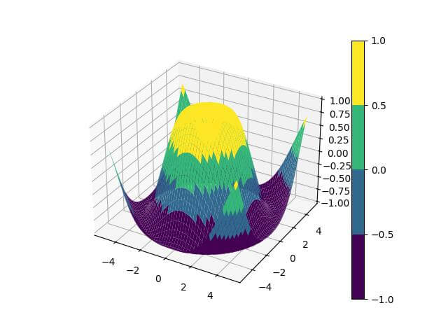
The plot now has discrete color levels based on the specified boundaries.
Logarithmic Color Scales
For data with a large range, you can use a logarithmic color scale. Here’s how to do it:
import numpy as np
import matplotlib.pyplot as plt
from mpl_toolkits.mplot3d import Axes3D
from matplotlib.colors import LogNorm
x = np.linspace(0, 5, 50)
y = np.linspace(0, 5, 50)
X, Y = np.meshgrid(x, y)
Z = np.exp(X + Y)
fig = plt.figure()
ax = fig.add_subplot(111, projection='3d')
surf = ax.plot_surface(X, Y, Z, cmap='viridis', norm=LogNorm())
fig.colorbar(surf)
plt.show()
Output:
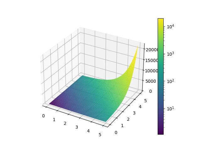
The plot uses a logarithmic color scale, which is useful for data with exponential growth.
Represent Categories with colors
You can use colors to represent different categories in a 3D scatter plot. Here’s an example:
import numpy as np
import matplotlib.pyplot as plt
from mpl_toolkits.mplot3d import Axes3D
n = 300
x = np.random.rand(n)
y = np.random.rand(n)
z = np.random.rand(n)
categories = np.random.choice(['A', 'B', 'C'], n)
fig = plt.figure()
ax = fig.add_subplot(111, projection='3d')
colors = {'A': 'red', 'B': 'green', 'C': 'blue'}
for category in colors:
    mask = categories == category
    ax.scatter(x[mask], y[mask], z[mask], c=colors[category], label=category)
ax.legend()
plt.show()
Output:
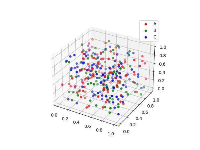
The scatter plot uses different colors to represent three categories of data points.
Highlight Specific points or regions
You can use color to highlight specific points or regions in a 3D plot. Here’s an example:
import numpy as np
import matplotlib.pyplot as plt
from mpl_toolkits.mplot3d import Axes3D
x = np.linspace(-5, 5, 50)
y = np.linspace(-5, 5, 50)
X, Y = np.meshgrid(x, y)
Z = np.sin(np.sqrt(X**2 + Y**2))
fig = plt.figure()
ax = fig.add_subplot(111, projection='3d')
surf = ax.plot_surface(X, Y, Z, cmap='viridis', alpha=0.7)

# Highlight specific points
highlight_x = [-3, 0, 3]
highlight_y = [-3, 0, 3]
highlight_z = np.sin(np.sqrt(np.array(highlight_x)**2 + np.array(highlight_y)**2))
ax.scatter(highlight_x, highlight_y, highlight_z, c='red', s=100)
plt.show()
Output:
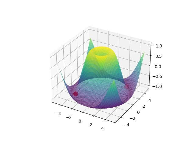
The plot highlights specific points in red on the surface plot.
Dynamic Coloring
Dynamic coloring involves changing colors in real time or based on user interaction.
Here’s a simple example of how you might set up an interactive 3D plot with color changes:
import numpy as np
import matplotlib.pyplot as plt
from mpl_toolkits.mplot3d import Axes3D
from matplotlib.widgets import Slider

# Define a list of colormaps to cycle through
colormaps = ['viridis', 'plasma', 'inferno', 'magma', 'cividis']
def update(val):
  ax.clear()
  # Use the slider value to select a colormap
  cmap_index = int(val / (2 * np.pi) * len(colormaps)) % len(colormaps)
  surf = ax.plot_surface(X, Y, Z, cmap=colormaps[cmap_index])
  fig.canvas.draw_idle()
x = np.linspace(-5, 5, 50)
y = np.linspace(-5, 5, 50)
X, Y = np.meshgrid(x, y)
Z = np.sin(np.sqrt(X**2 + Y**2))
fig = plt.figure()
ax = fig.add_subplot(111, projection='3d')
surf = ax.plot_surface(X, Y, Z, cmap='viridis')
ax_slider = plt.axes([0.1, 0.02, 0.65, 0.03])
slider = Slider(ax_slider, 'Phase', 0, 2*np.pi, valinit=0)
slider.on_changed(update)
plt.show()
Output:
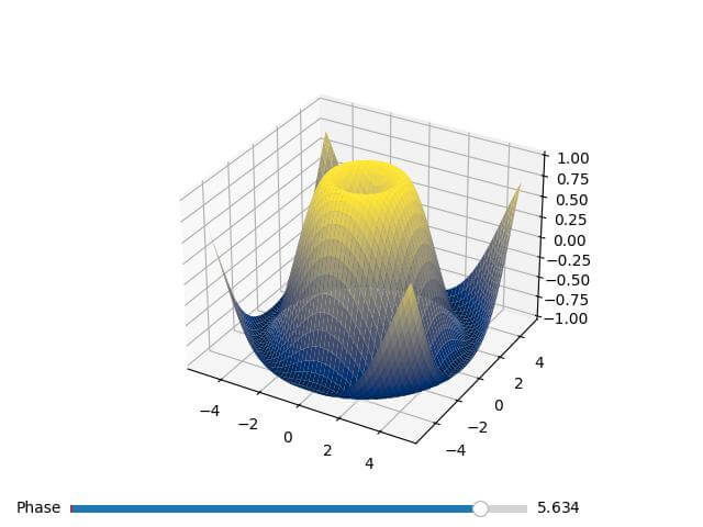
This creates an interactive plot where you can adjust the phase of the sine function using a slider and the color changes when the slider is moved.
Mokhtar is the founder of LikeGeeks.com. He is a seasoned technologist and accomplished author, with expertise in Linux system administration and Python development. Since 2010, Mokhtar has built an impressive career, transitioning from system administration to Python development in 2015. His work spans large corporations to freelance clients around the globe. Alongside his technical work, Mokhtar has authored some insightful books in his field. Known for his innovative solutions, meticulous attention to detail, and high-quality work, Mokhtar continually seeks new challenges within the dynamic field of technology.