Create 3D plot with Colorbar in Python using Matplotlib
This tutorial will guide you through the process of creating 3D plots with colorbars using the Python Matplotlib library.
You’ll learn how to generate 3D scatter plots, add colorbars to represent additional dimensions of data, and customize various aspects of your visualizations.
We’ll cover topics ranging from using custom colormaps to normalizing color scales, and much more.
Create a 3d Scatter Plot
To create a 3D scatter plot with a colorbar, you’ll use Matplotlib Axes3D and scatter function:
import numpy as np
import matplotlib.pyplot as plt
from mpl_toolkits.mplot3d import Axes3D
x = np.random.rand(100)
y = np.random.rand(100)
z = np.random.rand(100)
c = np.random.rand(100)
fig = plt.figure(figsize=(10, 8))
ax = fig.add_subplot(111, projection='3d')
scatter = ax.scatter(x, y, z, c=c, cmap='viridis')
plt.show()
Output:
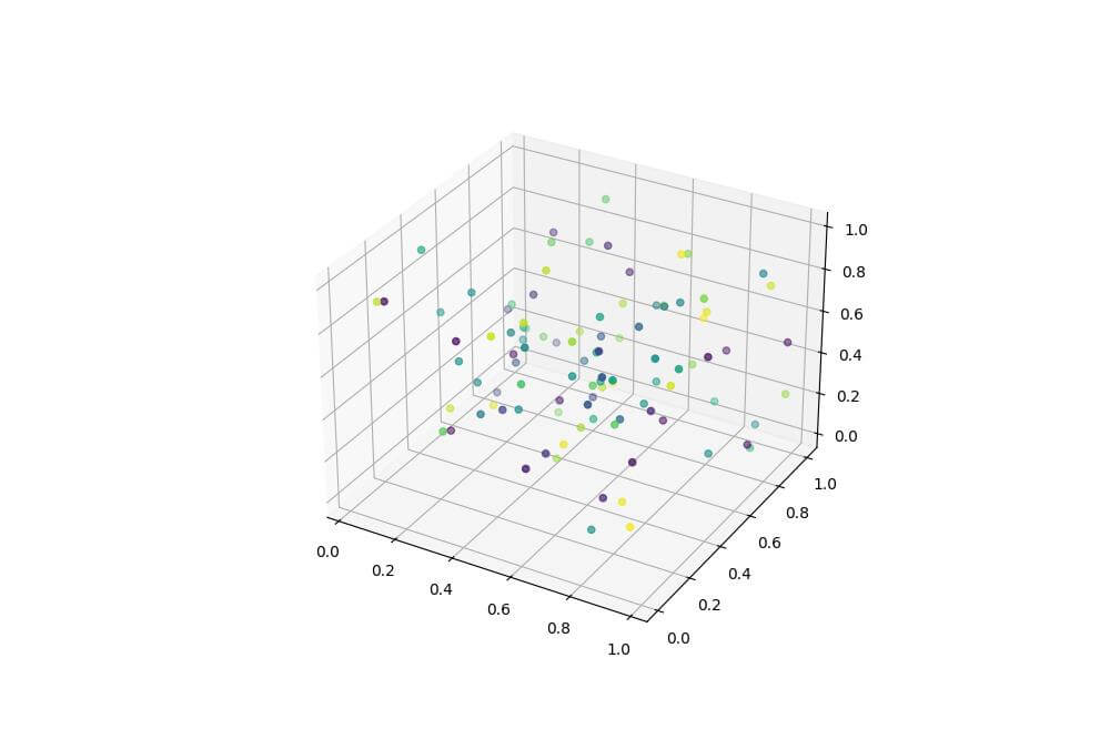
The color of each point is determined by the c values and mapped to the ‘viridis’ colormap.
Add a Colorbar to 3D Plot
Create colorbar object
To add a colorbar to your 3D plot, use the colorbar function:
fig = plt.figure(figsize=(12, 9))
ax = fig.add_subplot(111, projection='3d')
scatter = ax.scatter(x, y, z, c=c, cmap='viridis')
cbar = plt.colorbar(scatter)
cbar.set_label('Color Value')
plt.show()
Output:
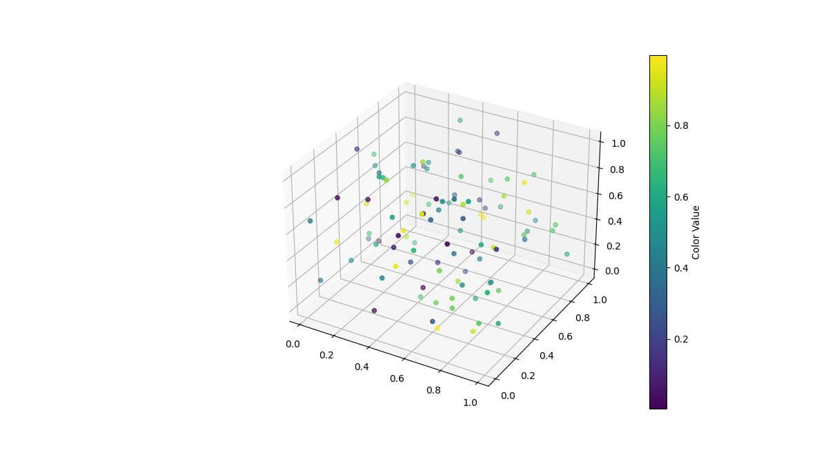
The colorbar is now added to the right side of the plot, showing the range of color values.
Mapping colors to Z values
You can map colors directly to the Z values for better visualization:
scatter = ax.scatter(x, y, z, c=z, cmap='viridis')
cbar = plt.colorbar(scatter)
cbar.set_label('Z Value')
plt.show()
Output:
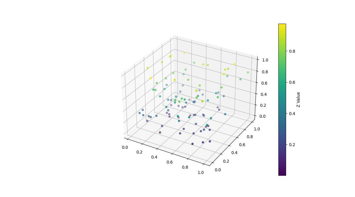
Now the colors of the points correspond to their Z-axis positions, providing a clearer representation of depth.
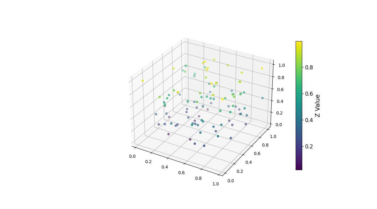
Customize Colorbar Appearance
You can customize the colorbar size, aspect ratio, and label font sizes for better readability:
cbar = plt.colorbar(scatter, shrink=0.8, aspect=20)
cbar.set_label('Z Value', fontsize=14)
cbar.ax.tick_params(labelsize=12)
plt.show()
Output:
Using Predefined Colormaps
Matplotlib offers various predefined colormaps. Here’s how to use them:
colormaps = ['viridis', 'plasma', 'coolwarm']
fig, axes = plt.subplots(1, 3, figsize=(18, 6), subplot_kw={'projection': '3d'})
for ax, cmap in zip(axes, colormaps):
    scatter = ax.scatter(x, y, z, c=z, cmap=cmap)
    plt.colorbar(scatter, ax=ax, label='Z Value')
    ax.set_title(f'Colormap: {cmap}')
plt.tight_layout()
plt.show()
Output:
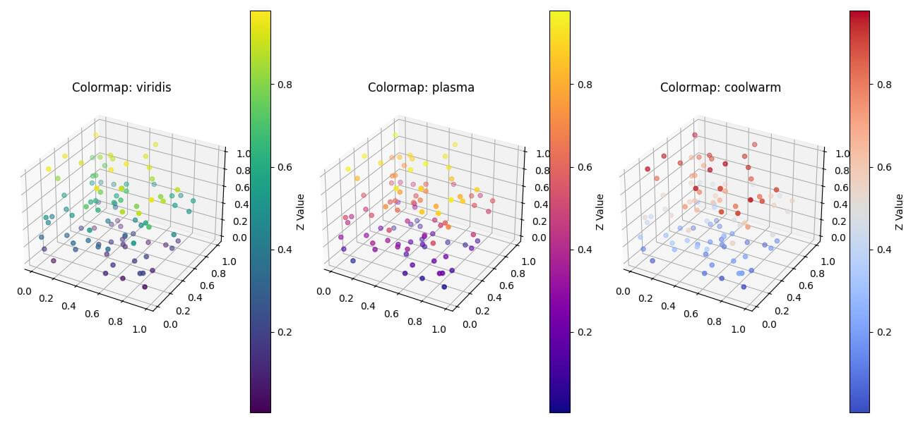
This code creates three subplots, each using a different colormap to visualize the same data.
Normalize Color Scales
To normalize color scales, use Matplotlib’s normalization classes:
from matplotlib.colors import Normalize, LogNorm, SymLogNorm
fig, axes = plt.subplots(1, 3, figsize=(18, 6), subplot_kw={'projection': '3d'})
norms = [Normalize(), LogNorm(), SymLogNorm(linthresh=0.1)]
titles = ['Linear', 'Logarithmic', 'Symmetric Log']
for ax, norm, title in zip(axes, norms, titles):
    scatter = ax.scatter(x, y, z, c=z, cmap='viridis', norm=norm)
    plt.colorbar(scatter, ax=ax, label='Z Value')
    ax.set_title(f'{title} Normalization')
plt.tight_layout()
plt.show()
Output:
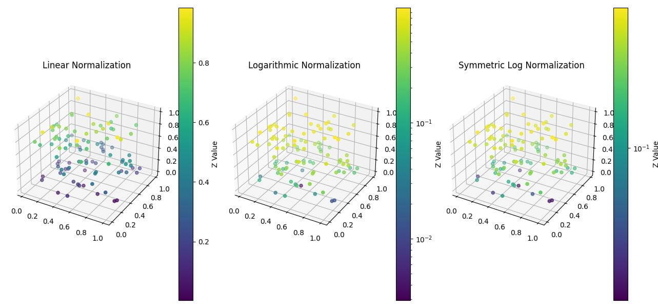
This code shows linear, logarithmic, and symmetric logarithmic color scaling.
Discrete Color Levels
To create discrete color levels, use the BoundaryNorm class:
from matplotlib.colors import BoundaryNorm
levels = [0, 0.2, 0.4, 0.6, 0.8, 1.0]
norm = BoundaryNorm(levels, ncolors=len(levels)-1)
fig = plt.figure(figsize=(10, 8))
ax = fig.add_subplot(111, projection='3d')
scatter = ax.scatter(x, y, z, c=z, cmap='viridis', norm=norm)
cbar = plt.colorbar(scatter, label='Z Value', ticks=levels)
plt.show()
Output:
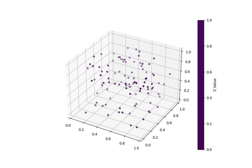
This plot uses discrete color levels which makes it easier to categorize data points into specific ranges.
Highlight Specific Regions or Thresholds
To highlight specific regions, create a custom colormap with distinct colors:
import numpy as np
import matplotlib.pyplot as plt
from mpl_toolkits.mplot3d import Axes3D
import matplotlib.colors as mcolors
from matplotlib.colors import LinearSegmentedColormap
x = np.random.rand(100)
y = np.random.rand(100)
z = np.random.rand(100)
c = np.random.rand(100)

# Define the custom colormap
threshold = 0.5
colors = ['#1E88E5', '#FFC107']
n_bins = 2
cmap = LinearSegmentedColormap.from_list('custom', colors, N=n_bins)
norm = mcolors.BoundaryNorm(boundaries=[0, threshold, 1], ncolors=n_bins)

fig = plt.figure(figsize=(10, 8))
ax = fig.add_subplot(111, projection='3d')
scatter = ax.scatter(x, y, z, c=z, cmap=cmap, norm=norm)
cbar = plt.colorbar(scatter, label='Z Value')
cbar.set_ticks([0.25, 0.75])
cbar.set_ticklabels(['Below threshold', 'Above threshold'])
plt.show()
Output:
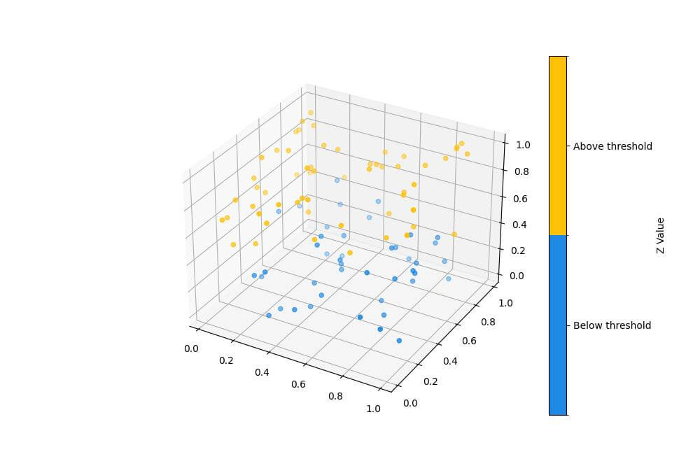
This plot highlights values above and below a specific threshold using distinct colors.
Using Multiple Colorbars for Different Data Aspects
To use multiple colorbars, create separate scatter plots for each aspect:
fig = plt.figure(figsize=(12, 8))
ax = fig.add_subplot(111, projection='3d')
scatter1 = ax.scatter(x, y, z, c=z, cmap='viridis')
scatter2 = ax.scatter(x, y, z, c=c, cmap='plasma')
cbar1 = plt.colorbar(scatter1, label='Z Value', pad=0.1)
cbar2 = plt.colorbar(scatter2, label='C Value', pad=0.15)
plt.tight_layout()
plt.show()
Output:
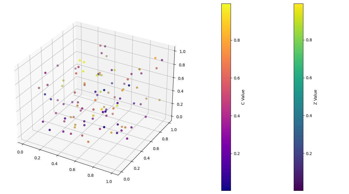
This plot uses two colorbars to represent different aspects of the data simultaneously.
Mokhtar is the founder of LikeGeeks.com. He is a seasoned technologist and accomplished author, with expertise in Linux system administration and Python development. Since 2010, Mokhtar has built an impressive career, transitioning from system administration to Python development in 2015. His work spans large corporations to freelance clients around the globe. Alongside his technical work, Mokhtar has authored some insightful books in his field. Known for his innovative solutions, meticulous attention to detail, and high-quality work, Mokhtar continually seeks new challenges within the dynamic field of technology.