Visualize 3D Data in 2D with Python
In this tutorial, you’ll learn how to represent 3D data in 2D using Python.
We’ll explore several methods, from contour plots and heatmaps to scatter plots with color mapping and projection plots.
You’ll also learn more advanced methods like parallel coordinates and Andrews curves.
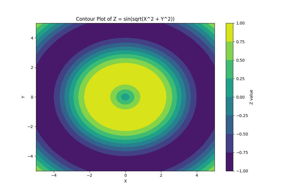
Using Contour Plot
You can create a contour plot to display the 3D surface as color-coded regions on a 2D plane, where each color represents a range of Z values.
import numpy as np
import matplotlib.pyplot as plt
x = np.linspace(-5, 5, 100)
y = np.linspace(-5, 5, 100)
X, Y = np.meshgrid(x, y)
Z = np.sin(np.sqrt(X**2 + Y**2))
plt.figure(figsize=(10, 8))
plt.contourf(X, Y, Z, cmap='viridis')
plt.colorbar(label='Z value')
plt.title('Contour Plot of Z = sin(sqrt(X^2 + Y^2))')
plt.xlabel('X')
plt.ylabel('Y')
plt.show()
Output:
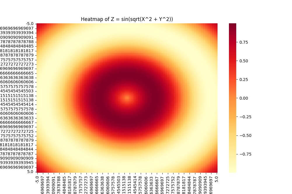
Using Heatmaps
You can use a heatmap to represent the Z values using color intensity to provide a clear visualization of the 3D surface on a 2D plane.
import seaborn as sns
import pandas as pd
data = pd.DataFrame(Z, index=y, columns=x)
plt.figure(figsize=(10, 8))
sns.heatmap(data, cmap='YlOrRd')
plt.title('Heatmap of Z = sin(sqrt(X^2 + Y^2))')
plt.xlabel('X')
plt.ylabel('Y')
plt.show()
Output:
Using Scatter Plots with Color Mapping
You can use the matplotlib scatter function with a colormap to represent the third dimension:
x = np.random.rand(1000)
y = np.random.rand(1000)
z = np.sin(x*10) + np.cos(y*10)
plt.figure(figsize=(10, 8))
scatter = plt.scatter(x, y, c=z, cmap='coolwarm')
plt.colorbar(scatter, label='Z value')
plt.title('Scatter Plot with Color Mapping')
plt.xlabel('X')
plt.ylabel('Y')
plt.show()
Output:
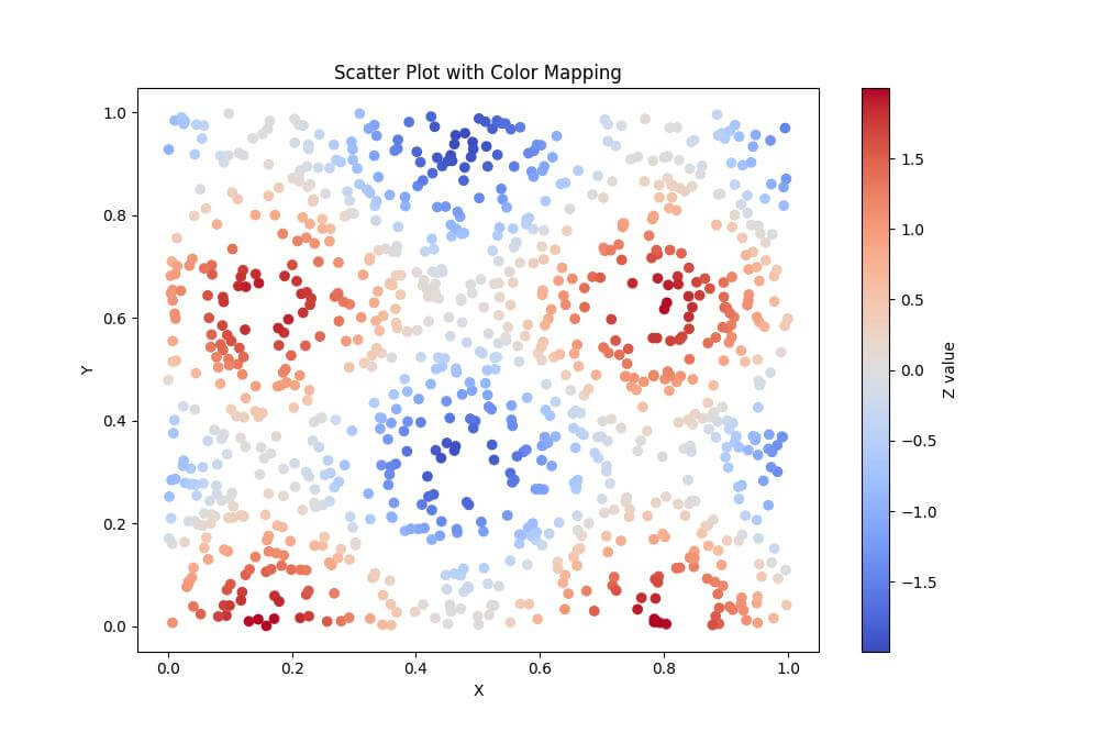
The scatter plot displays X and Y coordinates as points, while the color of each point represents the Z value.
Using Projection plots
You can generate 2D projections of 3D data using matplotlib:
from mpl_toolkits.mplot3d import Axes3D
x = np.random.rand(100)
y = np.random.rand(100)
z = np.random.rand(100)
fig = plt.figure(figsize=(15, 5))
ax1 = fig.add_subplot(131)
ax1.scatter(x, y)
ax1.set_title('XY Projection')
ax1.set_xlabel('X')
ax1.set_ylabel('Y')
ax2 = fig.add_subplot(132)
ax2.scatter(x, z)
ax2.set_title('XZ Projection')
ax2.set_xlabel('X')
ax2.set_ylabel('Z')
ax3 = fig.add_subplot(133)
ax3.scatter(y, z)
ax3.set_title('YZ Projection')
ax3.set_xlabel('Y')
ax3.set_ylabel('Z')
plt.tight_layout()
plt.show()
Output:
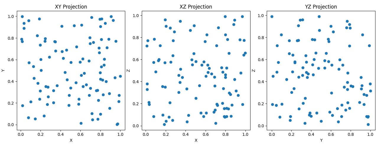
These projection plots show 2D views of the 3D data on different planes.
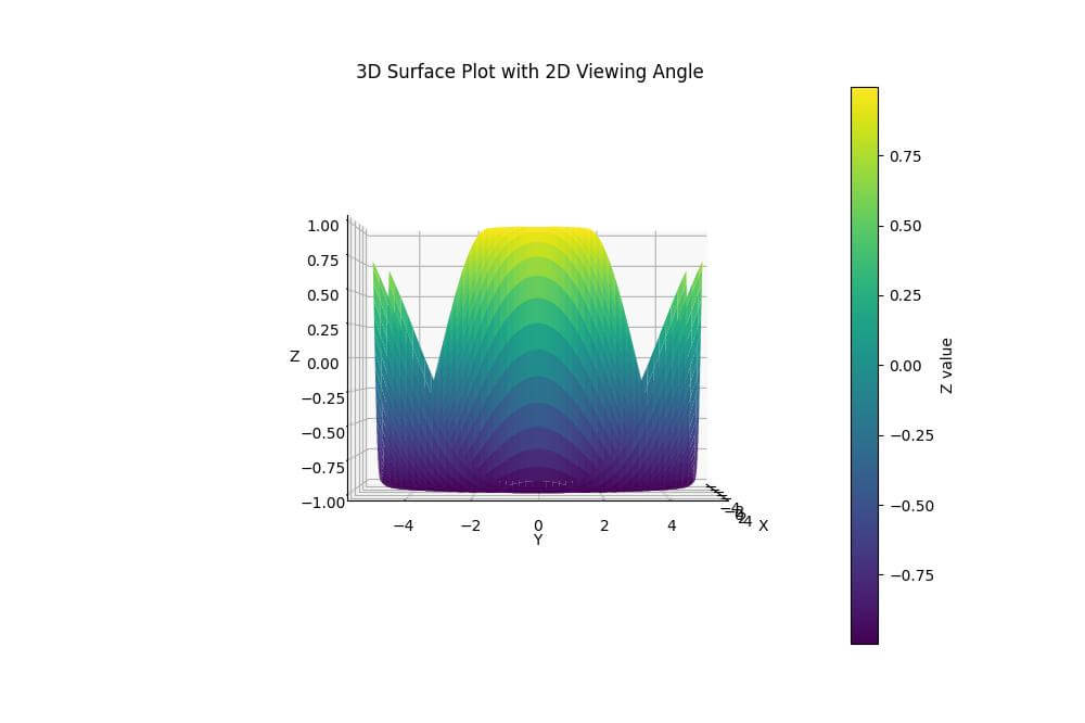
3D plots with 2D viewing angle
You can create a 3D surface plot and set a specific 2D viewing angle:
fig = plt.figure(figsize=(10, 8))
ax = fig.add_subplot(111, projection='3d')
x = np.linspace(-5, 5, 100)
y = np.linspace(-5, 5, 100)
X, Y = np.meshgrid(x, y)
Z = np.sin(np.sqrt(X**2 + Y**2))
surf = ax.plot_surface(X, Y, Z, cmap='viridis')
fig.colorbar(surf, label='Z value')
ax.set_title('3D Surface Plot with 2D Viewing Angle')
ax.set_xlabel('X')
ax.set_ylabel('Y')
ax.set_zlabel('Z')
ax.view_init(elev=0, azim=0)  # Set viewing angle
plt.show()
Output:
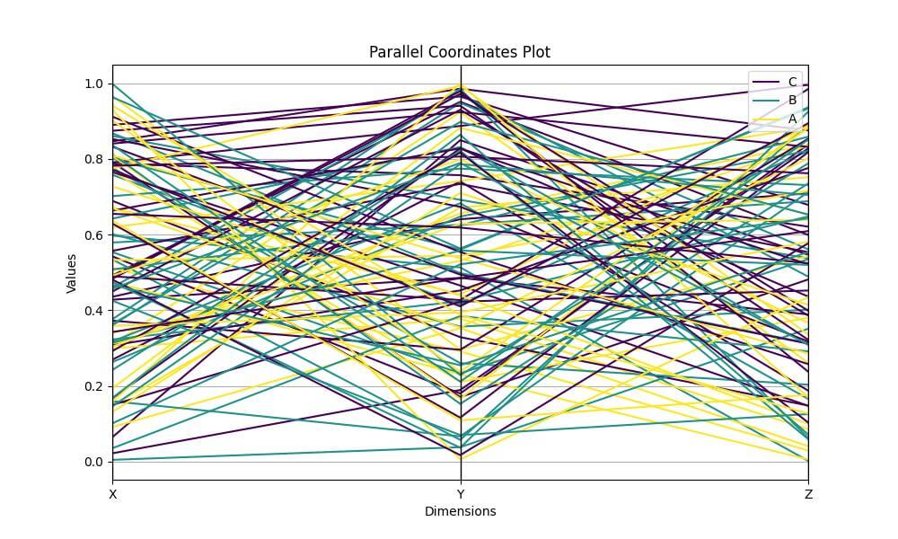
Using Parallel coordinates
The parallel coordinates plot displays multivariate data as lines across parallel axes which allows you to visualize patterns and relationships among multiple dimensions.
import pandas as pd
from pandas.plotting import parallel_coordinates
data = pd.DataFrame({
    'X': np.random.rand(100),
    'Y': np.random.rand(100),
    'Z': np.random.rand(100),
    'Category': np.random.choice(['A', 'B', 'C'], 100)
})
plt.figure(figsize=(10, 6))
parallel_coordinates(data, 'Category', colormap='viridis')
plt.title('Parallel Coordinates Plot')
plt.xlabel('Dimensions')
plt.ylabel('Values')
plt.show()
Output:
Using Andrews curves
You can create Andrews curves using pandas and matplotlib:
import numpy as np
import matplotlib.pyplot as plt
import pandas as pd
from pandas.plotting import andrews_curves
data = pd.DataFrame({
    'X': np.random.rand(100),
    'Y': np.random.rand(100),
    'Z': np.random.rand(100),
    'Category': np.random.choice(['A', 'B', 'C'], 100)
})
plt.figure(figsize=(10, 6))
andrews_curves(data, 'Category', colormap='viridis')
plt.title('Andrews Curves')
plt.xlabel('t')
plt.ylabel('f(t)')
plt.show()
Output:
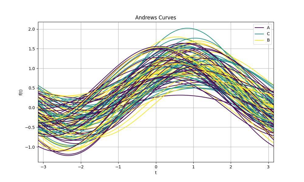
Andrews curves represent multivariate data as a series of curves.
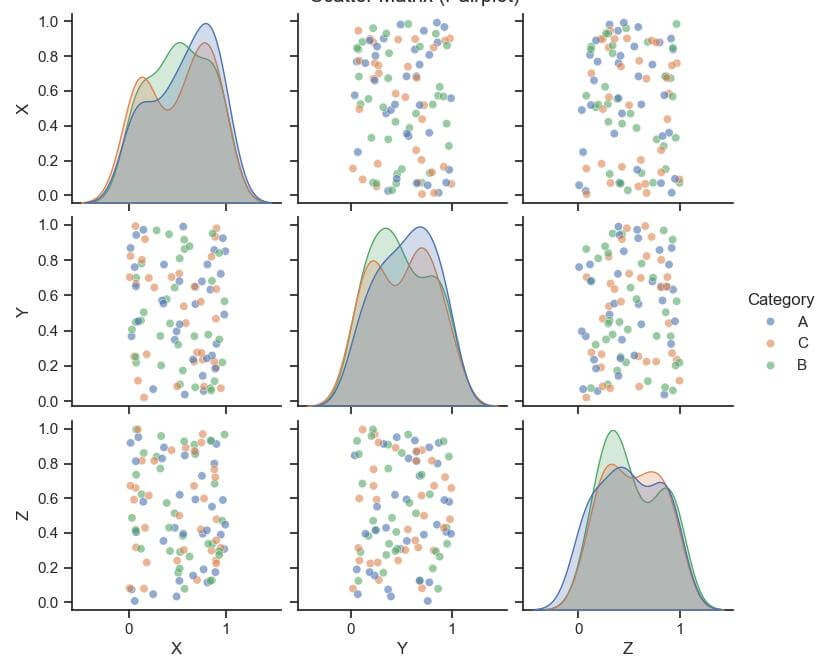
Using Scatter matrix (pairplot)
You can use the scatter matrix to display pairwise relationships between variables, with kernel density estimates on the diagonal to provide a view of the multidimensional data:
import seaborn as sns
sns.set(style="ticks")
sns.pairplot(data, hue="Category", diag_kind="kde", plot_kws={'alpha': 0.6})
plt.suptitle('Scatter Matrix (Pairplot)', y=1.02)
plt.show()
Output:
Mokhtar is the founder of LikeGeeks.com. He is a seasoned technologist and accomplished author, with expertise in Linux system administration and Python development. Since 2010, Mokhtar has built an impressive career, transitioning from system administration to Python development in 2015. His work spans large corporations to freelance clients around the globe. Alongside his technical work, Mokhtar has authored some insightful books in his field. Known for his innovative solutions, meticulous attention to detail, and high-quality work, Mokhtar continually seeks new challenges within the dynamic field of technology.