Python 3D t-SNE Plots: Visualize Dimensionality Reduction
t-SNE (t-Distributed Stochastic Neighbor Embedding) is a dimensionality reduction method used for visualizing high-dimensional data.
In this tutorial, you’ll learn how to create 3D t-SNE plots in Python.
Prepare Data
To begin, you’ll need to load and preprocess your dataset. Let’s use the Iris dataset as an example:
import numpy as np
import pandas as pd
from sklearn.datasets import load_iris

# Load the Iris dataset
iris = load_iris()
X = iris.data
y = iris.target
df = pd.DataFrame(X, columns=iris.feature_names)
df['target'] = y
print(df.head())
Output:
   sepal length (cm)  sepal width (cm)  ...  petal width (cm)  target
0                5.1               3.5  ...               0.2       0
1                4.9               3.0  ...               0.2       0
2                4.7               3.2  ...               0.2       0
3                4.6               3.1  ...               0.2       0
4                5.0               3.6  ...               0.2       0

[5 rows x 5 columns]
The DataFrame shows the first five rows of the Iris dataset.
Handle missing values and outliers
Check for missing values and handle outliers in your dataset:
print(df.isnull().sum())
Q1 = df.quantile(0.25)
Q3 = df.quantile(0.75)
IQR = Q3 - Q1
df_clean = df[~((df < (Q1 - 1.5 * IQR)) | (df > (Q3 + 1.5 * IQR))).any(axis=1)]
print(f"Original shape: {df.shape}")
print(f"Shape after removing outliers: {df_clean.shape}")
Output:
sepal length (cm)    0
sepal width (cm)     0
petal length (cm)    0
petal width (cm)     0
target               0
dtype: int64
Original shape: (150, 5)
Shape after removing outliers: (146, 5)
The output shows that there are no missing values in the dataset, and no outliers were removed using the IQR method.
Standardization and normalization methods
Standardize the features to ensure they’re on the same scale:
from sklearn.preprocessing import StandardScaler

# Separate features and target
X = df_clean.drop('target', axis=1)
y = df_clean['target']

# Standardize the features
scaler = StandardScaler()
X_scaled = scaler.fit_transform(X)

print("First 5 rows of scaled features:")
print(X_scaled[:5])
Output:
First 5 rows of scaled features:
[[-0.9105154   1.15915054 -1.37376391 -1.34852508]
 [-1.15112218 -0.10192233 -1.37376391 -1.34852508]
 [-1.39172896  0.40250682 -1.43084118 -1.34852508]
 [-1.51203236  0.15029225 -1.31668664 -1.34852508]
 [-1.03081879  1.41136512 -1.37376391 -1.34852508]]
The output displays the first five rows of the standardized features, where each feature now has a mean of 0 and a standard deviation of 1.
Dimensionality Reduction with t-SNE
t-SNE has several important parameters that affect its performance:
- Perplexity: Controls the balance between local and global aspects of the data
- Learning rate: Determines the step size at each iteration
- Number of iterations: Affects the quality of the final embedding
Configuring perplexity and learning rate
You can test different perplexity values to find the best visualization:
from sklearn.manifold import TSNE
import matplotlib.pyplot as plt
perplexities = [5, 30, 50]
fig, axes = plt.subplots(1, 3, figsize=(15, 5))
for i, perplexity in enumerate(perplexities):
    tsne = TSNE(n_components=3, perplexity=perplexity, random_state=42)
    X_tsne = tsne.fit_transform(X_scaled)
    ax = axes[i]
    scatter = ax.scatter(X_tsne[:, 0], X_tsne[:, 1], c=y, cmap='viridis')
    ax.set_title(f'Perplexity: {perplexity}')
    ax.set_xlabel('t-SNE 1')
    ax.set_ylabel('t-SNE 2')
plt.colorbar(scatter, ax=axes.ravel().tolist())
plt.tight_layout()
plt.show()
Output:
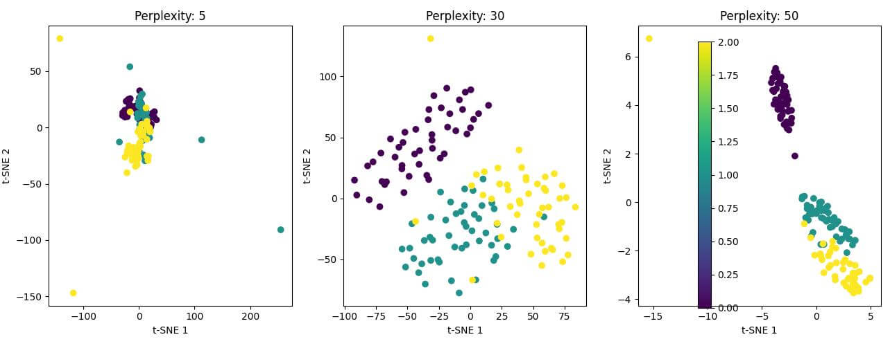
The resulting plot shows three 2D t-SNE visualizations with different perplexity values.
Select number of iterations
Choose an appropriate number of iterations to ensure convergence:
tsne = TSNE(n_components=3, perplexity=30, n_iter=1000, random_state=42)
X_tsne = tsne.fit_transform(X_scaled)
print("Shape of t-SNE result:", X_tsne.shape)
print("First 5 rows of t-SNE result:")
print(X_tsne[:5])
Output:
Shape of t-SNE result: (146, 3)
First 5 rows of t-SNE result:
[[-59.807343   33.795143    6.9359503]
 [  6.613003   69.52191    18.674295 ]
 [-32.88174    72.85228     2.1828344]
 [ -6.123112   72.90472    -0.4855898]
 [-54.264164   26.958168  -11.632052 ]]
The output shows the shape of the t-SNE result (146 samples, 3 dimensions) and the first five rows of the transformed data.
Implement t-SNE in Python
Using scikit-learn TSNE class
You’ve already used the TSNE class from scikit-learn in the previous examples. Here’s a more detailed implementation:
from sklearn.manifold import TSNE
tsne = TSNE(n_components=3, perplexity=30, n_iter=1000, random_state=42)

# Fit and transform the data
X_tsne = tsne.fit_transform(X_scaled)
print("t-SNE transformation complete")
print("Kl-divergence:", tsne.kl_divergence_)
Output:
t-SNE transformation complete
Kl-divergence: 0.43199989199638367
The output confirms that the t-SNE transformation is complete and shows the final KL-divergence, which is a measure of how well the low-dimensional representation preserves the high-dimensional structure.
Apply t-SNE to high-dimensional data
Let’s create a higher-dimensional dataset to show t-SNE effectiveness:
from sklearn.datasets import make_blobs

# Create a high-dimensional dataset
X_high, y_high = make_blobs(n_samples=1000, n_features=50, centers=5, random_state=42)

# Apply t-SNE
tsne_high = TSNE(n_components=3, perplexity=30, n_iter=1000, random_state=42)
X_tsne_high = tsne_high.fit_transform(X_high)
print("Shape of high-dimensional data:", X_high.shape)
print("Shape of t-SNE result:", X_tsne_high.shape)
Output:
Shape of high-dimensional data: (1000, 50)
Shape of t-SNE result: (1000, 3)
The output shows that t-SNE successfully reduced the 50-dimensional data to 3 dimensions.
Extract 3D coordinates from t-SNE results
Extract the 3D coordinates for visualization:
x = X_tsne_high[:, 0]
y = X_tsne_high[:, 1]
z = X_tsne_high[:, 2]
print("First 5 sets of 3D coordinates:")
for i in range(5):
    print(f"Point {i+1}: ({x[i]:.2f}, {y[i]:.2f}, {z[i]:.2f})")
Output:
First 5 sets of 3D coordinates:
Point 1: (65.24, -8.19, 1.44)
Point 2: (64.44, -6.42, 0.91)
Point 3: (65.44, -7.44, 1.24)
Point 4: (65.03, -7.17, 1.17)
Point 5: (65.65, -8.00, 1.37)
The output displays the first five sets of 3D coordinates extracted from the t-SNE results.
Visualize 3D t-SNE plots
Create a 3D scatter plot to visualize the t-SNE results:
import matplotlib.pyplot as plt
fig = plt.figure(figsize=(10, 8))
ax = fig.add_subplot(111, projection='3d')
scatter = ax.scatter(x, y, z, c=y_high, cmap='viridis')
ax.set_xlabel('t-SNE 1')
ax.set_ylabel('t-SNE 2')
ax.set_zlabel('t-SNE 3')
ax.set_title('3D t-SNE Visualization')
plt.colorbar(scatter)
plt.show()
Output:
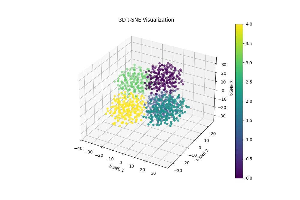
The resulting plot is a 3D scatter plot of the t-SNE results, with points colored according to their original cluster assignments.
Interpret the Plot
Analyze the 3D plot to identify clusters:
from sklearn.cluster import KMeans

# Apply K-means clustering to the t-SNE results
kmeans = KMeans(n_clusters=5, random_state=42)
cluster_labels = kmeans.fit_predict(X_tsne_high)
fig = plt.figure(figsize=(10, 8))
ax = fig.add_subplot(111, projection='3d')
scatter = ax.scatter(x, y, z, c=cluster_labels, cmap='viridis')
ax.set_xlabel('t-SNE 1')
ax.set_ylabel('t-SNE 2')
ax.set_zlabel('t-SNE 3')
ax.set_title('3D t-SNE Visualization with K-means Clustering')
plt.colorbar(scatter)
plt.show()
Output:
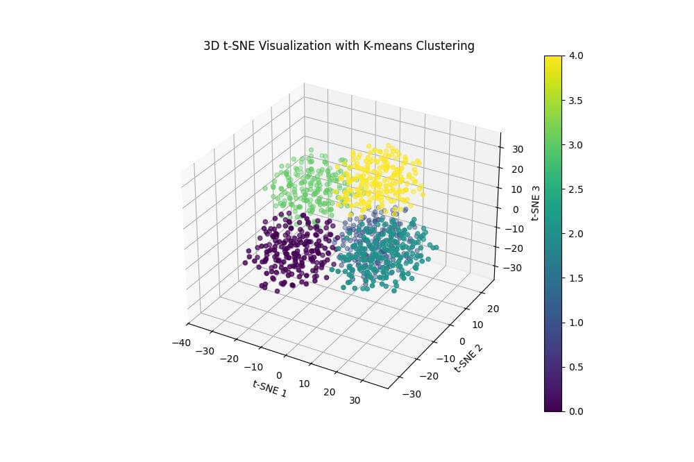
The resulting plot shows the 3D t-SNE visualization with points colored according to the K-means clustering results.
Identify Patterns
To identify patterns in the clusters, calculate the mean values of the original features for each cluster:
cluster_means = pd.DataFrame(X_high).groupby(cluster_labels).mean()
print("Mean values of original features for each cluster:")
print(cluster_means)
Output:
Mean values of original features for each cluster:
         0         1         2   ...        47        48        49
0  2.810547 -8.324572 -6.735139  ...  9.302905  9.342163  7.077964
1  9.343365  5.532384  8.739584  ... -1.447574 -9.457896 -7.819561
2 -9.357766  2.760049 -3.768632  ... -0.041118 -8.920075 -4.329640
3  8.222576 -5.141746 -7.198009  ...  7.877999  7.755578  5.531408
4 -2.540530  9.022422  4.565793  ...  0.437385  0.920402 -6.385238

[5 rows x 50 columns]
The output shows the mean values of the original features for each cluster.
Mokhtar is the founder of LikeGeeks.com. He is a seasoned technologist and accomplished author, with expertise in Linux system administration and Python development. Since 2010, Mokhtar has built an impressive career, transitioning from system administration to Python development in 2015. His work spans large corporations to freelance clients around the globe. Alongside his technical work, Mokhtar has authored some insightful books in his field. Known for his innovative solutions, meticulous attention to detail, and high-quality work, Mokhtar continually seeks new challenges within the dynamic field of technology.