How to Customize Plot Hover Text in Plotly
In this tutorial, you’ll learn how to customize various aspects of plot hover text in plotly.
To get started, install Plotly if you haven’t already:
!pip install plotly
Now, let’s import the necessary libraries and create a sample dataset:
import plotly.graph_objects as go
import pandas as pd
import numpy as np
np.random.seed(42)
df = pd.DataFrame({
  'x': np.random.rand(20),
  'y': np.random.rand(20),
  'size': np.random.randint(10, 50, 20),
  'category': np.random.choice(['A', 'B', 'C'], 20)
})
color_map = {'A': 'red', 'B': 'green', 'C': 'blue'}
fig = go.Figure(go.Scatter(
    x=df['x'],
    y=df['y'],
    mode='markers',
    marker=dict(
        size=df['size'],
        color=[color_map[cat] for cat in df['category']],
        colorscale='Viridis'
    ),
    text=df['category']
))
fig.show()
Output:
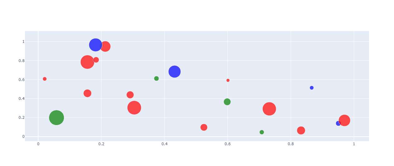
Each point has a size and category, which we’ll use to show hover text customization.
Custom Hover Text
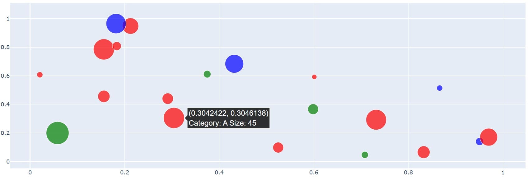
To customize the hover text content, you can use the hovertext parameter:
fig = go.Figure(go.Scatter(
  x=df['x'],
  y=df['y'],
  mode='markers',
  marker=dict(
      size=df['size'],
      color=[color_map[cat] for cat in df['category']],
      colorscale='Viridis'
  ),
  hovertext=df.apply(lambda row: f"Category: {row['category']}\nSize: {row['size']}", axis=1)
))
fig.show()
Output:
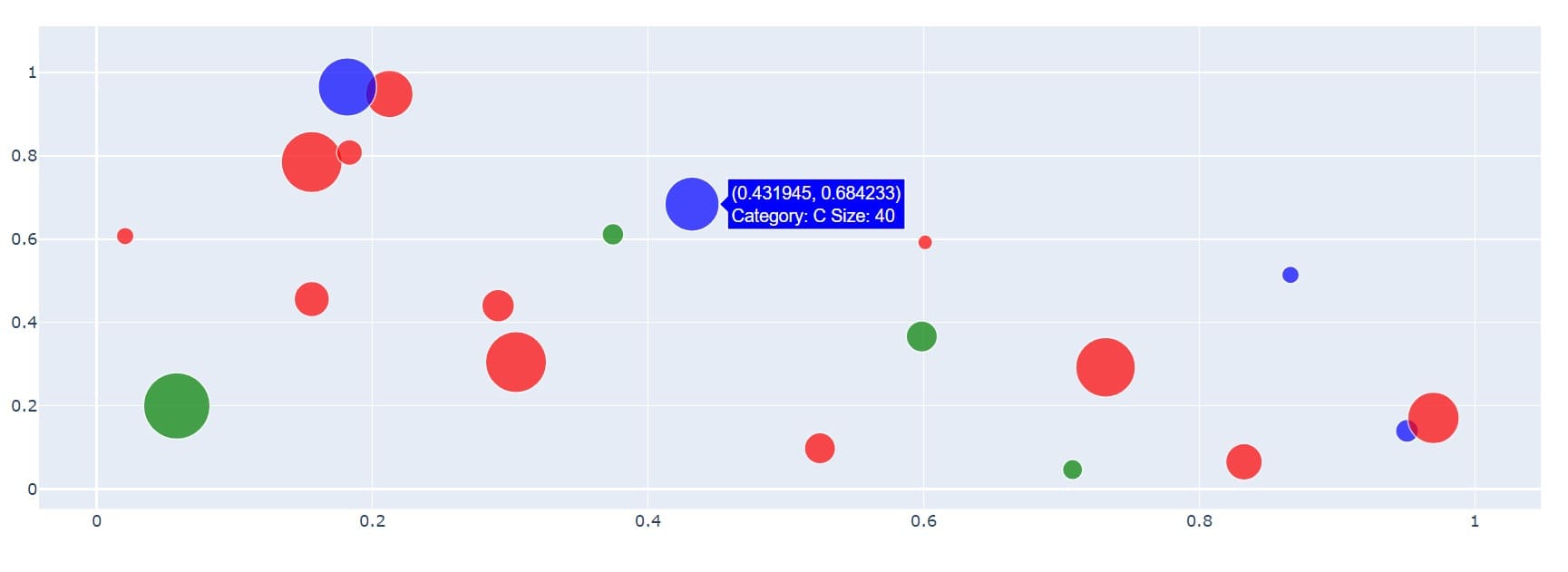
This code creates custom hover text for each data point.
Font(size, family,color)
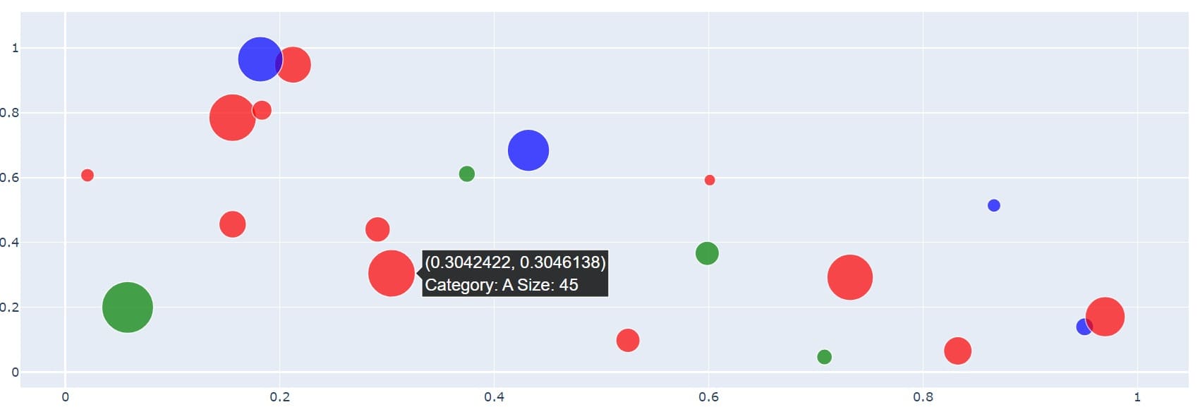
You can customize the font properties of the hover text using the hoverlabel parameter:
fig = go.Figure(go.Scatter(
  x=df['x'],
  y=df['y'],
  mode='markers',
  marker=dict(
      size=df['size'],
      color=[color_map[cat] for cat in df['category']],
      colorscale='Viridis'
  ),
  hovertext=df.apply(lambda row: f"Category: {row['category']}\nSize: {row['size']}", axis=1),
  hoverlabel=dict(font=dict(size=16, family='Arial', color='white')
    )
))
fig.show()
Output:
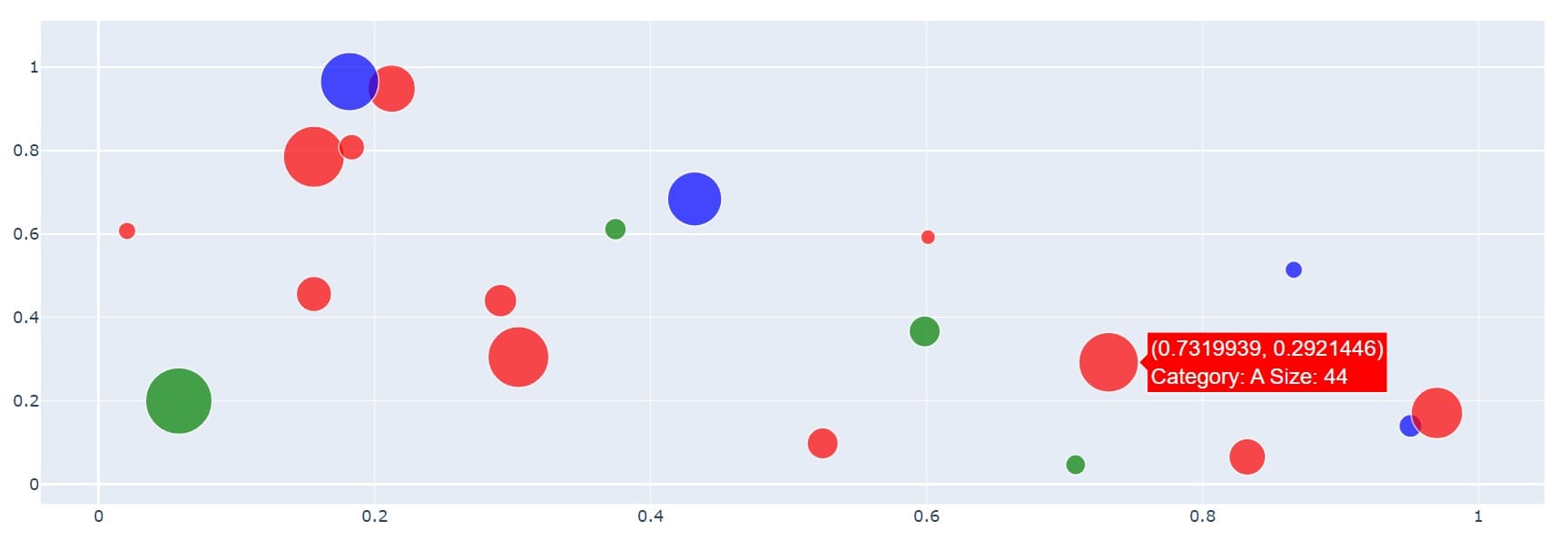
This code sets the hover text font size to 16 pixels, uses the Arial font family, and sets the text color to white.
Background Color
To change the background color of the hover label, use the bgcolor parameter:
fig = go.Figure(go.Scatter(
  x=df['x'],
  y=df['y'],
  mode='markers',
  marker=dict(
      size=df['size'],
      color=[color_map[cat] for cat in df['category']],
      colorscale='Viridis'
  ),
  hovertext=df.apply(lambda row: f"Category: {row['category']}\nSize: {row['size']}", axis=1),
  hoverlabel=dict(font=dict(size=16, family='Arial', color='white'),
  bgcolor='rgba(0, 0, 0, 0.8)'
    )
))
fig.show()
Output:
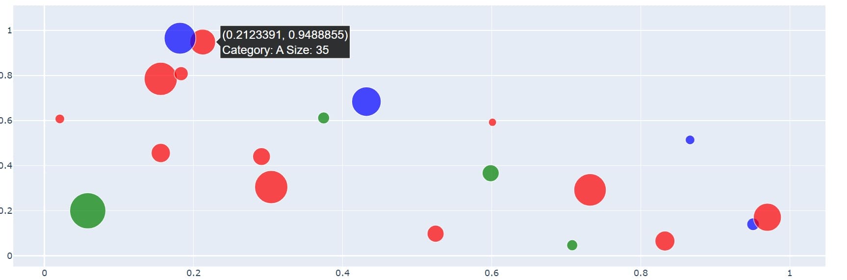
This code sets the hover label background color to a semi-transparent black.
Border Color
To customize the border color of the hover label, use the bordercolor parameter:
fig = go.Figure(go.Scatter(
  x=df['x'],
  y=df['y'],
  mode='markers',
  marker=dict(
      size=df['size'],
      color=[color_map[cat] for cat in df['category']],
      colorscale='Viridis'
  ),
  hovertext=df.apply(lambda row: f"Category: {row['category']}\nSize: {row['size']}", axis=1),
  hoverlabel=dict(font=dict(size=16, family='Arial', color='white'),
  bgcolor='rgba(0, 0, 0, 0.8)',
  bordercolor='white'
    )
))
fig.show()
Output:
Hover Text Alignment
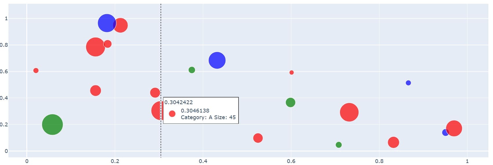
To control the alignment of the hover text, use the align parameter:
fig = go.Figure(go.Scatter(
  x=df['x'],
  y=df['y'],
  mode='markers',
  marker=dict(
      size=df['size'],
      color=[color_map[cat] for cat in df['category']],
      colorscale='Viridis'
  ),
  hovertext=df.apply(lambda row: f"Category: {row['category']}\nSize: {row['size']}", axis=1),
  hoverlabel=dict(font=dict(size=16, family='Arial', color='white'),
  bgcolor='rgba(0, 0, 0, 0.8)',
  bordercolor='white',
  align='left'
    )
))
fig.show()
Output:
This code aligns the hover text to the left. You can use ‘left’, ‘right’, or ‘auto’ for horizontal alignment.
Hover Label Positioning
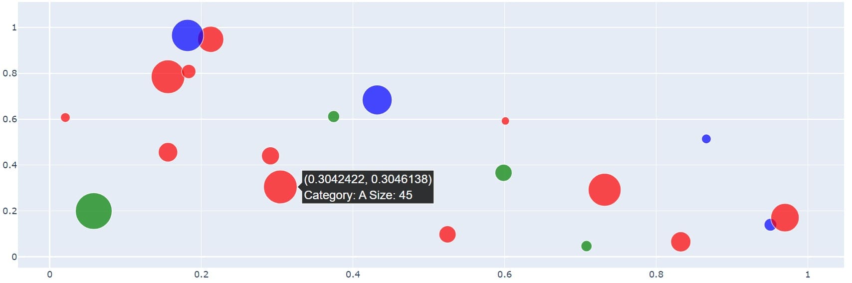
To control the positioning of the hover label, use the hovermode parameter in the layout:
fig = go.Figure(go.Scatter(
  x=df['x'],
  y=df['y'],
  mode='markers',
  marker=dict(
      size=df['size'],
      color=[color_map[cat] for cat in df['category']],
      colorscale='Viridis'
  ),
  hovertext=df.apply(lambda row: f"Category: {row['category']}\nSize: {row['size']}", axis=1),
  hoverlabel=dict(font=dict(size=16, family='Arial', color='white'),
  bgcolor='rgba(0, 0, 0, 0.8)',
  bordercolor='white',
  align='left'
    )
))
fig.update_layout(hovermode='x unified')
fig.show()
Output:
This code sets the hover mode to ‘x unified’, which displays all hover labels for data points with the same x-value.
You can choose between displaying hover information for the closest data point or all points:
fig.update_layout(hovermode='closest')  # or 'x' for all points
fig.show()
Output:
This code sets the hover mode to ‘closest’, which displays information for the closest data point to the cursor.
Hover Distance Threshold
To set a distance threshold for hover activation, use the hoverdistance parameter:
fig = go.Figure(go.Scatter(
  x=df['x'],
  y=df['y'],
  mode='markers',
  marker=dict(
      size=df['size'],
      color=[color_map[cat] for cat in df['category']],
      colorscale='Viridis'
  ),
  hovertext=df.apply(lambda row: f"Category: {row['category']}\nSize: {row['size']}", axis=1),
  hoverlabel=dict(font=dict(size=16, family='Arial', color='white'),
  bgcolor='rgba(0, 0, 0, 0.8)',
  bordercolor='white',
  align='left'
    )
))
fig.update_layout(hovermode='closest', hoverdistance=100)
fig.show()
Custom Hover Template (HTML Formatting)
For more advanced hover text customization, use the hovertemplate parameter:
fig = go.Figure(go.Scatter(
  x=df['x'],
  y=df['y'],
  mode='markers',
  marker=dict(
      size=df['size'],
      color=[color_map[cat] for cat in df['category']],
      colorscale='Viridis'
  ),
  hovertemplate='<b>Category:</b> %{text}<br>' +
                  '<b>Size:</b> %{marker.size}<br>' +
                  '<b>X:</b> %{x:.2f}<br>' +
                  '<b>Y:</b> %{y:.2f}<extra></extra>',
  text=df['category']
))
fig.update_layout(hovermode='closest', hoverdistance=100)
fig.show()
Output:
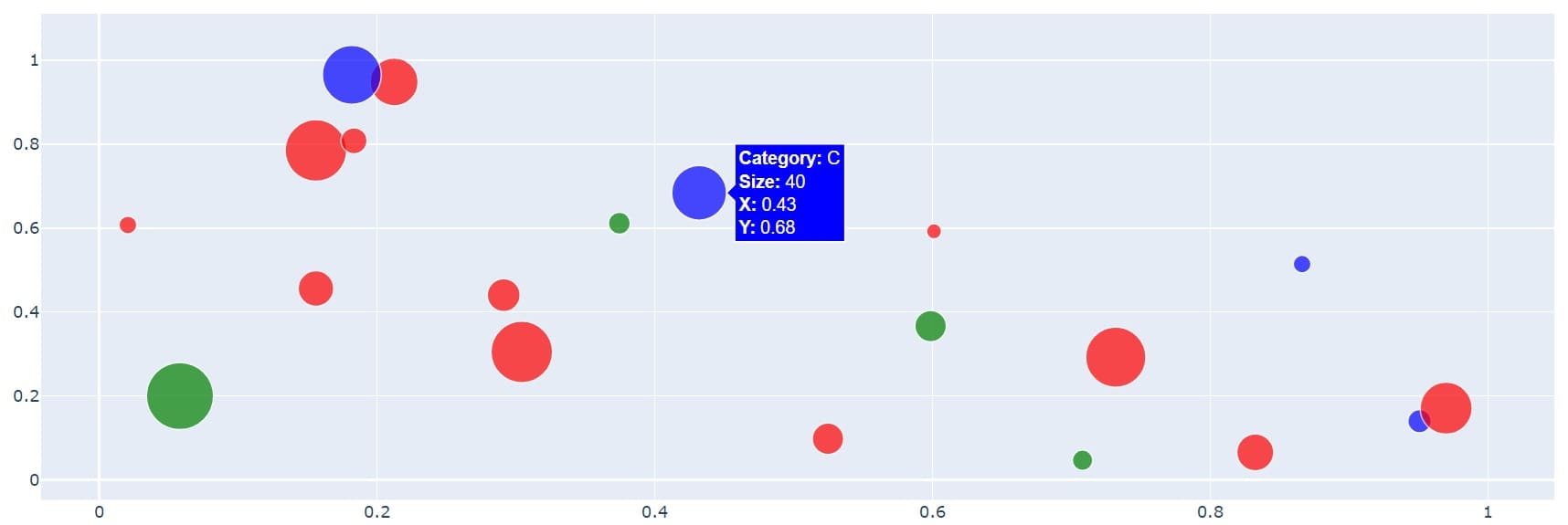
This code creates a custom hover template with formatted information about each data point.
Hover Info Selector
To control which information is displayed in the hover text, use the hoverinfo parameter:
category_nums = pd.Categorical(df['category']).codes
fig = go.Figure(go.Scatter(
  x=df['x'],
  y=df['y'],
  mode='markers',
  marker=dict(size=df['size'], color=category_nums, colorscale='Viridis'),
  text=df['category'],
  hoverinfo='x+y+text'
))
fig.show()
Output:
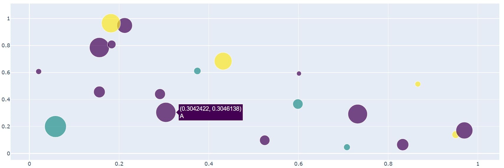
Here we display only the x and y coordinates, along with the text (category) in the hover information.
Mokhtar is the founder of LikeGeeks.com. He is a seasoned technologist and accomplished author, with expertise in Linux system administration and Python development. Since 2010, Mokhtar has built an impressive career, transitioning from system administration to Python development in 2015. His work spans large corporations to freelance clients around the globe. Alongside his technical work, Mokhtar has authored some insightful books in his field. Known for his innovative solutions, meticulous attention to detail, and high-quality work, Mokhtar continually seeks new challenges within the dynamic field of technology.