How To Color Points Conditionally in Plotly 3D Scatter Plot
In this tutorial, you’ll learn how to color points in a 3D scatter plot based on conditions using various methods.
These methods will help you show additional information through color.
To get started, import the necessary libraries and create some sample data:
import plotly.graph_objects as go
import numpy as np
np.random.seed(42)
n_points = 1000
x = np.random.randn(n_points)
y = np.random.randn(n_points)
z = np.random.randn(n_points)
This code creates the environment and random 3D data points for our examples.
Color by Distance
To color points based on their distance from a specific point, calculate the distances and use them as color values:
# Calculate distances from the origin (0, 0, 0)
distances = np.sqrt(x**2 + y**2 + z**2)

# Create the 3D scatter plot
fig = go.Figure(data=[go.Scatter3d(
    x=x, y=y, z=z,
    mode='markers',
    marker=dict(
        size=5,
        color=distances,
        colorscale='Viridis',
        colorbar=dict(title='Distance from Origin')
    )
)])
fig.update_layout(title='3D Scatter Plot: Color by Distance from Origin')
fig.show()
Output:
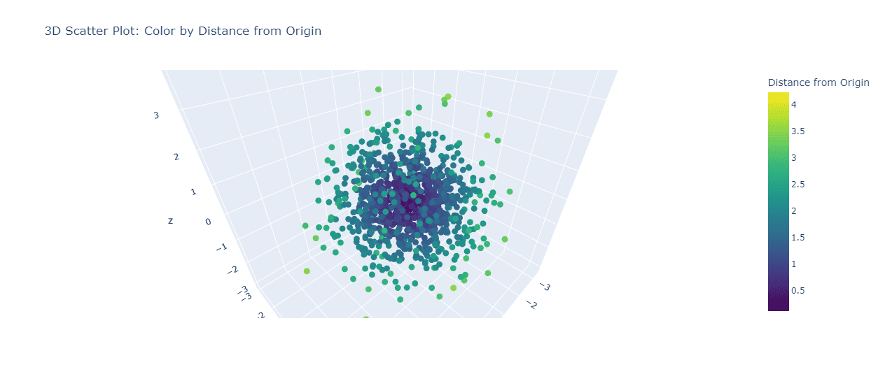
This code creates a 3D scatter plot where points are colored based on their distance from the origin (0, 0, 0).
The ‘Viridis’ colorscale is used, with darker colors representing points closer to the origin and brighter colors for points farther away.
Color by Density
To color points based on their density, you can use a kernel density estimation:
from scipy.stats import gaussian_kde

# Calculate point density
xyz = np.vstack([x, y, z])
kde = gaussian_kde(xyz)
density = kde(xyz)
fig = go.Figure(data=[go.Scatter3d(
    x=x, y=y, z=z,
    mode='markers',
    marker=dict(
        size=5,
        color=density,
        colorscale='Plasma',
        colorbar=dict(title='Point Density')
    )
)])
fig.update_layout(title='3D Scatter Plot: Color by Density')
fig.show()
Output:
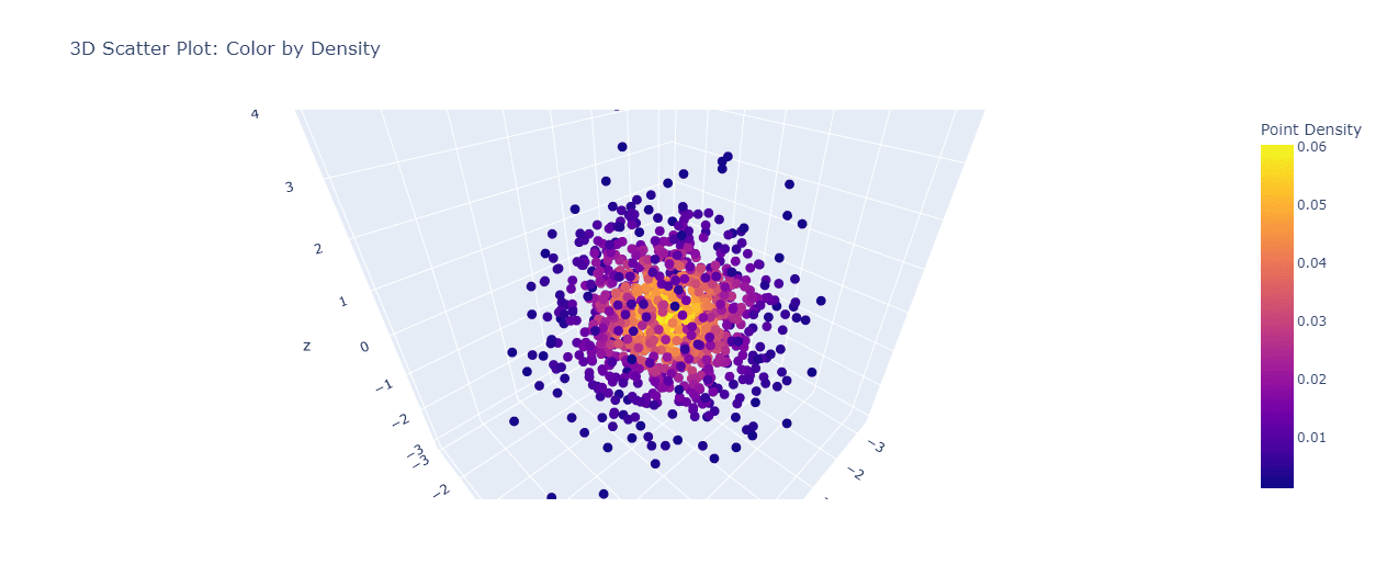
This code uses Gaussian kernel density estimation to calculate the density of points in 3D space.
The resulting plot shows areas of high density in brighter colors and areas of low density in darker colors using the ‘Plasma’ colorscale.
Color by Categorical data
To color points based on categorical data, assign a color to each category:
categories = np.random.choice(['A', 'B', 'C'], n_points)

# Create a color map
color_map = {'A': 'red', 'B': 'green', 'C': 'blue'}
colors = [color_map[cat] for cat in categories]
fig = go.Figure(data=[go.Scatter3d(
    x=x, y=y, z=z,
    mode='markers',
    marker=dict(
        size=5,
        color=colors,
    ),
    text=categories,
    hoverinfo='text'
)])
fig.update_layout(title='3D Scatter Plot: Color by Category')
fig.show()
Output:
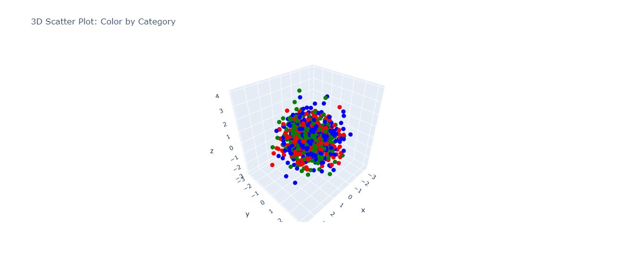
This code assigns random categories to each point and colors them accordingly.
The resulting plot shows distinct colors for each category so you can identify different groups of data points.
Color by Calculated metrics
To color points based on a calculated metric, perform the calculation and use the results for coloring:
# Calculate a metric (e.g., distance from a plane)
plane_normal = np.array([1, 1, 1])
plane_point = np.array([0, 0, 0])
points = np.column_stack((x, y, z))
distances_from_plane = np.abs(np.dot(points - plane_point, plane_normal)) / np.linalg.norm(plane_normal)
fig = go.Figure(data=[go.Scatter3d(
    x=x, y=y, z=z,
    mode='markers',
    marker=dict(
        size=5,
        color=distances_from_plane,
        colorscale='Turbo',
        colorbar=dict(title='Distance from Plane')
    )
)])
fig.update_layout(title='3D Scatter Plot: Color by Distance from Plane')
fig.show()
Output:
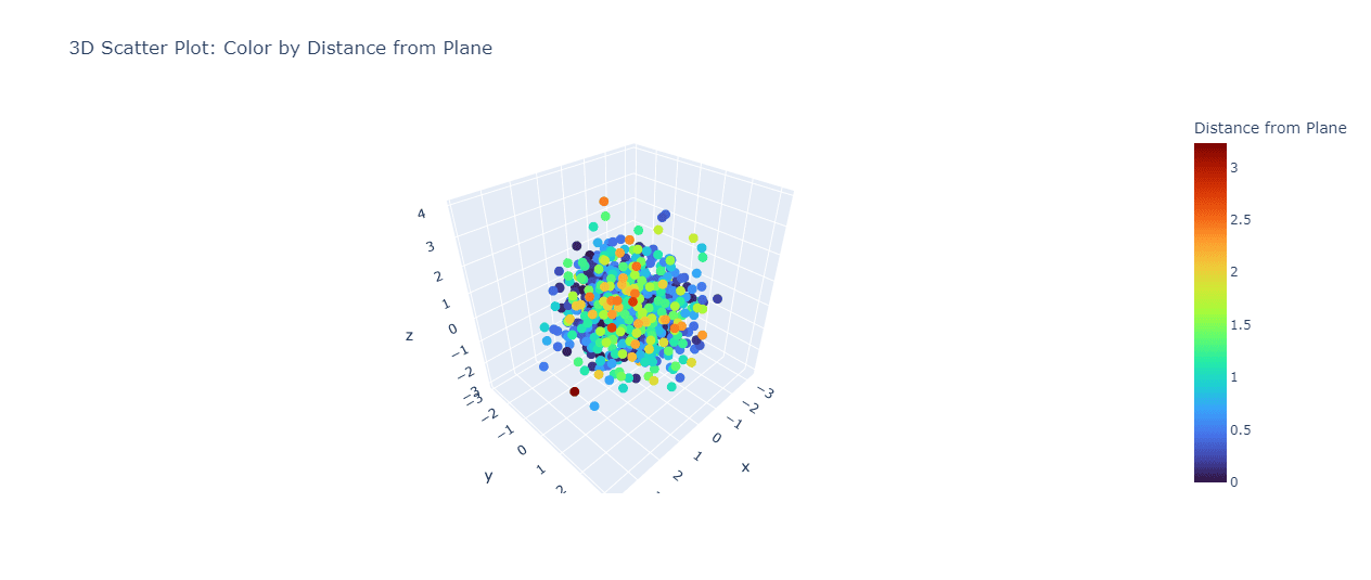
This code calculates the distance of each point from a plane defined by the normal vector [1, 1, 1] passing through the origin.
The resulting plot colors points based on their distance from this plane, using the ‘Turbo’ colorscale.
Mokhtar is the founder of LikeGeeks.com. He is a seasoned technologist and accomplished author, with expertise in Linux system administration and Python development. Since 2010, Mokhtar has built an impressive career, transitioning from system administration to Python development in 2015. His work spans large corporations to freelance clients around the globe. Alongside his technical work, Mokhtar has authored some insightful books in his field. Known for his innovative solutions, meticulous attention to detail, and high-quality work, Mokhtar continually seeks new challenges within the dynamic field of technology.